 Like yesterday…. but super-creatively (hehe) substituting white accessories for black.
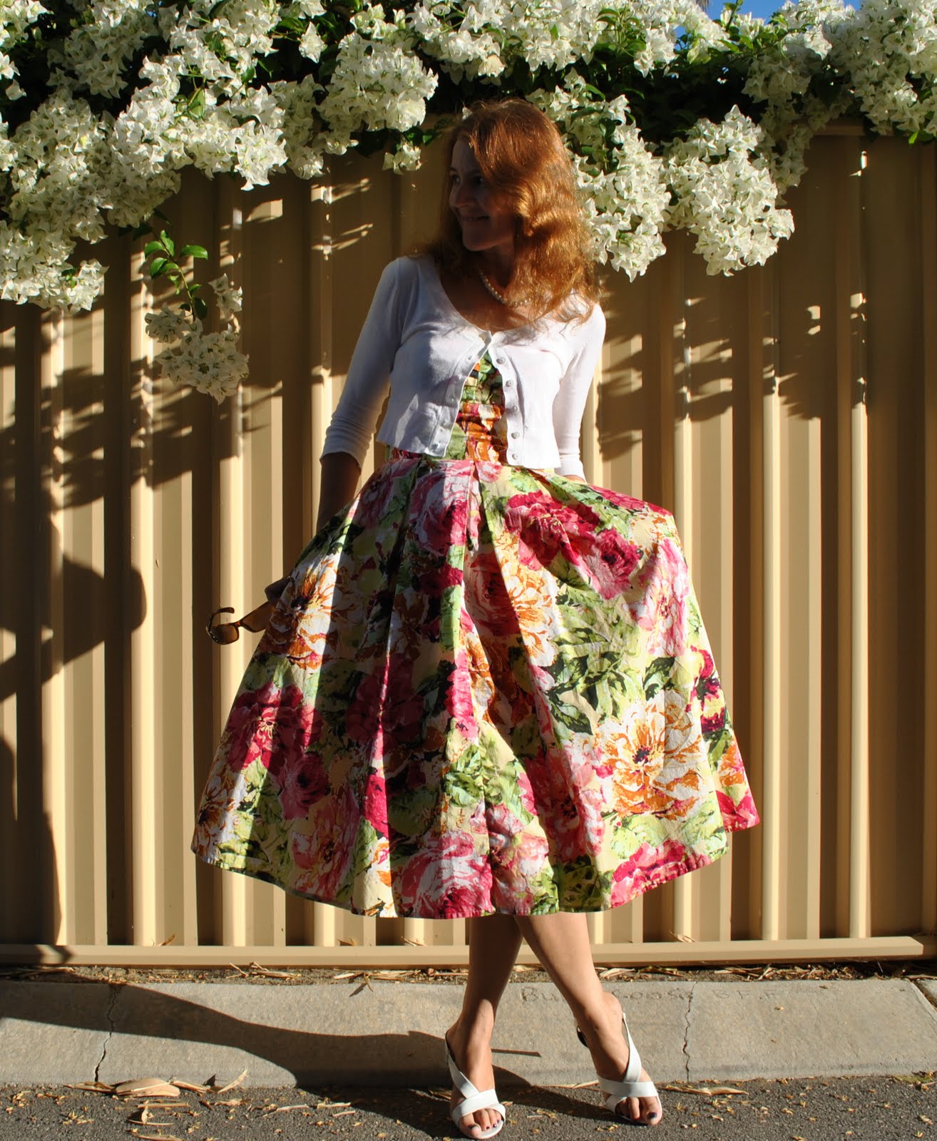
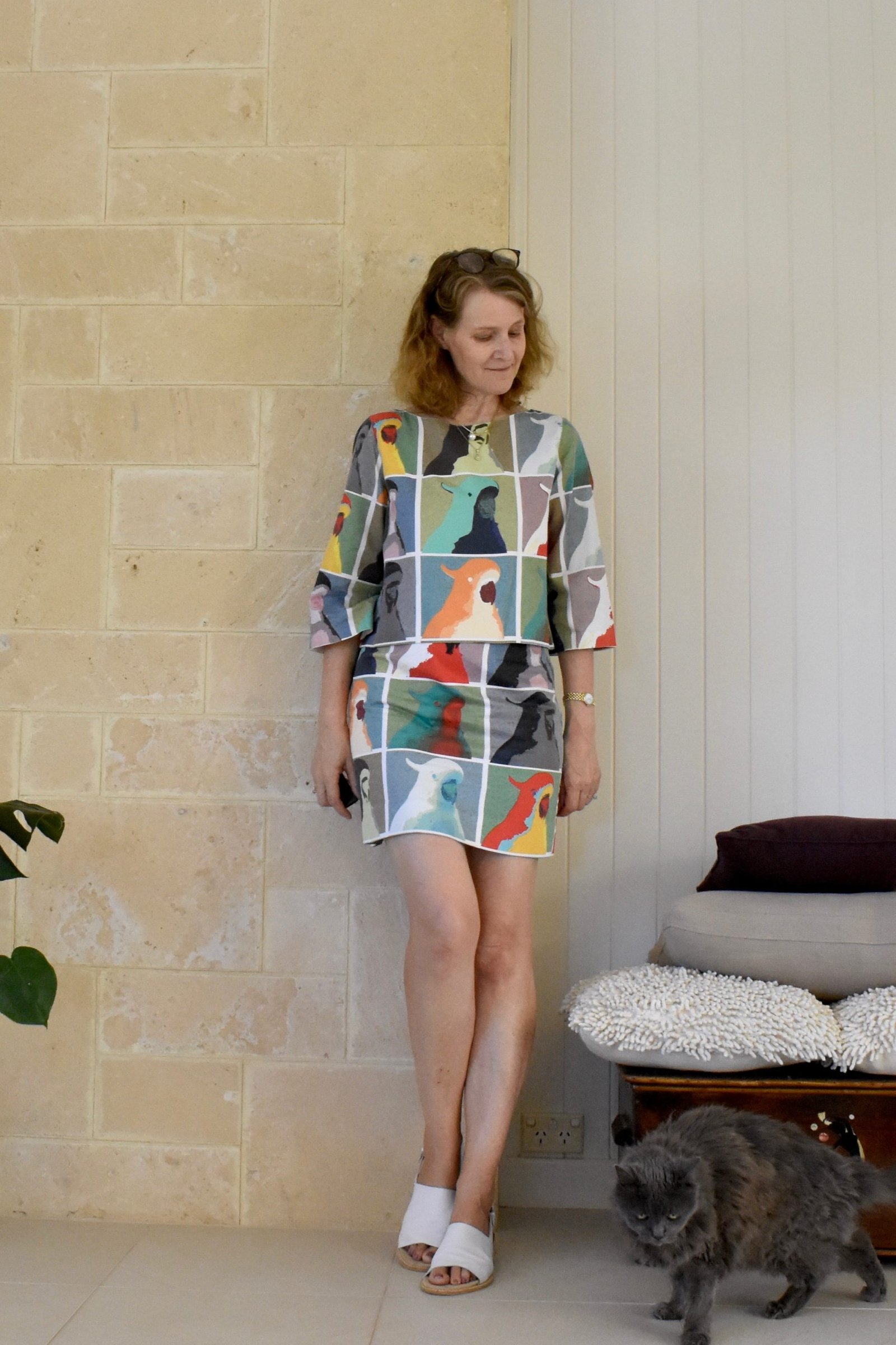
I wore this to the Alumni High Tea up at the college today. A lovely afternoon of tea, tiny sandwiches and miniature cakes and lots of catching up with friends, some of whom I hadn’t seen in a while.
The only just slightly funny thing was the flute of champagne on entry. You always get presented with one upon entry at things now. What’s with that?! There’s something incredibly decadent and naughty about a glass of champagne in the afternoon, no? When I attend a tea I really expect tea, not booze. Nonetheless everyone at our table enjoyed the champagne too…. 😉
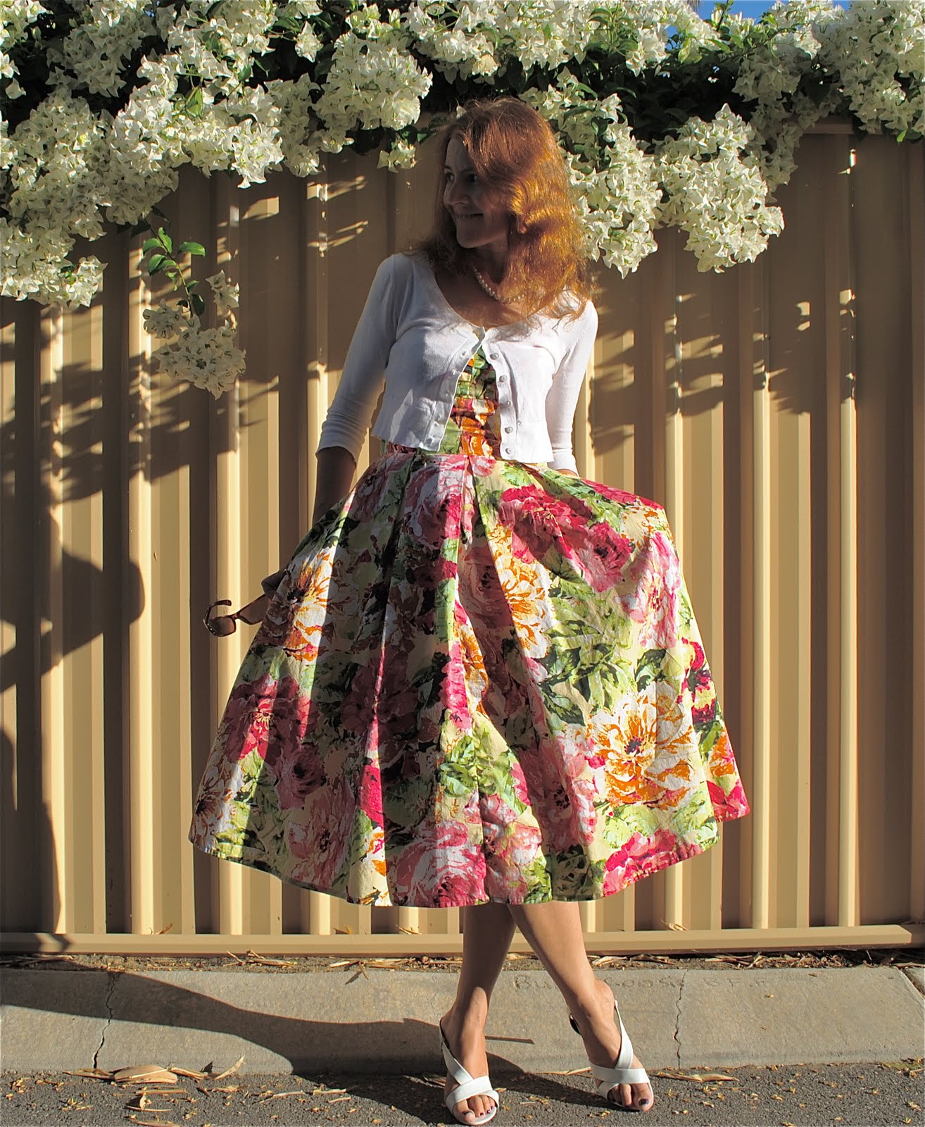
Now, tell me what you think… taking photos in Perth can be really challenging at times because the sunlight is soooo bright here. Forcing the amateur DIY photographer like me to seek out shady spots as much as possible… Apart from cropping which I always do I don’t normally alter my photos a lot. I once blurred out a person in the background, and once a stray bra-strap, but usually the photo is as is. Sometimes I reduce the exposure, because of the aforementioned brightness factor. Today I tried experimenting with the contrast to get a sort of washed out antique-y look. My children like the original (above), I thought the altered one below looked more interesting as well as showed off the outfit better which I think should be the point… which photo do you prefer? I would love to have photoshop to play with, but I don’t want to present a false picture of my work or myself… Opinions?
Do you prefer arty, or true-to-life?
Details:
Dress; adapted from Vogue 8555, printed cotton, bodice of my own design details here, and a review of the pattern here
Cardigan; Picnic
Necklace; Diva
Sandals; Franco Burrone, from David Jones


Neutral accessories are great! It's funny you have to decrease the exposure, a lot of times I have to increase the exposure in my pictures just so you can see anything.
This sweater looks great with the dress.
I really like the first picture the best. It is more visually pleasing to my eye.
A. The print is so fun and suits the dress really well.
B. I don't think there's anything wrong with tweaking photos a little–I do it to mine to make details appear more clearly, and I like bloggers who have a cohesive "look" to their photos.
The full skirt is lush! I can't really tell the difference between the two pictures, so either is fine with me.
very pretty – and the flowers on the fence make a great background.
What a beautiful dress. I enjoy picturing you at your tea. What a different life from mine. 😉
I prefer the first pic.
I've always liked that dress. And about the pictures: I think this particular one is kind of 'arty' anyway, with your face hidden in the deep dark shadow. And I think the occasional bit of tweaking is fine. You've got lots of pictures showing 'you as you are' on this blog, sometimes it's nice to use the camera's and computer's options to show off some romantic fantasy (I did so with the 'glamour shots' of my jacket). And in fact, I like both versions of today's picture.
I prefer true to life photos. I want to see how the pattern (made up) looks on a real body.
Wow! Wonderful! You seem to "escape" from another era, my favorite is the first, the photos are to enjoy and is well set to achieve diversity, that's my opinion.
You have a knack for great photos! I like the first one best because it looks sharper and brighter. I haven't done anything too dramatic with my photoshop program either. But I think whether you alter a photo depends on what you are trying to achieve, whether it be an artistic photo – go crazy if you want! or one whose purpose is to document a pattern and fabric – keep it as close to real life as possible.
Love that dress! Wear it lots, please. 🙂
I never do anything with my photos except crop and straighten them. Very occasionally I will change the contrast if hubby is helping. But you could probably tell that. I like the second one, the light looks softer. But the top one is very nice too. I think your photos are lovely, you really put some effort into it.
Hmmm, champagne in the afternoon?I could go for that….
Oh very pretty Carolyn, its gorgeous!
I love the first photo with bright light. Your dress is beautiful with floral print.
I prefer the first picture. I think you can see the dress better which by the way is lovely. I love the print.
I wish I had your problem with the sunlight. At this time of year here in Melbourne, it's hard to get any sunshine at all it's just overcast and cloudy.
Your photos look great as they are. Photoshop is a cool tool when you really need it though! My camera overexposes the pictures at times and then it's the only thing that can save them! Lovely outfit, I'm charmed by the fullness of the skirt and the richness of the print!
Wow..what a perfectly gorgeous dress!
I prefer the second photo; I like the antiquey look of it and also to be able to see your face a bit better. I think it's totally legit to crop, lighten / darken (or straighten!!) – if this alters the fabric appearance too much you can include a separate close-up in "true" colours. Horses for courses though…
Happy Mother's day for yesterday!
I think you should totally tweak photos if you want to. You don't have to do it all the time but throw it in once in a while to spice it up if you think the photo is lacking. In this case I like the unaltered pic the best as it shows off the bright happy pattern of the dress. xo
It's really a wonderful dress and look gorgeous with the withe cardigan and white sandals.
you looks very beautiful in that dress!
I would like to know which photo is more accurate to the fabric of the dress? Is the print bright like in the first one, or soft like in the second one?
As far as the photos generally, I like the top one best. I like the play of sunlight and shadow, both interacting with the gorgeous dress. And the brightness of the scene is, knowing you come from Perth and it is bright because the sun is so bright there, makes me want to go to Perth. You are also, in a way showing Perth off, not just your clothes.
Bear in mind I am from Darwin so I am used to bright. Maybe people from elsewhere aren't so much?
Generally in sewing blogs I prefer more natural shots to see how the clothes/pattern/fabric look on real people.