Tag Archives: Photography

Just a splash of Colour…

So on what is yet another sunny sunny day (yeah, we do get lots of them here) I would normally head straight for the shadows away from that notoriously harsh Australian light that drains all colour and detail from my clothes and everything, but I knew these cheerfully intense colours were strong enough to stand up to the full force of the early morning sunlight.
I have been asked many times before if I touch up my photos or alter them, and I admit that in a photo like this I certainly do look as if I’ve stepped straight into cartoonland, but let me assure you right now that this is not an altered photo in any way.  Apart from my usual cropping, that is.  I like my photos to be square.  Yeah yeah.  Square, just like me….  ðŸ™‚
The second to last day of the one-week-one-pattern challenge, and I have worn all of my garments from the pattern Burda 7723… or have I??  
Hehe, stay tuned…. I might just have a surprise up my (voluminous orange) sleeve….

Details:
Top; Vogue 1247, orange shot cotton, details and my review of this pattern here
Shorts; Burda 7723, hot pink linen, details here
Sandals; Misano from MarieClaire shoes

pinterestmail

Fun with Photoshop

I’ve got a version of Photoshop with which to experiment, and I found a really fantastic ombre tutorial here.  This photo has a single gradient layer added; (33.3% (Gradient Fill 1, RGB/8*)* … er, I don’t really know what that actually means, but hey…fyi) and I fiddled with it to have white at the bottom at 10% opacity, through violet, and khaki at the top at 70% opacity.
Soooo, tres moody and sorta apocalyptic, oui?
As we were…

pinterestmail

A little bit of Sunshine…

Recently Donna gave me the Sunshine award, thank you so much Donna!  I thought at first that I already had this one…  but I noticed that this Sunshine award is a New-and-Improved Sunshine award that now comes with a cool little list of questions…  yay! questions can be fun, can’t they?
Sooo, here we go…. and just for fun, some random sunshine-y photos too  (unless otherwise stated all photos are taken by me)

Favourite Colour: ok, that’s easy!  er… hang on, wait.  Let me think now.  Hmmm.  OK, how’s about this, I saw a divine mustard scarf recently.  Mustard.  Done!  Actually, wait; I’m lately also rather thrilled about that wonderful shade of ox-blood red I achieved here…  And then of course there’s my best neutral, olive.  And my perennial allegiance to ivory remains unabated.  Oh, and then there is charcoal, and pinky-beige, and muddy chocolate, and pure white, and burnt orange, and duck-egg blue, and raspberry … and … and …

Favourite Animal:  I am ridiculously soft and soppy about all animals.  Except for mosquitoes.  Mosquitoes, I squish.  Mosquitoes bringeth no good to the world.  Apart from being frog food.  That one sole good deed on the part of mosquitoes.

Favourite Number: What…?  Do other people really have favourite numbers?  I don’t know if I could pick just one.  The infinite others would feel left out  ðŸ™‚

Favourite Non-Alcoholic Drink: Aha! at last, one for which I can give a straight answer… tea!  English Breakfast.  In a proper tea cup, please.  Strong, and with a little bit of milk.  No, no sugar, but thanks for offering.

Facebook or Twitter: I’ve recently discovered a whole host of old school friends on Facebook. It was so awesome!

(btw, this topless person is not me, but is the husband!)

My Passion: no prizes for guessing that one… 😀

Getting or Giving Presents: er… both??  Y’know what; I’ve been thinking about that one, and I’ve decided that it is one of those posers to which 99% of people will give exactly the same answer, the one I just gave.  Think about it.  Answering the former would be a no-no, except to garner laughs, and answering the latter is raaather priggish, so is equally a no-go…  it’s a non question, really.  What do you think?

Favourite Pattern:  Well, it changes all the time.  Virtually with each new project.  Right now I am in raptures all over again with McCalls 5525, since I have just completed a new coat that I am insanely pleased with.

(Craig took this one.  This is me, on a stand-up paddle board!)

Favourite Day of the Week: Well.  Any day that the whole family’s schedules serendipitously dovetail so we all happen to be all home for dinner, together, at once.  This happens rarely.  But when it does, it is my favourite day of that week.

Favourite Flower: In first place; my daughter, the most beautiful blossom in my life.  In second place; big old-fashioned roses in shades of pink, apricot and old-gold.  The sort that get blousy and overblown and scatter their petals in gorgeous profusion.  Which then dry into sweet-smelling colour-distilled scraps.  Which then becomes divine pot-pourri.

Favourite celebrity role model:  Now why would I idolise a stranger when I have such amazing women in my real life?  Srsly  ðŸ™‚

So now, to pass the sunshine-y love along…. 

Beth; of SunnyGal Sewing Studio
Liza Jane; of Liza Jane Sews
Karin; of Sew Here We Go Again!
ElleC; of ElleC Sews
Alexandra; of Alexandra Mason Crafts and Stuff
Lynne; of Sewing Cafe
Adithi’s Amma; of Adithi’s Amma Sews

Details:
Top; Vogue 1247, of orange cotton, details and my review of this pattern here
Shorts; Burda 7723 modified, of yellow embroidered cotton, details here, and my review of this pattern here
Nail varnish (above); BYS Bright Light, with daisy decal.  I know, decals are so last year, yes?  Well maybe I am a last year kind of a gal  ðŸ™‚

pinterestmail

Hot (pink) pants

G’day, peops!
Remember when I mentioned a piece of hot pink linen that had befriended me in the fabric store and then beseeched me to give it a new home and some purpose in its life?  (ahem) Well I’ve done the right thing by this piece of lolly-bright fabric fabulousness and transformed it into something that I am already excited about wearing a tonne of times this summer!  A bomb of times!  A colour bomb!  A Barbie bomb!  Wait, I doubt if Barbie is considered very cool, or even PC anymore…?  so mebbe scratch that one…
I used Burda 7723, again; my go-to shorts pattern now.  Such a nicely tailored shorts pattern; with a slight flare enough to make them “cute”, a wide high waistband that sits securely and firmly at one’s true waist, and good sized pockets.  The last feature making it a definite win all by itself…  I also think this shape just really suits my style and my figure too, I think.  In the past I’ve altered this pattern slightly each time I’ve made it up; to make them more flared, flat-fronted and longer respectively, but this time I made it up just as is.   Oh, except for my usual modification; the addition of a zip placket.  Well, naturally why wouldn’t you put in a zip placket? uses hardly any fabric and you see them in even the cheapest and most badly made RTW shorts so it is completely beyond me why patterns continue to leave this minor, but telling little detail out.  I once did a sort of tutorial on how to add a zip placket to any fly-front pattern, here.

Now just to diverge for a sec into photography territory again, I know lots of other fashionable seamsters aren’t interested in the slightest in photography; but I am.  So …
I first thought of photographing this ensemble against a bright white wall, in the strong midday sunlight; thinking that the intense shades of cobalt blue and hot pink would stand up well to the lighting challenge.  But I was still a bit amazed at the incredibly deep shadows created… also I realised that you couldn’t see the shorts properly with the tie thing-y in the front hanging over the front of the shorts.  So I tucked in the top, and moved over to a shady spot.  But the photos I took, even though they don’t show the shorts very well, still intrigued me in an artistic sense so I decided to put one in here as well.  And btw; I do not photoshop or alter my photos apart from cropping.  This is how it is!  (although oftentimes I wish my face could always be in shadow like this…)
When you look at pictures of clothes, do you prefer realism; as in showing the dressmaking details as accurately as possible; or do you like to see a bit of artistry in the photography as well?  Me, I know I like a bit of both…  but I’ve said enough about that in the past so I won’t repeat myself.
What aspect of fashion photography do you appreciate the most?
Details:
Top; blue “bunches”, from Pattern Magic 3, of thin cobalt blue cotton jersey, details here
Shorts; Burda 7723, hot pink linen

pinterestmail

An apology, more on cropping, and patterns!

I would just like to point out that it wasn’t my intention to offend anyone yesterday with my reference to the “typical” blogger’s stance.  So some people like to pose and smile like this, well that’s great!! and please don’t blush or feel like you have to defend yourself just because I say that this isn’t my own thing…   That was just how my thoughts have developed about how I like to present my creations and myself in my own photos.

And cropping…
I would also like to assure everyone that I am not always swanning about in paradise; and cropping fabulously beautiful scenery from my photos either.  A lot of my locations are very very prosaic and ordinary, and usually I am just chopping out boring stuff that contributes absolutely nothing to showing off my sewing… to give a few more examples:
The gardener’s storage shed in a local park

becomes

The catamaran-hire kiosk down at the river

becomes

Camera perched in the back of my car in a carpark on a busy day full of errands (I’ve used this as a tripod substitute several times… even one of my “natural bushland” shots was taken like this)

becomes

Basically I just grab a photo opportunity that presents itself; a location that just happens to have nobody around when I am passing by.  (yawn) pretty boring and not very exotic, actually… 
My point is; there is no such thing as a necessarily “ugly” location it all comes down to how your outfit shows up against it; and taking into account the available lighting and colours, and framing and perspective…
My clothes-line area… (I’m really giving away my secrets here, aren’t I?!)

becomes

See how in each case the background might not appear very promising, but the garments still show up well, and the picture is much improved by judicious cropping?

And patterns!
Myrna contacted me about sending me a Vogue pattern that she had mistakenly double ordered, and I gratefully accepted.  Vogue patterns are actually pretty expensive to us Aussies… so imagine my delight when a parcel arrived with not one, but nine patterns in it!  So generous!!  Thank you sooo much Myrna!  I will enjoy exploring and trying out these so very much…
Of course, now I feel pretty stingy that I am giving away but one (admittedly special) pattern in my blogiversary give-away, so I have decided there shall be more give-aways around here.  Soon.  Zere vill be noooo more stinginess!

pinterestmail

Versatility; or Photography is your friend

During September, I was give the Versatile blogger award by Adithi’s Amma Sews; and also from SewingCafe with Lynne thank you so much to both Adithi’s Amma and Lynne!
Now the rules are as follows, you have to write seven things about yourself… well, I’ve done a few of those before (in the sidebar at right) and truthfully I have nothing further of any interest about myself to add.  Yup, I am a pretty boring person… and what is more this is not supposed to be about me, although if I do feel like sharing any little titbits of what is going on in my life I will blurt it out at there and then, but pretty much this blog is all about my sewing, knitting or general fashion-related stuff as it inspires me.
So.
The last time I did one of these I wrote 7 things about couture sewing I had picked up from reading the excellent and highly enlightening instructions in Vogue 8333, and I decided that was a far more fun and interesting thing for people to read about than boring old me, so I decided to go down that path again… this is supposed to be a versatile blogger award, right?
So to be a bit versatile; today I shall touch on a completely different subject of interest to me and probably all bloggers like me documenting their handmade creations… photography.  People have left me lovely comments saying nice things about my photography, so while I am no expert and what I know about the actual technical side of photography could be written on a pinhead with room to spare, and a real photographer might read this and laugh at my naivety; I do still like dabbling in fashion photography in my own silly small-scale way and take some pride in my photos.  So thought I would just jot down a few little things about taking photos of myself and my work that I have learnt along the way.

1. Background
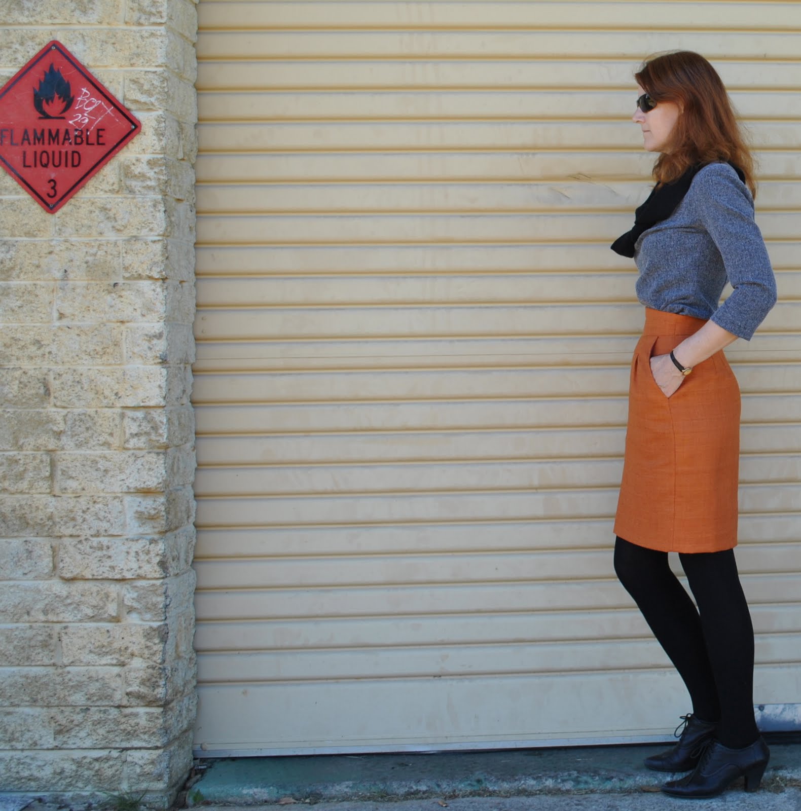
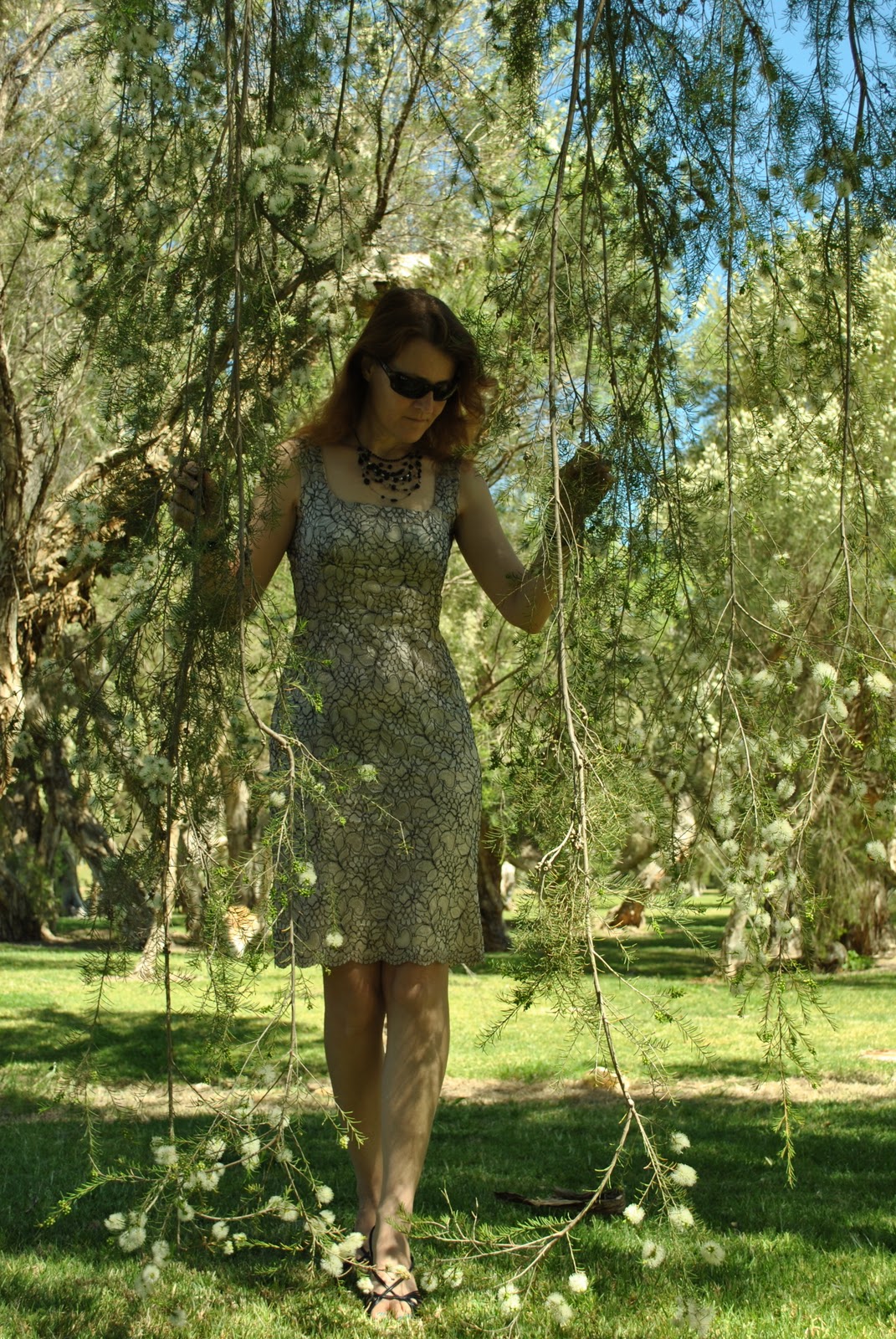
It might seem obvious and therefore not worth mentioning, but this is a biggie.  The background of your photographs is really important and there is a big difference between a background that will highlight your creations to advantage, or alternatively swamp them into insignificance.
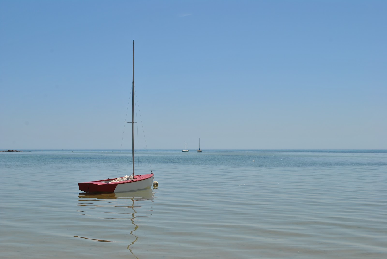
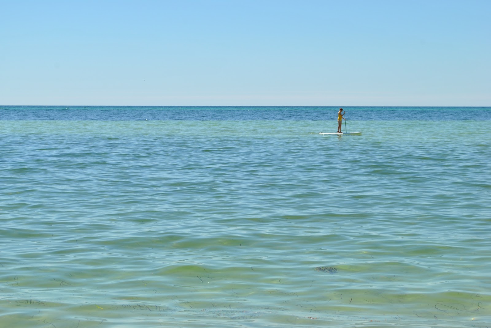
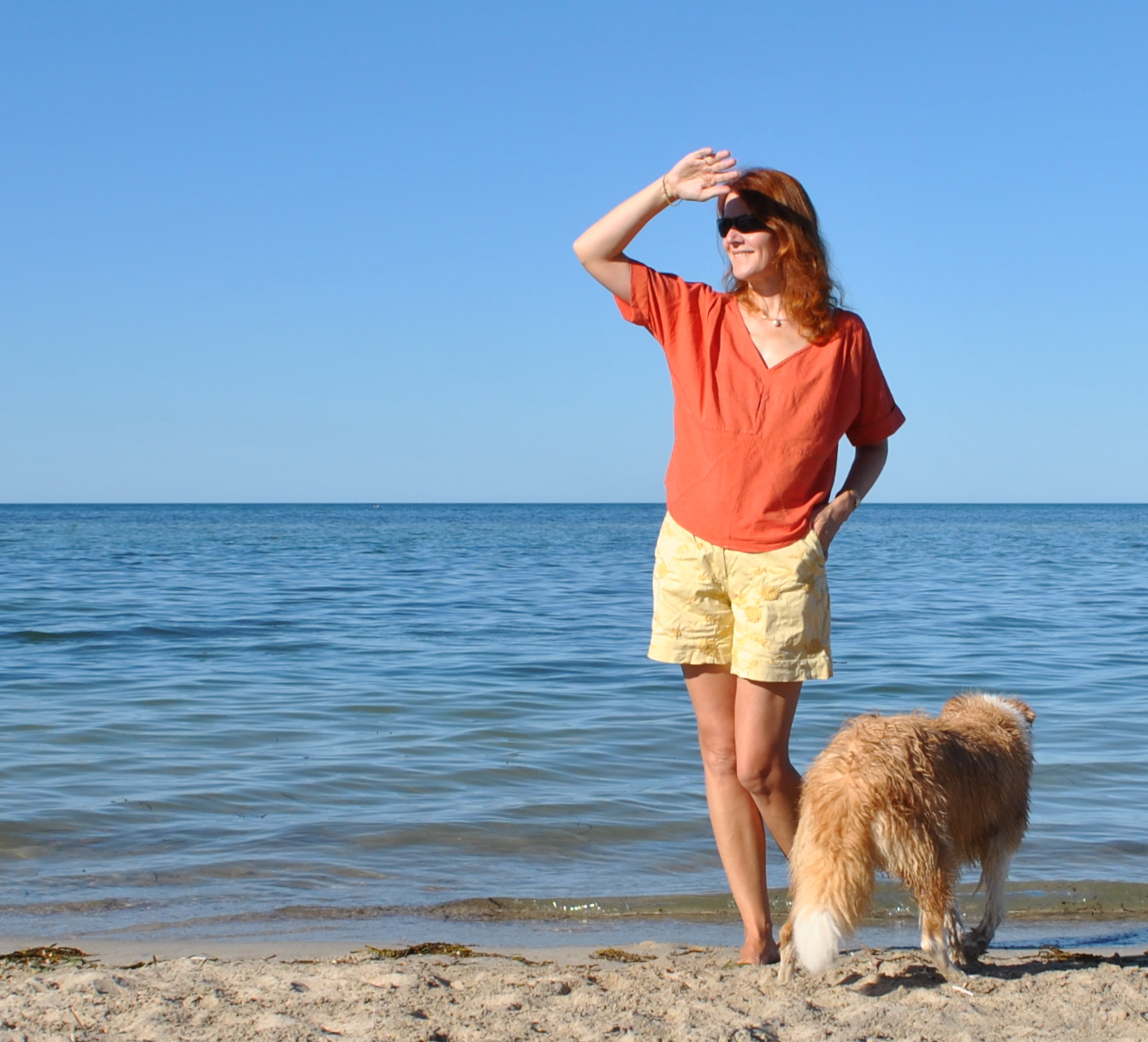
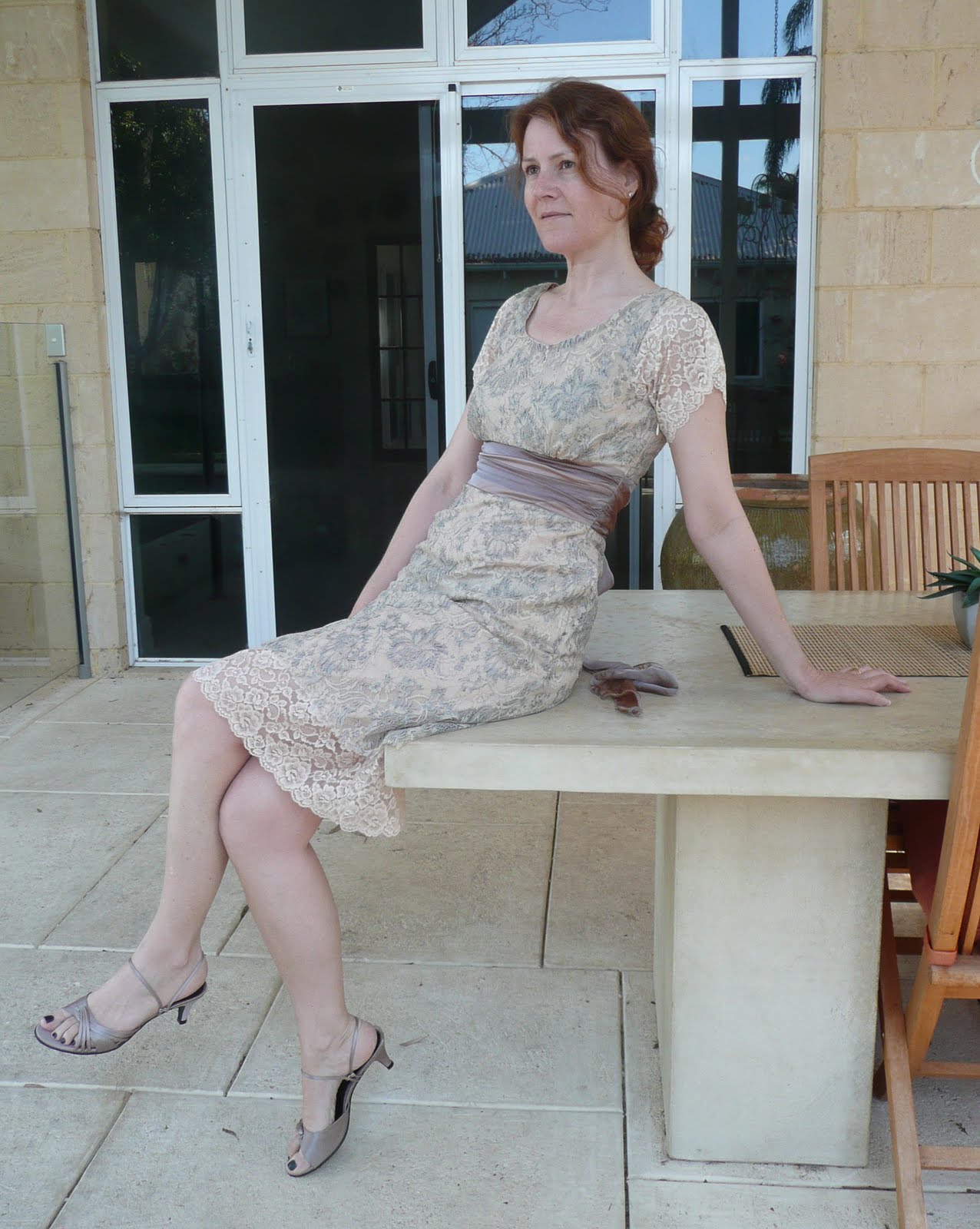
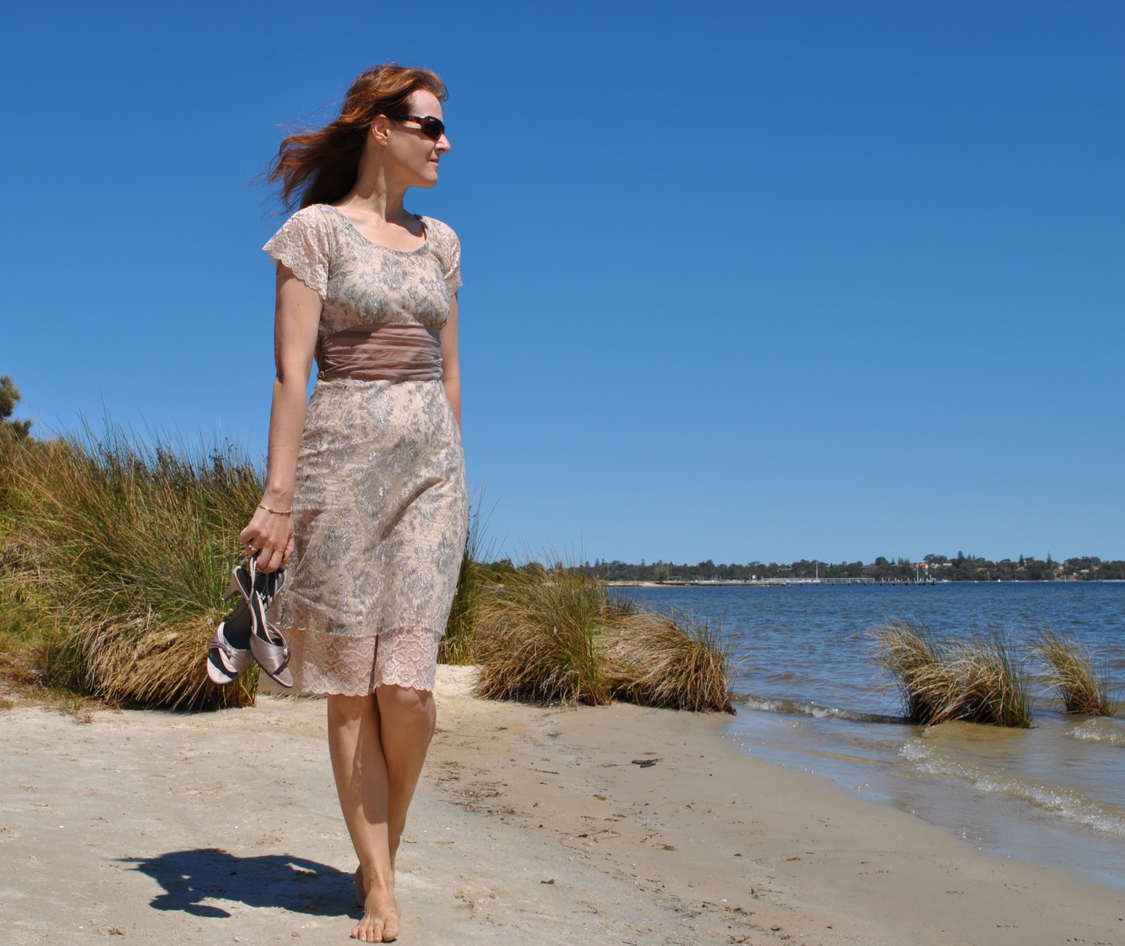
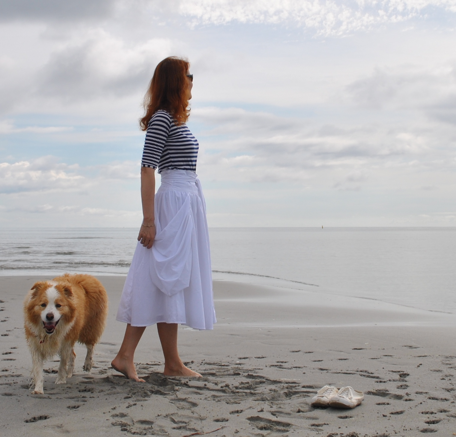
Aaaand; not particularly vital and not something I obsess about, but I do find myself semi-consciously seeking out photo spots that will enhance my creations.  I certainly don’t let it get in the way of my life, but if I see a good spot around about I will often tuck it away mentally for future reference.  Also, there are suitable spots, and there are unsuitable spots.  Let’s just say, if I have made some new bathers then I will pick a day I am going to the beach to bring along my camera.  And if I am photographing say, a beige dress, then it’s probably best not to sabotage my creation by standing in front of a beige background.
Take these two examples, two pictures of the same dress.  Below is one taken before I had grasped that a contrasting background would show up my dress better.  Below that, I had started to twig that an attractive setting might make a difference.  Which do you think is the better picture?

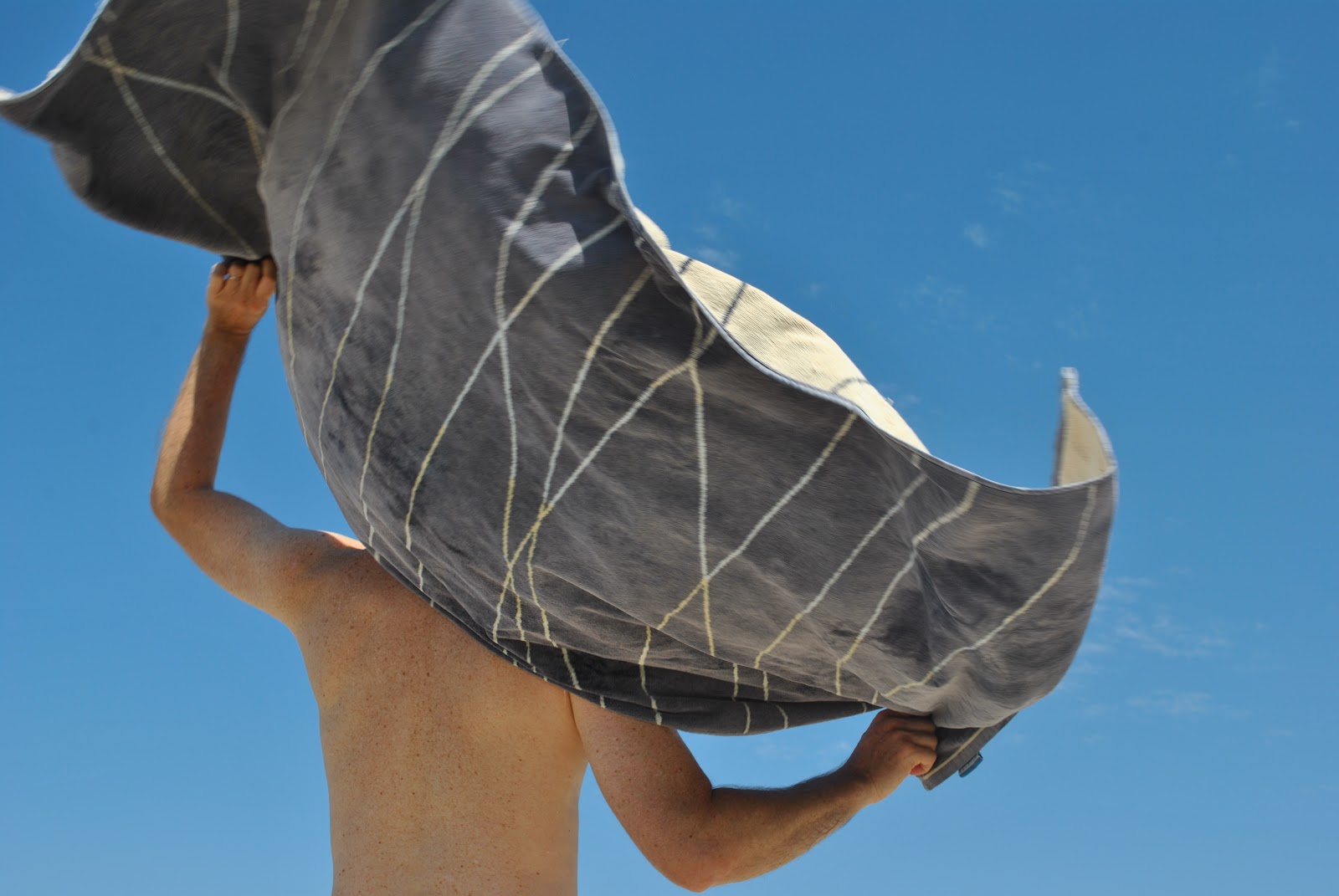
2. Natural light vs. Flash
A tricky one.  I reckon natural light is far superior if you can get it.  I haven’t yet taken a photo of myself with a flash in which I didn’t look terribly ill; on death’s door even.  Or at least ten years older than I am… so I nearly always “force flash off”.  But I’ve heard that professional photographers can do wonderful things with a flash, and I really should take the time to work out what those things are….
In the meantime, take these two examples, below is a photo taken at nighttime, with a flash.  Horrible, no?  Below that, the same trousers in the daylight and sans flash.  Which do you think is the better picture?

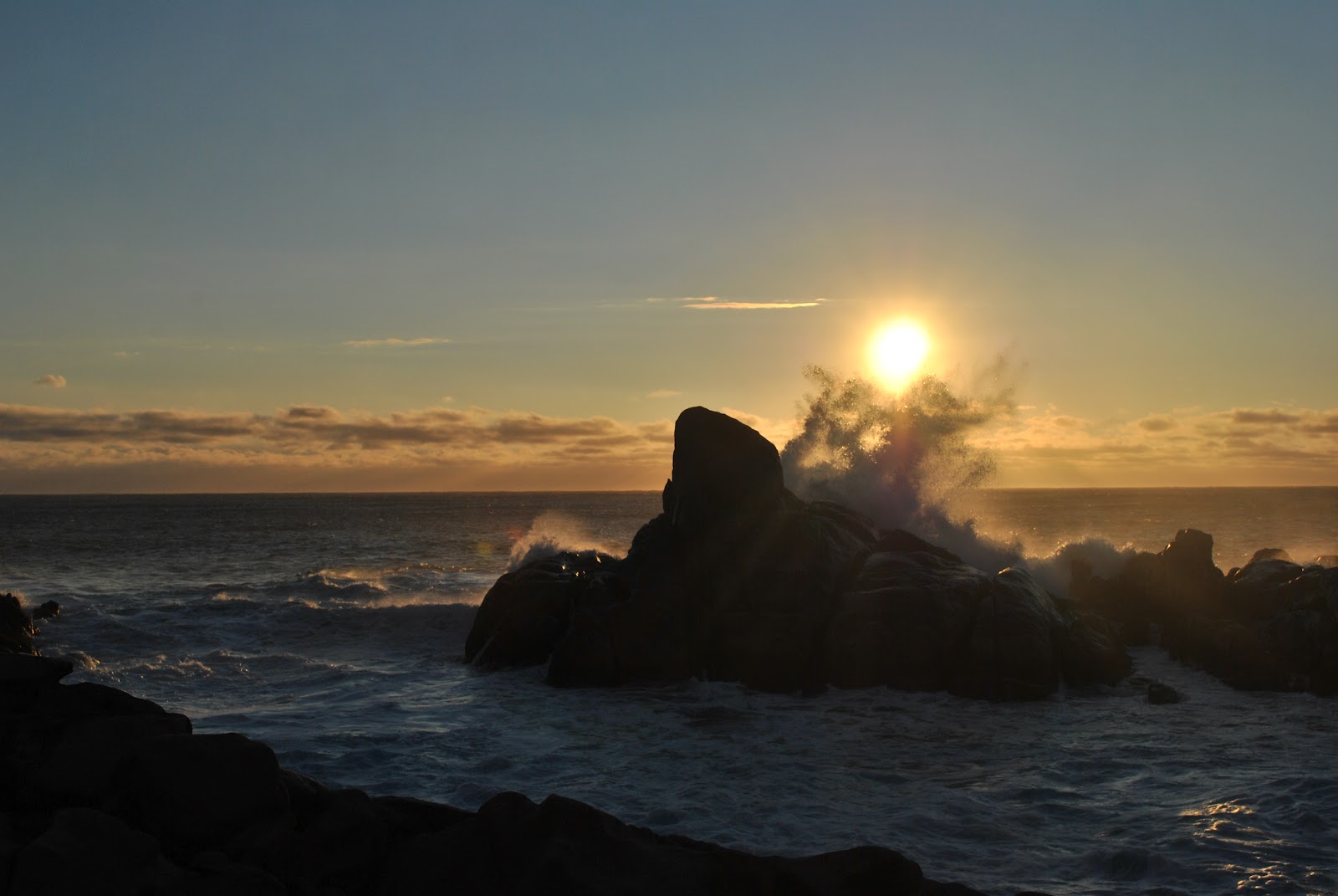
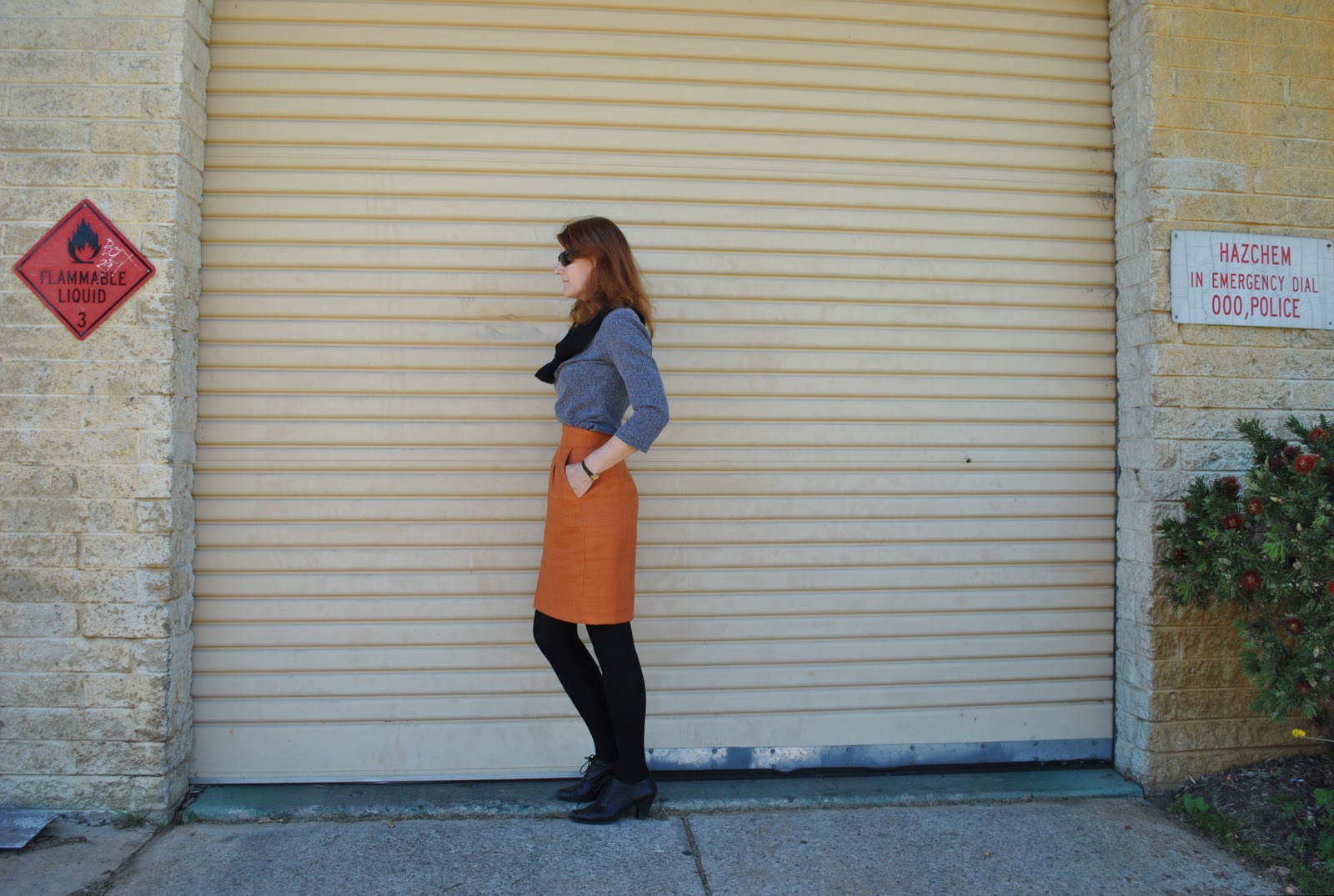
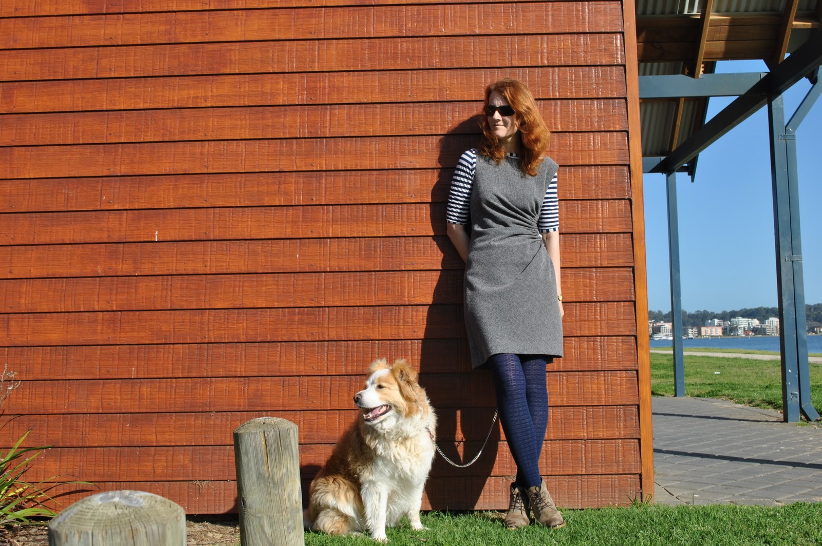
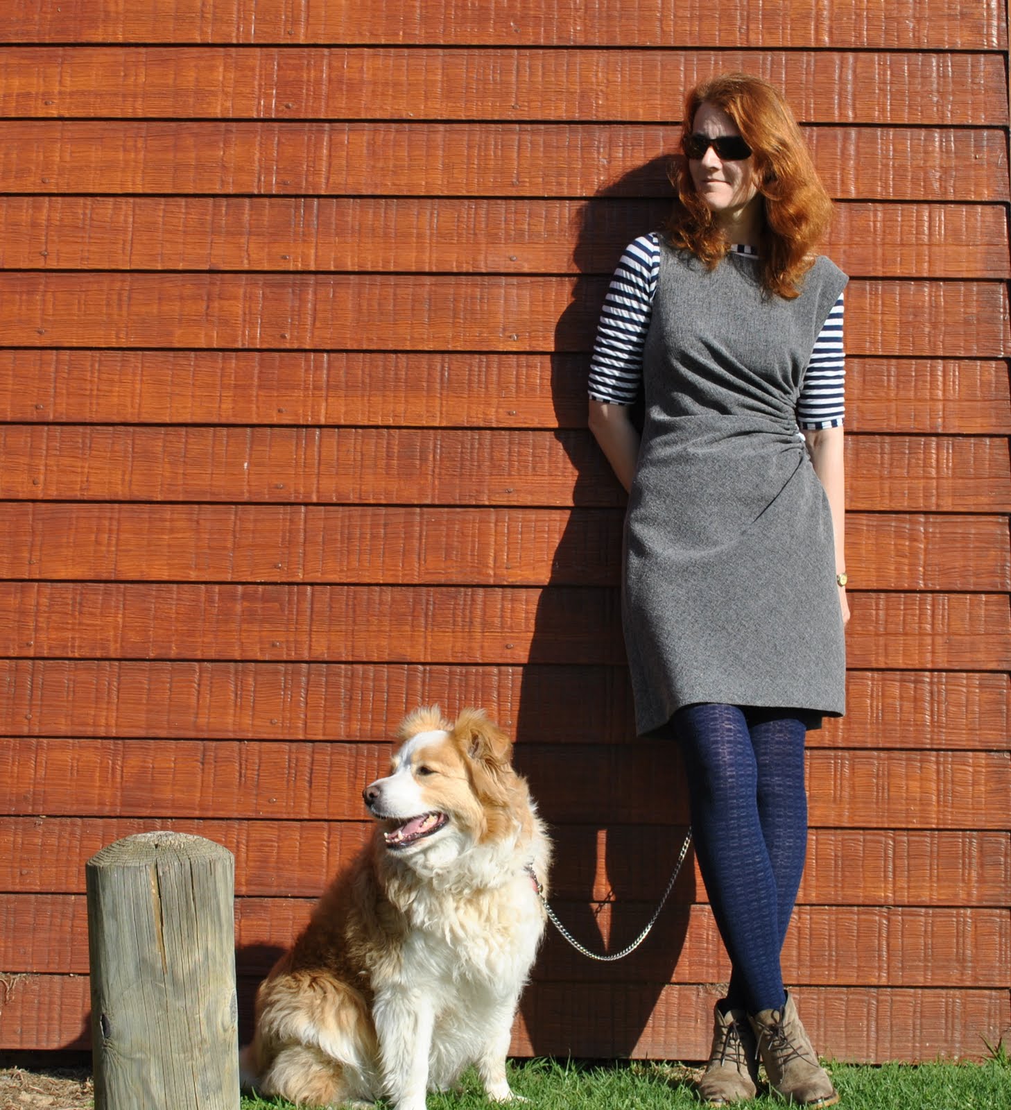
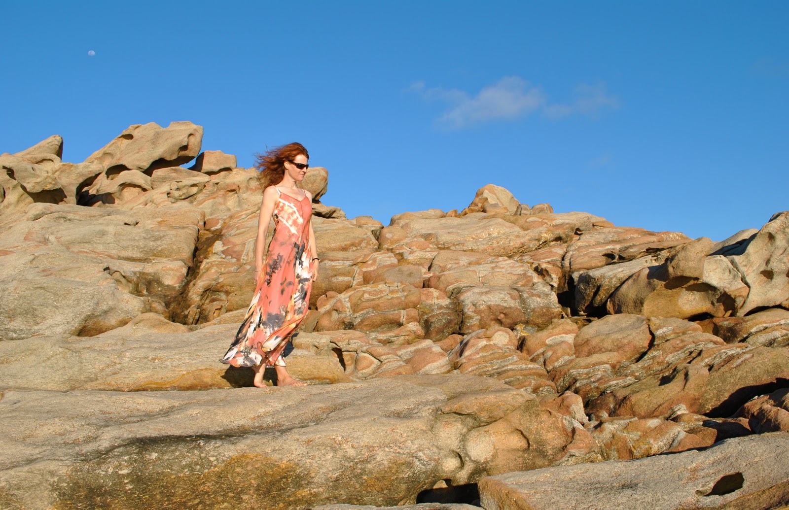
3. the Direction of your light
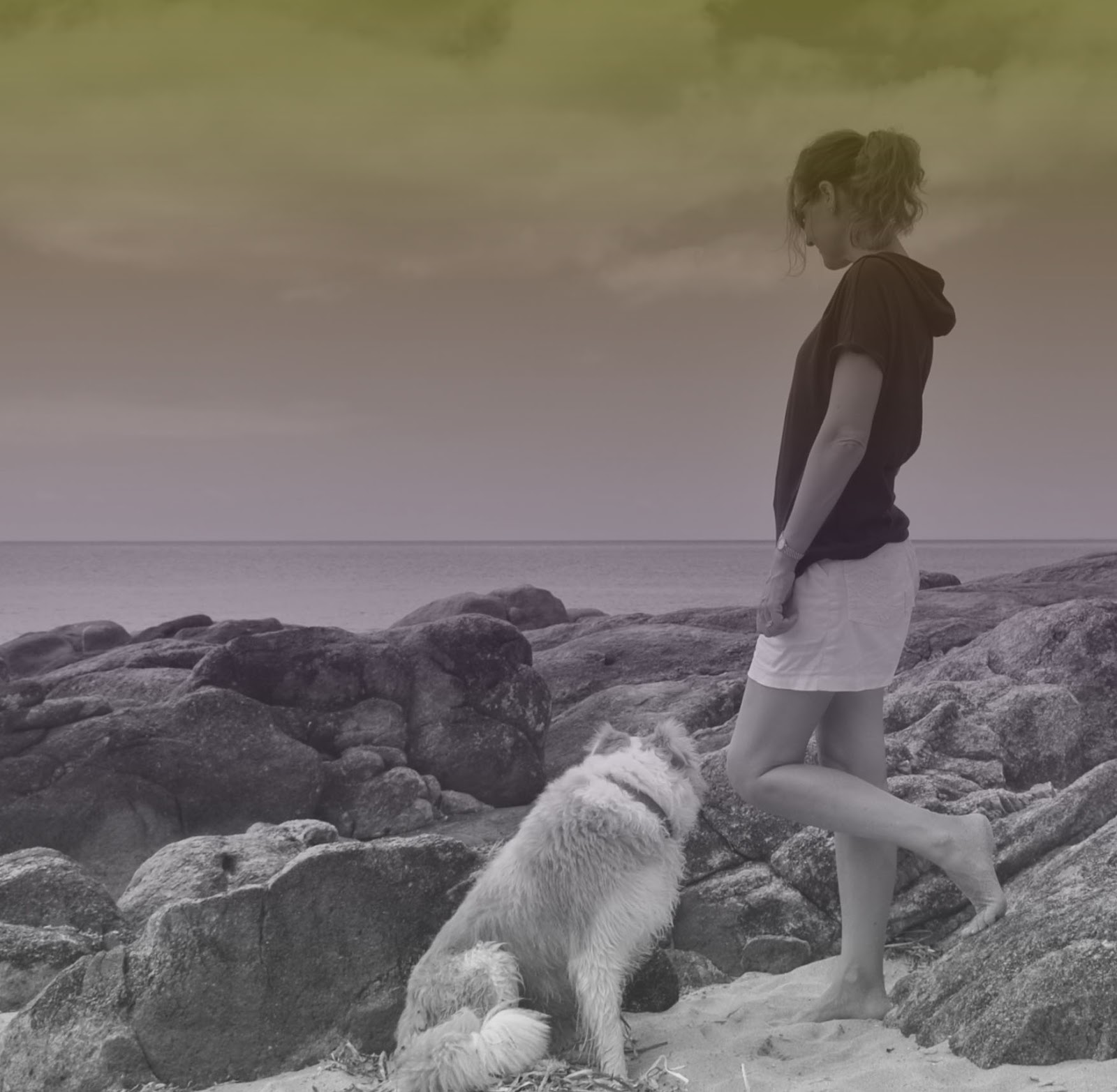
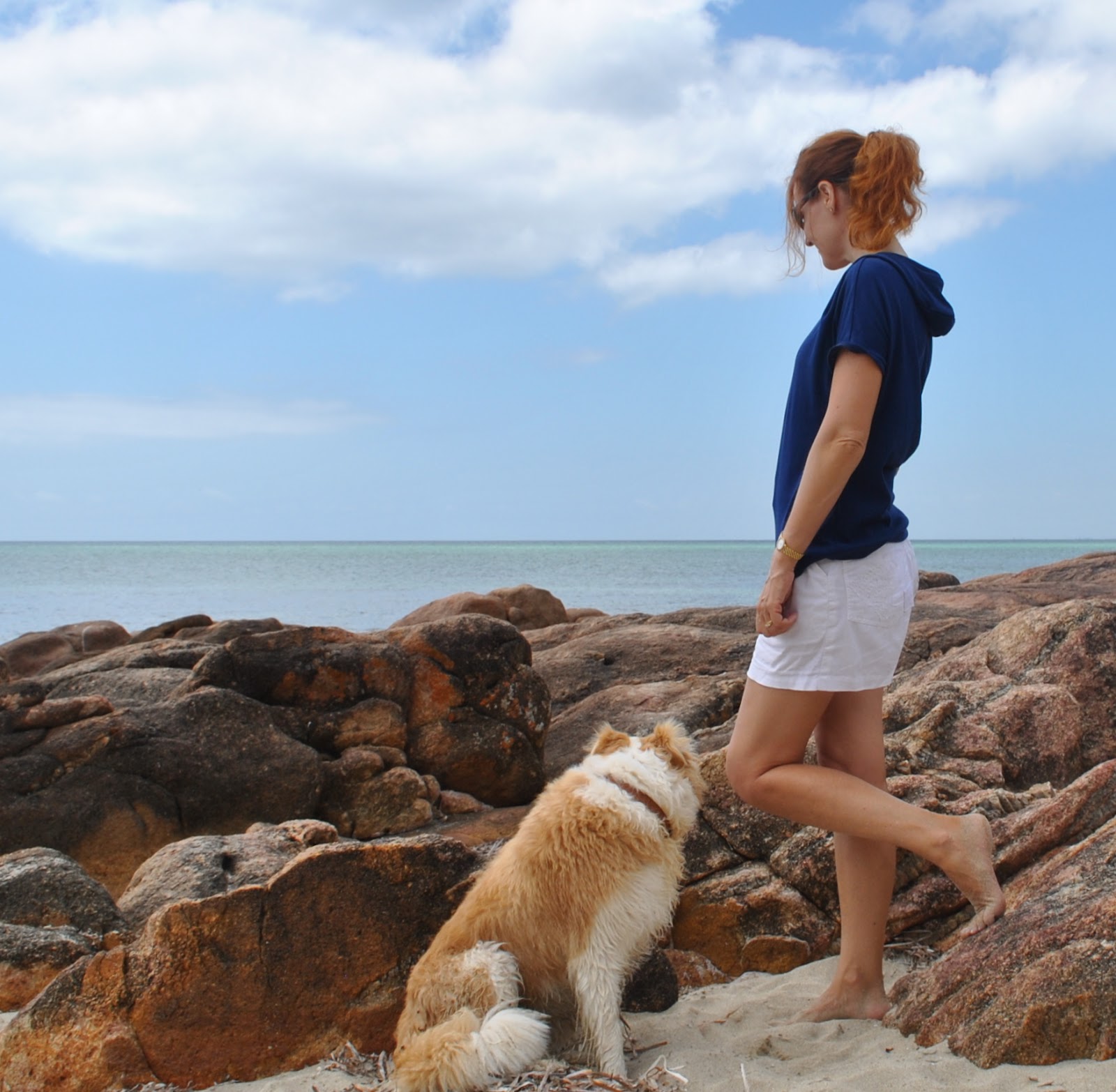
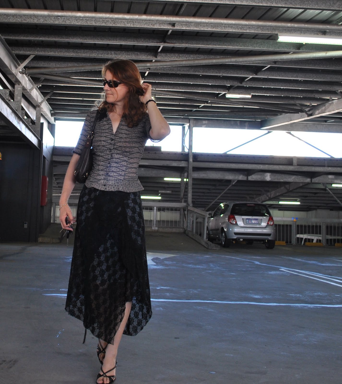
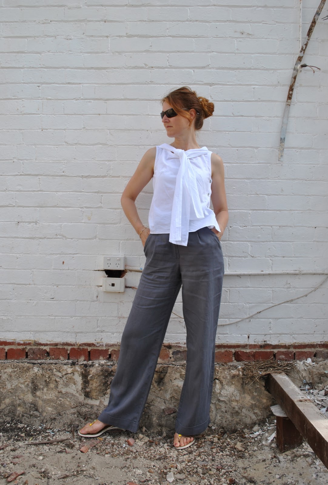
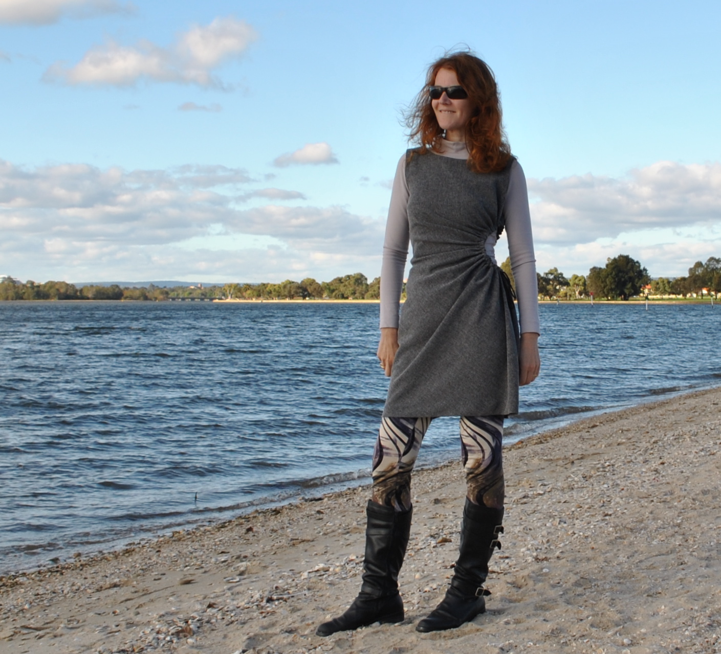
In general, shaded outdoor light is the best for giving naturalness to your clothes, and providing a true indication of colours, textures and details.  And if the light source is behind you, you will just be a featureless silhouette in front of a bright beautiful background, and no one will be able to see any details of your creation at all.  Take these two examples… below I took this photo without thinking enough about direction of the light.  Below that is a similar outfit, taken in the shade.  In which can you see the details of the outfit better?
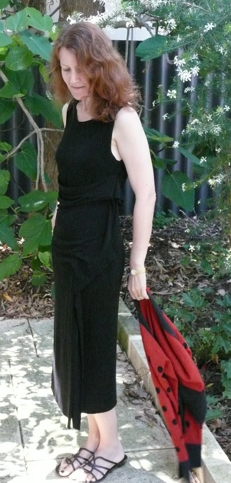
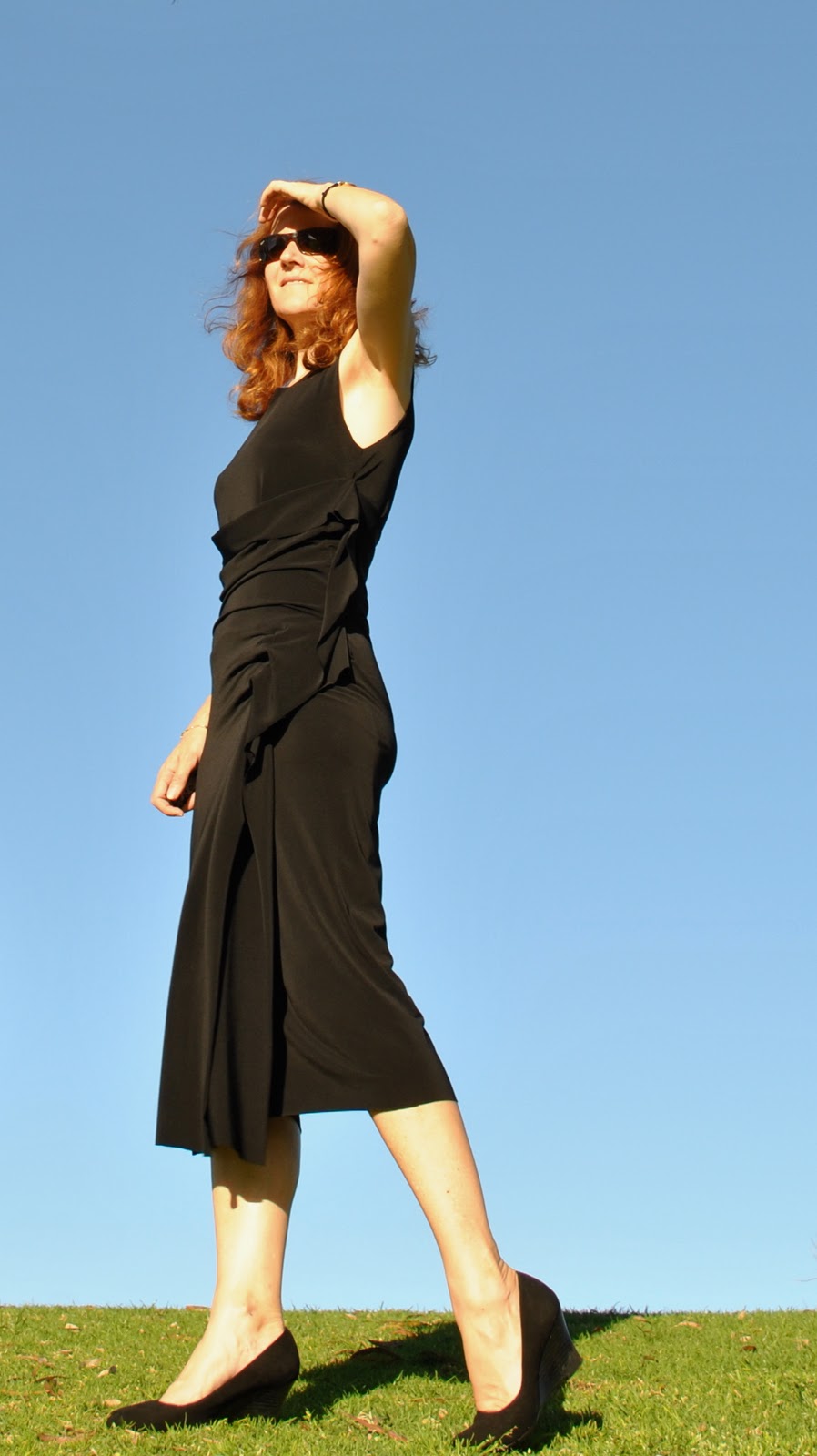
4. Black 
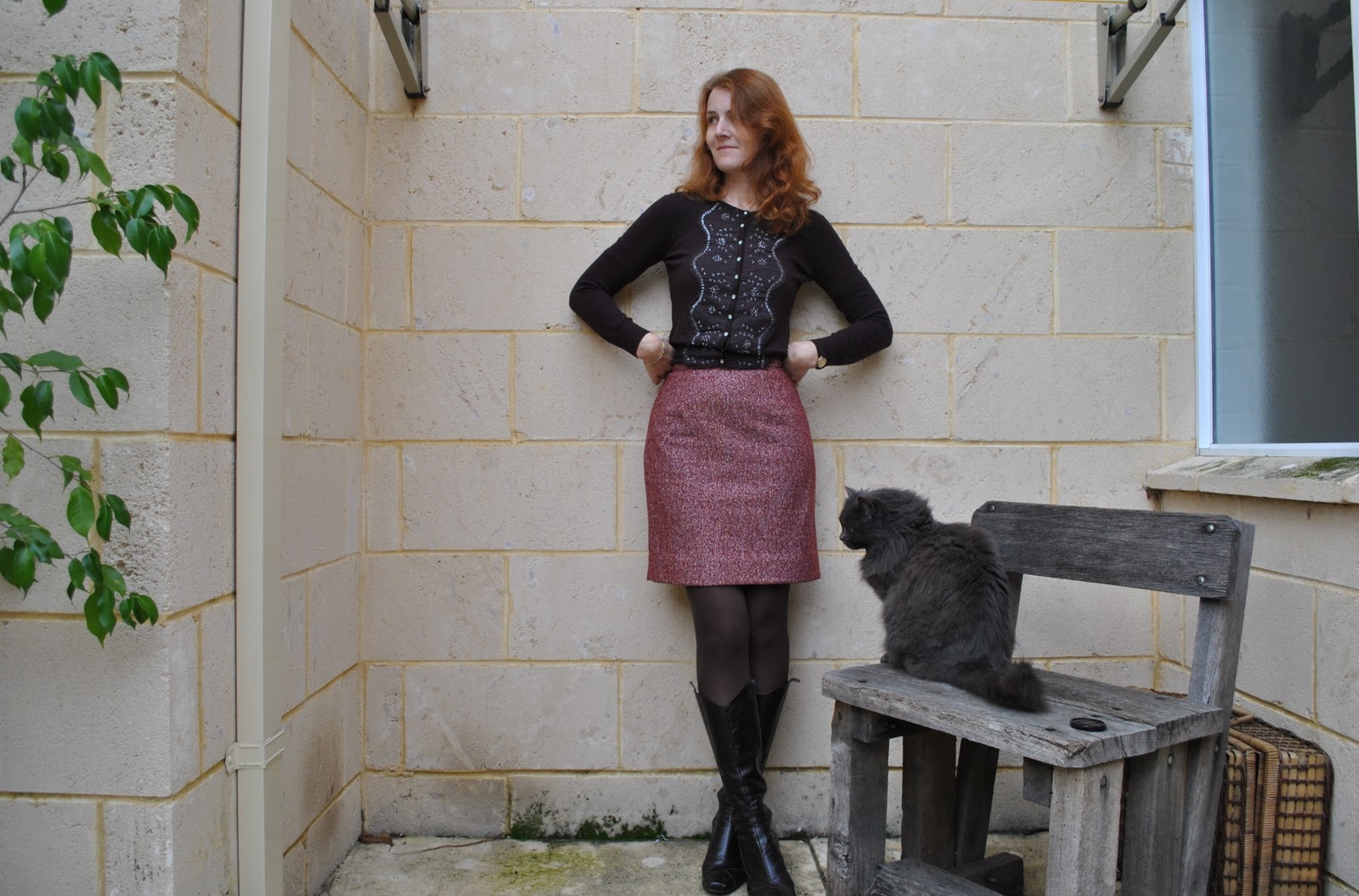
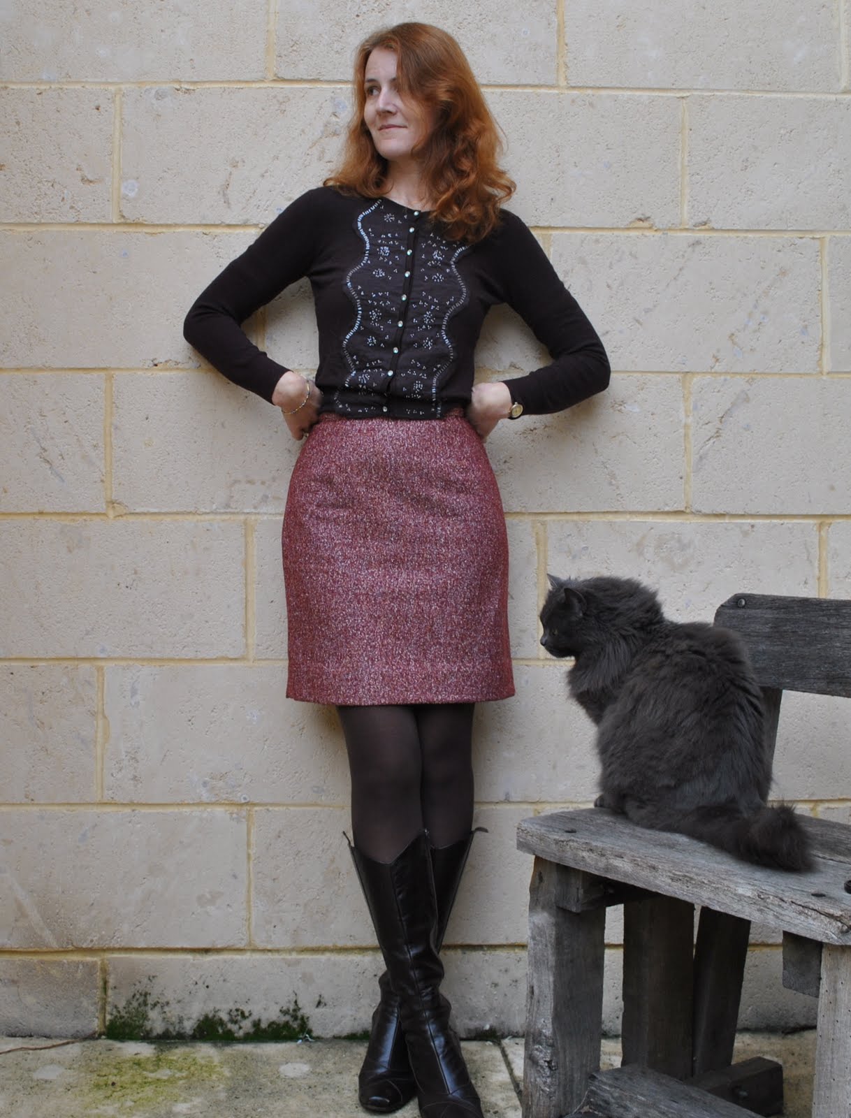
Black is “special”.  Generally speaking (without access to a studio set-up), bright or strong light is necessary to show any details at all of a black ensemble…  Take these two examples, two pictures of the same dress.  On the left is one taken when I thought that shaded natural light was the best option for all my photographs regardless of the colour of my garments, on the right is one taken when I had realised that black might be an exception to this rule.  In which picture do the details of the dress stand out better?
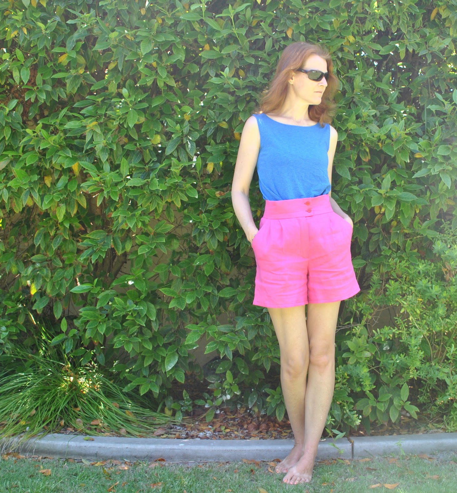
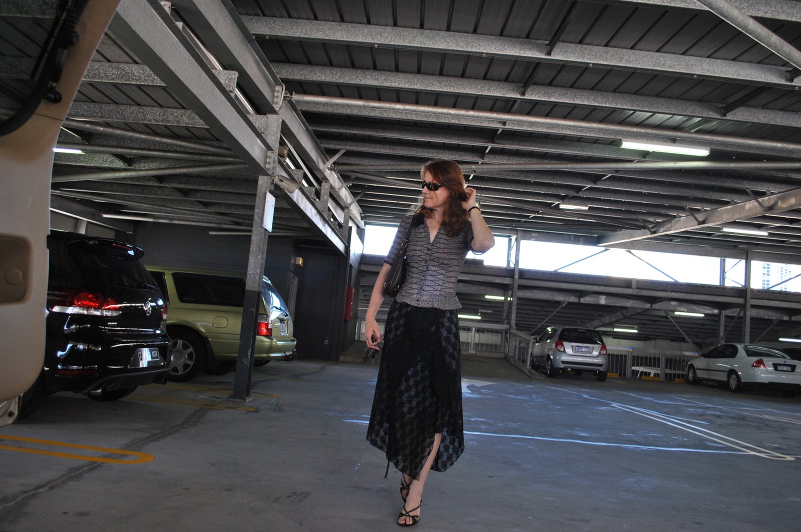
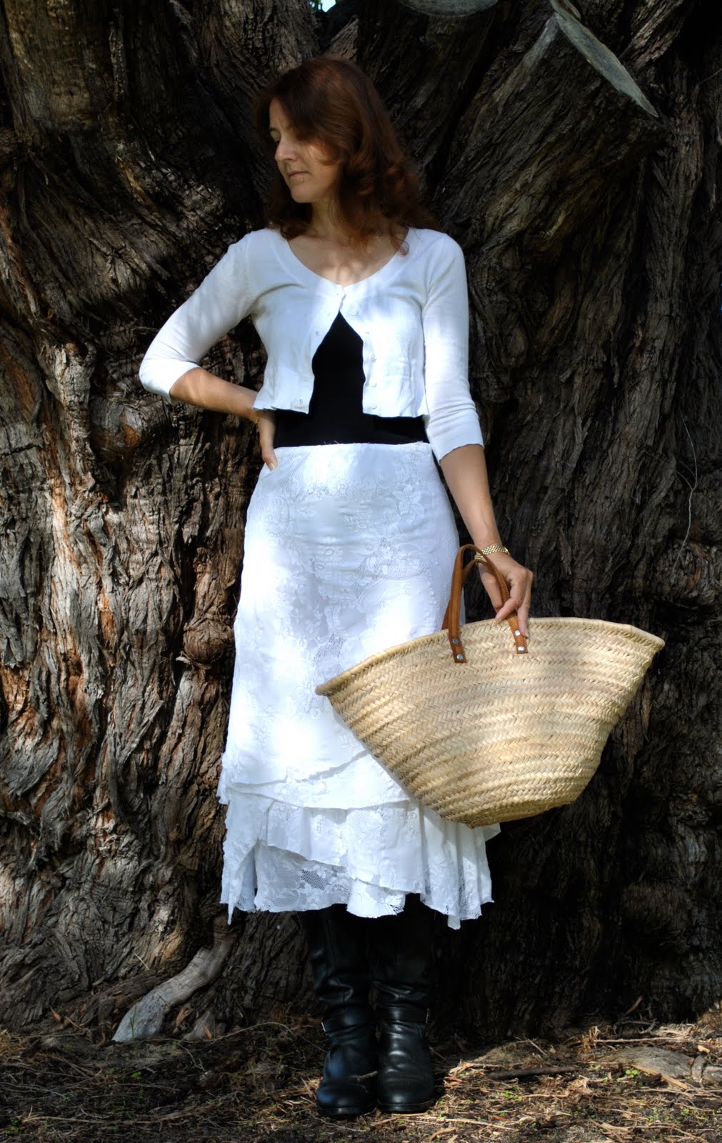
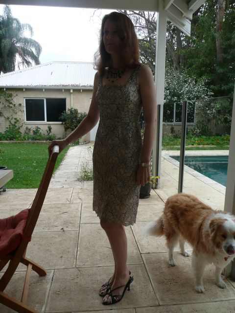
5. Posing
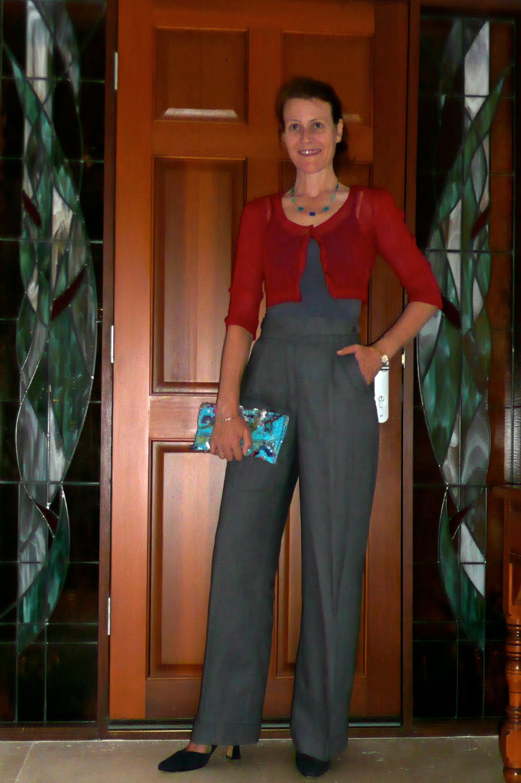
I believe that a natural stance suits my personality.  For me personally, the typical blogger’s stance with one hand on the hip and smiling straight into the lens, is not very natural and sorta too aggressive for my own style.  I did this a few times in my early days of blogging and now those photos make me cringe, because in real life I am quite shy and that sort of stance is not me at all.  Now I just aim to be as relaxed and hopefully the least dorky that I can.  A big cheesy grin is just not very me, although I try to smile at least a little bit in some of my photos since my husband told me I am always looking too serious.  Incidentally, my posture has improved outasight since I started taking photos of myself.  I am not super tall, but I am certainly taller than most of my friends, and I think that was making me slouch.  I could see that in my earlier photos and I’ve stamped that out.  That is one area I can definitely say where blogging has really improved my life!
Take these two photos; below is early blogging days.  A dreadful and cheesy pose, right?  Below that, a similar outfit but I think my posing and my posture has improved enormously and is a lot more natural.
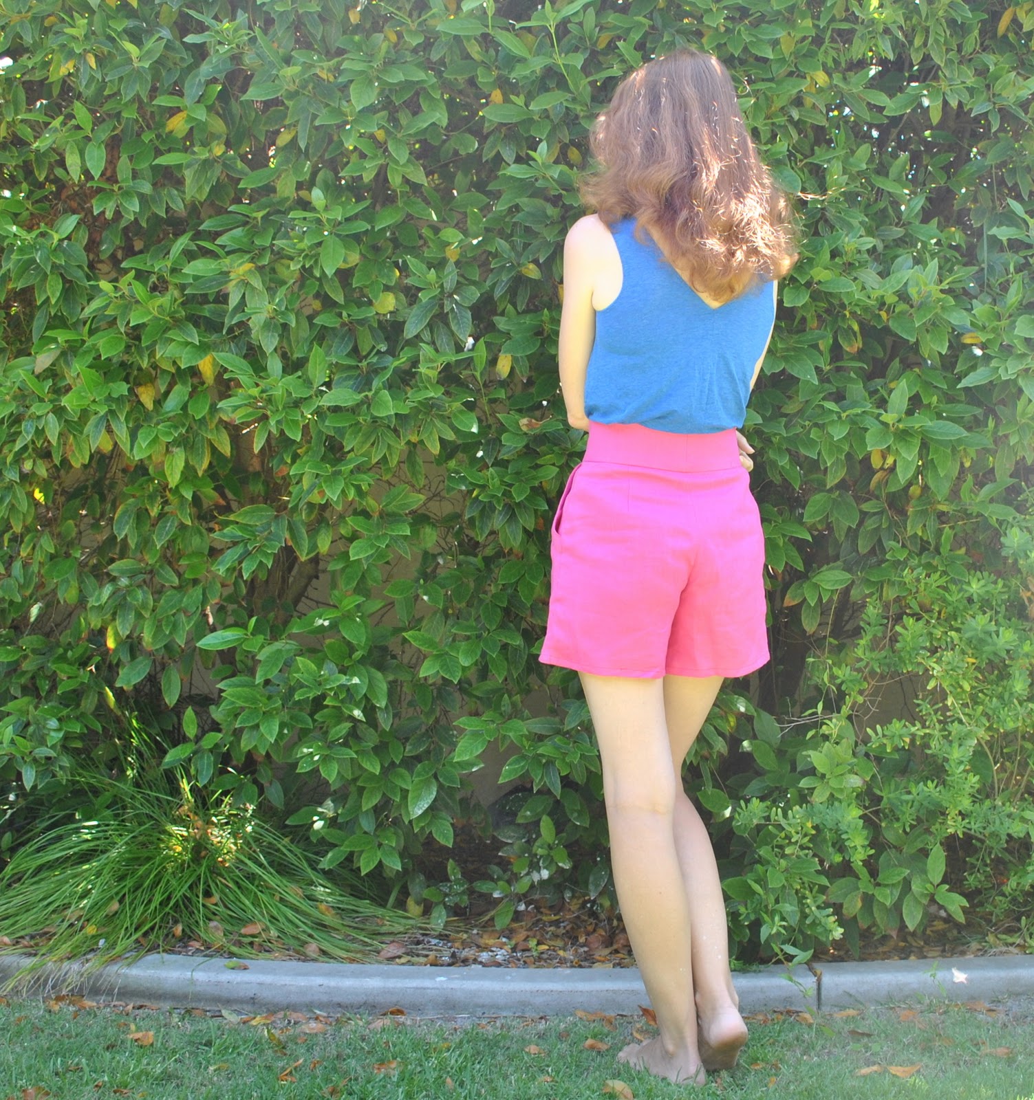
6. Perspective
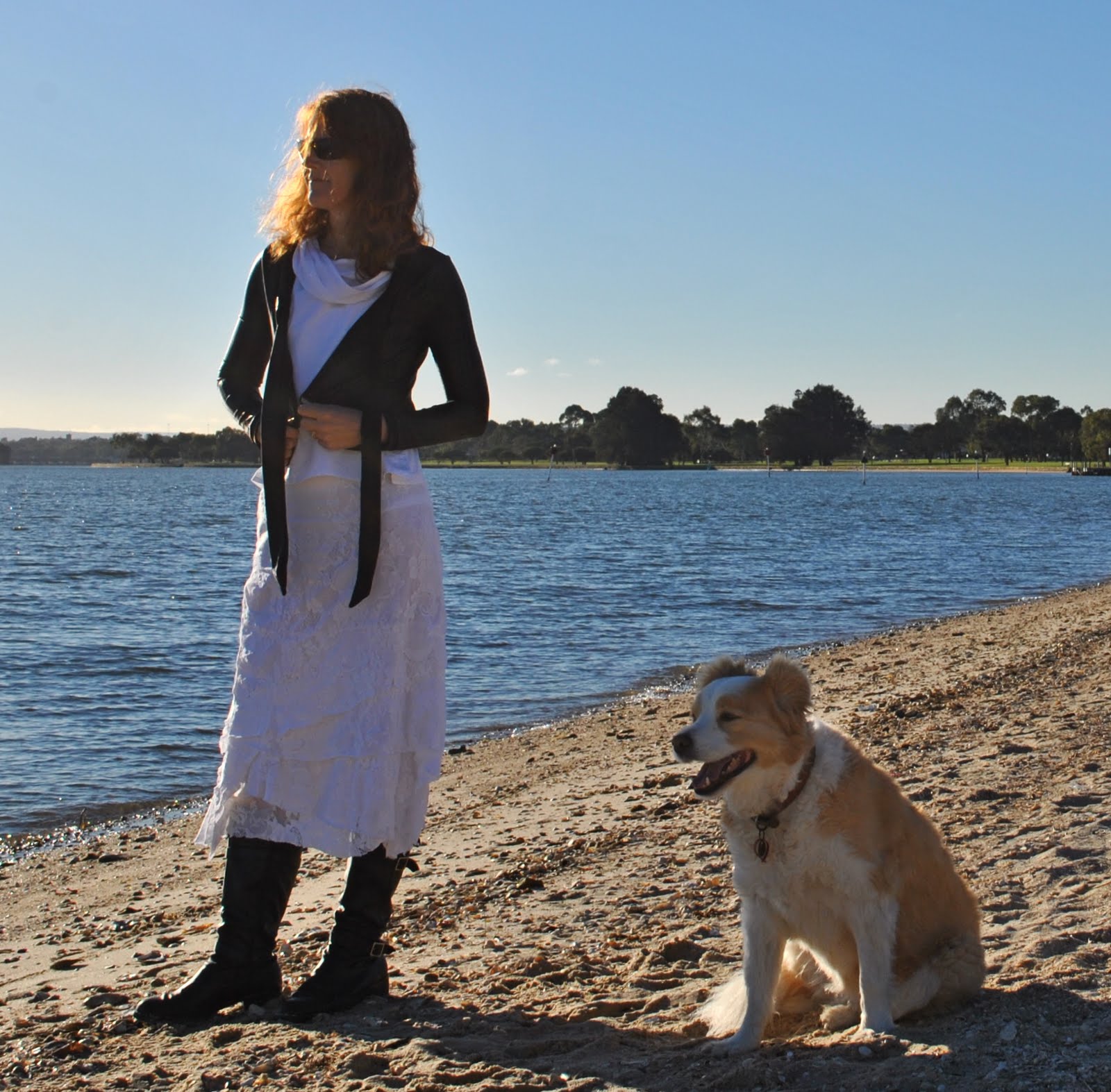
well, again a biggie.  I’ve found that the most flattering angle for a photo is when the camera is situated quite low, say at low hip height, and certainly no higher than waist height.  The worst angle is if somebody taller than you is taking your photo, from their full height, and one ends up looking munchkin-like up into the camera… with a big head and tiny weeny little feet down below.  This isn’t because you actually have a big head and teensie weensy little feet, but is just how it looks from the perspective of the camera.  Do yourself a favour (as Molly would say), and if a tall person is taking your photo get them to crouch down to squatting height.  Or get yourself a tripod and open for yourself a whole new world no longer to subject to the whims of your family’s photo-taking willingness nor availability…
Take these two examples, two pictures of the same dress.  On the left is a picture taken by my son at his full height in the days before I had worked out how to take my own photos, on the right is one I took myself with my camera on a tripod at hip height.  Which has the better perspective? (the two photos of my black dress above have exactly the same issue!)
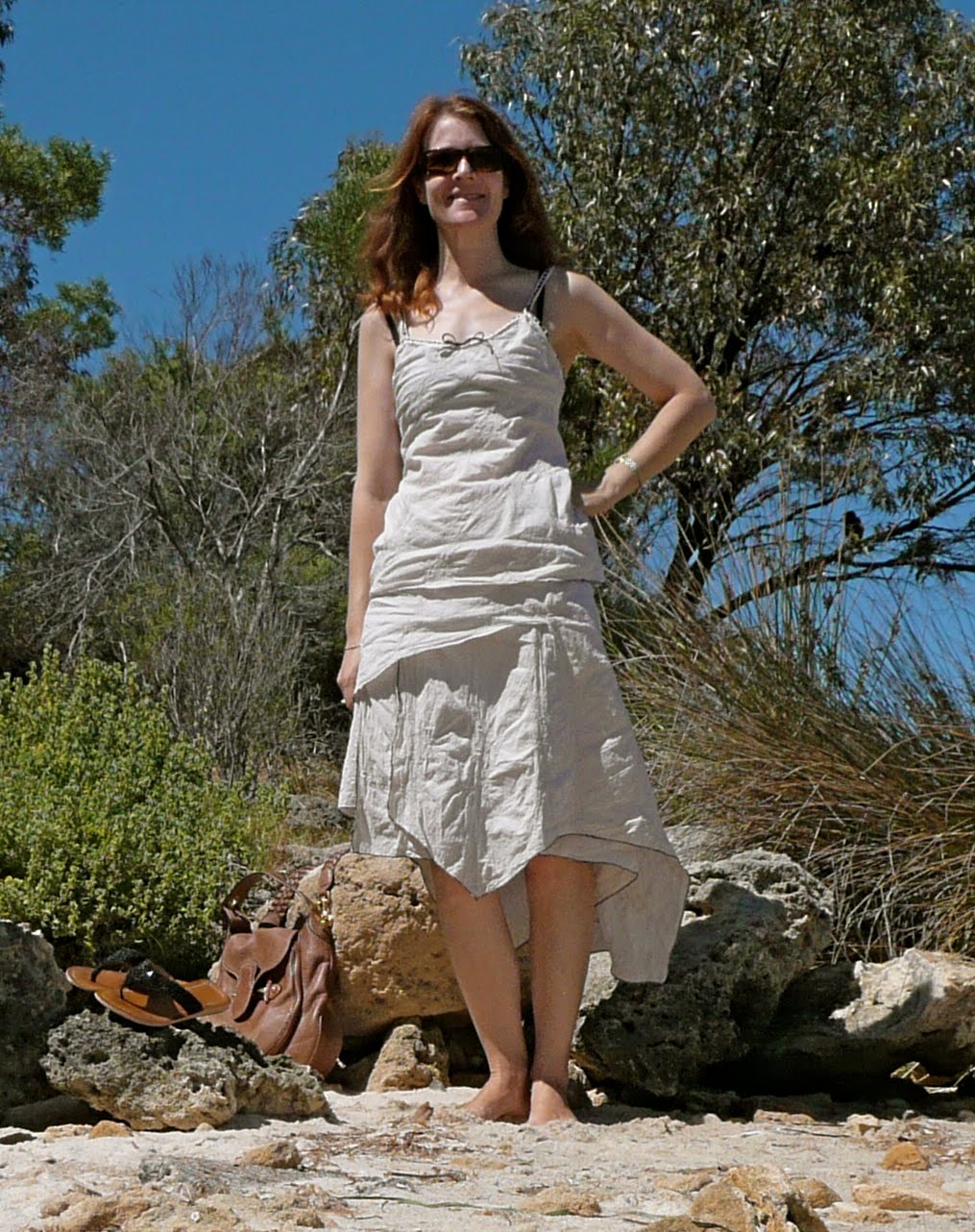
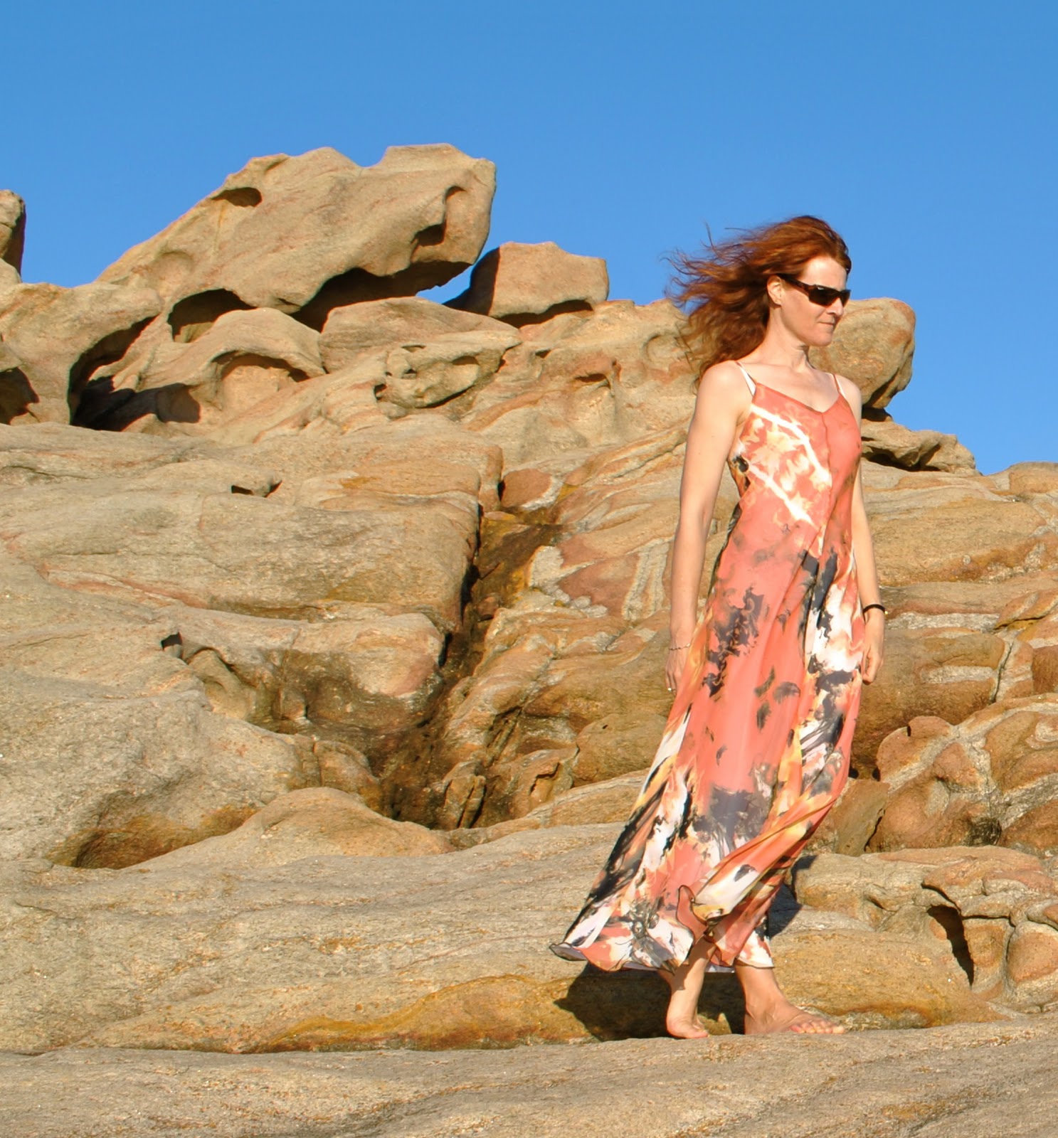
7. Crop
I usually zoom out as far as possible when taking my pictures, reasoning that I can always crop later if necessary.  This is a better option to the alternative, ie taking a few pictures only to later see that your head has been chopped off.  Take these two pictures, below is the unadulterated photo.  Of course you can see only rock and sky (I agree, this might be preferable…), but the dress is a tiny no-detailed speck in the midst of rocks.  Below that is the one I used in this blog.  It is exactly the same photo but cropped to show off the details of the dress.

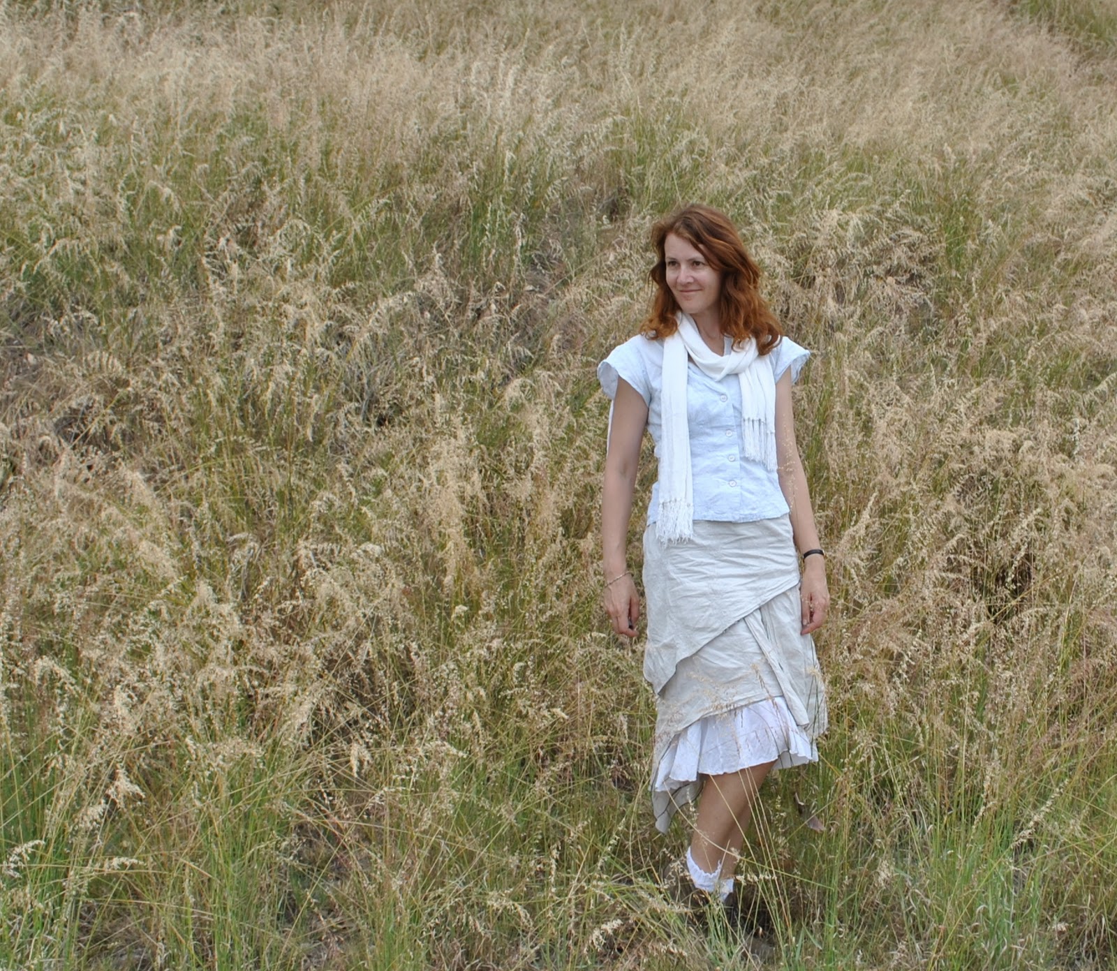
Don’t let the beauty of your background overwhelm you!
This is the biggest for me.  Often I am so smitten by the beautiful locations I take my photos in I don’t want to crop anything out.  But it is better to be ruthless since I am trying to show off the details of my creations and not just a lovely location… below is the uncropped photo.  Then the cropped version; well, now you can actually see some details of the skirt!

(On a side-note, I’ve noticed lately that I usually crop the picture to place myself off-centre, often in the third portion.  I’m not sure why, except that it seems to be visually more pleasing than if I’m right in the centre… what do you think?)

Now, I am passing this award on to some other blogs that I like reading… your mission should you choose to accept it:
Ana, of Stepalica
Andrea, of Fabric Epiphanies
Caroline, of Church Sexy
Shannon, of Mushywear
Tanit-Isis, of Tanit-Isis Sews
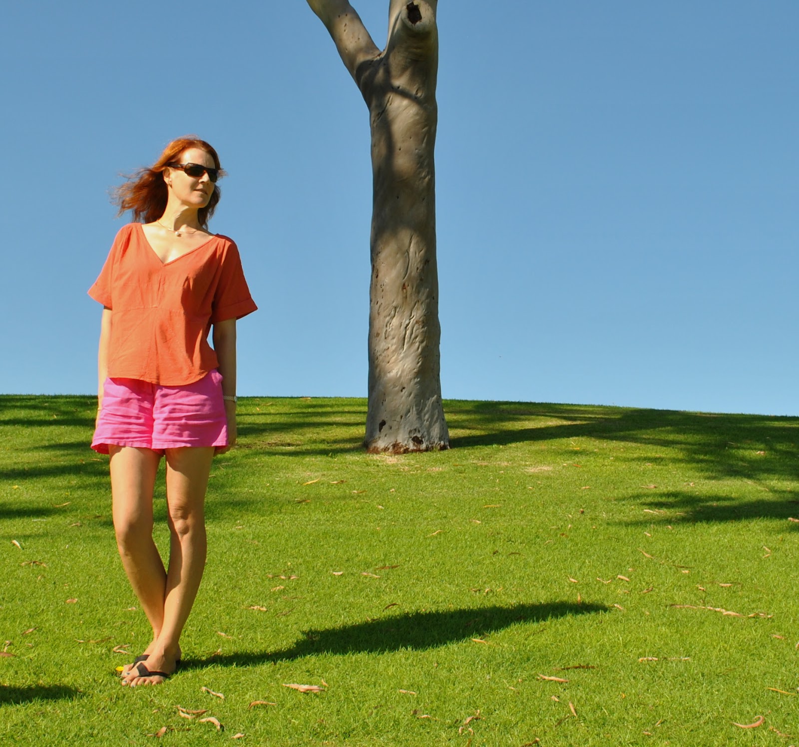
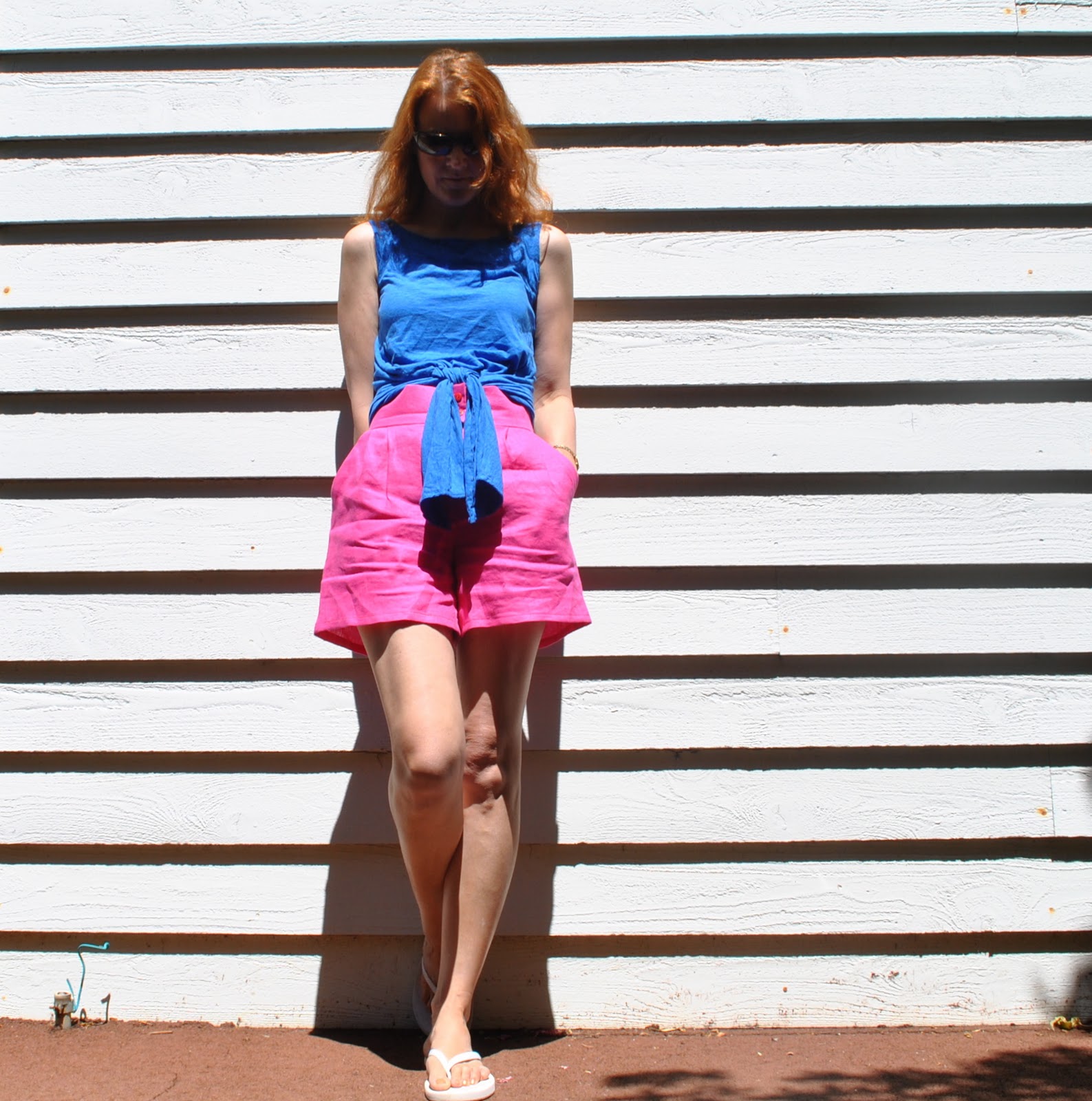
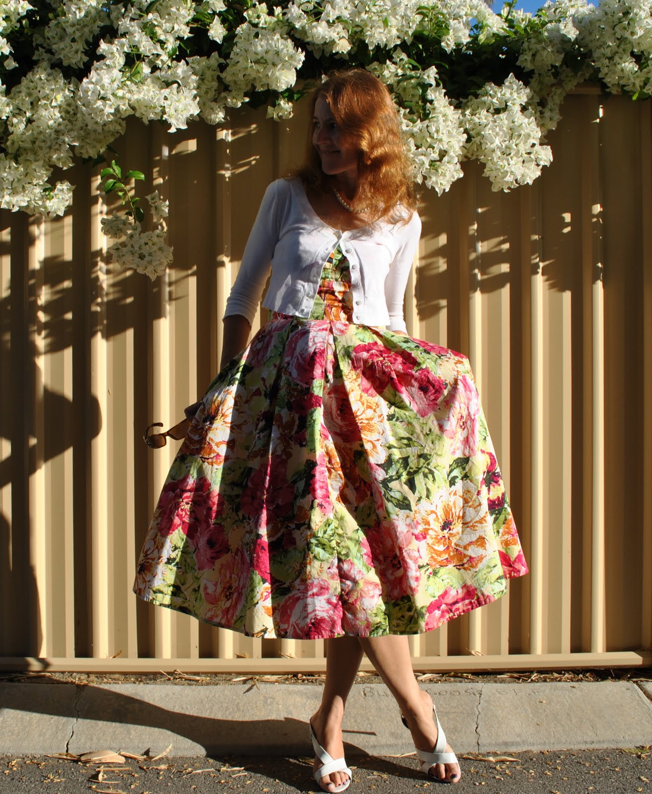
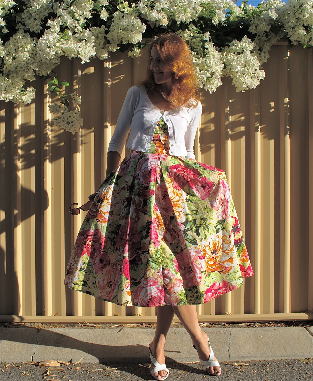
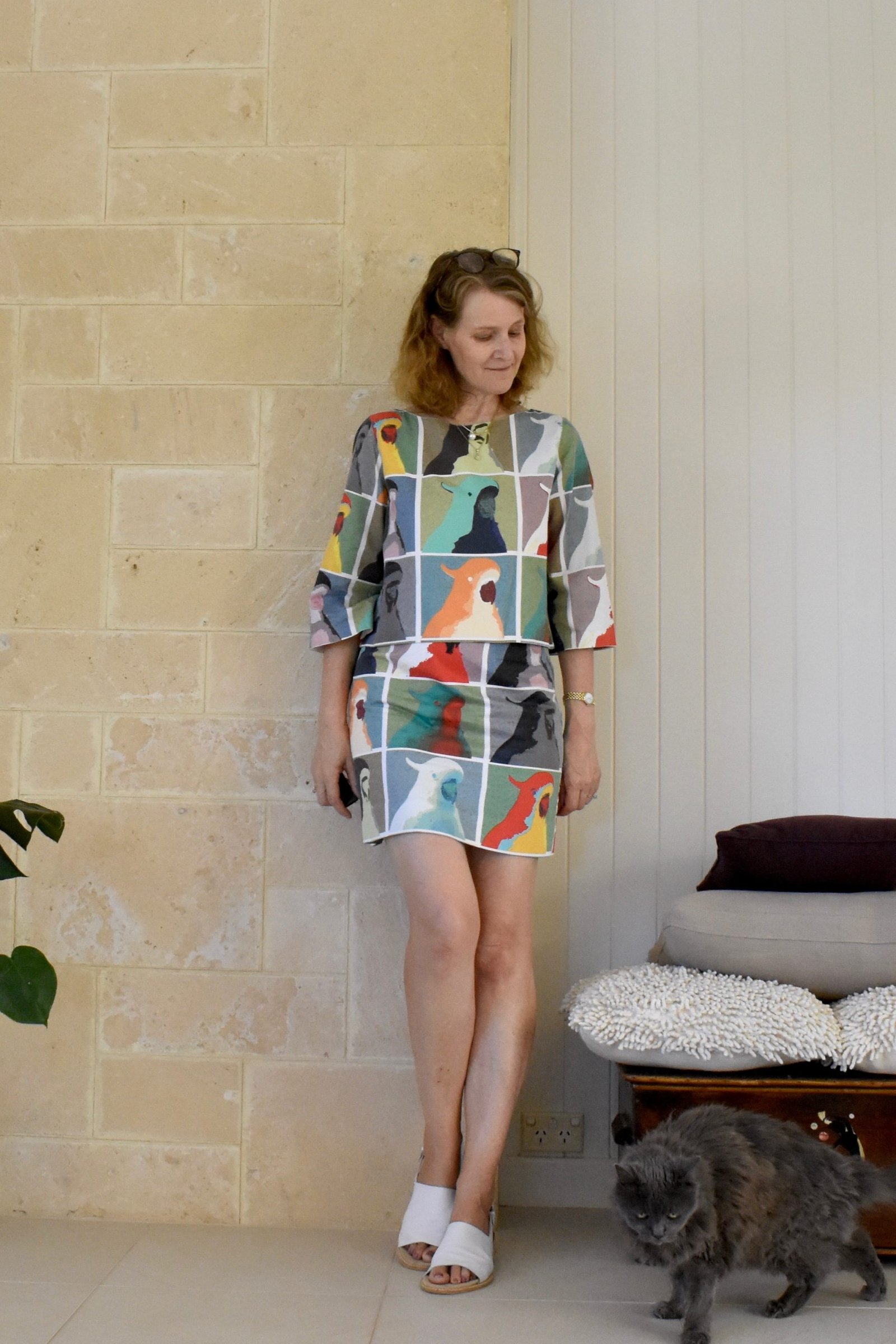
pinterestmail

A timely cloud

Me-Made June, Day 8
I was very pleased with this ensemble when I put it on.  And then received a compliment from a friend on my Pattern Magic dress.  Which was very nice!
But I have to confess I felt absolutely zero motivation to take a photo of myself this morning.  It’s not that I’m having trouble dressing in all me-made clothes, since my wardrobe is now mostly sewn by me.  It would be more challenging for me to find an outfit that is all NOT me-made actually…   To be honest I have been quite disappointed with my photos the past few days.  It’s harder to take a well balanced photo in the harsh Australian sunlight.  A reason why I usually head for the shade…  Don’t get me wrong, I love sunshine as much as the next person, but I am starting to think I should have chosen a different “spot” for this month which was more shadow-y. 
Well for a number of reasons; Sienna has hurt her foot so no walkies today, me having some officework to do, long story short, blah blah, I did take this photo much later in the day today when a few clouds had blown fortuitously in, and the sun thoughtfully went behind one just long enough so I could take this photo without that bright sunshine creating in my photo those stark extremes of light and shadow which kill all details in my ensemble.
Clouds, for the win…

Details:
Dress; from the Japanese pattern book Pattern Magic by Tomoko Nakamichi, of charcoal wool mix, details here
Top; my own design, grey/mauve jersey knit, details here
Leggings; my own design, printed jersey knit, details here
Boots; Andrea and Joen, from Uggies in Dunsborough
Sunnies; RayBan

below, just that little bit of rain last week, and …

pinterestmail

Girl-y, with a bit of white

Like yesterday…. but super-creatively (hehe) substituting white accessories for black.
I wore this to the Alumni High Tea up at the college today.  A lovely afternoon of tea, tiny sandwiches and miniature cakes and lots of catching up with friends, some of whom I hadn’t seen in a while.  
The only just slightly funny thing was the flute of champagne on entry.  You always get presented with one upon entry at things now.  What’s with that?!  There’s something incredibly decadent and naughty about a glass of champagne in the afternoon, no?  When I attend a tea I really expect tea, not booze.  Nonetheless everyone at our table enjoyed the champagne too….  ðŸ˜‰
Now, tell me what you think… taking photos in Perth can be really challenging at times because the sunlight is soooo bright here.  Forcing the amateur DIY photographer like me to seek out shady spots as much as possible…  Apart from cropping which I always do I don’t normally alter my photos a lot.  I once blurred out a person in the background, and once a stray bra-strap, but usually the photo is as is.  Sometimes I reduce the exposure, because of the aforementioned brightness factor.  Today I tried experimenting with the contrast to get a sort of washed out antique-y look.  My children like the original (above), I thought the altered one below looked more interesting as well as showed off the outfit better which I think should be the point… which photo do you prefer?  I would love to have photoshop to play with, but I don’t want to present a false picture of my work or myself…  Opinions?
Do you prefer arty, or true-to-life?

Details:
Dress; adapted from Vogue 8555, printed cotton, bodice of my own design details here, and a review of the pattern here
Cardigan; Picnic
Necklace; Diva
Sandals; Franco Burrone, from David Jones

pinterestmail
Switch to mobile version
↓