Tag Archives: Printing

Poppies lingerie set

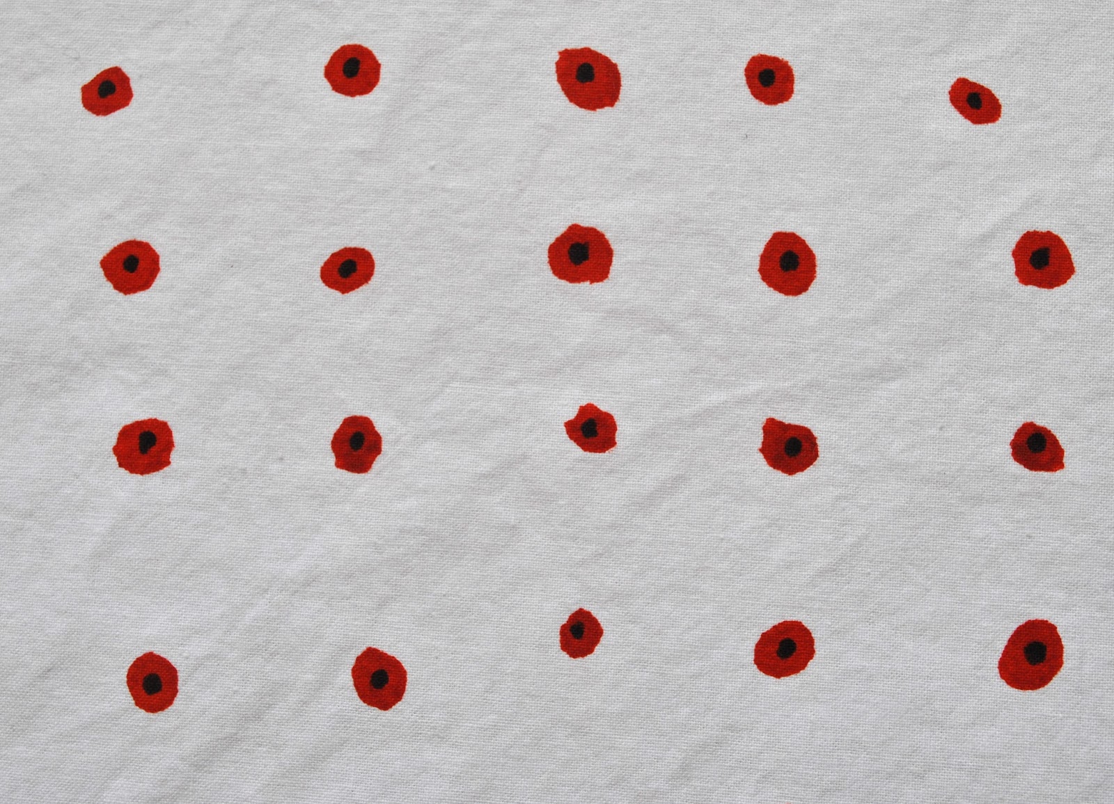
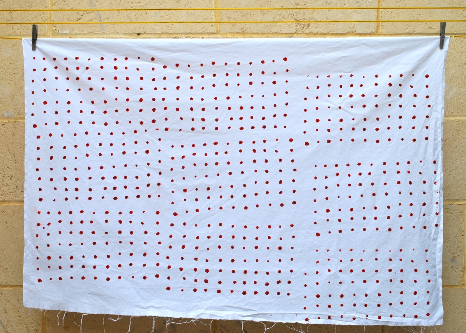
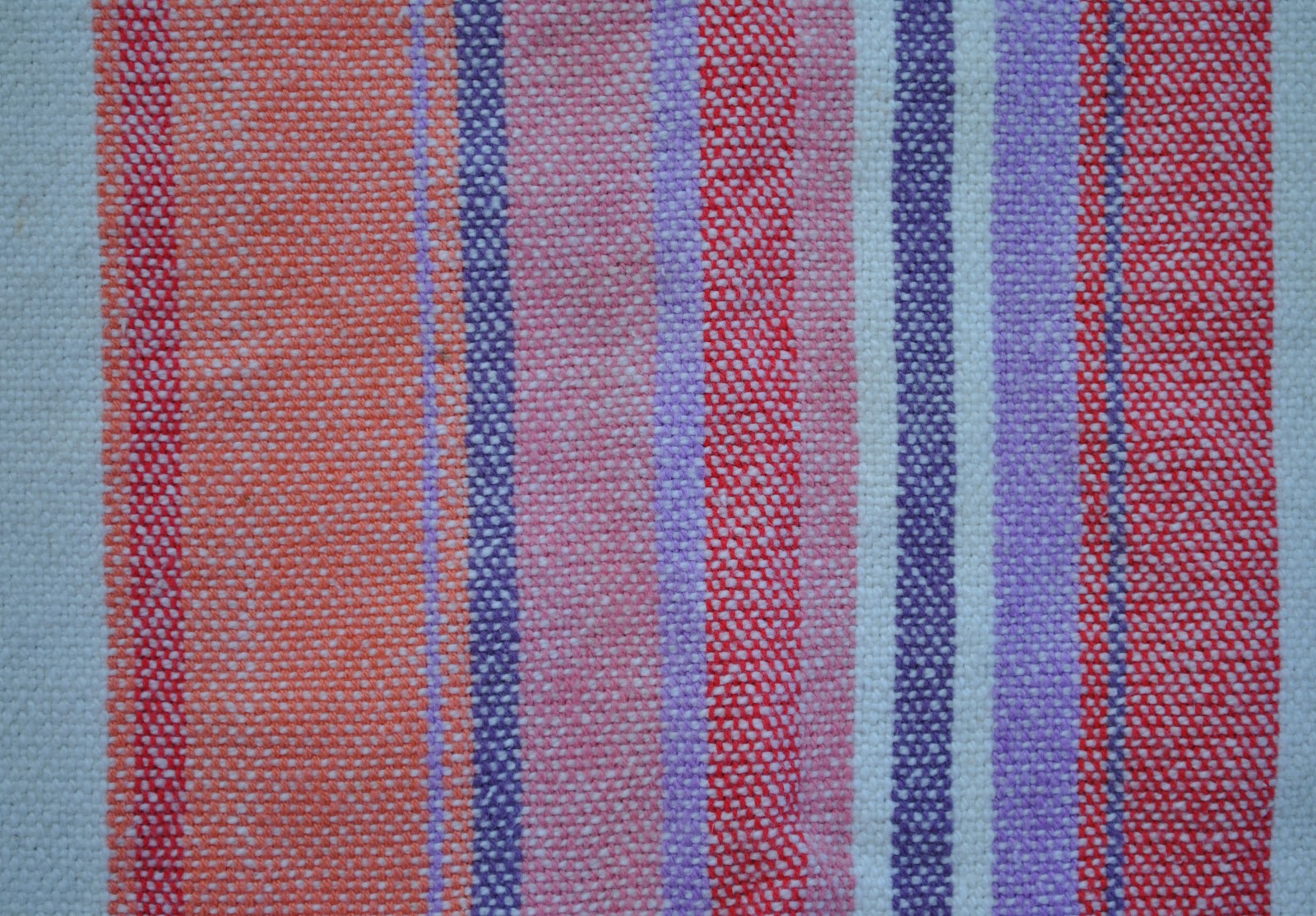
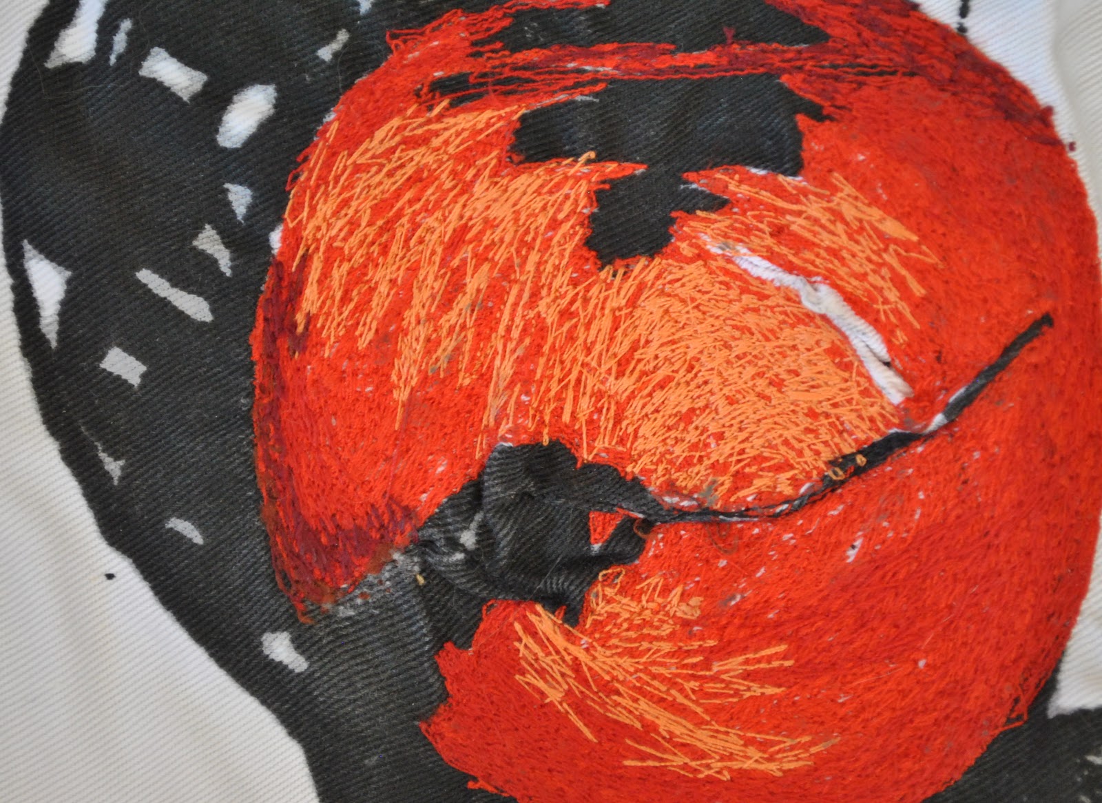
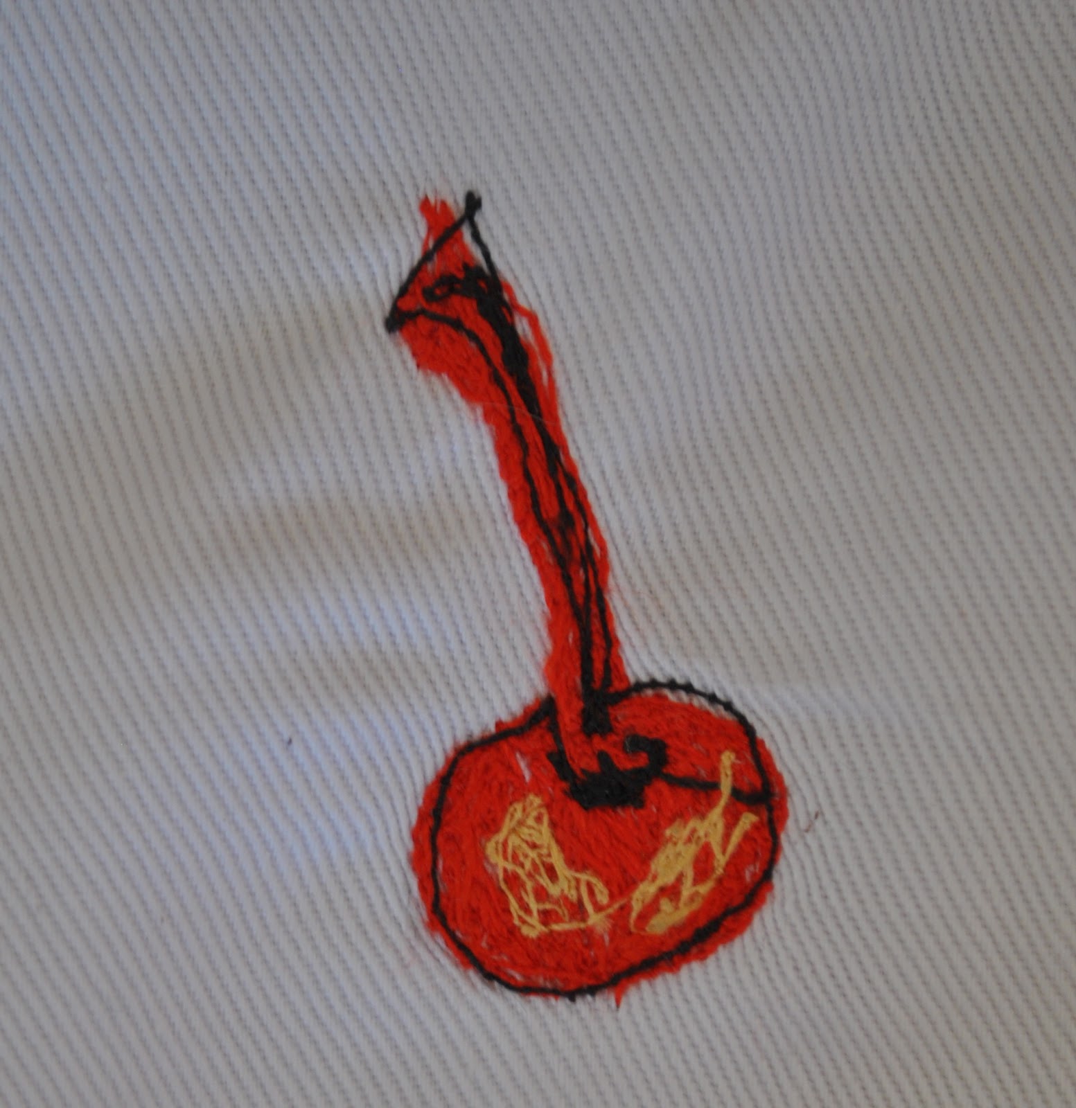
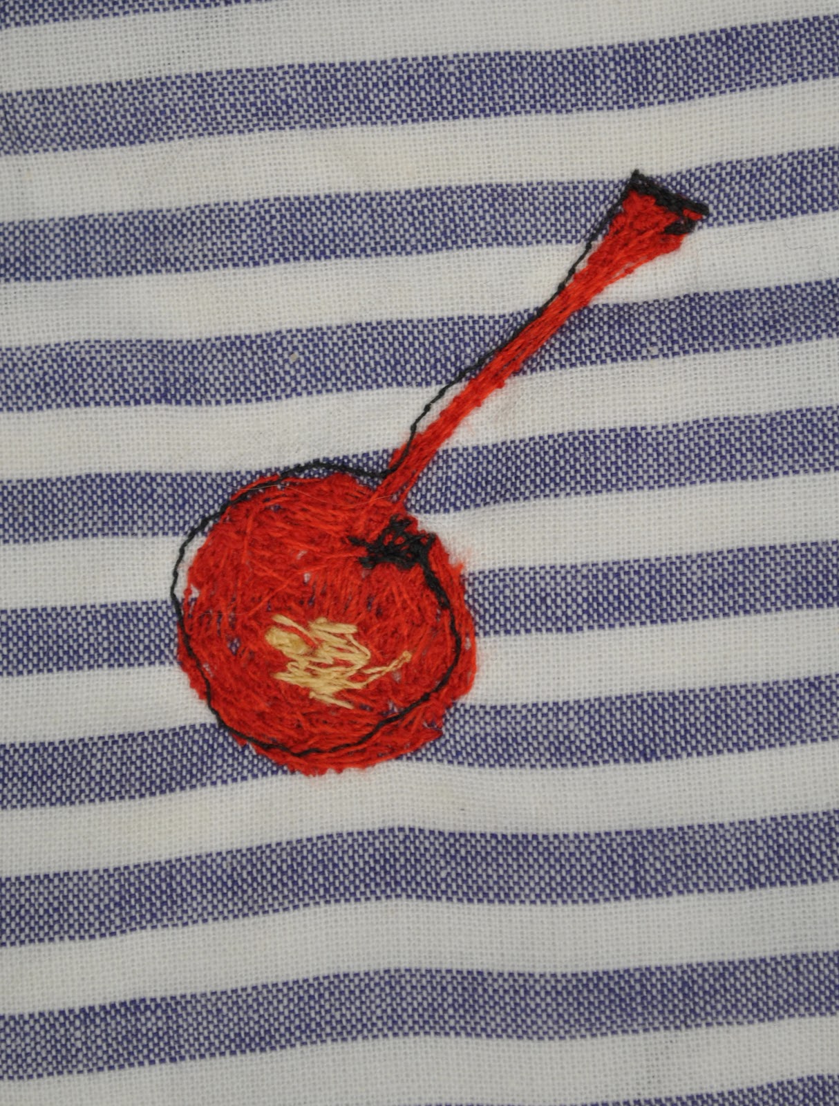
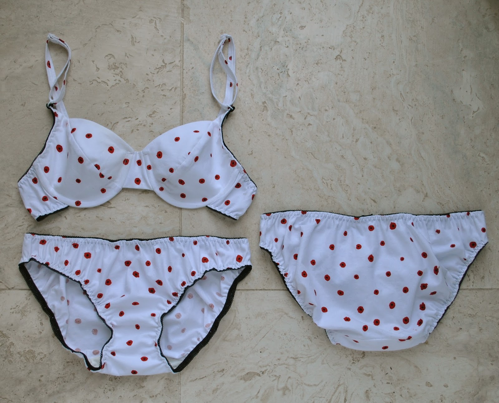
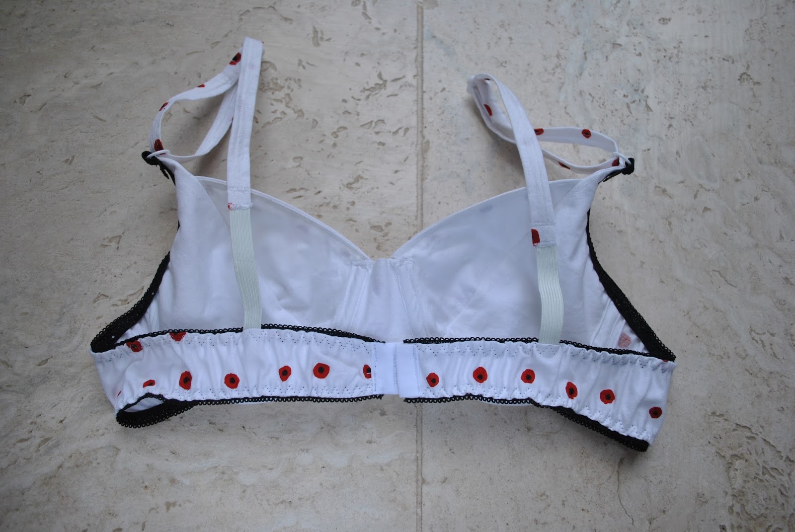
My first screen-printing effort obviously lent itself best to something comprised of smaller pieces that could be cut to avoid the more glaring imperfections in the print, ahem!  A set of lingerie sounded like a plan  ðŸ™‚  My poppies print was pretty bad really, but it still felt precious to me just because I’m a silly sentimental thing.  There was extensive contemplation of, and moving around, the pattern pieces on the fabric before I braved snipping!  And bias placement is such a fabric hog.  I considered disobeying and naughtily cutting the undies on the grain but didn’t want to court disaster.  I cut the bigger undies pieces from my later, more successful print placements (at upper left of my fabric length) and cut the smaller bra pieces from the in between scraps and from my first, badly placed prints (at lower right) and mirror-matched as much as possible the print placement on front pieces and back pieces of the bra.

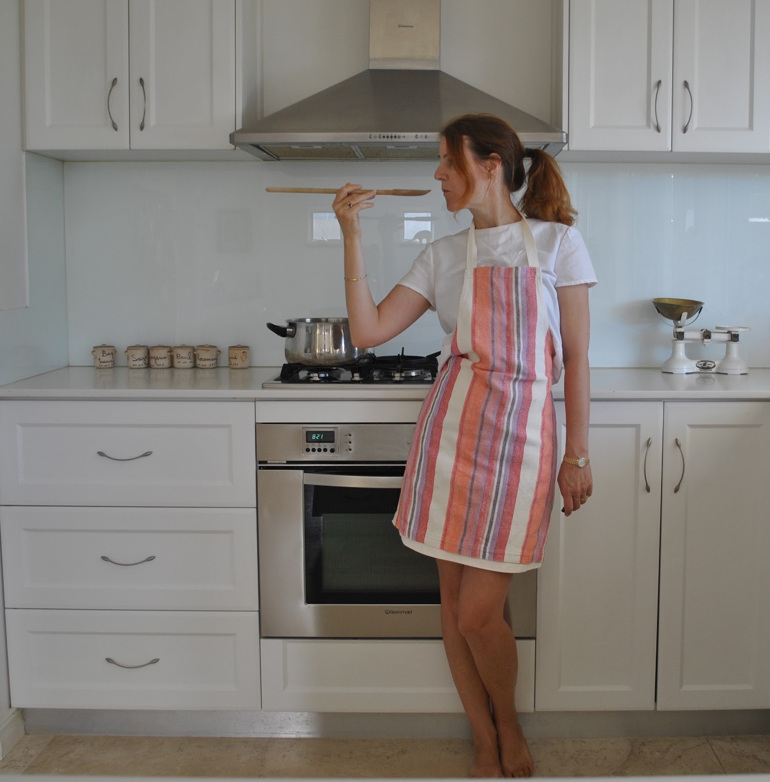
The bra pattern is KwikSew 3300 with modifications to account for using a woven fabric as opposed to a stretch knit (as described here)  This time I cut the back pieces to be 6cm longer at centre back, and narrower to fit the purchased hook and eye clasp.  This is my eighth time making this bra pattern up so obviously I love it!  It is one of the original designs of the late Kerstin Martensson, Swedish founder of KwikSew and a talented pattern maker.  The style is very much to my taste, which is why I chose it of course! and over time I’ve fine-tuned the fit by shaving off a little bit here and there,: so it fits me really well.

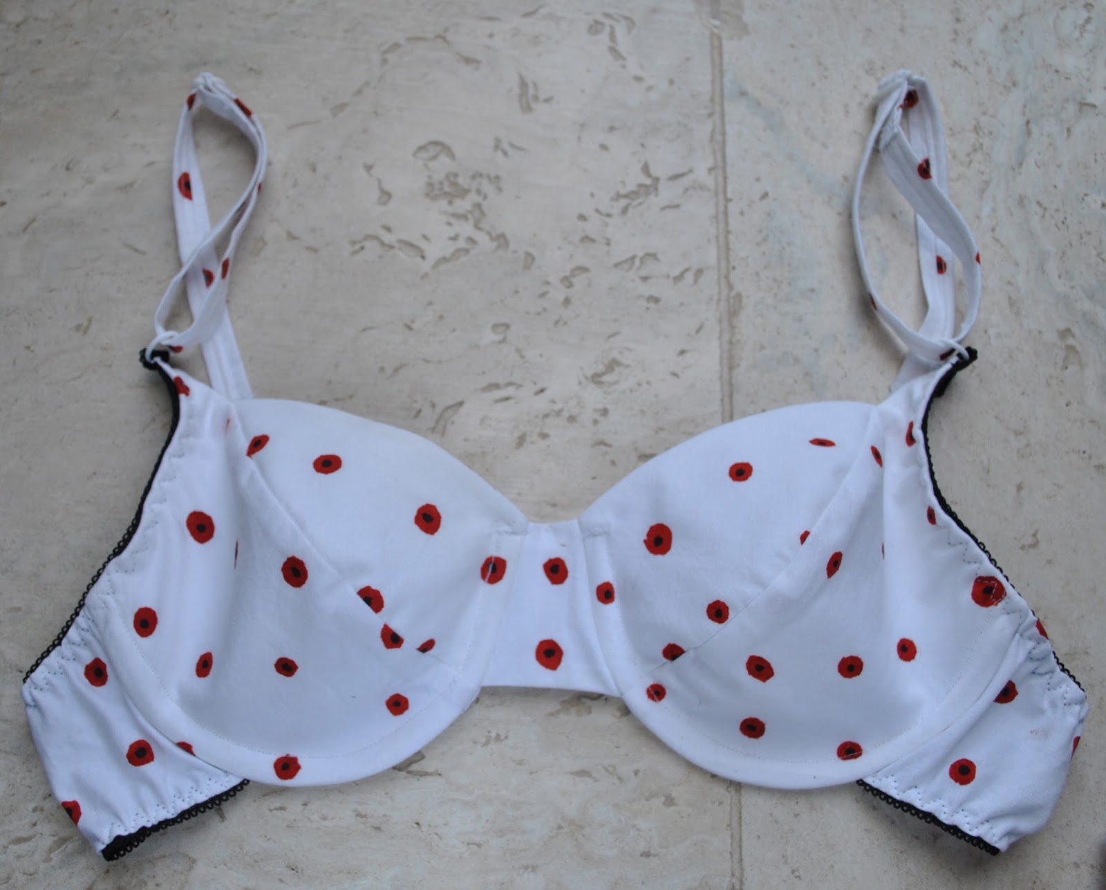
The bra lining pieces were cut from the white unprinted bits around the edge, and the bra underlining and undies liners from ivory jersey knit.  I chose black lingerie elastic to match the black centres of the poppies, and fortunately my Spotlight currently has lingerie rings andsliders both in white, so they match each other.  Woot!  I stocked up!!

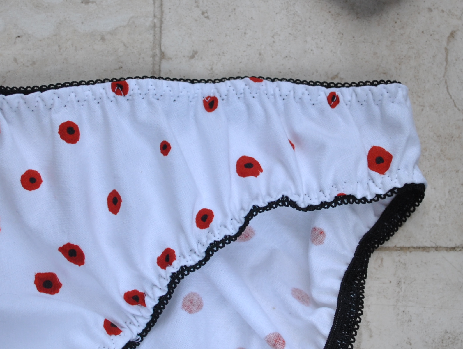
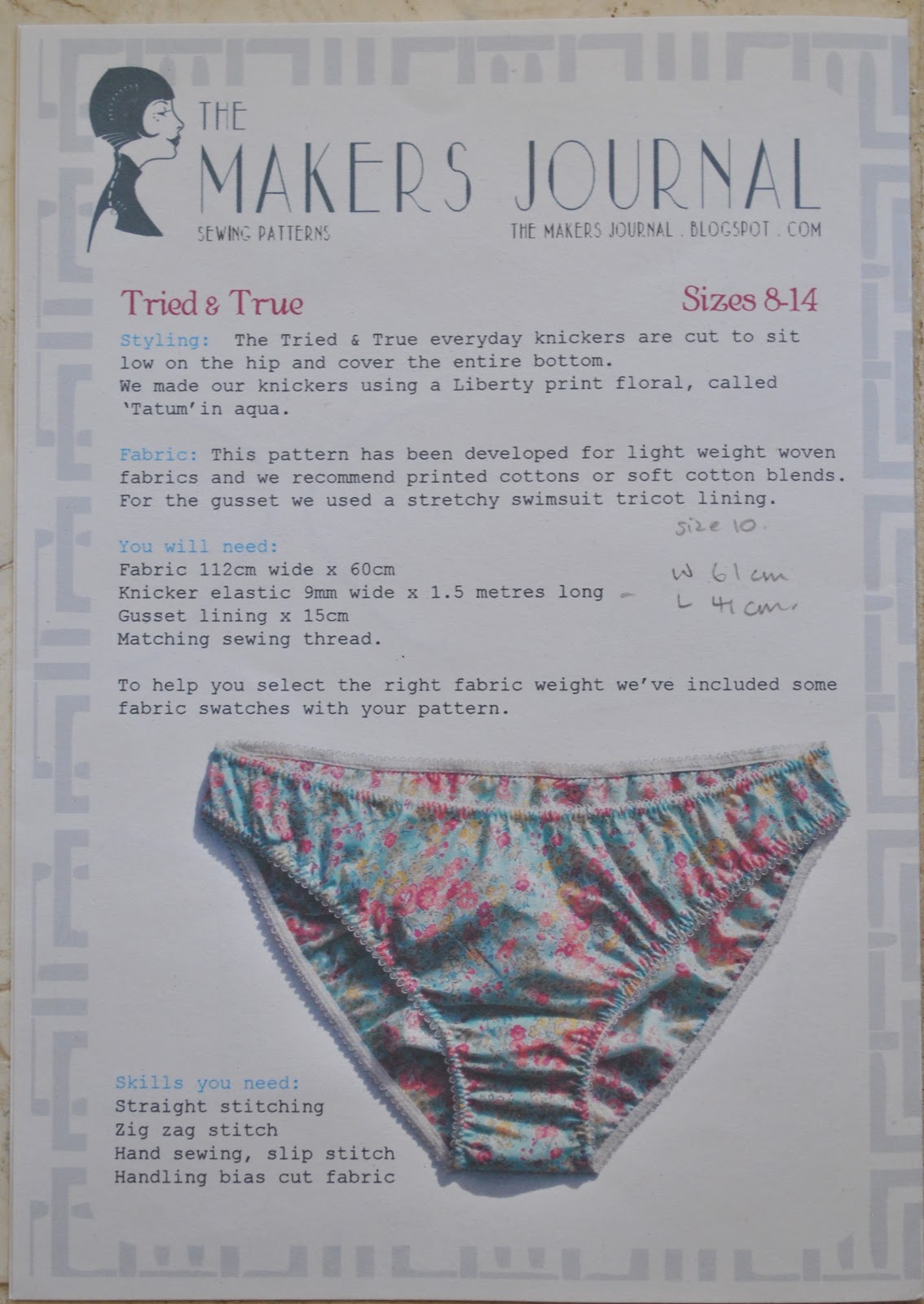
The two pairs of matching knickers are based onThe Makers Journal Tried & True, the third and fourth times I’ve used it, and I’ve altered this pattern too to suit my personal tastes.  The first time I made it pretty much to pattern, the second and subsequent times I have made it to have a more substantial liner (as illustrated here), to be less high-rise, to scoop in at the front leg more, and to scoop out at the back leg more to give more bottom coverage.  These are small alterations but even 1cm makes quite a difference when you’re wearing them.  The closest I have made to the original pattern is the pair pictured on the far right in this post here.

Details:
Bra; KwikSew 3300 modified for woven fabric as specified here, screen-printed white cotton, my review of this pattern here
Matching undies; The Makers Journal Tried & True, modified, my review of this pattern here

pinterestmail

Screen-printing; a field of poppies

Hello!
I am doing a screen printing course!  I have tonnes of pretty patterns gleaned from Pinterest that I would loooove to print onto my own fabric, but I think my aspirations might be a tad more ambitious than my abilities, hehe.  Whatevs, it should be fun and I am finally making use of my screen, bought using a Jacksons gift voucher that was on the point of expiration.  Confession time; this purchase actually took place about seven years ago (eep!) and up until now the screen has been utterly and perfectly pristine and unsullied by anything so messy as actual fabric paint …  perish the thought!  Well, it has at last had its initiation ceremony  ðŸ™‚
I decided to start with something simple; my first effort is a stylised field of poppies.  The screen print component is a imperfect grid of wonky red dots, like a really lovely Nano Iro pocho dots pattern that I saw for $50/m in a local shop which shall remain nameless.  Ah, the joys of living in Perth…. hey, I’m all for supporting local businesses and have got nothing against someone making a living, but a line has to be drawn somewhere.  $50/m is overstepping somewhat, no?!
I used a lightweight white cotton from Spotlight, and mixed a deepish but still quite intense red/orange, like the colour of a, well the colour of a poppy!  The break-down is about two thirds mid orange (which I would describe as garishly, in-your-face, “life jacket” orange), a third new mid red (which I would describe as “crimson”) and the tiniest touch of black.  I added about 10% transparency medium but I don’t think this quantity was enough to make any difference.  After it had dried I went over and manually added a black dot in the middle of each orange dot using a Sharpie laundry marker.
“Registering the print”, which is printer’s speak for lining up the screen so that repeat designs sit seamlessly alongside each other and you are not supposed to be able to tell where one stops and the next starts; is a heck of a lot harder than it appears… my nine prints are laughably misaligned.  I think though that since my design is random and intentionally wonky it can almost get away with having a less than perfect line-up.
This fabric to appear in sewn-together garment form very soon… stay tuned!

pinterestmail

Kitchen witch

Some kitchen couture!!
With all the gorgeous aprons popping up in the sewing blogging world at the mo’ I thought I should show why I did not take part in the big sew-along this time… you see; I have a very nice little selection of perfectly lovely handmade goodnesses to choose from when it comes to cooking-related apparel; already!
All of which are of quite high sentimental value to me since they were hand-crafted by my two favourite ladies in my life; my Mum and my daughter Cassie.
I own two aprons and one pair of oven mitts.  Actually I have one other pair of oven mitts too, cruddy old ones which I actually use.  The ones Cassie made are too good to muck up  ðŸ™‚  But I do wear the aprons.
They are both quite simple in line and style BUT the divinity is in the details.
Firstly; the striped apron above was handwoven and made by my mother, and I have been using it all my adult married life.
It is all cotton; the fabric handwoven by Mum on a big floor loom in a plain weave; and has twill tape attached for the neck bizzo and the waist ties.

I just love the colours Mum chose  ðŸ™‚

Secondly; I have an apron and oven mitts set; made by Cassie when she was in year 11 for an Art assignment.  

This was term project, culminating in this apron and oven mitt set, a framed painting, and a whole portfolio of sketches.  The name of the project is Eve’s Temptation… thus the sprinkling of cherries (innocence) and apples (temptation) over the textiles.  The fruit is all embroidered in three different reds, plus yellow and black, and is richly textured.

The embroidered bits were all created by Cassie devoting hours to madly feverish back-and-forth sewing on my daggy little sewing machine, that ahem, does not do embroidery.  It overheated and broke down during the saga, which was pretty devastating to both of us, for entirely different reasons!… but we won’t dwell on that melancholy time; my machine was repaired, Cassie finished the project with a fresh perspective on respecting other people’s property, and we remained friends ….  happily ever after etc etc!
The black designs are screen-printed and with some random areas of machine embroidery for a bit of added texture, and Eve’s red lips are embroidered too.  Also all done on my very ordinary non-embroidery machine.

So you can see I’m pretty right in the apron department.  I am so lucky to have such clever creative women in my family!

(I am also wearing here my Bamboo shoot top from Pattern Magic; and my curtaining skirt from Vogue 1247)

pinterestmail
Switch to mobile version
↓