Tag Archives: Printing

White trees and buttons

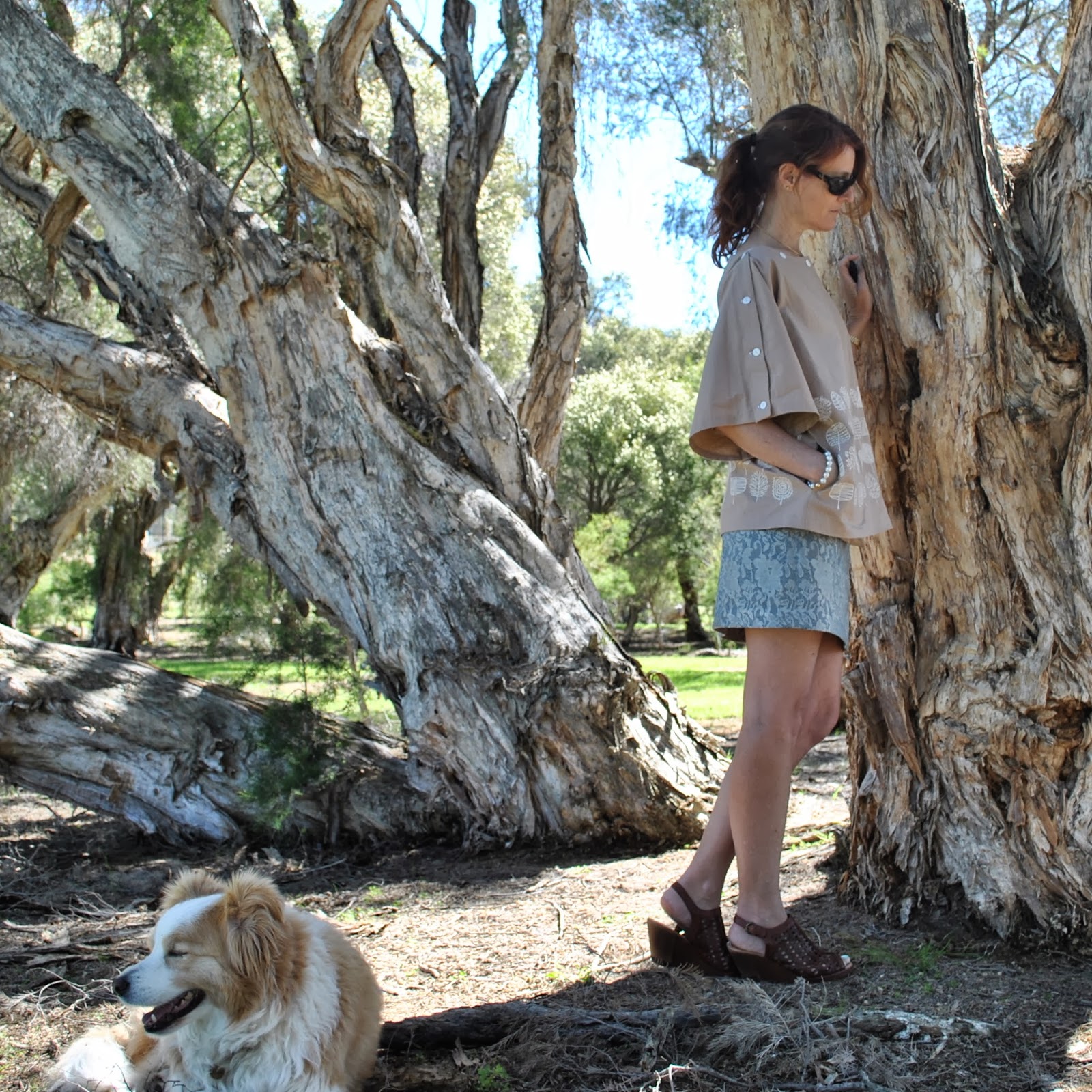
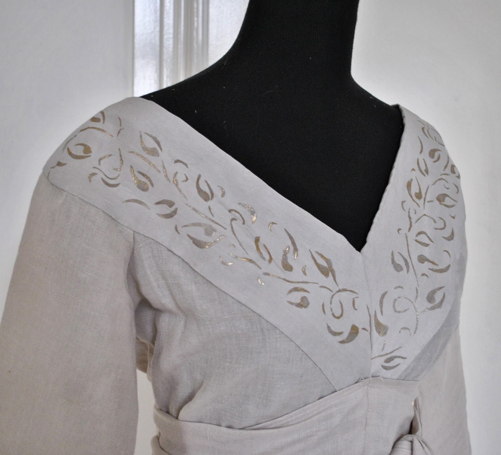
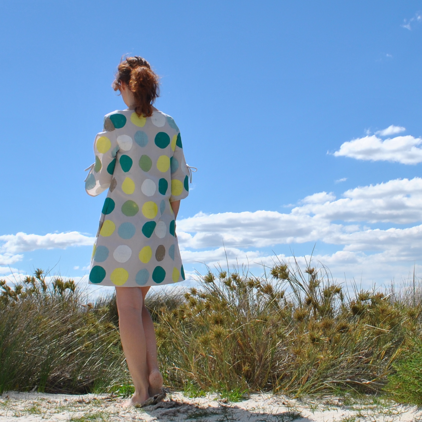
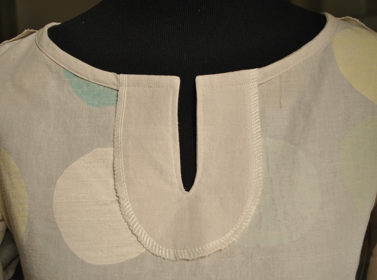
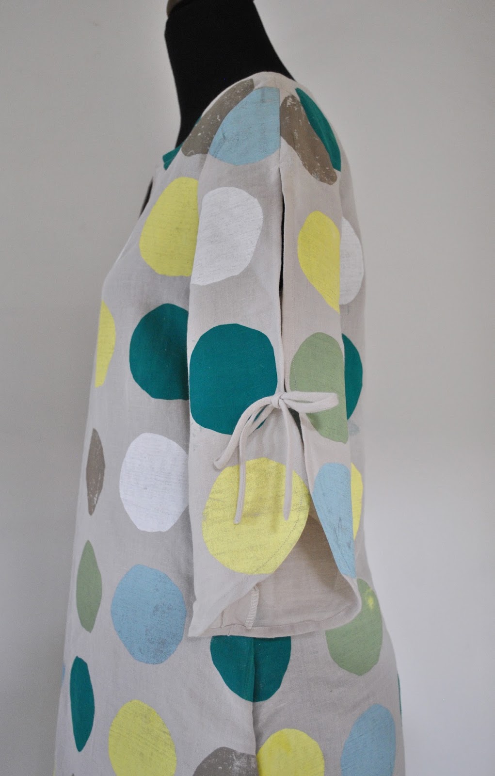
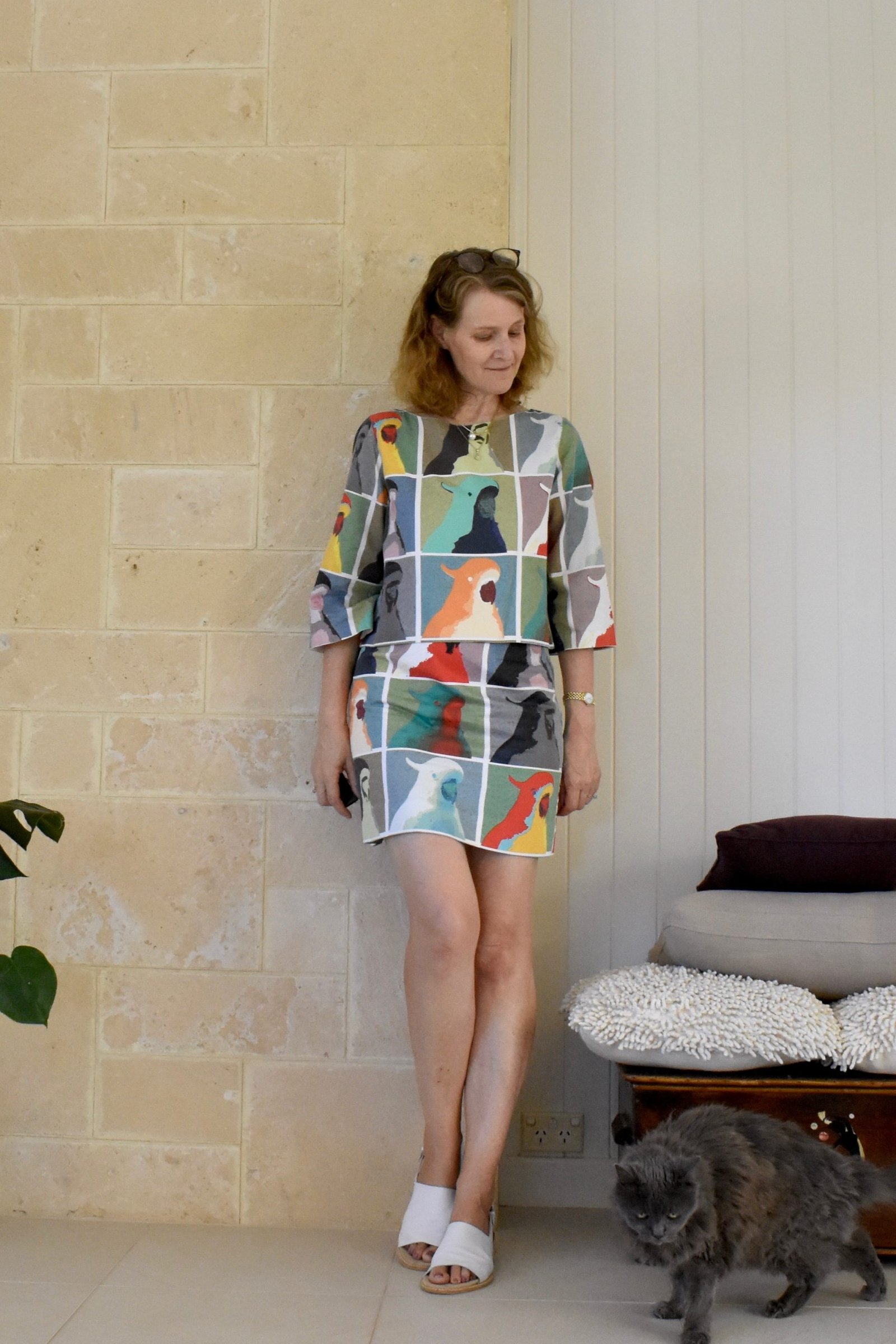
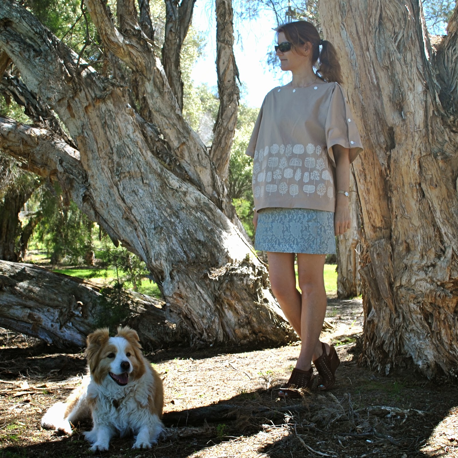
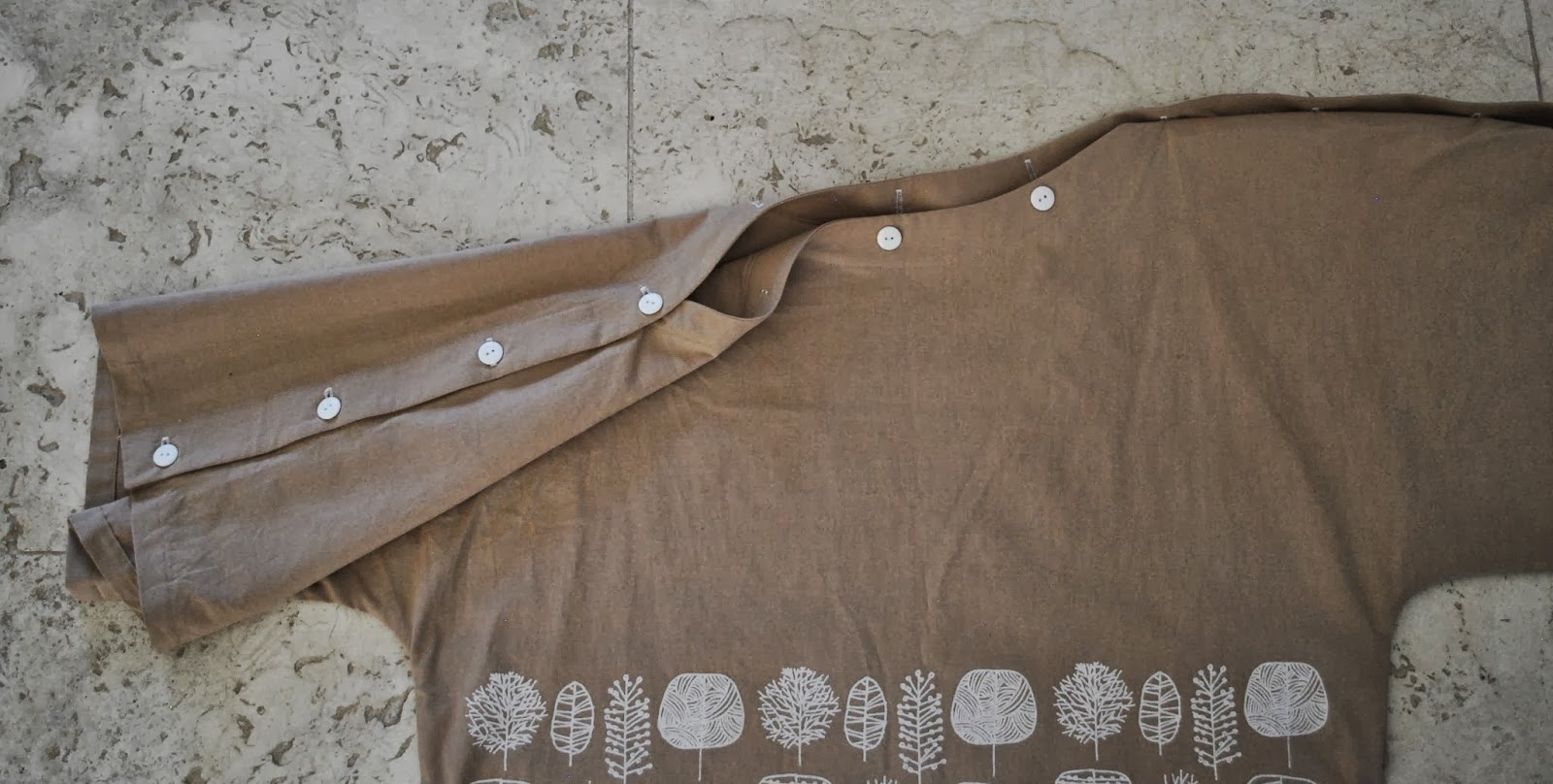
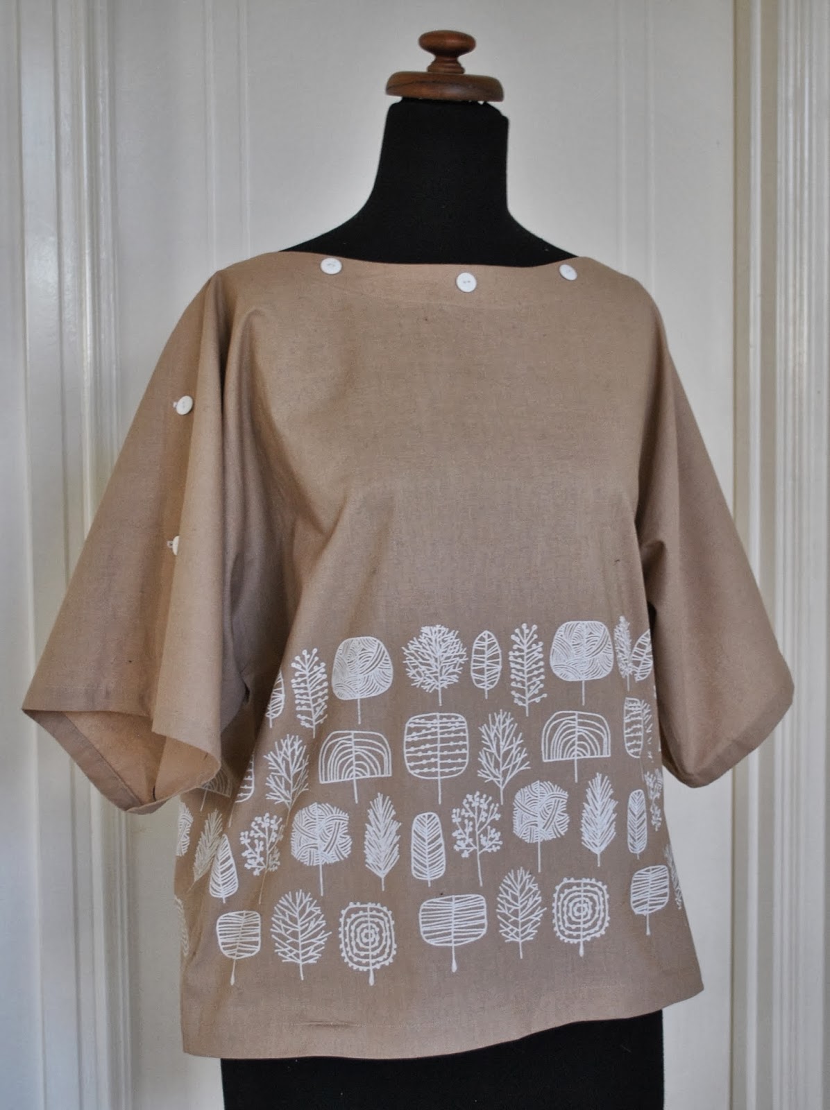
I’ve sewn up my white trees fabric… into a top! I drafted it myself but it is a pretty simple silhouette; basically a big oversized T-shape, with something interesting in the form of the completely open top edge.  The top edges of front and back have a full length button and buttonhole placket respectively, stretching from sleeve hem to sleeve hem along the whole neckline, and it’s partially buttoned up to close the top of the sleeves.  Technically, you could button the top edge up all the way, except that the neckline is curved as an anti-strangulation measure.  It’s funny though, when you’re wearing it you can’t really tell the neckline is curved, it reads as an almost straight edge.

It is based on several different sources of inspiration: years ago I had a Metalicus Tshirt that had an open top with snaps, that could open like this from sleeve right the way along the neckline; and also a few months ago Kirsty posted plans for her gorgeous top from the Japanese pattern book She has a Mannish Style, a top with a wide buttoned neckline although with separate closed sleeves.  I sorta combined those concepts in the design of my own top.

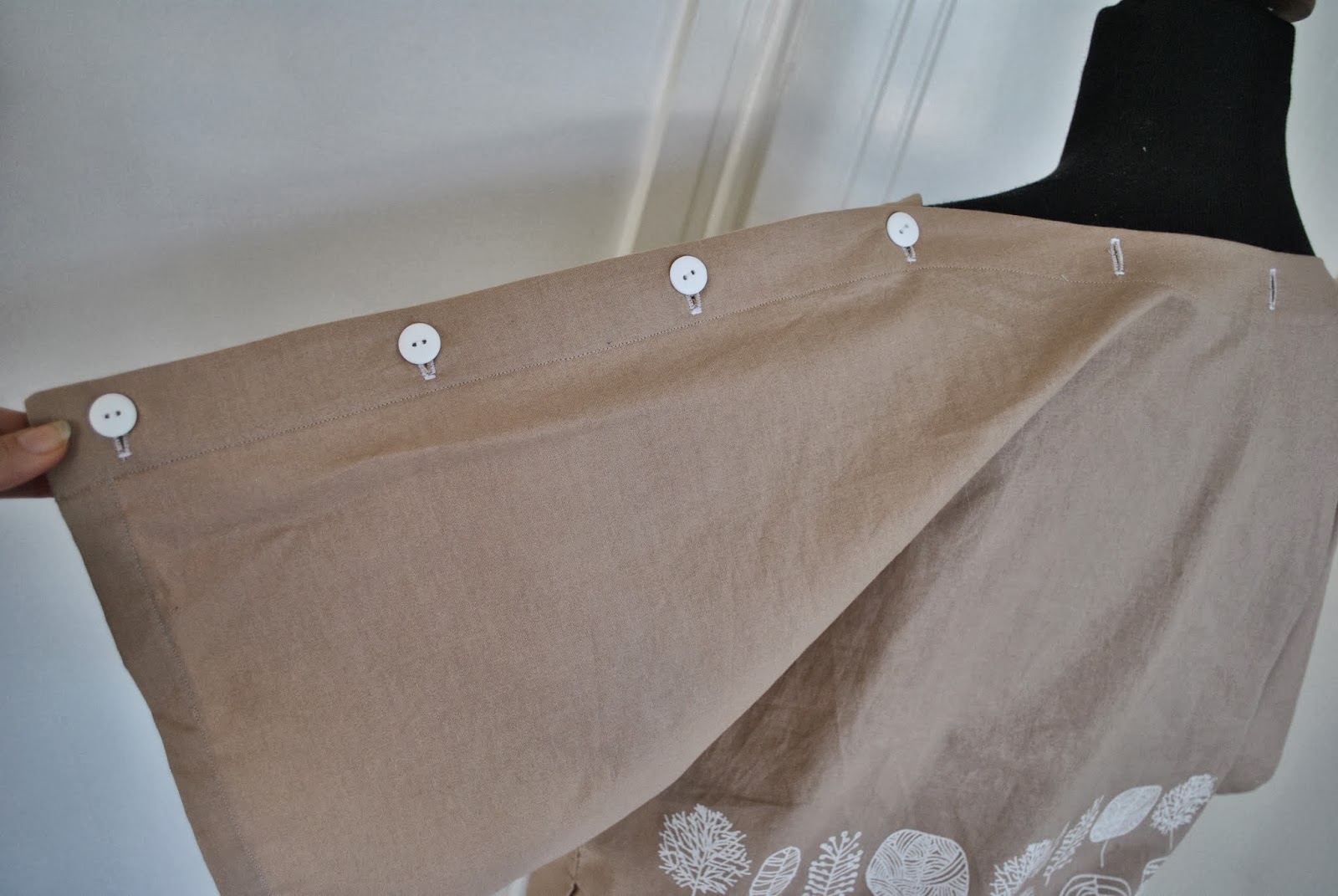
Most time consuming bit: I fiddled for aaaages with the spacing of the buttons/buttonhole, so it would both look “right” and also that I could have a button placed just at the point on my shoulders where I wanted it to go.

the back view is unexciting, but I know those of us who sew like to see this bit too….  

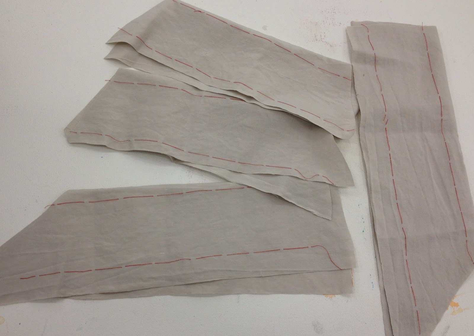
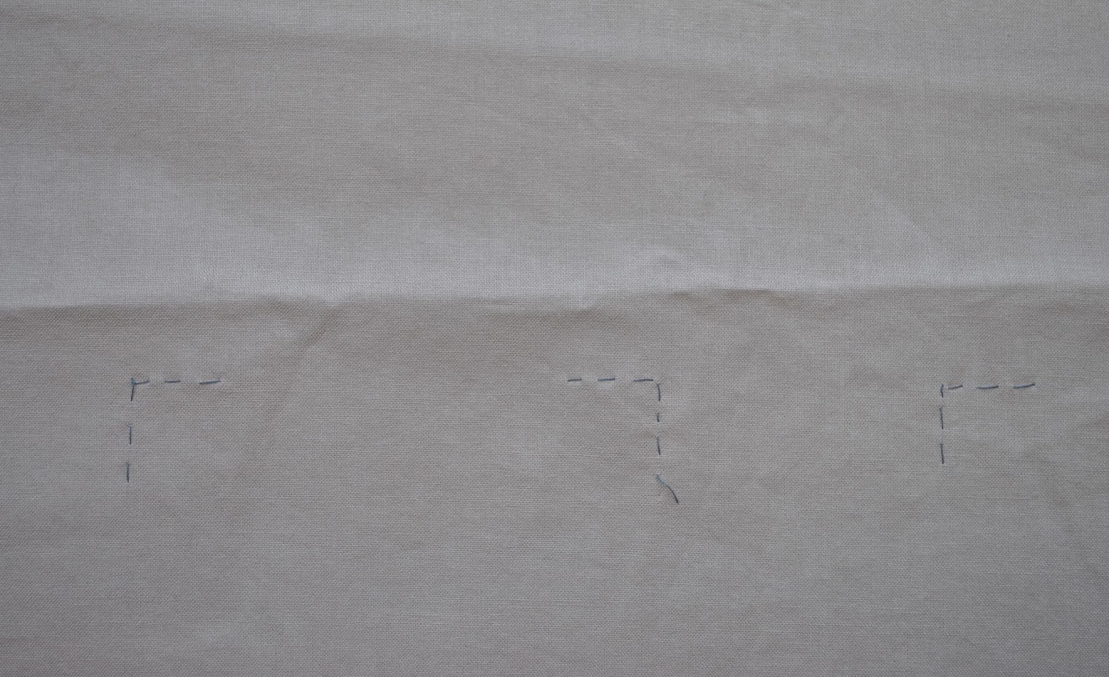
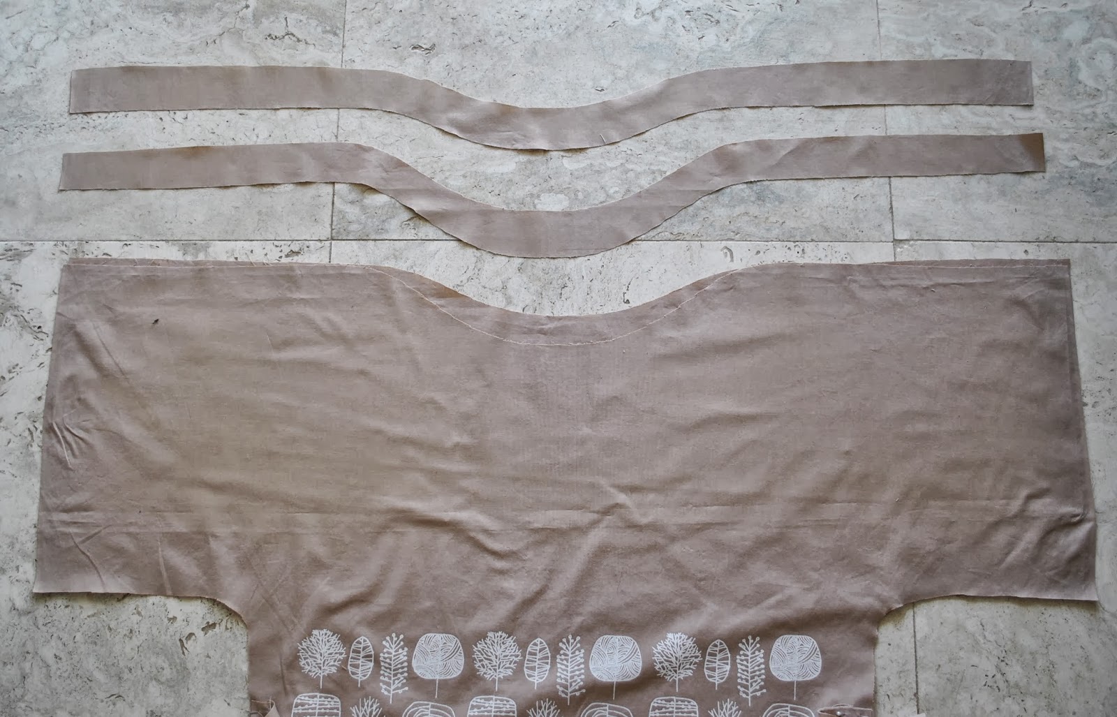
Since the front neckline has a lower dip than the back, the buttons are spaced a little more wide apart along the front curve than the corresponding buttonholes at the back.  I sewed up the rest of the top completely, before doing the button/buttonhole plackets along the top edge, this was the last step.  The top edges were interfaced with similarly shaped strips of iron-on interfacing and then I sewed the plackets on.
What else.  Oh, and it’s got pockets, too  (blush)
I fear I have some sort of weird pocket obsession…  is pocket-aholic a “thing”?   Guess I should sign myself up  ;D

Details:
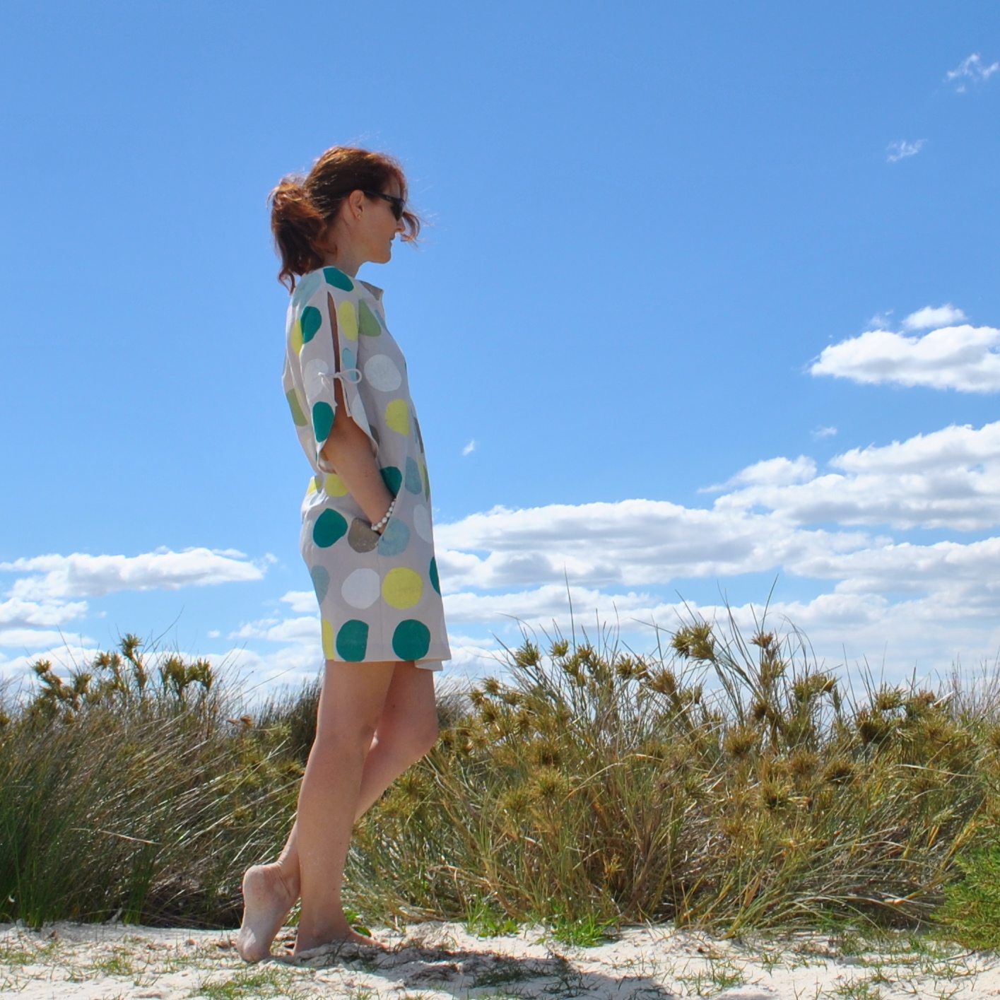
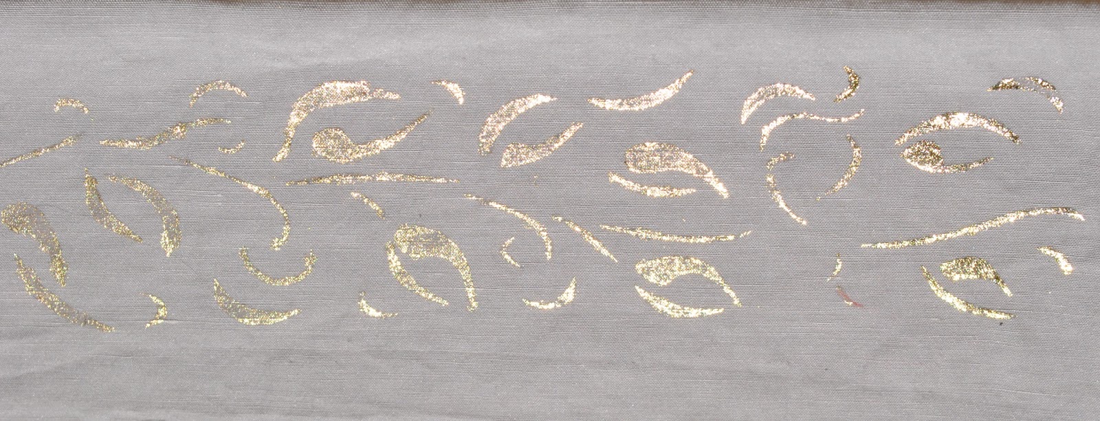
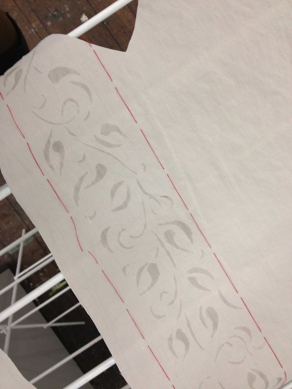
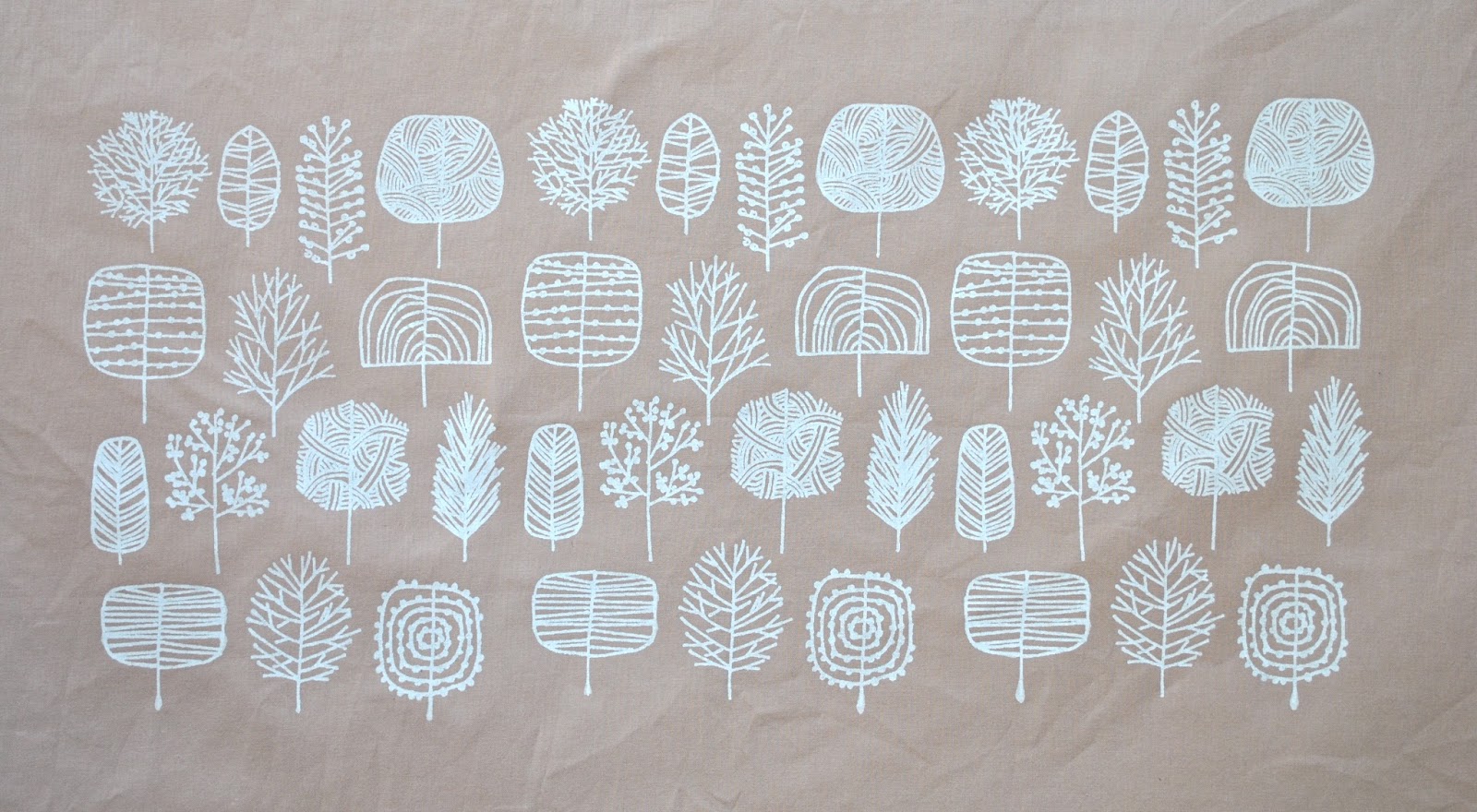
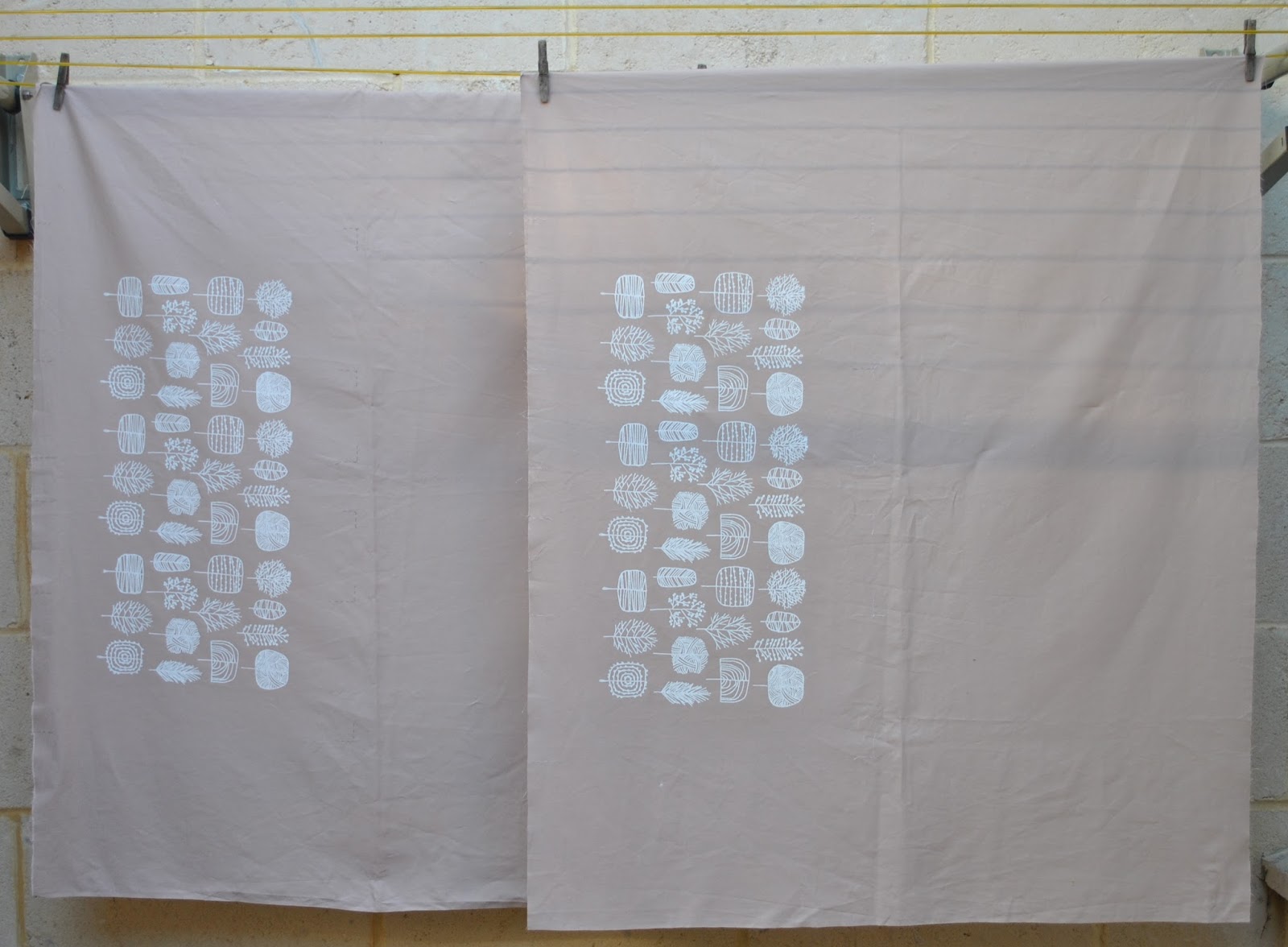
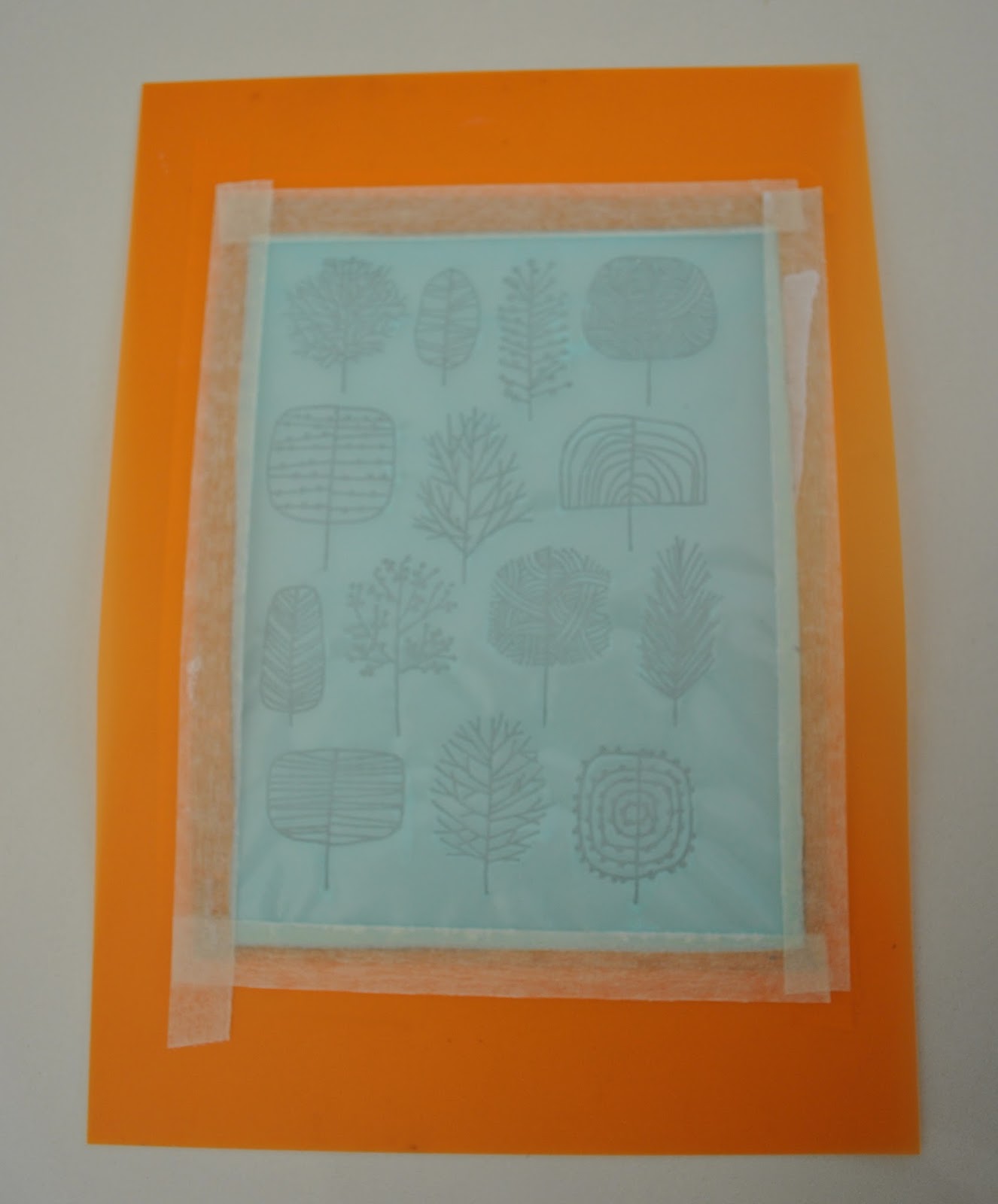
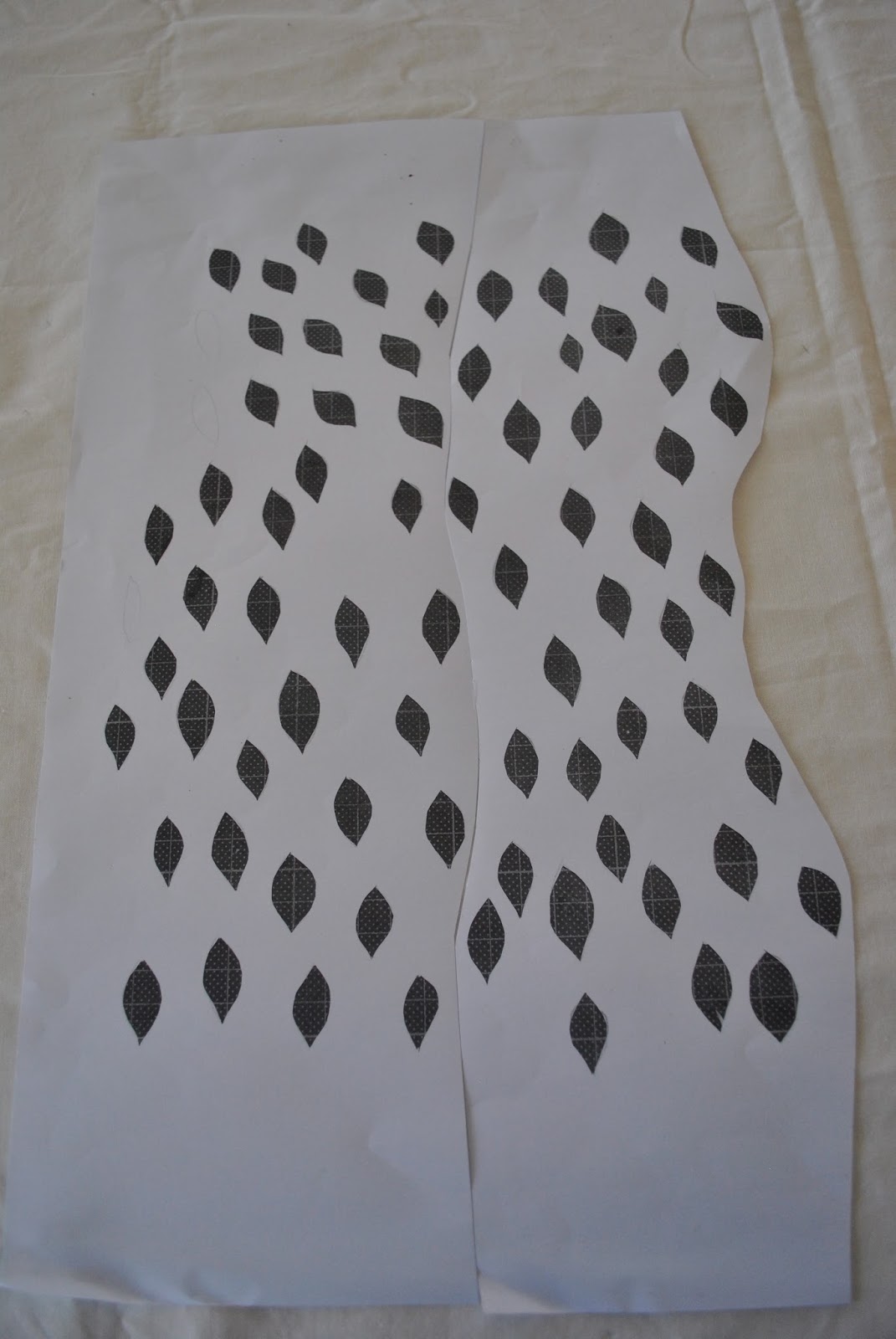
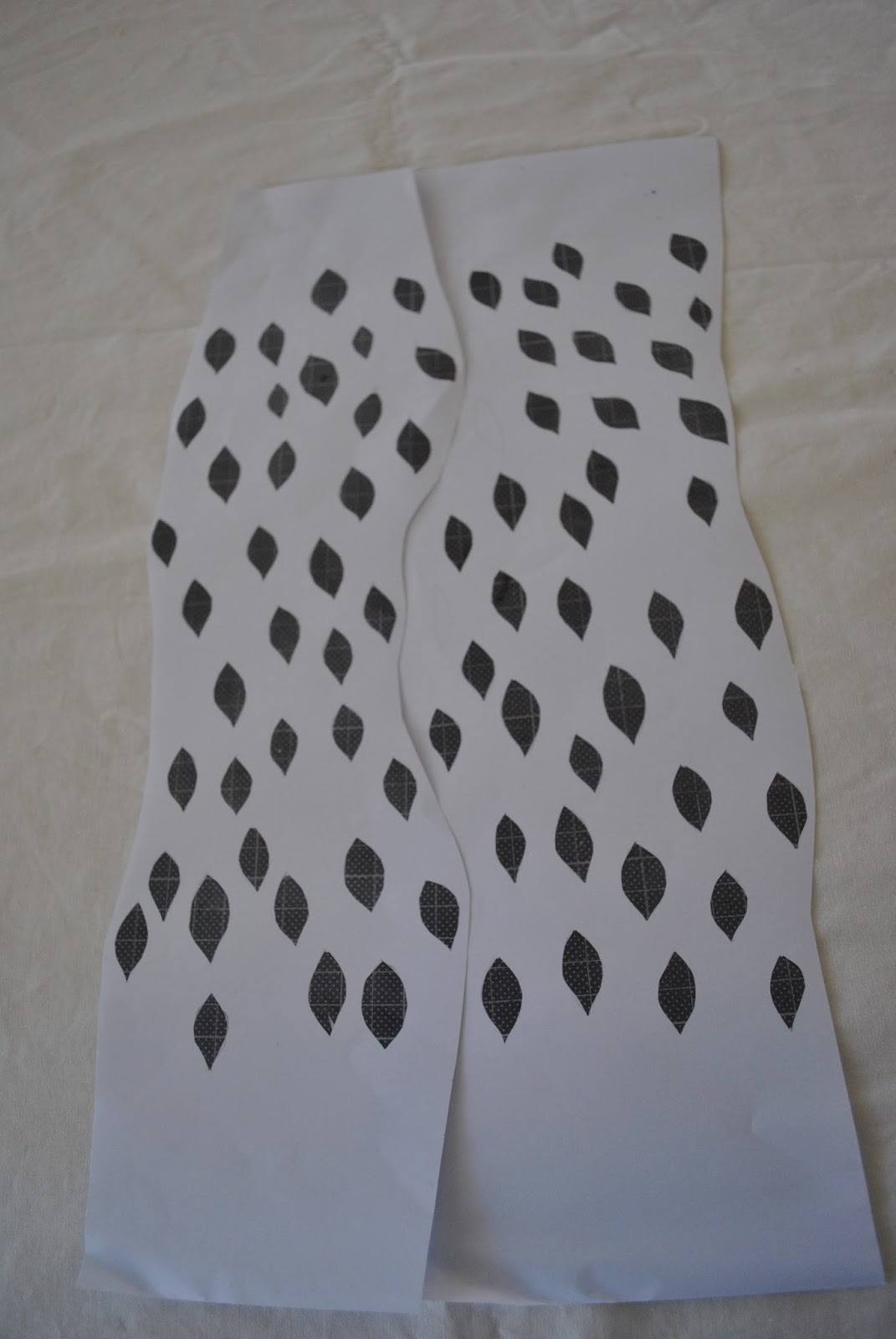
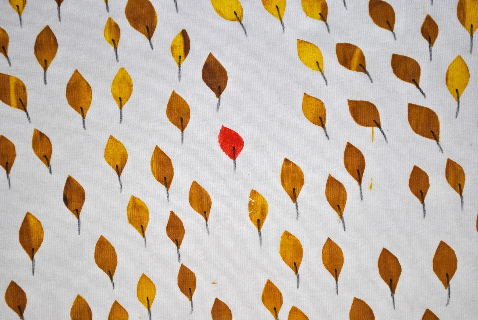
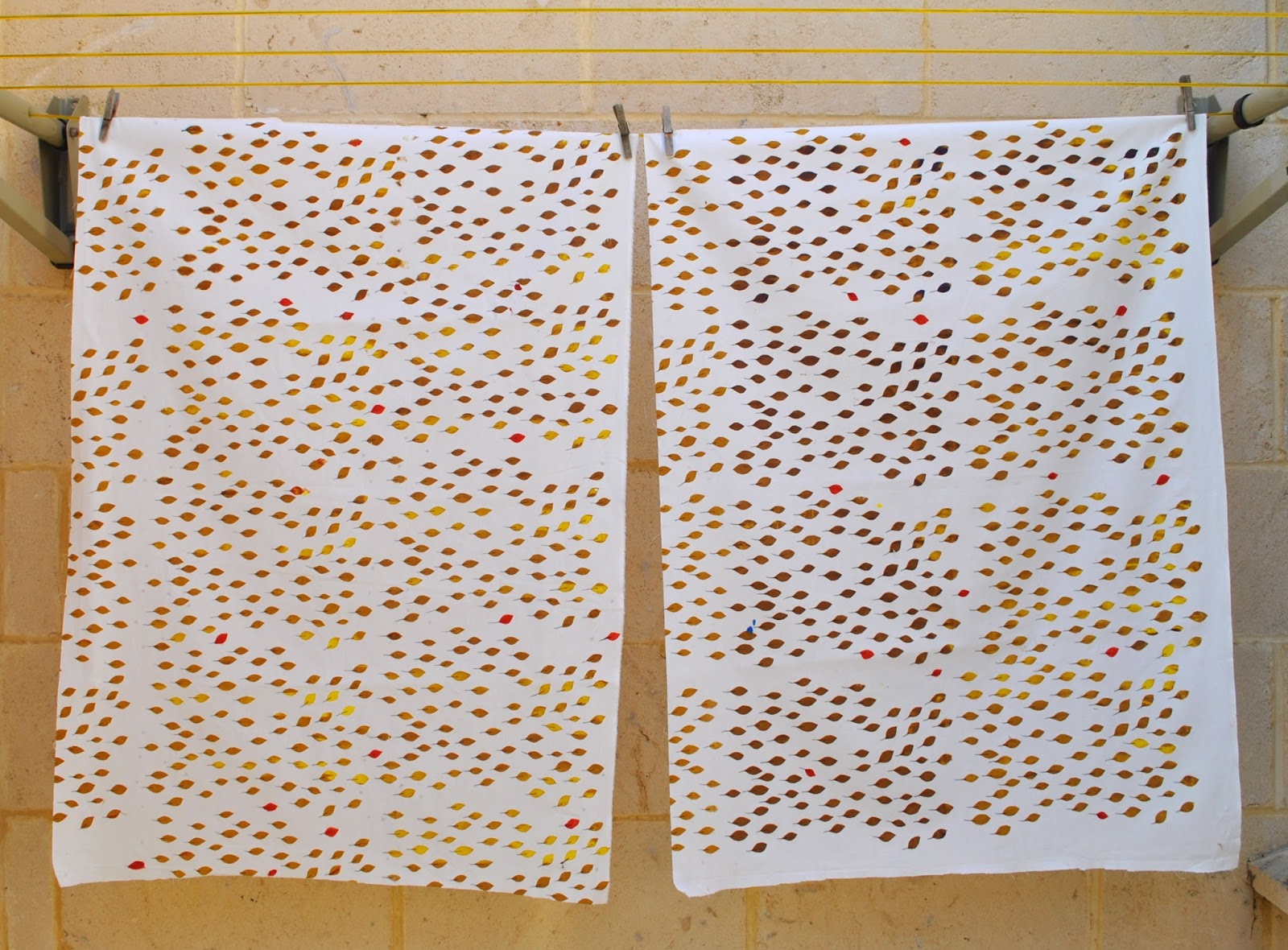
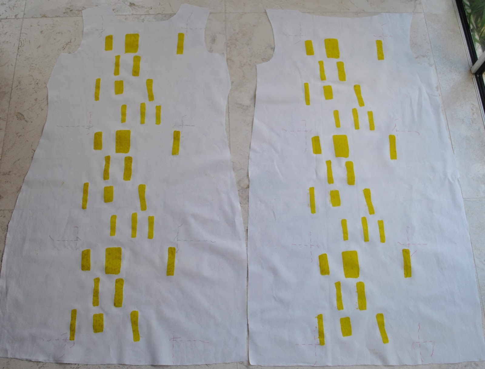
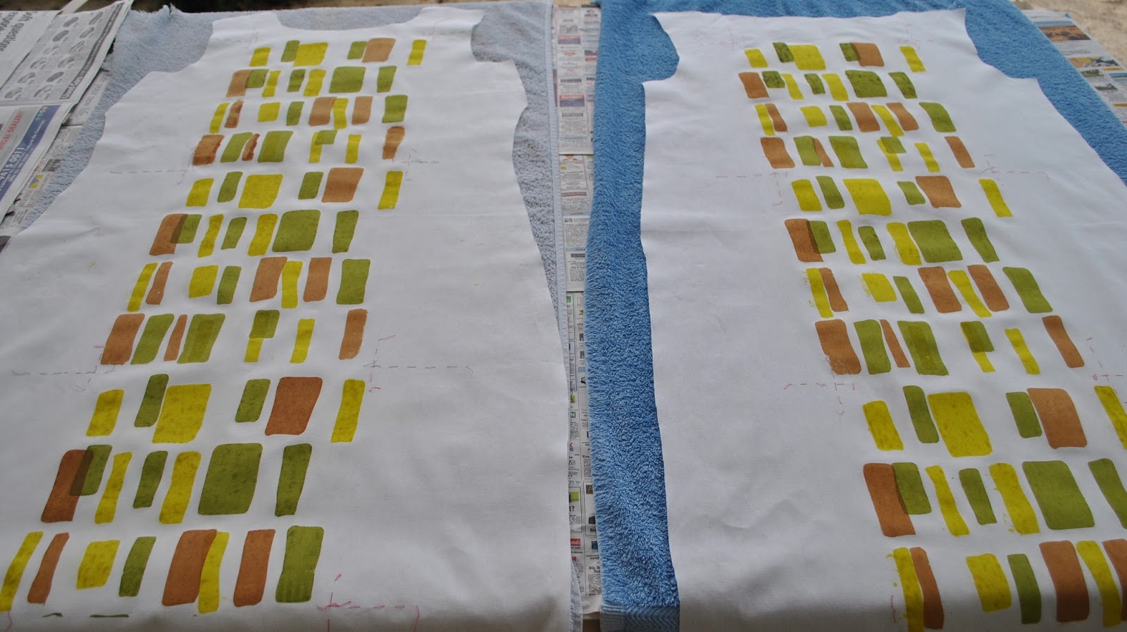
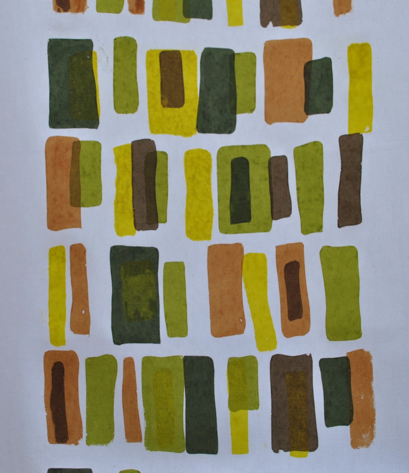
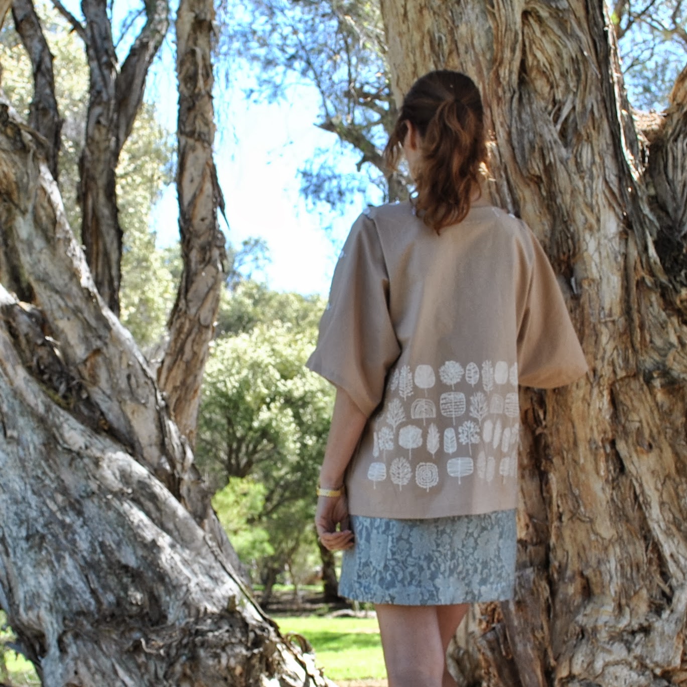
Top; my own design, coffee cotton broadcloth, screen-printed by me with little white trees here
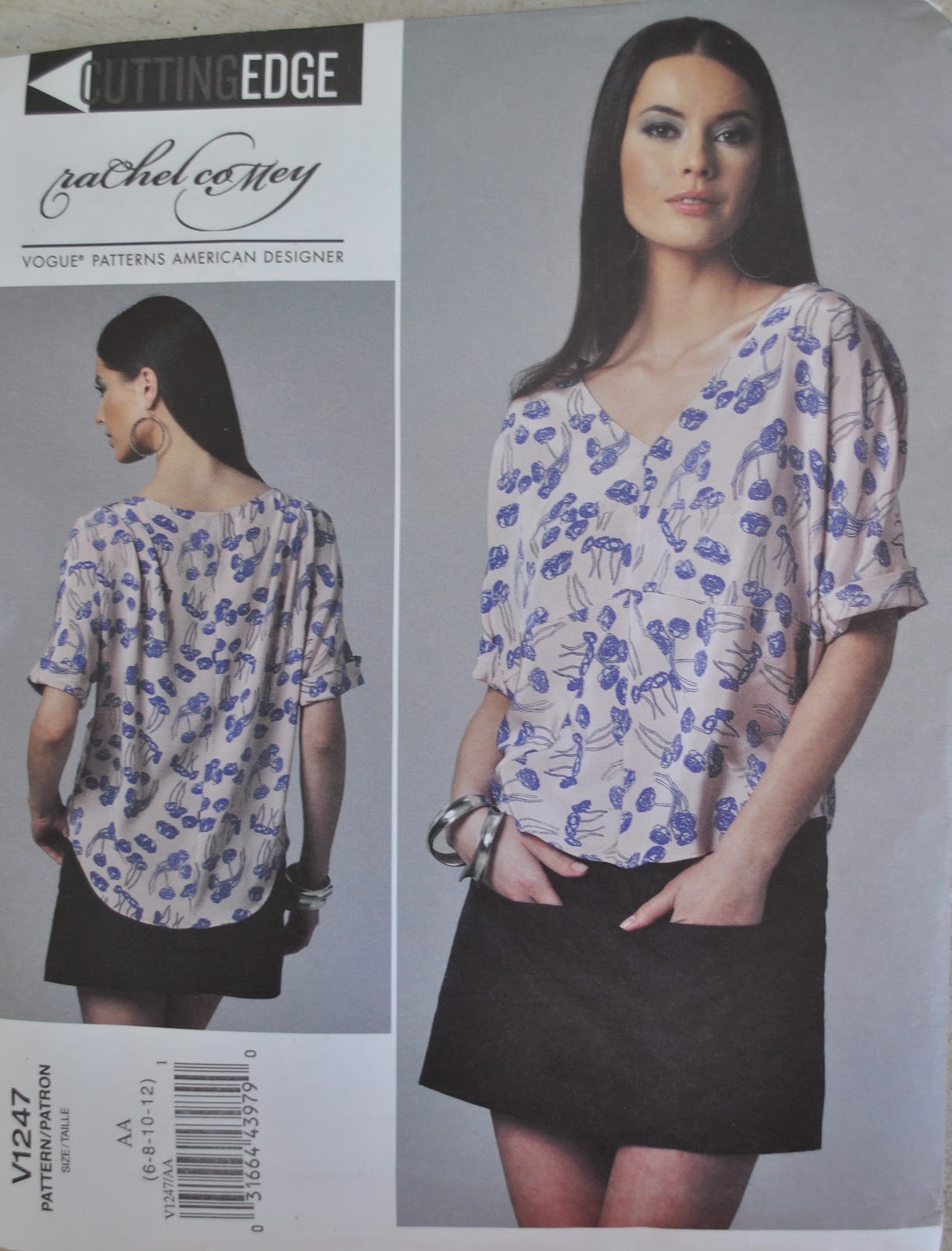
Skirt; Vogue 1247, blue damask, details here and my review of this pattern here
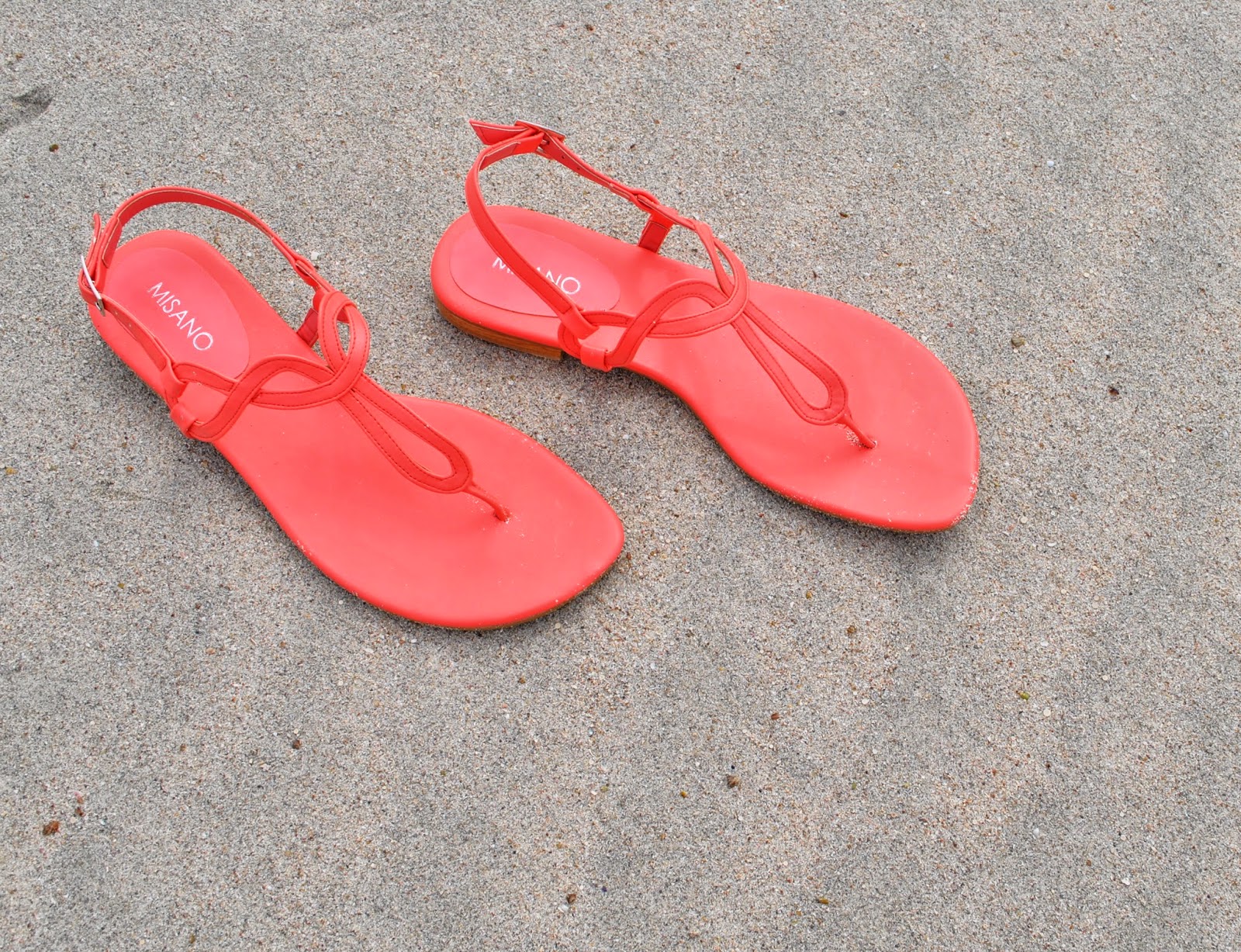
Sandals; c/o Misano

LATER EDIT:
this tee has received a bit of a makeover! Basically I hadn’t worn it in over a year, so I gave it a rejuvenating dunk in a pink dye bath… voila!!!  I love it all over again and it’s back in rotation…. yay!!!
wearing it with:
pinterestmail

Sandy top with gold bits

OK, so I’ve made a top.  Simple, fairly plain, unexciting even? but I’m totally happy with it anyway.  Hard to see in the photo above, but the front and back neckbands have little golden swirls, twirling and tumbling sinuously around it.  Screen-printed by me!
The neckbands are of pale grey silk/linen from Fabulous Fabrics, and the remainder of the top is made using a pale sand-coloured cotton-linen from Spotlight,  the leftovers from after I cut out the pieces for my giant polka-dot dress.
I used the pattern for top 136B from Burdastyle magazine 07/12.  Sam gave this mag to me for Christmas last year, but this is the very first thing I’ve made from it  (oops!)  No matter, I reckon Burdastyle patterns never really go outta style  🙂  When planning my top I knew exactly what I wanted; a pull-over loose top with a big wide neckband for screen-printing, and either a wrap-front or something to define the waist.  I searched through, only like every single one of my patterns, the lines of this one leapt out as pretty close to the vision I had in my head.

Technical blah-dy blah: I have to confess that while stylistically the design was perfect, technically it was far from a perfect fabric/pattern match: the pattern was designed to be tight for stretch knits and came graded for Plus sizes 44-52 only; and I wanted “loose” in a woven and I generally go with a 38.  But I reckoned it could work; those factors have the opposite effect to each other so it’s like they cancel each other out right?  It was worth a try, anyway.  I’ve never let fabric inappropriateness get in the way of my creative vision! and was pretty sure it would be OK.  
I traced a size 44 and just cut my pieces with quite big seams allowances, plus a touch extra at three areas just in case: the underarm points on the front and back, around the widest part of the sleeves, and with extra width at the hips; essentially, the places where you might expect extra ease would be required.  Basted the pieces together and tried it on, ensuring the raglan seams matched the notches on the neckband pieces as a set-in-stone point of reference and just made a few little adjustments in and out and here and there to some seams.  I reckon it turned out OK!
The waist ties are meant to be attached inside the centre neckband seam, from the top to the bottom of the seam, which means that not only would it have covered up part of my print, but when you wrap it around your waist it would have dragged the V-neck right down, thus rendering it a very cleavage-tastic top indeed.  How it is, is quite cleavage-y enough for me already, thanks!  Burdastyle’s coy description is “Impossible to ignore!”   Ahem, so I sewed mine on further down, only just covering the very lowest tip of the neckband.

The neckline is a flatteringly wide portrait neckline, which means that my bra straps are showing.  But I’m cool with that, since I just happen to have a bra with straps that just about perfectly colour-match this top.  Now is that good wardrobe planning, or what?!  I reckon they just look like little camisole straps.

And; I have a pair of new flat sandals for summer!  these gorgeous cheerful bright coral sandals are going to pep up my wardrobe so nicely!  They are practically neon!

Details:
Top; Burdastyle magazine 07/2012, 136B modified, with neckband screen-printed by me here
Skirt; Vogue 1247 modified, ivory curtaining fabric, details here and my review of this pattern here
Sandals; c/o Misano

pinterestmail

Beachy polka dots dress


So, we had some purr-fectly dee-lightful weather last Monday, allowing me to wear, and take some piccies of, my dress. The product of my giant beachy polka dots fabric, screen-printed by moi.  Um, I’m completely satisfied with how it turned out.  And I can think of nothing further to add.  Not like me, I know  😉

OK, just a few things.  
I used the pattern for dress F from the Stylish Dress Book by Yushiko Tsukiori, chosen because I wanted an almost featureless tunic dress, with no darts and minimal shaping to interfere with my print, but still had a certain je ne sais quoi.  This design, with a short neckline split and two piece open sleeves with a discreet but pretty little ribbon to tie them closed, was exactly what I wanted.  I cut out all the pieces before printing and sized my print to fit the pieces.

A stylistically simple design, like my stylistically simple print.  I added the obligatory-to-me pockets, ahem; deep inseam ones.  These are cut from the same sand-coloured cotton/linen fabric as the dress, but unprinted obviously.  The same goes for the bias-cut sleeve ties, and bias neckline finish and the neck facing.  There are advantages to printing your own; you can leave it off all the “invisible” bits of your dress, and that is a vast improvement… nothing to show through!

It’s been a thoroughly satisfying project in that the result truly matches my vision.  I’m going to really enjoy wearing it.  
The creativity demon inside has been sated… for now  🙂
pinterestmail

Screen-printing: golden curls

 We had our last screen-printing class (sad face)   I’m going to miss heading out to class!  Anyhow, since I feel up to doing regular screen-printing on my own at home I had decided to try out a couple of the less usual techniques; so, foiling…

I put a lot of thought into marking the placement of my design … and came up with the following idea; those straight cut-out lines on either side of my stencil were masked with clear, see-through sticky tape, and are intended to be a sort of “window” through which I was hoping to see the lines of red tacking stitches, in order to put the screen down as accurately as possible.  Of course, you could just put the screen down on a large piece, print with a wide margin all around, and then cut out your pieces afterwards, but I had only exactly just enough of this pale grey silk/linen for my pieces and needed to be as fabric economical as possible.  This approach worked beautifully! and I would definitely do this again if I wanted to print a border design like this.

 Ta da!  the foiling glue actually looked pretty cool all by itself on the fabric, subtle and rustic in a tone-on-tone way like ancient stone carvings or something, and I was tempted to leave it like this!  But nothing ventured, nothing gained, or let’s hope so anyway…

…and Eureka!

I tried in places to achieve a very subtle mix of shades, but mostly went for gold.  I only wear gold.  She says, all la-di-da like.

I quite liked my design, and how it turned out, but the foiling glue is trickier and even messier than regular fabric paint, if you can imagine! so I’m not sure if I would do this technique again.  The glue is like a close relative of epoxy, and if you make the mistake of getting any on your fingers it rapidly turns into a tenacious tacky stain and nothing short of Gumption will get it off.  No kidding!
Below should give an idea of how I’m going to use these pieces, when I get around to it.  Sometime, soon.
I’m really going to have to get cracking on the sewing machine  🙂 
pinterestmail

Screen-printing: giant beachy polka dots

My latest screen-printing project  🙂
Searching for design inspiration, I randomly set myself a theme.  The beach!  I sketched out several ideas and variations, some abstract some more literal, and spent ages agonising over which one I should do… aaargh, so indecisive!!  Eventually settled on this very simple and abstract one, obviously! since we are really pushed for time and space in our class and it’s best not to to turn up with very ambitious ideas.  I had to finish this one at home since I only managed to get halfway through in class.  But I am seriously considering setting up at home to print at least one of my other beach-related ideas too.
I used a lovely lightweight cotton/linen from Spotlight, in a soft sandy shade.  This is probably the nicest, classiest fabric I have printed so far.  It was scary, but I felt ready to take a risk.
The colour palette (6 colours) :

The dots are all printed using the same imperfect circle template, but oriented different ways so they don’t look identical to each other.
Funny moment; my friend J, with whom I am doing the class, on seeing my stencil “um, it’s a hole?”
When printing I tried to vary the visual texture of the dots; at times I did a scanty pull, to get scratchy dots, at other times I put together blobs of slightly different shades of the colours without mixing properly, to get streaked or blotchy dots.

Before class, I cut out all my pattern pieces and tacked an accurate 11cmx11cm grid all over each piece.  When printing the dots I placed the screen just slightly off every now and again, because I like how a little imperfection makes the design look more casual and fun.  Plus, wonky designs are the beginner screen-printer’s best friend!!

The whole shebang…

Thoughts: I am super happy with how the print turned out! and am pretty excited to see how the final garment will look.  I’m motivated to sew it up quickly, because my teacher specifically asked me to show it at our next class.. which will be our last!  Yes, I’m a little sad that my weekly class is going to end, but this isn’t going to be the end of my screen-printing adventures, that’s for sure!

pinterestmail

Screen-printing; white trees

A very simple little print, but finally one with which I am satisfied… maybe because this design is not my own?! This is a design by Eloise Renouf, which I re-drew free-hand to improve the resolution for a screenprint.  I
LOVE her designs; and they strongly remind me of the Figgjo crockery that our family used every day while I was growing up.  Such stylised naive interpretations of nature really inform my own tastes to this day I think.  I’m plunged straight back into my childhood whenever I look at them  🙂
As
well as the pretty design, my execution went sooo well this time too.  No boo-boos!  The print is very simple, which helped a lot!
just one colour, with three repeats each on two pieces of fabric.
 The fabric is lightweight, cafe au lait cotton broadcloth from Spotlight.
I
was super careful about marking for the repeats this time; I went down the same path as for the murky blocks design and tacked thread-lines at the corners of
each screen placement, and this paid off big-tiiime! with very easy and stress free placement.  It may take a bit of
extra time and planning, but doing this is well worth the effort and I will not
ever ever shirk doing this properly ever again.  With my previous design, the autumn leaves, I was really pushed
for time in the class and just quickly marked the corners with lightly pencilled-in crosses, but
this was a pretty lazy and slapdash method really. 
The sameness of them, and the proximity of different crosses for
different placements to each other was confusing and I was a bit disappointed
with how the registration turned out.  Note to
self: do NOT try to save time on marking the placement spots.  In fact, spend the MOST time on this bit.  Srsly!!!
Unlike
my previous stencils, which have all been paper stencils hand-cut by moi with a
craft knife, this time my drawing was scanned and transferred to a permanent
bonded stencil. The advantages of this are obvious; it can be used over and over and lasts almost indefinitely, depending how well you look after it, and design-wise you can dispense with the bridges needed to join all the negative spaces in your design so they don’t fall off.  Also the stencil and screen are all in
one, bonded together, so you don’t even need a separate screen.  
Downside; it costs more.
It’s
probably pretty easy to see that my print is a border.  A border for a mysterious… something, hehehe.  Something summery, of course!  I do have a plan…. which will appear here soon, when I can
get around to both making it, and then wearing it, and photographing it.  Lately, I’ve been zooming along supersonically with the first task on that list, and lagging behind with the
third… since I have a little queue of finished new spring projects just waiting to be worn and pictured.
pinterestmail

Screen-printing; autumn leaves

Hello! been screen-printing some more  🙂
btw, Shelley and Ute asked about the ink and colour-fastness of; we are using Permaset Aqua Textile Printing Ink, you can read about it, search for stockists and buy online here.  I got some at Jacksons art suppliers.  wrt colour-fastness I am veeeeery pleased to report that I have laundered my Poppies set and it came out as fresh and clean and bright as when it was first printed… phew!  (wipes sweat from brow)  I had this horrible feeling that I was going to pull an all-over pink and poppy-less set of lingerie from the washing machine, but no, this ink is marvellous stuff!  so yeah, my experience is that if you follow the instructions on the jar and iron like mad, then happy, print-y laundering will ensue.
But back to the current project…
This time I printed two large-ish pieces of fabric, and tried to make a random repeating print, one that had an interlocking-overlapping design so that repeat prints looked more organically seamless and less obvious where the design started and finished with each one.  My teacher photocopied my design to show me how you can cut it up the middle and place the sides back on themselves to see how the design needs to be altered so that it fits in visually.

Also, because I wanted my leaves to be an autumnal colour range as opposed to one single solid colour, I did not mix anything but instead plopped blobs of colour along the top of the screen and just allowed them to mix and marble together however they wanted during the screening.  I started with blobs of Mid Yellow and Purple, which eventually with repeat screenings became a kind of olive, which I re-used and kept adding new little blobs of yellow and purple to it at the top of the screen randomly.  More yellow got into the mix than purple because I wanted the leaves to “glow”, and loved how the streaks of yellow accentuated this effect.
I had to cut two identical paper stencils because I did it in two lots, the first length of fabric in class and the second at home.  My second effort (at left in the picture below) clearly has a much better alignment! haha hardly surprising, that!  and this time, remembering the difficulties I had with cutting pattern pieces from my poppies print, I tried as much as possible to print right up to and over the edges of my fabric pieces.
Something I forgot to mention in my murky blocks post but have found indispensible!! is to draw a large arrow on the back side of the stencil, indicating “this side up” of course!  With designs like mine which are abstract but still directional, having this has saved me several times from making a terrible mistake…

Once both lengths had dried it looked a little dull and I fancied the idea of a random red leaf here and there, both for visual interest as well as to fill in some gaps.  I didn’t use the screen, but just cut a single-leaf stencil from thickish paper and sort of “sploodged” with a small amount of ink on the end of a paintbrush to fill it in.  Because the paper degrades and starts to bleed quickly, I only used each one about three or four times each before needing to cut a new one.  This colour is the leftover, so the same as, my poppies print.

Once all this had dried, I went over with a Sharpie laundry marker and hand-added the leaf stalks in later.
(and, you can see in my first photo, some little pencilled-in crosses between the leaves? these are my alignment guides and will wash out, no worries  🙂

Thoughts:
Not fabulous but getting… somewhere?!  Has some disastrous spots, but overall I eventually wrangled it into something I like.  I already know how I’m going to use it!  Since I’m less happy with this than with my murky block print then paradoxically I will feel less angst-y about slicing into it and sewing it up first… if that makes any sense.  No, I know it doesn’t.  I’m intimidated by fabrics I love more, so am more likely NOT to use them through weird feelings of inadequacy that I can’t do them justice… pretty silly, huh?
Anyway this will get made up quickly… stay tuned!

pinterestmail

Screen-printing: murky blocks

Well … screen-printing, whoar!  You guys.  I’m totally sucked in.  Somebody stop me!
So yesterday everyone was out except for me … but I had fabric.   I had a design and paint and I had a screen.  I had a big outdoor table, all to myself.
I hopped straight into it.
Luckily I had cooked a massive pot of soup in the morning because I was pooped by the end of the day!
So, this is a five colour design, with two sets of two and three quarters pattern repeats spread over two pieces of fabric.

The fabric is an ivory cotton from Homecraft Textiles.  It is quite tightly woven, crisp and stiff, but it’s not too bad with a quality like a coupla steps up from calico.
I started out by cutting a roughish dress outline, using my tried and true sheath dress pattern Burda 8511, I did this mostly to gauge out the size of the design, how it would look proportionally on a dress.

My design is one that is very forgiving to wonky alignment, even so I think my registration is improving; this time I spent a lot of time carefully measuring and marking key placement spots.  I tacked crosses at the border junctions of each repeat and marked the fabric with pins at the corner points for the screen for each repeat.  I was intentionally going for a more random appearance this time, so with each repeat I purposely moved the screen just a tiny bit this way and that way so the pattern would not be too obviously identical from one repeat to the next.
The colours: I’m such a scrooge and was really economical here! I started out with the palest colour and then continued adding to it to make the subsequent colours.  I only have a little bit of the last colour leftover so this approach really did make the most of my paint.

First colour, Mustard (yellow + teensiest touch of black):
I was totally in the zone and forgot to take a picture after the second colour! woops!
The second colour is Olive (the first colour mustard + teensiest touches of blue and black).  I had overestimated quantities here and made a lot of Olive, so divided this to make both the third and fourth colours….
Caramel (the 2nd colour olive + mid red)
Dark Olive (the 2nd colour olive + a touch more black)
lastly Chocolate (the remains of the caramel and dark olive mixed together)

The pattern repeat, although they each vary slightly:

Thoughts:
Far from perfect, but I’m pretty happy with it.  I like the late 60’s/early 70’s vibe it’s giving me.  These are my earliest years so I’m drawn to this time  🙂
Sometimes, my first print after a colour change is terrible and comes out scratchy no matter how carefully I try to flood the screen.  This happened twice during this project, and also happened with my poppy print.  Meaning that statistically speaking, I have a 50% chance of a good first print, subsequent prints seem to go on more easily, smoothly and cleanly.  So to save myself tears, in the future I’m going to have a sacrificial scrap piece of fabric sitting on the side for that pesky first print.
The colours were supposed to be more transparent; I added what seemed to be heaps of transparency medium to the darker colours! but they are just NOT all that transparent.  Disappointed!  Some of the overlaps have masked the underneath colour completely.  I’m going to check with my teacher a good transparency ratio, or maybe the future I should minimise overlapping of motifs.

So eventually this will be a dress, but not yet.  I’m a-pondering it for a while.

With a pensive silence and furrowed brow.

It’s funny how easily we can slice into shop-bought printed fabric without a second thought but when it is your very own precious print, cutting into it is terrifying!
For now I’m embarking on a couple of quickie wardrobe fixer-ups, plus now I’ve done this project at home I have to cut some more stencils before my next class… later, dudes! 🙂

pinterestmail
Switch to mobile version
↓