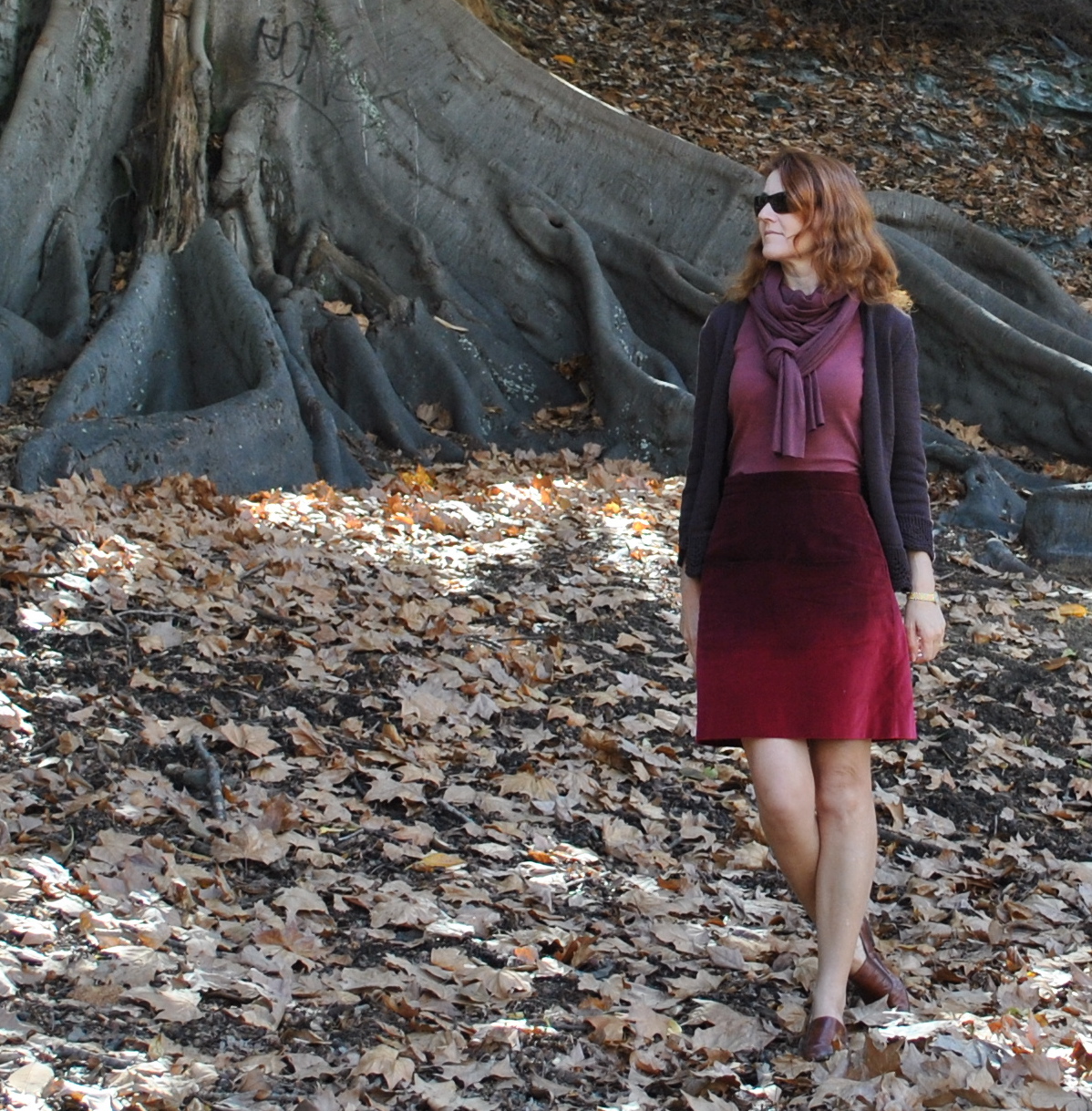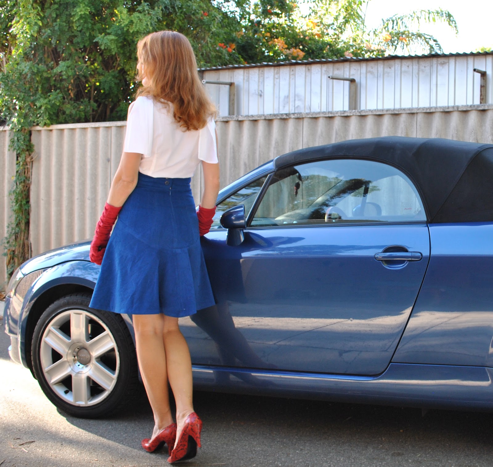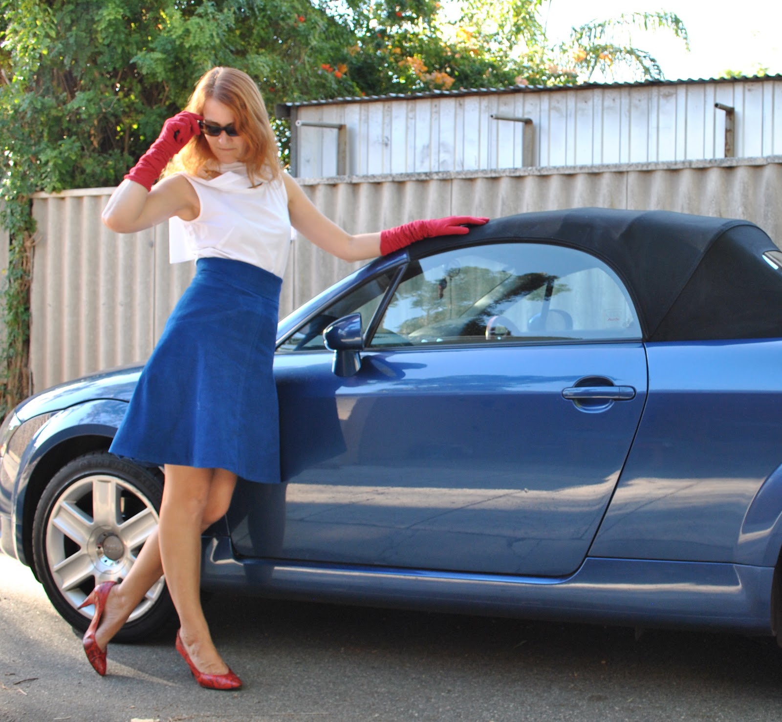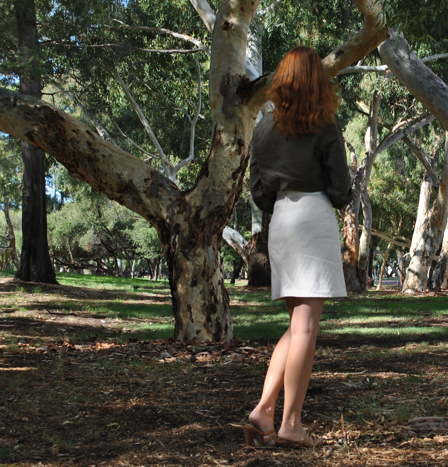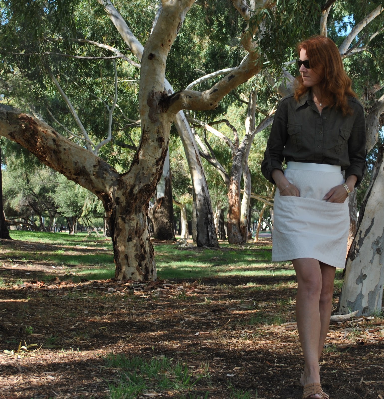
I’ve made another winter skirt. From the tanned hide of that elusive and rare wild beast; the
leatherette. Classy, non?
Hehe, so I’ve made bags and tablecloths using PVC before, pretty simple beginner’s type stuff; but this is the first wearable garment I’ve attempted from this sort of stuff. Phwoar! A first! (self high five)
I spotted this fab leatherette at Fabulous Fabrics, and practically pounced on it. The colour is a pretty awesome colour for winter, no? Sorta grey, sorta brown. Very moi. There was also a marvellous dirty pumpkin colour, which was pretty divine. That one was darn tempting as well. I’ll be honest with you, I dithered. But eventually I had to choose a colour, just one colour, although it was like having to choose between two of my children.
Oh, it also came in black, but that caused no dithering on my part. I was dither-less in the face of black.
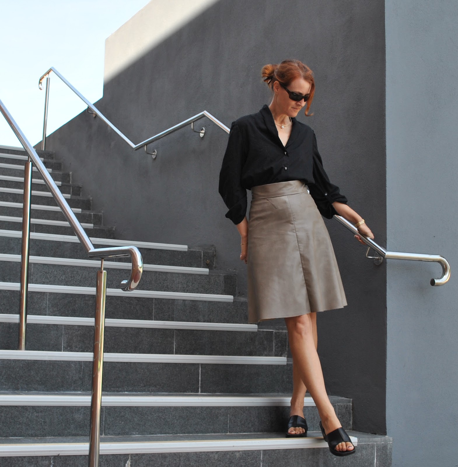
I used the skirt pattern from Vogue 1170. I have made the top from this pattern already,
reviewed here, but this is the first time I have made the skirt.
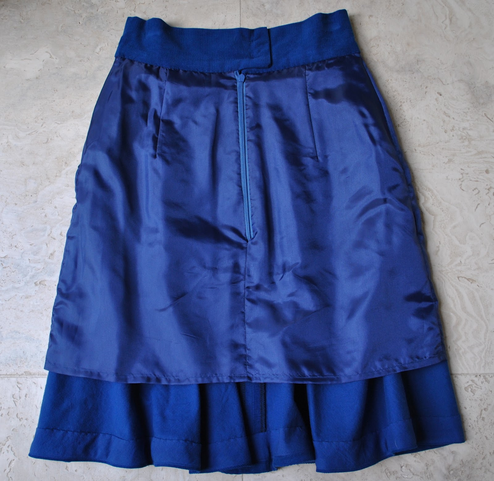
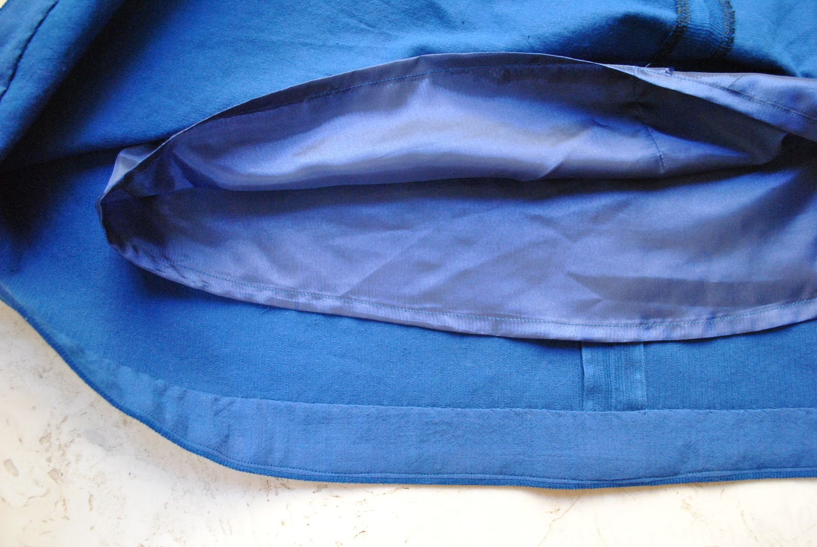
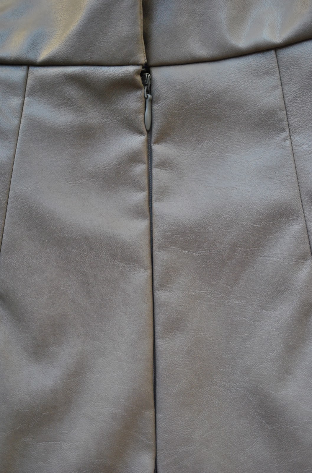
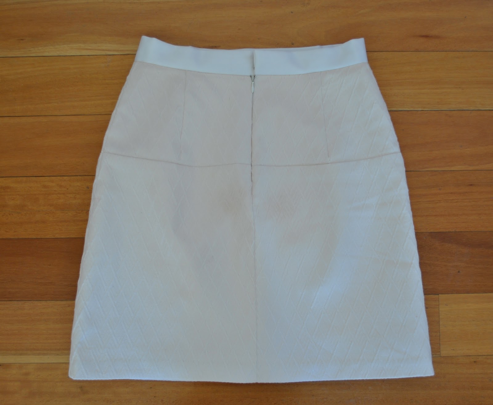
I bound all the raw edges with HongKong binding, as stipulated, and although I did buy lining fabric I opted not to use it. The built-in body and stiffness inherent in this type of coated fabric along with the frictionless texture of the backing stuff means that sticking to tights is not going to be a problem here. The leatherette is surprisingly soft and pliable to wear, although I can tell it is going to take some getting used to. I feel almost Barbarella in this. Modern. A bit suave and sophisticated; a little bit “cool”. Very unlike me 🙂
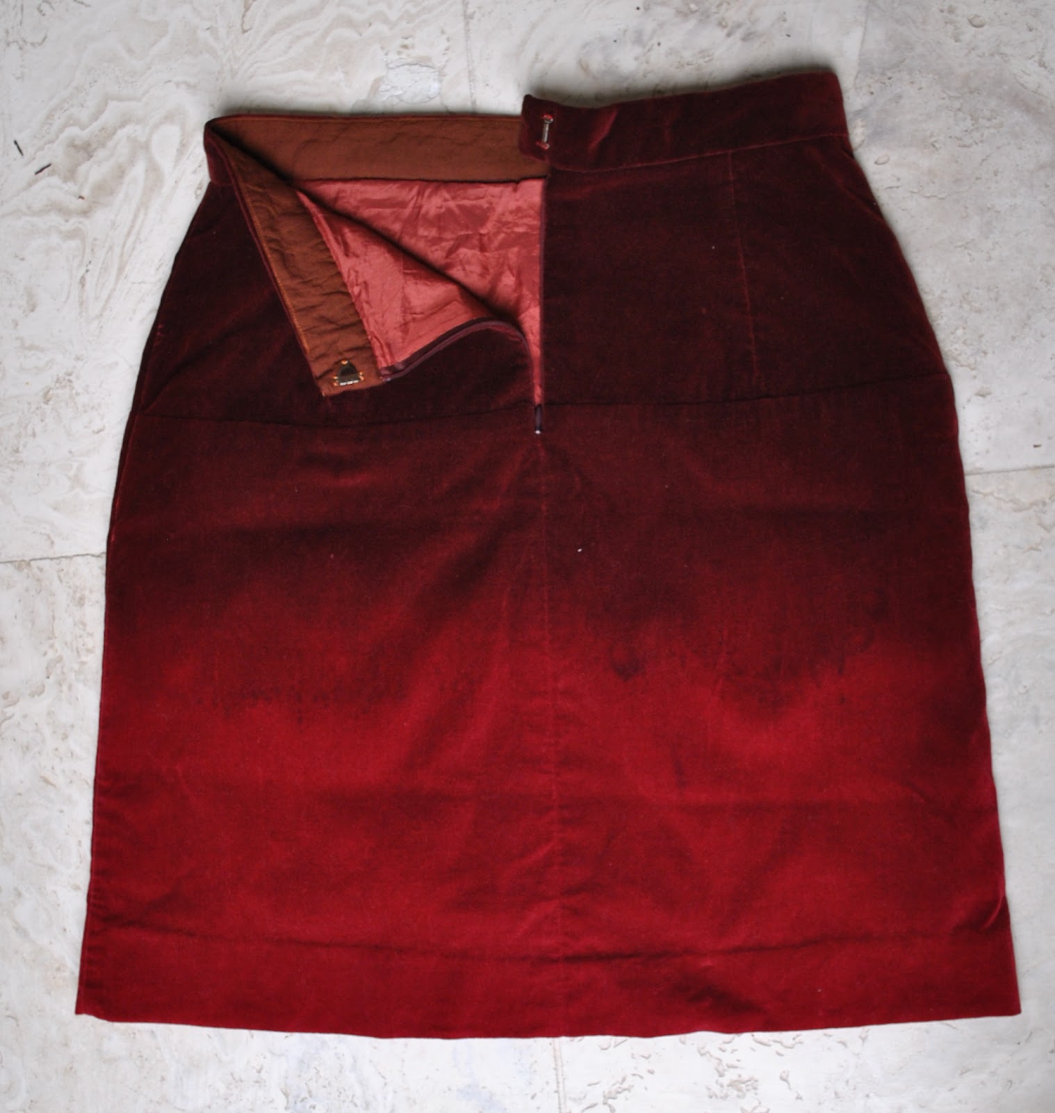
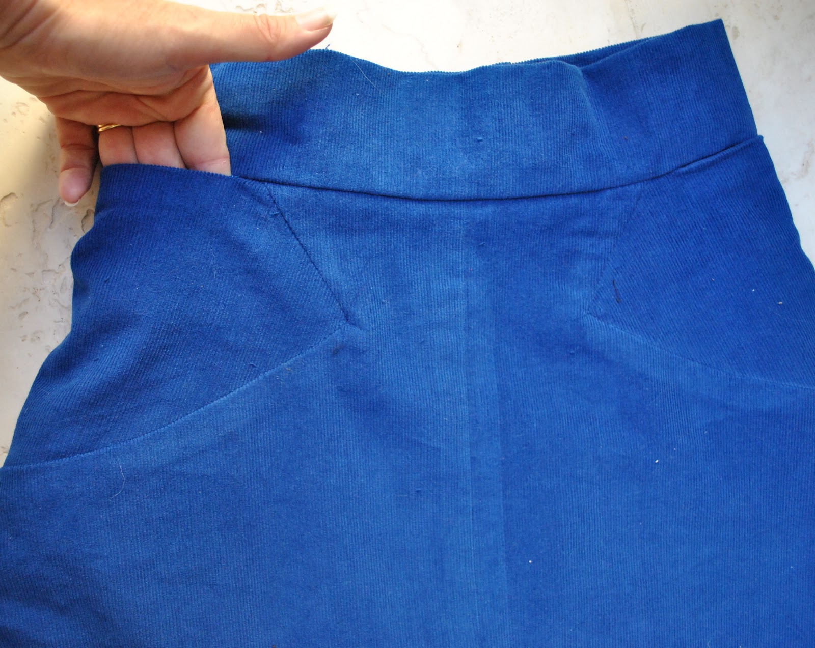
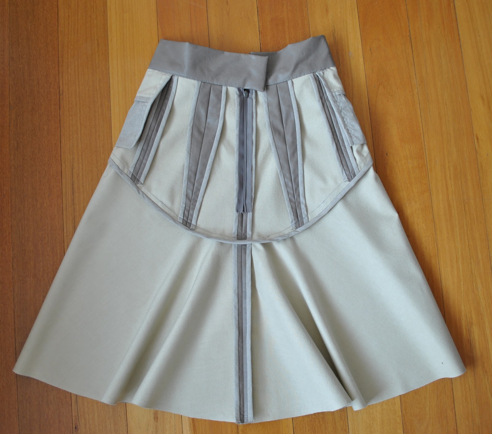
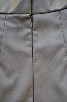
above right; those funny fat seam allowances in the small of the back? That, my friends, is my sway back adjustment 🙂
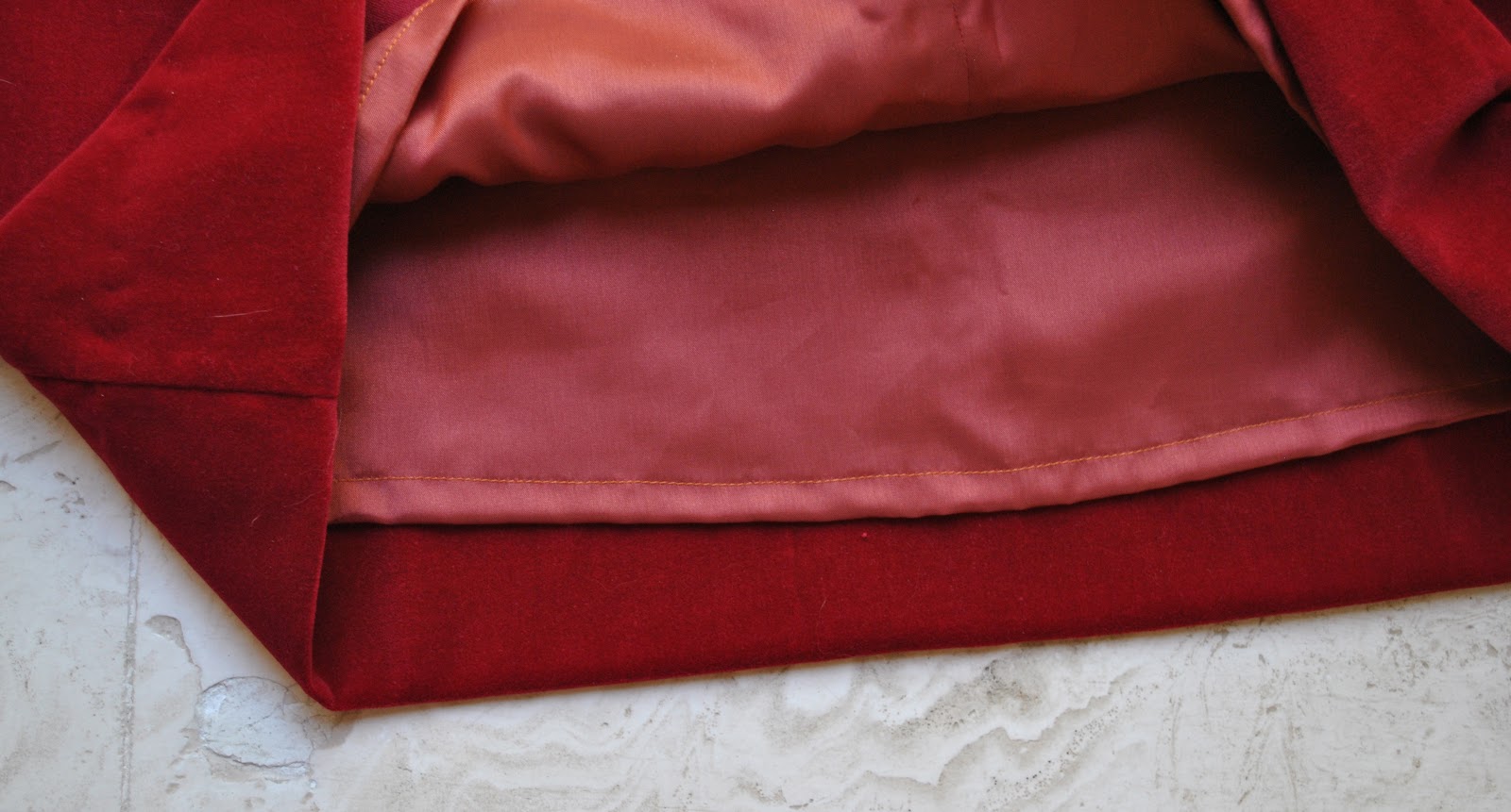
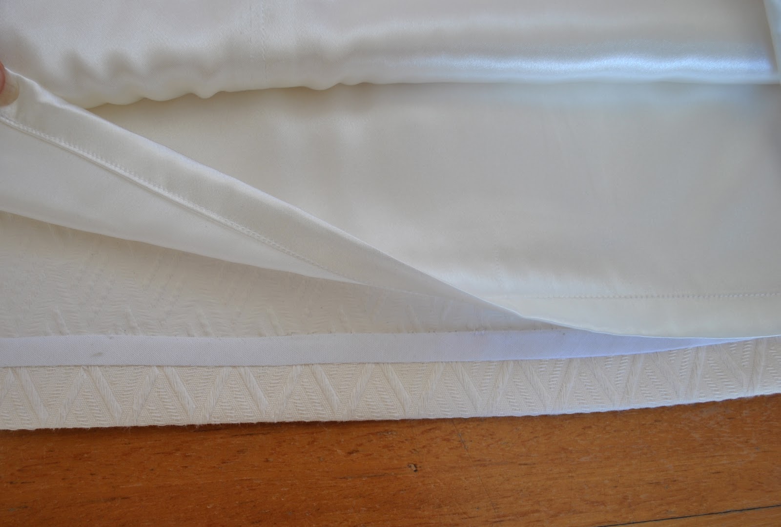
The pattern stipulates a hemline facing, which I did, but it was utterly disastrous in this fabric. With the facing in place the hemline went from previously smooth and free flowing to stiff and awkward and pokey-outy horrible. Finally I decided that the best finish was to have the curved edge trimmed as smoothly as I was capable of, and left raw and un-hemmed. Which is what I did after unpicking the hem stitching, and the under-stitching, and I even rescued the HongKong seaming off the facing also to use for a future project (waste not want not, and all that….) That was a whole heap of painstaking unpicking, I tell you.
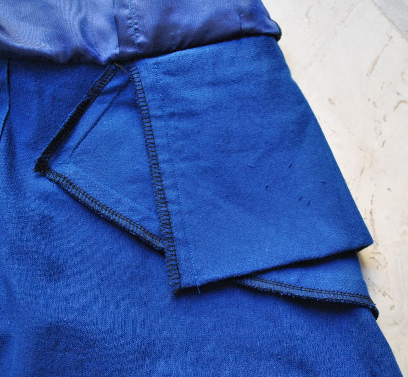
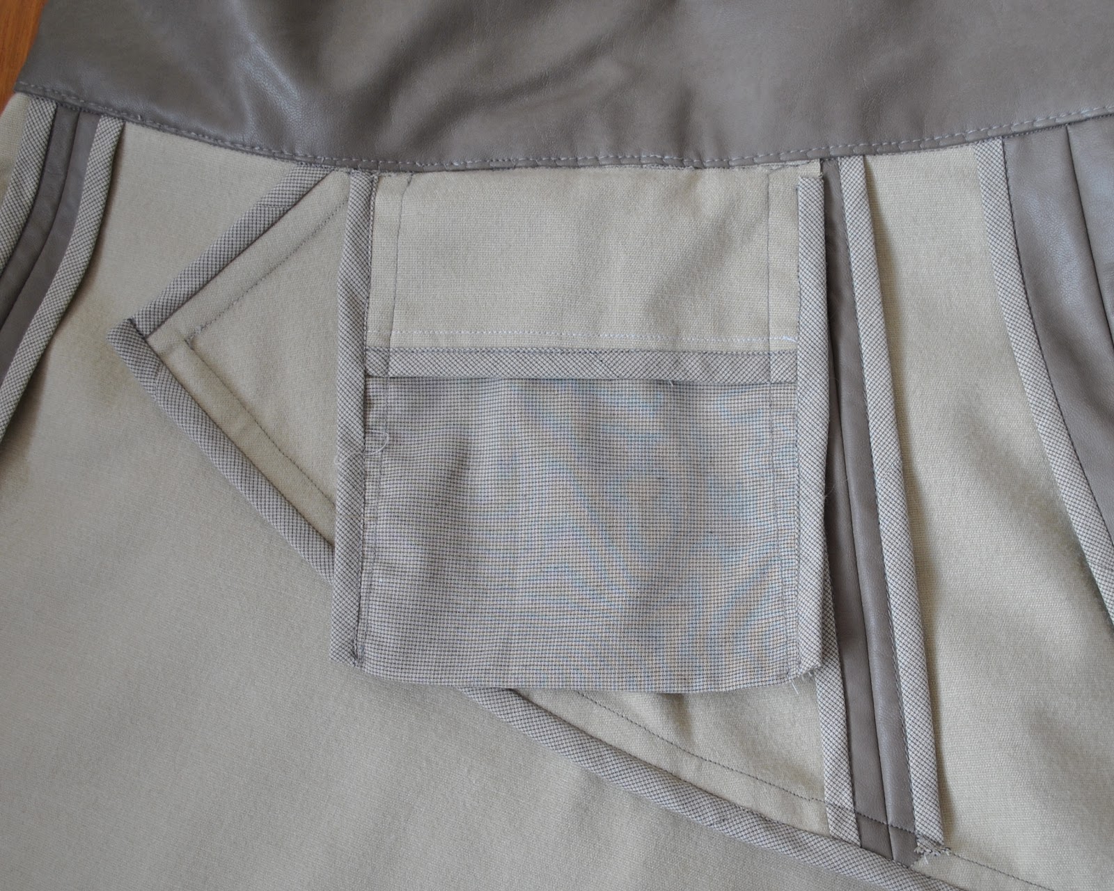
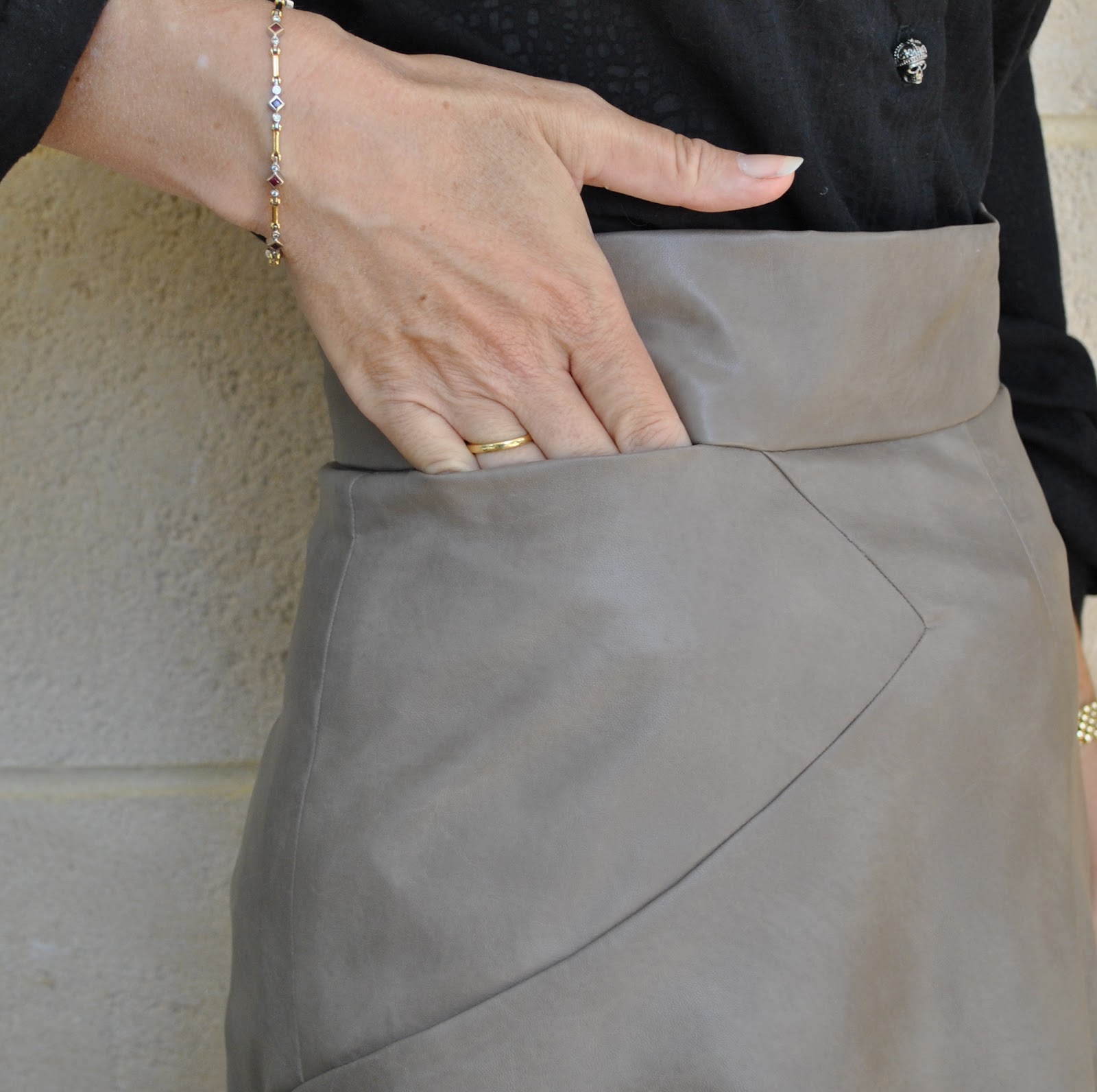
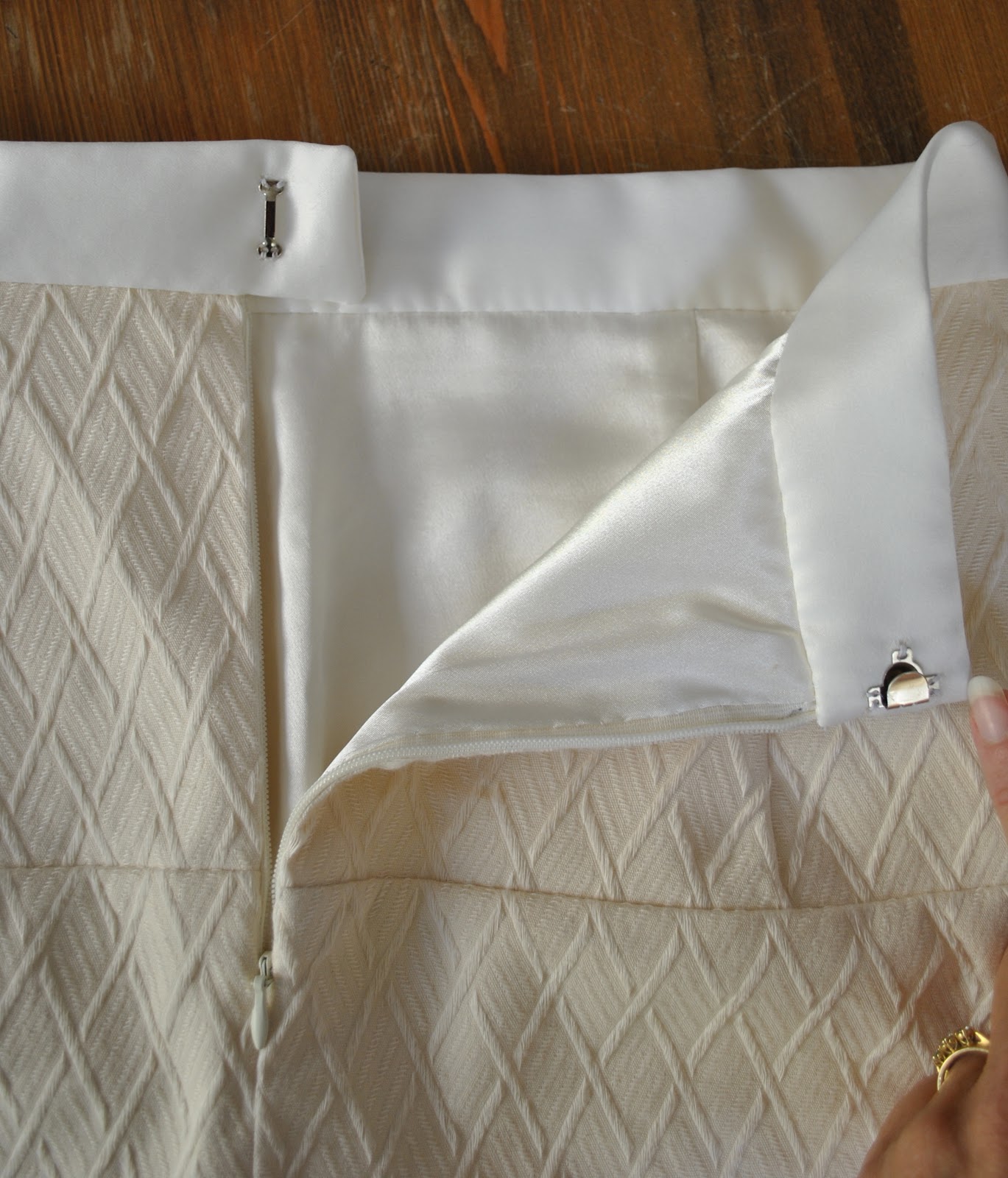
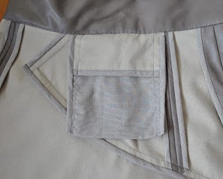
What else… oh, I made the pockets deeper. The pocket was pieced for reduced bulk., so that the pocket facings on the outer edges of the pocket are leatherette and lightweight polycotton forms the bulk of the pocket piece. This polycotton was harvested from one of my old
Pattern Magic muslins and was also used for the HongKong seaming. Unfortunately the placement of the pockets is right on the hipbone, which means that one cannot really use them for anything bulkier than a tissue or a credit card anyway. Just saying. But at least the pockets are there!
Details:
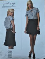
Skirt; Vogue 1170, “leatherette”
Shirt; my own design, using several patterns, of black cotton mix,
details hereShoes; Perrini (I’ve had these for donkey’s years)
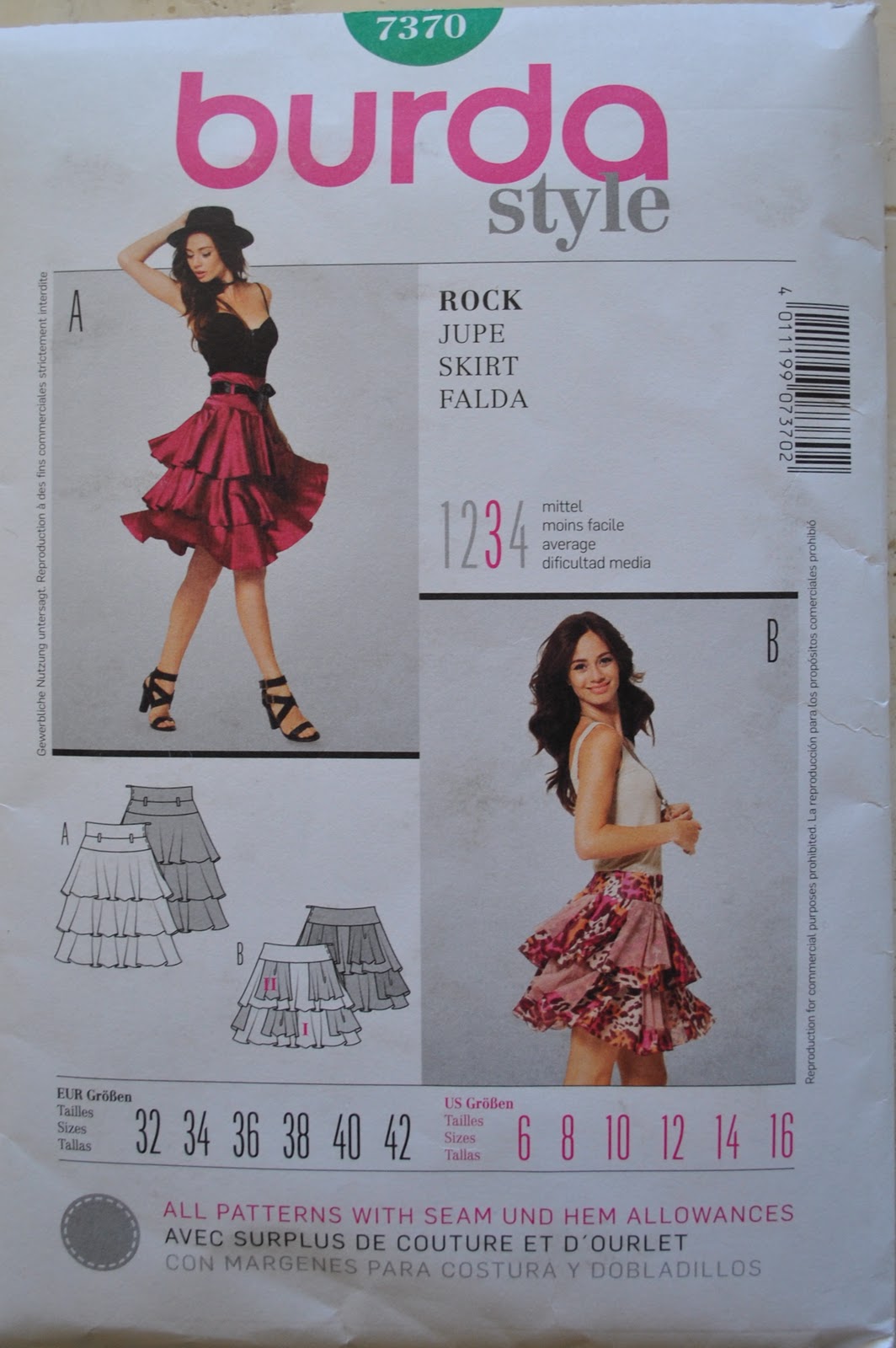
Pattern Description:
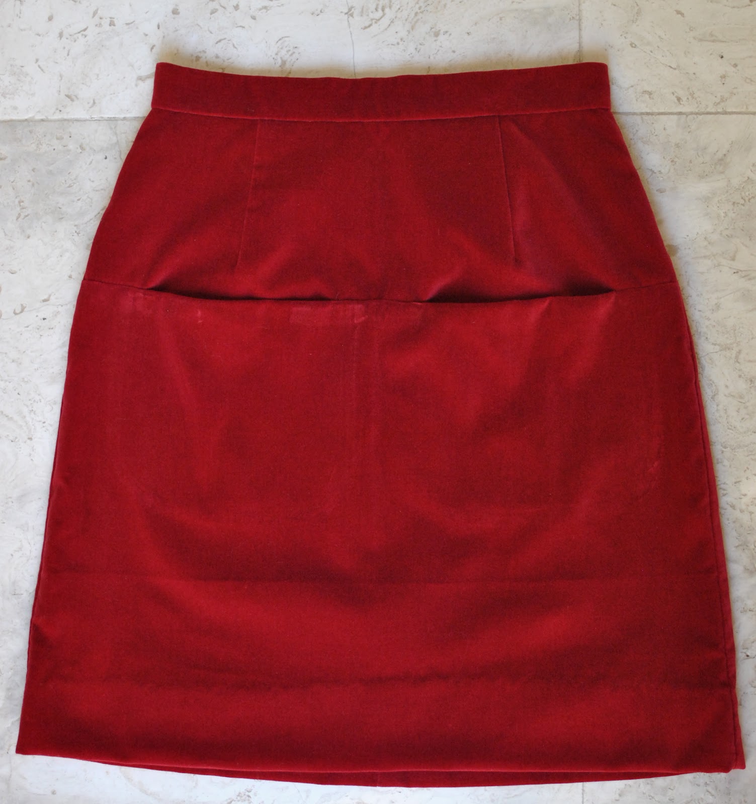
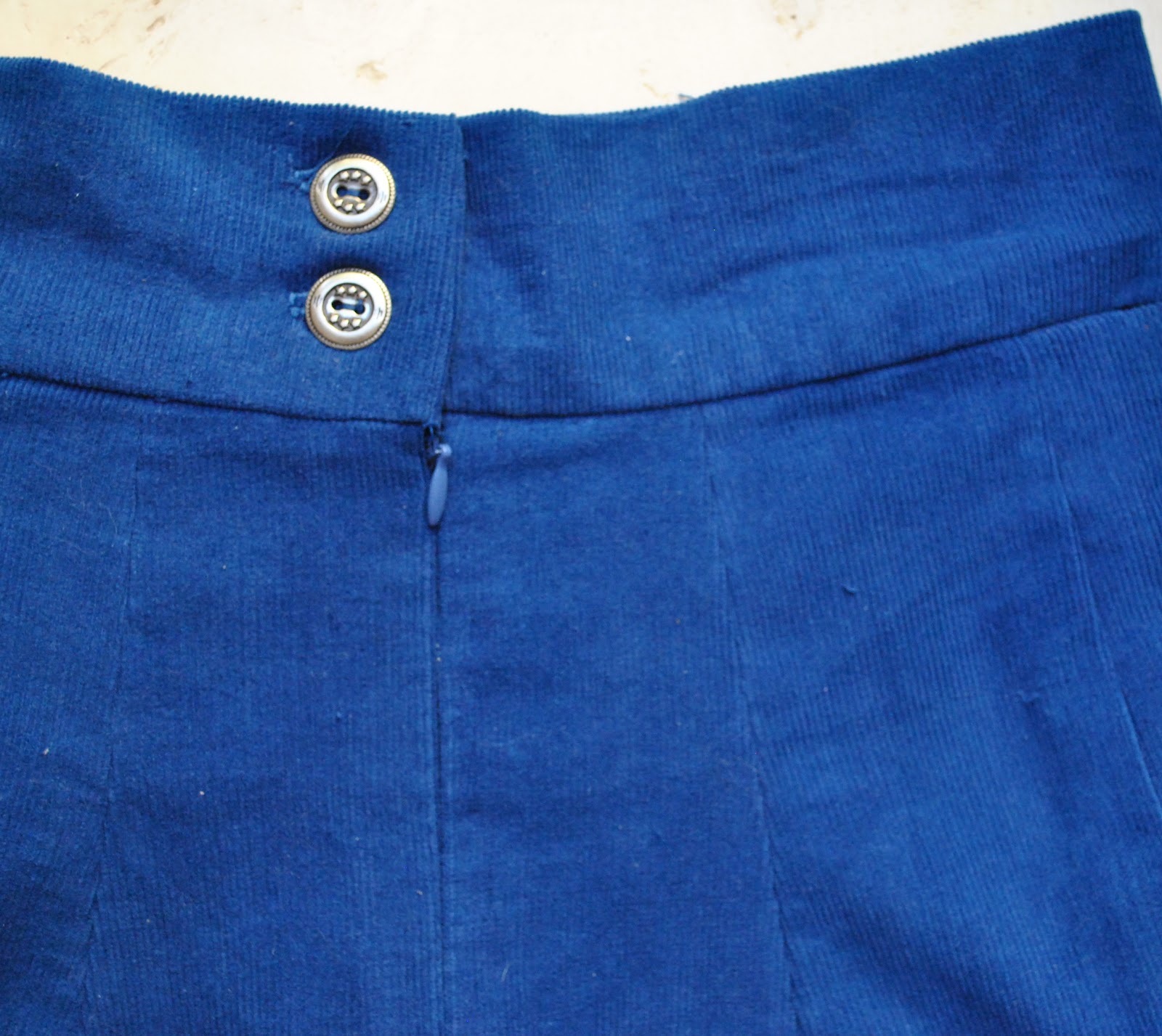
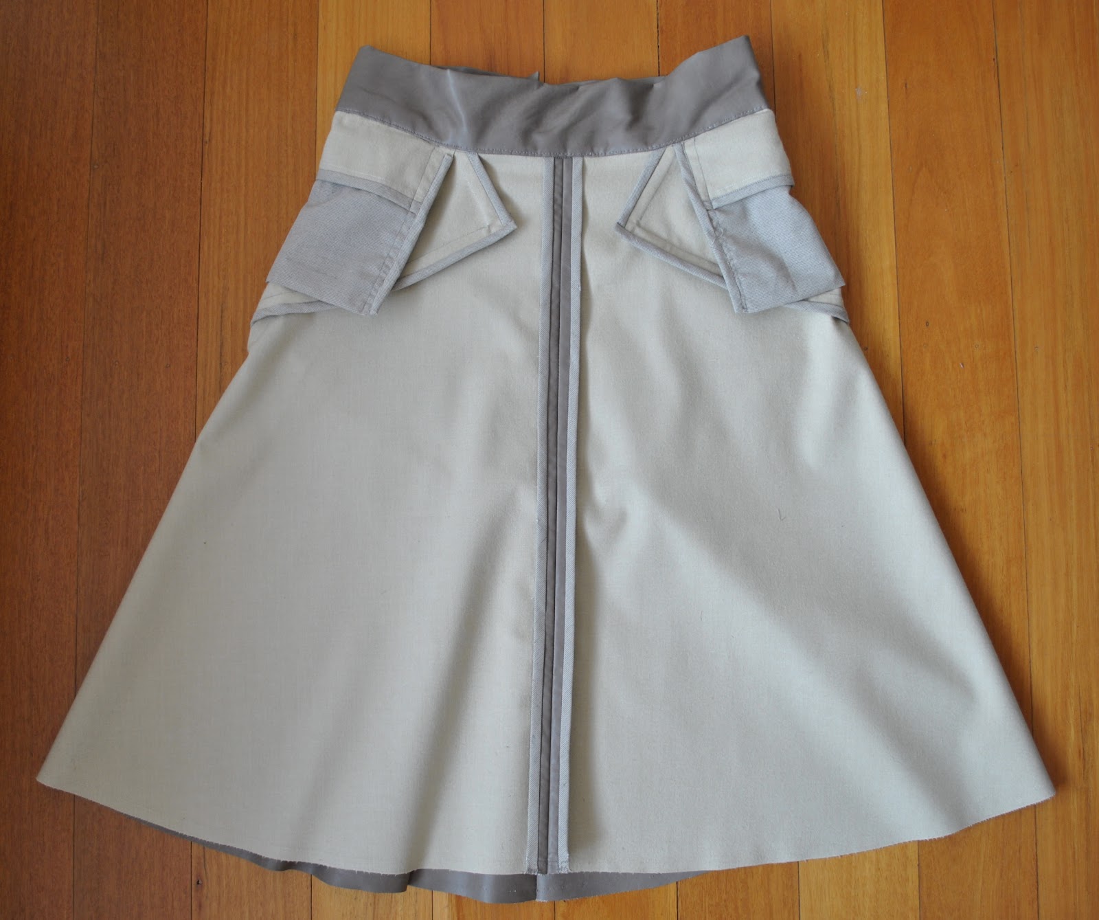
Flared skirt has front and back seam details, back invisible zip closing and wide waistband
Pattern Sizing:
4-10. I made mine a straight size 10.
Did it look like the photo/drawing on the pattern envelope once you had finished sewing it?
Well, mine resembles the line drawing on the envelope. The photo on the envelope is completely featureless. Black… really?? You can’t make out any details on the skirt at all!
Were the instructions easy to follow?
Yes.
What did you particularly like or dislike about the pattern?
Pretty, flirty and feminine, resembling a straight A-line from the front view, and then frilly and twirly from the back view. The angular seaming between the skirt and the front yoke is a nice feature. I also like that lovely wide high waistband, and the instruction to bind all the internal raw edges with HongKong seaming is a nice finishing touch. I really like to see patterns encouraging people to extend themselves to use high quality internal finishes like this.
A small gripe, the pockets are situated right high on the hip, so they not really very useful. Also, in my opinion, the more “twirly” a short skirt is the more difficult it can be to wear. I added 10cm in length to the lower edge of my lower skirt pieces.
Fabric Used:
PU laminate or “leatherette”, lightweight polycotton for the HongKong seaming
Pattern alterations or any design changes you made:
I thought it looked quite short on the envelope photograph so I lengthened the skirt by 10cm. This meant the skirt facing pieces were completely different to the pattern piece; but that was no biggie, I just used my new longer skirt pieces themselves to cut the facings. However, I ended up not using them because this method of hemming turned out to be disastrously bulky with my PU. I went with a clean-cut raw edge.
I made my pocket pieces longer for a deeper pocket, and pieced them to be PU for the facings on the edges, and lightweight polycotton for the central main part of the pocket piece; for lesser bulk.
I removed width in the back/side back seams for a sway back adjustment.
Would you sew it again? Would you recommend it to others?
Yes, I would sew it up again … and already have! 😉 And yes!
Conclusion:
A very nice skirt pattern, with interesting seaming and a pretty yet modern silhouette. However I do think the skirt length as it is in the pattern presents an unbalanced and slightly unflattering silhouette, and adding just 10cm to the length substantially improved the proportions of the skirt. I think it is visually important that the lower flounce at the back of the skirt be at least as long as the fitted yoke sections above it. Shorter; the effect is slightly “top heavy”.


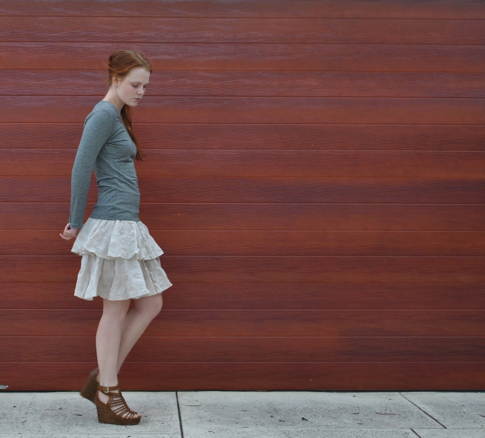
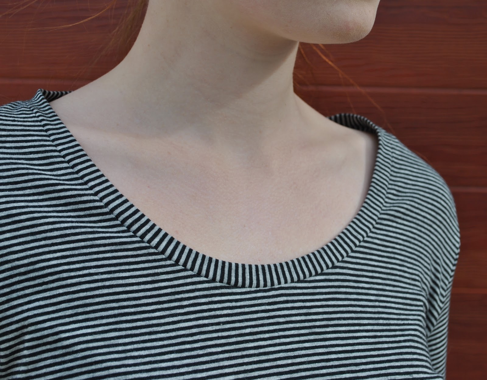
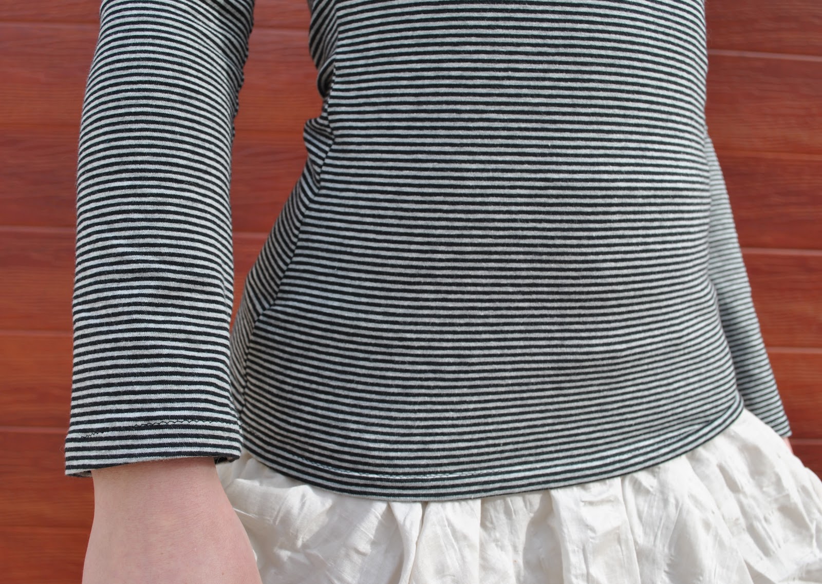
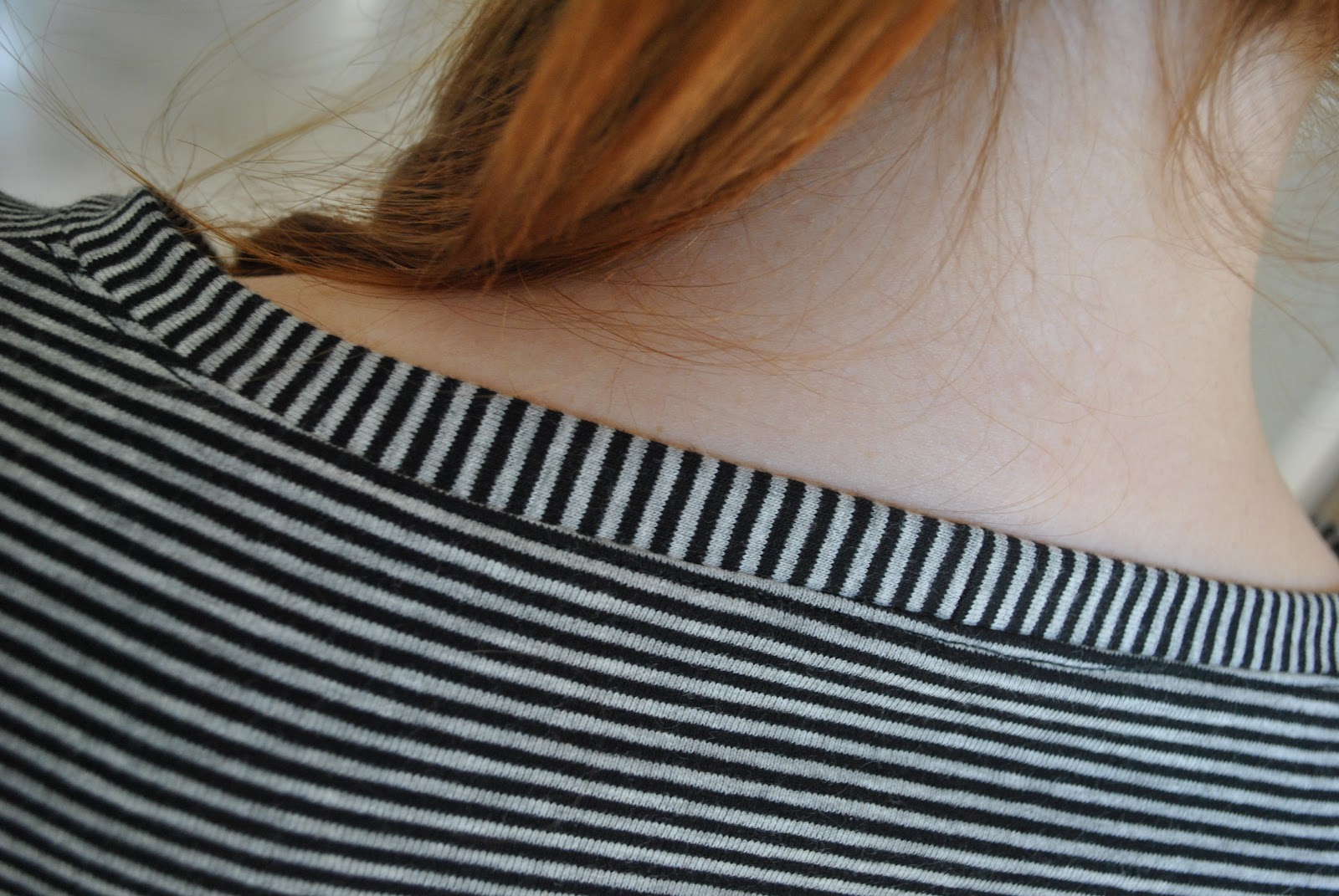
 After I had finished Craig’s hoodie, I had quite a lot of leftover fabric. I had originally bought 2.5m of this lovely grey-and-black striped cotton jersey from Spotlight. Turns out that this was stacks. Loads. Well ahem, I didn’t want to fall short 🙂 When I am making something self-drafted, for the first time; I worry so much about stuffing up somewhere along the line, and so I think I need way more fabric than I usually do. And buy accordingly.