Tag Archives: 6 Different Ways

Blood Orange top; 6 different ways

Hey y’all peeps.
I’ve been
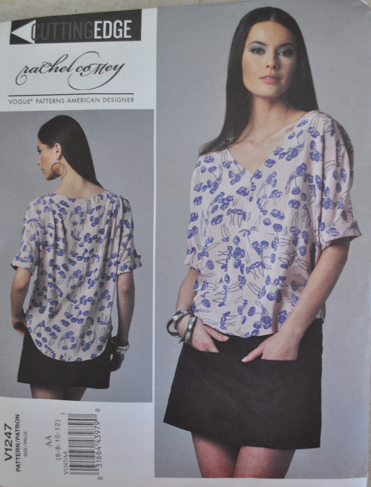
having a play around with my blood orange Vogue 1247 top… trying out different ways to wear it.
So… I might have said this before, once, or twice, or twenty times  😉  but I absolutely love brainstorming in my wardrobe
trying out different outfits like this.  It never fails to inspire me with
new and different ways to wear my clothes.  I frequently get tired with everything in my wardrobe and crave to break free of the
little “outfit ruts” I get into; and experimenting with unusual and different combinations really keeps my
pieces interesting to me and helps my wardrobe to achieve the fullest variety
of which it is capable.
Having said that; I have to admit that the first two looks are the two ways I wear this top and its older twin the clementine top, just about all the time.  But, I’m setting my sights on breaking free from that  😀


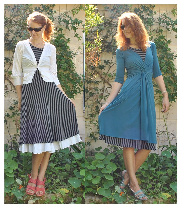
Below left; unadorned and no frills, it is the perfect thing to wear with shorts on a really hot hot summer’s day at the beach or around the house.  Cool and airy enough for the hottest of hot days.  Colourwise, I also adore the unexpectedness of this sombre claret against the shocking pink too.  Below right; pop on a sludgy little skirt, cute ballet flats and throw on a couple of entwined skinny scarves, and the top looks quite smart enough to sally forth on some errand requiring a bit more style.
boshirt1
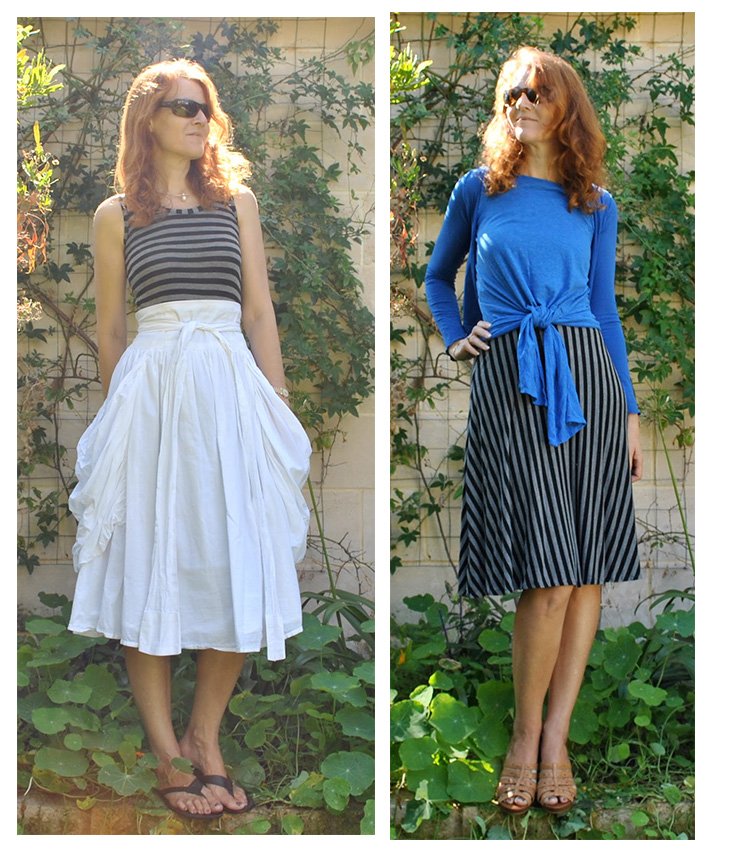
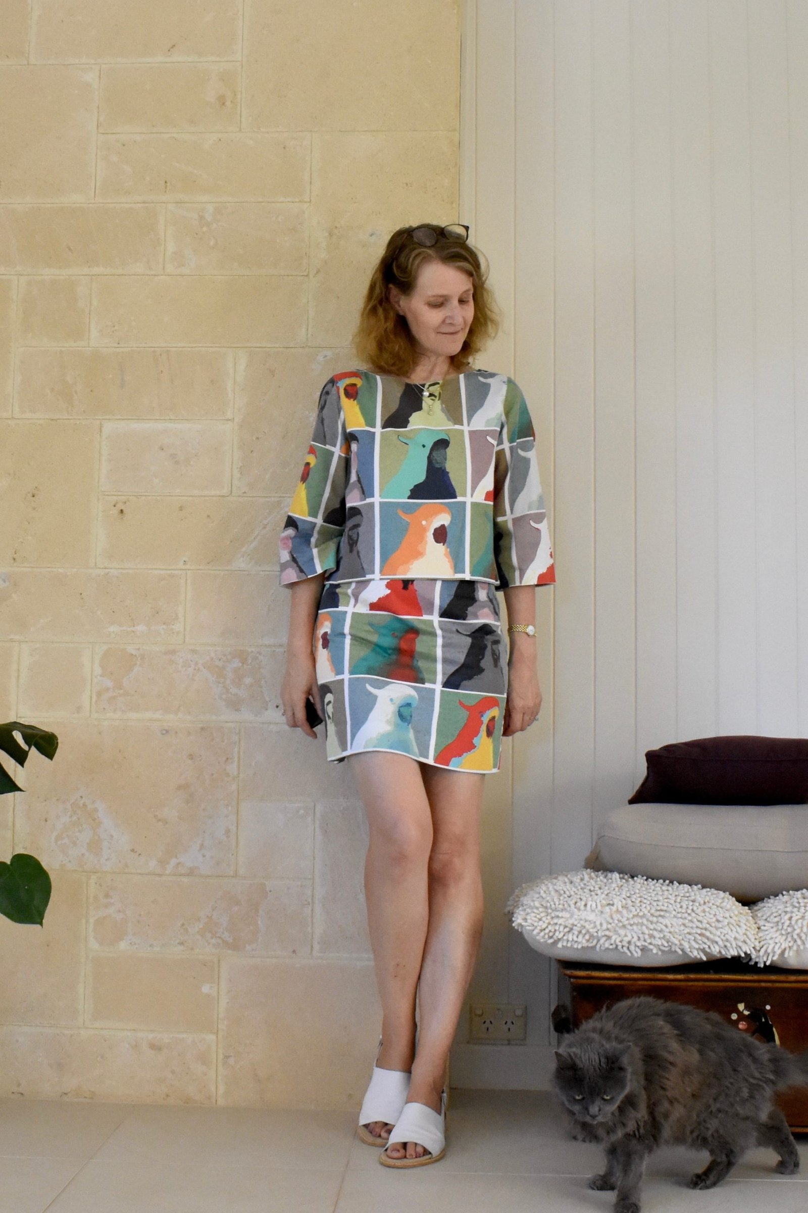
Below left; on very hot summer days you might want to wear a dress with spaghetti straps, but need to protect your shoulders from the sun.  Cardigans are too hot and cloying to even contemplate, but a light boxy top like this is comfortable and cool and fits the bill quite well.  And looks sort of boho-chic too…  Below right; I know we all in the sewing blogging world have been conditioned into thinking that this top must be worn hanging out! and I have sure been guilty of this too… well not necessarily!  I actually love how it looks when tucked into a high waisted skirt as well.  Looks pretty cute like this, yes?  I was also serendipitously thrilled to discover that the top is just about a perfect colour match for my high heeled caramel wedges too  🙂
boshirt2
This top is just made of cotton, and therefore it’s not really suitable for really cold or winter-y days.. but it can still be worn as part of a cooler weather ensemble and not look silly imo…
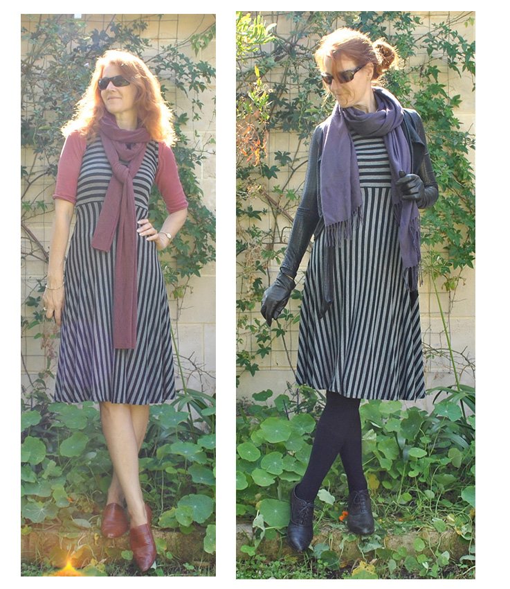
Below left; sometimes, y’know you just want a bit of that colour, added into your outfit??  worn like this, I like how it looks peeping out as just a layer of colour layered over a long skirt and under a shorter jacket, and co-ordinating with a matching scarf and boots.  Below right; being quite loose, it can also be comfortably worn over an insulative Tshirt, with jeans and a skinny scarf.  I’ve always liked this slightly grunge-y double-top look, with shorter sleeves worn over longer.
boshirt3
Actually I really love both these last two looks.   I just wish I’d thought of them during our winter just gone!  Aah, well, there’s always next year  🙂
Which look am I wearing today?  well being quite a fairly hot day and having errands I am sporting the green ballet flats, the sludgy little skirt and twisted blue and black scarves.  I love dark sludgy colours made just slightly edgy with just an unexpected splash of bright colour.  Kinda reminds me of Tron.
(And incidentally I’ve done something new with this 6-way post… I’ve linked to the construction posts of all the other garments appearing in the outfits here.  Please let me know if this is helpful or interesting, and whether you think it is worth my continuing with this… thanks  🙂  )
pinterestmail

Red velveteen skirt; 6 different ways


A big
fashion trend around about these parts currently is the red jeans trend.
It is HUGE-o-rama!  I do like it too..  however since my
husband bought a pair of bright red jeans for himself while in Milan and my daughter
has since bought a pair for herself too; so now I cannot possibly
follow along literally myself without us running the risk of
bobbing about the house looking like a little flock of Santa’s
helpers… but luckily I already have my ombre-dyed red velveteen skirt in the wardrobe; mwahaha.   Trend box ticked!  Well sorta.  It is to my
satisfaction, anyway.
In
Milan I noticed the most successful red jeans combos were with a very neutral,
or at least a very conservative top; the better to tone down the woa!-ness of
those eye-catching legs and avoid clown territory, and I think mixing and
matching an in-your-face colour or print skirt follows the same principles.  I tend to pair the red skirt with very
bland or classic garments, or just very occasionally with a colourful top if
I’m in that sort of mood.
Below:
at left; a classic boat-neck navy and white striped Tshirt is without a doubt
the most popular pairing with red jeans I have seen here in Perth.  That combo is sooooo hot right
now.  Rather French I think with little white
sand shoes, and fortunately I happen to have red leggings too… At right;
a men’s styled denim shirt is another perennial classic, which works well with the red skirt peeping out under, and smartened up with chunky high-heeled caramel wedges.
redskirt1
Below:
at left; a flash of crimson from under a long-line cardigan adds a spot
of cheer to an all-charcoal winter-y outfit, and at right; on a day when one is
feeling particularly bubbly, a bright tunic top and ballet flats matches the strength of primary colour in the skirt
redskirt2
Below: at
left; the freshness of white, the rumpled crispness of linen and unusual
styling of this shirt is a total counterpoint to the rich colour, plush velveteen
texture and very simple silhouette of the skirt.  I really love all the contrasts in this outfit here… and at
right; I hope you’re not bored with this orange top, since I do tend to wear it a lot!!  I guess maybe it deserves its own 6-way post one of these days… except it’s been seen a tonne of times already, maybe I’ve run out of fresh combos!  Obviously it is another very versatile player in my wardrobe!
redskirt3

Traditionally I’ve considered red to be a primadonna colour that is quite difficult to mix and match, but I have enjoyed playing with this little red skirt.  Which way would you be wearing it?

pinterestmail

Khaki military shirt; 6 different ways

Oooh, it’s been a while since I did one of these posts… which is silly since I do get a big kick out of these myself.  Playing in one’s wardrobe, the bestest play a grown-up girl can have, no?
Sometimes I like to play with new garments, to see how they are going to work out with things I already have; sometimes with an old garment to revisit it, and see how it’s holding up.
This shirt falls into the latter category.  I made it using a men’s shirt pattern Burda 7767, of deep olive linen and with carved brass buttons, and first posted it here.  I really loved the slouchy easy vibe of the military trend and added lots of little details like arrow-head tabs, flaps and pin-tucked pockets to make my shirt look as much like an army shirt as possible.  Is the military trend on the way out?  Oh well.  I still absolutely love my shirt.  It helps that casual and grunge-y is my all-time thang, and that khaki is one of my best colours  :))
This is such an easy garment to have and to wear.  It is linen, and I don’t even iron it.  Ever.  Yes I’m serious!!  It’s supposed to look crinkly!
I’ve worn it several times here on my blog already, and for today tried to mix it up in a few new ways….  and yes, the fact that I have worn it loads of different ways already and can easily come up with a whole host of completely new ensembles incorporating this shirt… oh, did somebody say “way too many clothes”…?    😉
Ahem, without further ado.
Below left; the casualness of the design combined with the airiness of linen makes the shirt a perfect pairing for shorts on a hot summer’s day.  At right; I really love the look of a slouchy man-style shirt blousing out over the top of a high-waisted pencil skirt.  I wore this  outfit last week sometime.  Hmmm, looking at this I’ve realised it is pretty rare for me to actually show any of my handbags in my photos, would you prefer to see the whole ensemble including the handbag in future daily outfit photos?  Please let me know….

khaki1
Below at left: yes it does go nicely with my new capris as well…  this is another outfit I wore last week.  I adore this safari colour mix of khaki, beige and black too.  At right; worn as a “jacket” to grunge down a slightly dressy, more winter-y ensemble.  I wore this exact outfit once or twice over the winter just gone.
khaki2
Below left; it looks a touch smarter when belted, over a little skirt and with my slouchy boots.  Seriously, the colour khaki goes with all the colours in my wardrobe… I had trouble picking out just one of my skirts for this look.  Middle; another winter-y but casual ensemble, with jeans and boots.  I really did enjoy wearing the shirt as a sorta jacket like this during the cooler months.  Truth be told; being linen it didn’t add much warmth but I just liked the look of it!  At right; a sludgy and neutral foil to bright bright bright blue.  Incidentally, this last outfit is the one I am wearing today…
khaki3
I’m sure you can count, and have probably noticed that there are seven different ways here, not six.  Sorry, I just got carried away and then I couldn’t narrow it down!!  So yah, seriously.  I sure hope the military trend sticks around for just a bit longer!
pinterestmail

Ultramarine corduroy skirt; 6 different ways

Y’know, sometimes you add something to your wardrobe purely on a crazy whim and you have a teeny niggling doubt about how well it is actually going to work?  This ultramarine corduroy skirt, made using Vogue 1170 and first posted here; is one of those things.  I grabbed the fabric without thinking about it very much during a mad Spotlight sale.. you know, one of those instinctive “ooh, pretty colour” moments when you are rushing past a table of fabrics on your way to the cutting counter and your brain is on autopilot, really focused on getting in the queue before it builds up too much.
I think one of the reasons I really like doing these 6 different ways posts for myself is because of that old old wardrobe rule of thumb taught to me when I was growing up… every new thing you add to your wardrobe must go with at least six other things.  I am a very whimsical seamster, but once I’ve got something I do still like to mix and match and make sure a thing has several good options to partner up with; not just one other thing.  One must be practical  (sigh)
Luckily bright blue has slotted in very well after all, and I’ve grown to love its punchy shock of colour against my traditional pale and/or sludgy neutrals!  I have worn each of these outfits over the past month or so, and taken each photo on the day that I wore it.  With the exception of the first very summery one; I just put that outfit in there to show a bit of seasonal variety so to speak.  The weather is still coldish here… well it is for me anyway.  I am such a wuss in that regard.  But things are warming up very nicely lately.  Spring is in the air!

Below: at left; the skirt worn with the pretty knotted blouse that is from that very same Vogue pattern.  They are designed to go together and I do think they look very nice together.  I like the textural clash of decadent glossy silk against the homely corduroy.  I will wear this outfit on a much warmer day  🙂  At right; the blue holds its own when worn as part of a trio of bright colours.  Colourblocking!  Still a trendy concept, yes?  According to the shop windows here-abouts it sure is anyway.  Brights are gonna be “in” for the down-under spring.

blueskirt1

Below: at left; these muddy mossy shades of green against bright bright blue felt “wrong” at first but then I really loved them and was pleased I had forced them together.  Such an unexpected combination, it worked beautifully!  I felt sorta “art student” or “urban hipster” in this ensemble.  I felt cool.  In my book that is a very good thing.  At right; on a colder rainy day I wore a warm and cosy, all-charcoal-grey outfit with just one slice of bright blue corduroy showing to add a peep of colour.

blueskirt2

Below: at left; playing it safe, letting the brilliant blue colour take centre stage and be the prima donna against neutrals of black and cream.  A nice outfit, I liked it.  It is plain, but then again maybe this is very me.  I am plain!  At right; worn along with all the other bright blue garments in my collection, and with just wine-red leggings to break up the colour scheme and add another shade to the mix.

blueskirt3

What am I wearing today? well, actually yesterday I wore the last all-ultramine-blue-with-the-red-leggings outfit, just above.  I meant to post this yesterday, but got distracted with writing my review for shape shape, hehe.  Today I am still wearing the skirt, but with something completely different!

pinterestmail

Sludgy little skirt; 6 different ways

I haven’t done one of these for a while! but that’s OK since I thought May and June came with somewhat of an overload of “daily outfits” posts, no?  😉
I am so thrilled with this little sludgy skirt, made using Vogue 1247 and originally posted about here, along with my review of this fab pattern.  In fact dressing it up in 6 different outfits felt a bit like cheating.  It is the perfect basic for my tastes… a plain little skirt is my favoured skirt silhouette,  and this deep purple-y brown shade I achieved through over-dyeing is a favoured neutral in my palette that goes with just about everything I own.  The only reservation I have is the length! it is just a touch on the short side even though my version is 5cm longer than the designer intended.  I wore it several times during the warmer months but always felt a tad self-conscious about bending over, which with my doggy, household-y lifestyle is pretty ridiculous.  However, in the winter months with tights, it has really come into its own!
These are all outfits I have worn over the past few weeks and I took each photo on the day I wore it.  With the exception of this first very summery one, natch.  I just put that one in for some seasonal variety…

Below: at left; the top and the skirt from Vogue 1247 worn both together, how the designer intended.  I just love the silhouette of this outfit, the oversized block-y top is perfectly balanced out by the form-fitting, plain little mini underneath.  There is no doubt in my mind I will make this skirt and this top up again in different fabrics, too!  I am totally not surprised that Pattern Review named this pattern one of the patterns of the year! At right; with my crazy patterned tights, and my twisty Pattern magic top, the skirt is a solid and unobtrusive little block of plainness to separate and balance out each of these eye-catching garments.

sludgy1

Below: at left; during a recent discussion with friends, someone remarked that the only two colours that did not go together were brown and grey.  I immediately became slightly obsessed with the thought of wearing those two colours together successfully.  I really love this outfit.  I found it interesting that the other greys in my outfit really brought out the purple in the skirt.  At right; the warm chocolate is nice and cosy-looking when worn with a warm all reddy-purple-y-raspberry palette.

sludgy2

Below: at left; The skirt blends in with an all-chocolate ensemble with just an expected touch of bright colour in a shocking pink pair of tights.  Random fact: I actually garnered a wolf-whistle from a passing truck in this outfit… ha!   😀  And at right; I saw a similar outfit to this in Australian Vogue magazine and tried to emulate it with my own wardrobe.  I really liked this, the combination of a casual chambray shirt with the mini and lace-up heels has a hip, comfy and pretty cool vibe, I thought.  The skirt’s plain shape means it looks equally good with shirts tucked in, or left hanging out.  I love this versatility in a skirt.

sludgy3

Which outfit here do you like the best?  Just for interest’s sake I am wearing the all raspberry hued outfit today.  Except it was pretty nippy earlier this morning, so gloves were on!

pinterestmail

Grey stripe dress; 6 different ways

I was chuffed when Robyn suggested this dress would be a good candidate for a mix-up and match-up; thank you Robyn!  And you were so right, yes, indeedy, this is an excellently versatile dress…
It is self-drafted and I was inspired by a Metalicus dress, pretty much my favourite RTW label.  Everything in their range of thin stretch garments layers together and goes together so beautifully; so it is all very easy to wear.   When I made my dress (dressmaking details here); I envisioned that I would be able to layer it up and down and all different ways, to go with a lot of things already in my wardrobe.   These non-colours are good for any time of the year and any season…  also being very light and flowy means the dress has no “structure” itself, making it very easy to throw over and under other things, it can adapt to different functions and not just be worn solely as a stand-alone dress.
And stripes are so hot right now!  (thank you Zoolander for that awesome quote)
So here are just a few of the “ways” I came up with after a bit of a play session in my wardrobe…
First up, well (obviously) worn as a dress.  I made it specifically the perfect length to go over this white petticoat, so this is the way I have worn it mostly so far  🙂  But at right; it can also work as a petticoat itself, worn under a shorter open dress.

stripe1

It doubles as a tank top as well as a petticoat, when worn under a big skirt.  Actually I wore this outfit last week, and it turned out to be a good idea… this skirt is very pouffy already, but I would love it to be pouffier still! and having a full-skirted petticoat on underneath gave the whole thing a welcome extra ounce of pouffiness.  I liked that!  And at right, put a light Tshirt and optional cardi over the top, and the dress is a skirt…

stripe2

At left; the dress is a pinafore when worn with a Tshirt underneath.  And at right; the subdued colours are a natural choice for winter too, so here is all layered up and ready for winter; with long johns, tights, a little jacket, gloves and a scarf.

stripe3

What am I wearing today?  well today has a definite and very welcome autumnal air to it, so I am wearing the pinny version just above with the raspberry half-sleeved tshirt underneath and my purple-y raspberry scarf…  but one thing I learnt even in this short play-about with this dress is that I have so many more options and I’m really looking forward to wearing this dress a bunch this autumn and winter…   What do you think?  how would you wear this dress?

pinterestmail

Dusky pink ‘bustle” skirt; 6 different ways

This dusky pink skirt of a very simple and yet at the same time very unusual shape has been one of my favourites since I made it and it has appeared multiple times here on the blog already.  It is made using the pattern for skirt “m” from the Japanese pattern book Unique Clothes Any Way You Like (also sometimes referred to variously as Clever Co-Ordinates to Wear, Shape shape, and also Sewing Clothing Patterns to Wear Multiple Ways) by Natsuno Hiraiwa.  The lack of structure and form in the design has been the key to its versatility, enabling the wearer to flip the skirt around any which way on the body without being limited to the one-way-only nature of most conventional western-style skirt designs; and its style embraces both the minimalist and the heavily draped, depending on the angle from which it is viewed.
I made it from a lovely linen/cotton mix from Tessuti’s in Melbourne, and it is lined with a soft, thin almost fluffy beige cotton from Fabulous Fabrics.  The outer fabric is a greyish pink that is so subtle as to be almost a neutral.  So accordingly, I tend to wear it mostly with some sort of little white shirt, to show off that pretty colour to its best, or with a blue chambray shirt.  Otherwise, I do like it best mixed up with quietly subtle beige or ivory neutrals which do not overpower that soft soft colour.

When I first made it, I wore it mostly like it is pictured at the left, with that modernist bustle situated over the hip.  Probably because this how it was styled for the book.  And obviously, you can wear it over either hip, take your pick…  and colourwise, I must say I do like the pink and turquoise together, too…  🙂
Then at right; I discovered one day that you could push the bustle in on itself, creating a kind of big pocket at the side of the skirt.  This is also became a favourite “way” for a while for me! Incidentally, the little necklace I am wearing here is a souvenir from our trip to Japan, a miniature leather-bound book on a leather thong.  It is pretty cute, no…?

pink1

Then I tried wearing it with the whole bustle swivelled to the back, and this might be my currently preferred way of wearing it now…  although I do still tend to flip it around any which way on random whim….  staves off boredom y’know.
At left; worn with a longer shirt belted over the top, the bustle is covered up and it looks pretty much like a conventional Aline skirt; and at right, paired with more winter-y accessories; long boots and a dip-dyed stole that is short enough to put that bustle on display at the back.  Incidentally, this asymmetric stole is also from the same book, posted here.

pink2

Below; at left; a cool and chic-ly featureless front is presented when worn with a summery little beige sleeveless top tucked in, and with black summer sandals to provide a foil to those pretty colours.
And at right; well I’m always partial to the flattering longline layers of a little dress worn over a longer skirt, as in this last ensemble.  And these sugared almond colours are particularly nice I think, too!

pink3

Which of these “looks” here do you like the best?
And would you like to know which one am I wearing today?  well, it is still pretty warm around these parts so I am wearing the summeriest of these outfits just above, with the little sleeveless top the colour of milky latte.  I just love these soft coffee and pink shades together!

pinterestmail

Purple dress; 6 different ways

I think this little purple shot rayon dress, made using Burdastyle magazine 06/2011, 102 and seen first here will be one of those winning dresses with year round capabilities.  I have been wearing it a tonne this summer;  being a natural fibre and with its flow-y loose design it is beautifully light and so cool on even the hottest day. And I think that come the cooler weather that I will still be able to wear it to, thanks to its sludgy winter-y colour.  It’s amazing to me that I was a little doubtful of this dress at first… since I can’t imagine now how I did without something just like this before!
At left; being such an easy casual design with no zips, buttons or other bits and bobs, makes it a perfect throw-on over the bathers, as a beach cover-up or if you just want to pop out for a few groceries.  I have worn it on over my bathers like this lots of times this summer already!  I also love this colour combination of bright yellow against that sludgy purple colour too; colour wheel opposites.  At right; I have a big collection of light summer scarves to dress up a plain dress like this one.  And y’know what? it is amazing, all of my scarves are showcased beautifully against this very blank canvas of a dress.  This scarf, a gift from my parents from their trip to Italy, is one of my favourites.

purple1
At left; with a loose-fitting blouse over it, it masquerades as a skirt.  I don’t often go for the dress-as-a-skirt look, but the loose nature of both these pieces allow the combination to work really well.  At right; the simple but elegant style can be dressed up for a more formal party or dinner on a summer’s evening, with all hot-pink accessories.  I wore this outfit to Cassie’s birthday party.
purple2
Now for some cool weather ensembles, and I am looking forward when I will be wearing more nuanced outfits with a few layers such as these!  At left; purple is a great base colour for an autumn wardrobe, and I love it against warm rich autumnal colours, such as raspberry red.  Add a creamy scarf, and I’m all ready for a casz day.  At right; worn as a tunic top, and layered up with neutral and similarly sludge-y hued accessories for winter…  I would wear this when I wanted to look smart, like meeting my husband or friends out for lunch, or going out to dinner.  Fyi? best not to try wearing either of these outfits on a 38C day.  That would be just plain silly, yes?  😀
purple3
What am I wearing today?  Well I am wearing the second outfit, with the lovely colourful scarf… it was perfect for a pretty hot summer day.  I had morning tea out with some friends and then ran a few errands.
So which of these outfits would be your favourite?
pinterestmail
Switch to mobile version
↓