Python alert

I finished my python print satin outfit!  Here in this photo I’m not sure if I look as much like a sleepy python draped lazily down a tree trunk any more than I do an extra from the set of Dynasty… all that satin….  At least I’m not sporting shoulder pads, but give me a dry martini, a grotesquely over-carved balustrade to drape myself over, or at least a gilt-handled door to slam and I’m your woman…
The top is out of Burda 8497, with the only variation in the addition of long pointy cuffs that are permanently sewn closed with these rather gorgeous metal buttons I found.  I considered making cufflinks out of the buttons and going down that path with buttonholes in the cuffs… but nah, this is a much simpler solution; not to mention looks better finished.  Given the struggles my menfolk have with cufflinks I like to just be able to throw on my outfit and swan out the door with minimal fiddling over my ensemble, so it was  “no” to the cufflink idea.
The skirt was kind of based on Vogue 7303, my old favourite which I use as a basic shape for so many projects.  I’ve had enquiries about this one, sadly I think it’s out of print (or I’d get another as a back-up for myself!) but some are possibly floating around on the second hand scene.  It’s really just a good basic pattern, of which there are many many new varieties available in dressmaking stores.
As I posted about before, the panels down the side are satin, which I pintucked randomly and ironed flat, aiming for a scale-y effect with debatable success…  At one point these panels, which are finished off properly, hung lower than the hemline in a randomly wavy point, but I decided this looked a bit odd and folded them up level with the rest of the skirt and tacked them up on the inside.  They’re still up there if I change my mind and want the skirt to look more gothic-y, I can just unpick the tacking stitches and let them fall down again.
The lining of the skirt (not seen here, but posted about yesterday) is jungle green bemsilk.
Over the cooler season coming up I plan to wear this to formal and semi-formal functions with my Icelandic shoes, pictured.  I just LOVE these shoes!!

Details:
Top; Burda 8497, satin print
Skirt; my own variation on Vogue 7303, satin print with satin side panels
Shoes; Kron by KronKron, bought online

pinterestmail

Unexpected inner workings…

Most of the time I make predictable choices in lining by carefully matching my lining fabric to the outer layer to get as close a match as possible, but every so often I go for something completely different.  A little burst or jolt of surprising colour just to give a little zing of unexpected pleasure when I catch sight of it, and what are our clothes if not to give us pleasure as well as the necessary warmth and modesty requirements?
Even on my wedding dress I chose a soft rose pink lining to go under the ivory silk taffeta of my dress, because I wanted to project a sort of rosy pink glow on my wedding day… I know it is kind of funny, we were quite young when we married and features such as a pretty pink glow rated highly on my scale of ideal looks.  Wouldn’t be a look today’s bride would go for I think, my friend E and I the other day were discussing how sophisticated bridal fashions are now compared with the “princess” look most of my generation sported back then.  My wedding dress was heavily influenced by Princess Diana’s, who was the absolute epitome of chicness and coolness when I was a teenager….  sigh, lapsing into nostalgia somewhat here…
Back to the subject I went through my wardrobe and selected some samples of contrasting linings/facings I’ve utilised recently:
You’ve probably never seen the purple underskirt to this floral number before;

I used some leftovers of this floral fabric to edge the seams of my burnt orange skirt; (I’ve already shown this picture recently, but it fitted in with my theme for today so sorry to rehash this one…)

This pale blue/silver lining adds a cool futuristic metallic touch to this black lace gothic inspired skirt;

I saw a divine vintage black velvet evening coat in Melbourne with an unexpected and stunning primrose yellow satin lining which I have regretted ever since not buying; I have since bought some fabric and am still working on the perfect evening coat shape;

For the record I DIDN’T make this corduroy coat, but its quirky lining always brings a smile to my face;

And this vintage fur coat which I was so lucky to have been given recently (please don’t be cross PETA supporters, this coat is old, probably older than anybody reading this blog) has a gorgeous warm tangerine lining;

My snakeskin print outfit?  Finished and ready to show to you soon, and here is a preview…. A lining for a satin skirt is essential if you don’t want it clinging to your legs closer than leggings, I chose a jungly shade of rich green for the lining;

Confession: I had vowed recently not to buy any more fabric until I’d finished my stash.  Well, I’ve been a bad girl.  To paraphrase Beyonce (to Lady GaGa) I’ve been a very very bad bad girl…  I read a review by Erica B on how very difficult this Vogue 1087 dress was to make.  Then I read in Australian Stitches how Cate can Reyk found the same to be an extreme challenge.  Well, I didn’t need any further encouragement.  I just love a challenge.  I’m pretty competitive that way.  So this is now been added to my to-do list….

Keep you posted!

pinterestmail

St Patrick’s Day

How do I know it’s St Patrick’s Day, even though we don’t make a big deal out of it here in Australia?  Why, because the Spotlight stores, which are heavily influenced by American merchandising choices are simply chocka with fluorescent green top hats, fluffy-haired leprachauns, wigs and shamrocks, which will most likely and sadly go unpurchased by Australians….
So, even though I don’t have a single drop of Irish blood in me my outfit for today is influenced by my perception of the Irish manner of dress which is quite different from the Spotlight examples.  My one Irish friend S has quiet and subdued tastes in her colour choices of apparel and kelly green rarely makes an appearance on her person…  I’m wondering if the holiday is becoming more an American tradition than Irish?  Thoughts, anyone?
When we were living briefly in the US we bought this simply gorgeous bedspread from a shop called Orvis, a store which had a beautifully provincial huntin’/fishin’ vibe that truly gladdened my rustic little heart.  This bedspread is made completely from patches of pure Irish wool tweed, which in their previous life provided warmth to Seamus’s and Liams on their daily pilgrimage to the village pub, or so we believe.  We’re always on the lookout for a recycled objet d’art and this one has dressed our bed every winter since we got it, and I love it more and more with each passing year.

On another, only slightly related note: conversation with my son last night illustrating the youthful Australian take on a sainted day…
T: “Do you know what day it is tomorrow, Mum?”
Me: “St Patrick’s Day.”
T: “No, it’s Touch-A-Boob Day”
Confused pause, then “Whaaaaat?”
T(patiently):”Touch-a-boob day.”
Me: “No, it’s not…”
T: “Everyone knows it’s touch-a-boob day…”
Later on…
T: “Dad, do you know what day it is tomorrow?”
C: “St Patrick’s Day?”
T: (sighing) “It’s touch-a-boob day…”
C: “Oh reeeeally…”
We’re so behind the times…

Details:
Skirt; my own design based on Vogue 7303, lace knit
Camisole and cardigan; Country Road
Shoes; so old I can no longer read the name on the inside…
Bedspread; Pure Irish wool, Orvis

pinterestmail

Pattern Magic; toile 2, detsubori top

Actually that should read toile 2, and er, 3 as well, as I had a hiccup in the making of this one and had to start over.
Thanks to the wonderful and inspirational Karin of ancien-nouveau who was so incredibly helpful to me with Japanese terms  I managed to decipher that the name of this project is (I think) detsubori.  My (uneducated) guess is that this translates to perhaps “sail-collar” or some such, as that is how it looks.  I drew out the first version of the pattern and made up a toile out of some very cheap and nasty fabric bought for toile-making purposes.  In the making of this toile I initially sewed all  the back darts inside out, so they had to be unpicked and re-done; beginner’s mistake and I don’t think of myself as a beginner any more and was pretty cross with myself, grr….  Kept on with the toile and put it together properly this time…. For some reason known only to me-in-the-past, I finished this toile off with sew-on snap tape and finished the sleeve holes with bias binding, haven’t a clue why as the fabric didn’t suit the blouse and really is a bit nasty….  Sometimes when I get into sewing mode I’m like a robot and later on even I’m like “what was I thinking?…”and was pretty much finished…

It suddenly hit me like a thunderclap that this didn’t look much like the picture in the book.  Yeah, I’d made another boo-boo.  See the unpicker pointing to the bust dart in the photo?  Yeeeah..those bust darts aren’t supposed to be there.  At all.  The pattern is supposed to be drafted to eliminate this bust dart…  Oh…right, and this is not un-pickable…  (get out the paper and start drawing out the pattern again…)
Finished the second toile in like half the time of the first, so there had to be some advantages to all my blunders first time round.  Here is the second toile, note no bust darts… the sail is on the other side this time, well variety is the spice of life…

So I had some linen to make my husband another shirt and I managed to squeeze the pieces for the detsubori top out of the leftover fabric, except for the sleeves…  I made it into a little crossover top with a waist tie and a single button and little cap sleeves in a contrasting white, see the nautical colour scheme? that’s the influence of the “sail”.  I wonder if it translates to something completely different!!
In the front-view picture I’m holding up the sail as it has an annoying habit of going “flopsy” (that’s a highly technical sewing term, I’m sure advanced seamstresses would recognise).  It has been interfaced with quite stiff interfacing, but it still doesn’t stay up as smartly as the toile version.  Probably this is because linen is a much heavier and denser fabric that the light polycotton I used for the toile.  When I launder it I’m planning to give it a hefty spray of starch to keep it standing to attention.


pinterestmail

Borrowing from husband’s wardrobe, again…

Woot, for autumn!  I think the hot weather has finally settled down after a last scorcher on Friday and I’m in the mood for some of my cooler weather gear and some cooler weather colouring….
This skirt has been a winner; it was wonderful to reach for during the hottest days of summer as its so light and airy, and I’m thinking its cheerful hues will carry me through the cooler months too.  When I first bought this floral fabric I was a little afraid it wouldn’t be particularly versatile as it’s such an eye-catching print, but I’ve been proven wrong as I’ve worn it in so many ways; for today I decided to put it with the linen shirt I made recently for my husband (he’s going to get a surprise when he sees it here today!), worn as a kind of light coat unbuttoned and belted at the waist.  I love the colour combination of the deep port-wine shirt/coat with the bright reds/pinks of the skirt; feels so autumn-y, vibrant and rich, a fortuitous marriage for sure!
I’ve often expressed how much I love menswear to be worn by women; I think it can be a very sexy and feminine look, especially when paired with overly feminine garments like this blowsy floral skirt….

Details:
Skirt; Vogue 2894, floral cotton
Camisole; Country Road
Shirt/coat; Burda 7767, port wine linen
Belt; had since teenage years
Sandals; Micam by Joanne Mercer, from Hobbs
Nail varnish; Crimson Sparkle, Revlon

pinterestmail

Evening bag, specimen 1

So a new year brings with it a new round of birthday prezzies to be conceived.
For M’s birthday I made her this little evening bag.  It is made out of some leftover silk hessian (remember the heather purple dress?), with sparkly net overlay (remember the light summer cardigan?), velvet ribbon trimming and with pale pistachio green satin piping and lining.  I used a couple of large silver rings for handle loops and I sewed in one of my own labels, for fun.
I enjoyed making this bag, I think it’s cute and it was a lot less time consuming than the tea cosies of last year….

pinterestmail

Candy floss colours

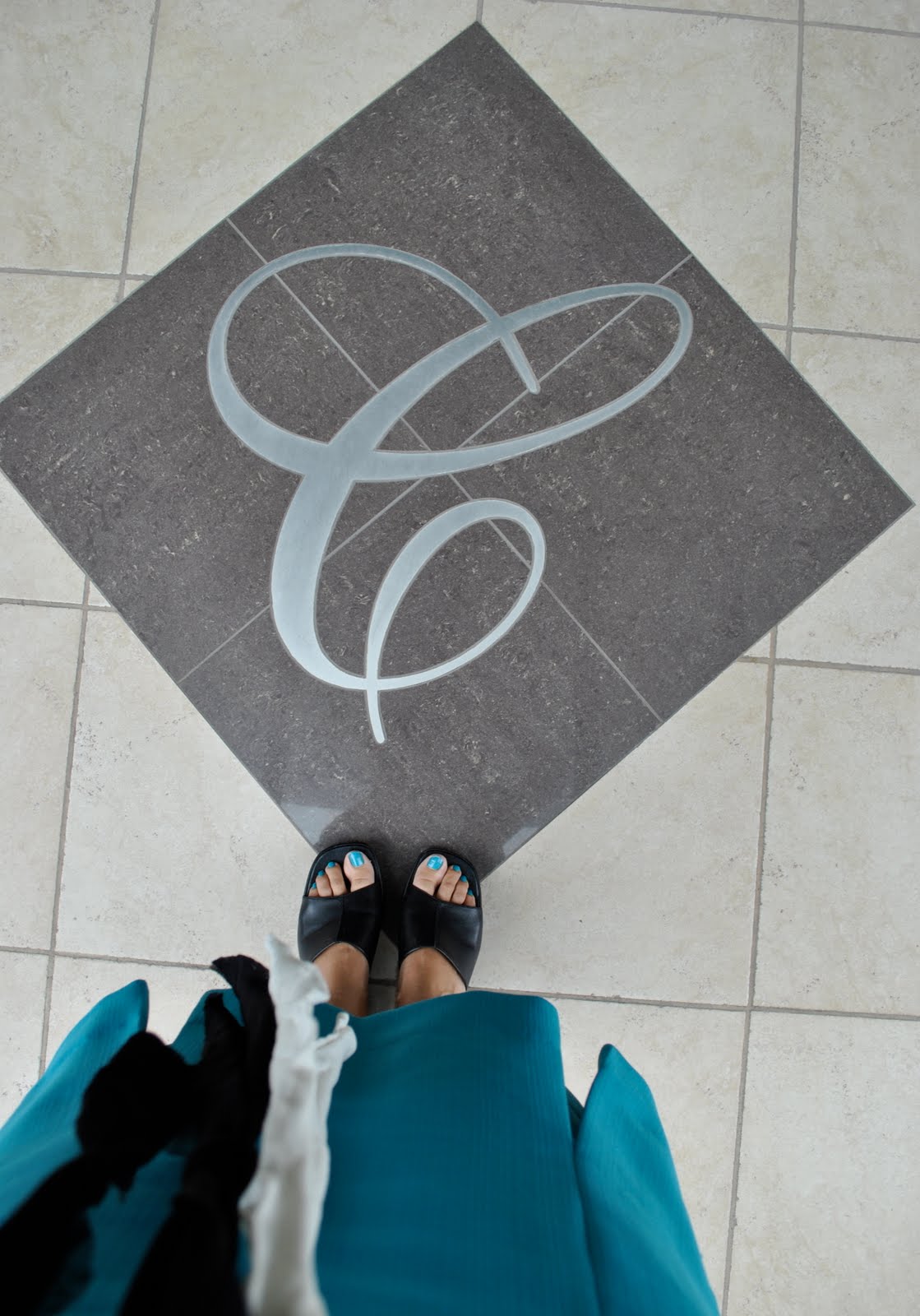
The colours in my photos have disappointed me a little as my camisole is really pinker than it appears here.  Today I felt in the mood for an artificial and unnatural candy-floss pop of colour, a peek into the Hello Kitty world with its both hard and soft clashing colours.  Thus my atypical backdrop, a grey and black concrete and glass monolith all hard edges and manmade lines with not a speck of nature to be seen.  (And how fortuitous that the building should have my initial inset in marble and brass in it’s doorstep?!)
I’m also inspired by this Josh Goot dress I spied in the latest Vogue magazine; the colours so sharp, impossibly lolly-pink and  blue with the touches of stark black and white; stepping just out of a sci-fi cartoon world.  Nothing natural here.  Bring on the digital age, yeah.  I would love to have this dress in my wardrobe, but for now I’ll just have to settle for reproducing its colour scheme as best I can with what I’ve already got, but isn’t this fabric out of this world?
Though if I really look at these hues again wouldn’t they be just right for a sunrise peeping over ocean waters lapping onto pristine beach sands, the charred remains of a midnight driftwood campfire scattered about…. the epitome of a natural environs…. ah nature always has one tucked up the sleeve, does it not?  Just when fashion has contrived a seemingly artificial colour scheme mother nature slips in the reminder of a colourama of her own…

Details:
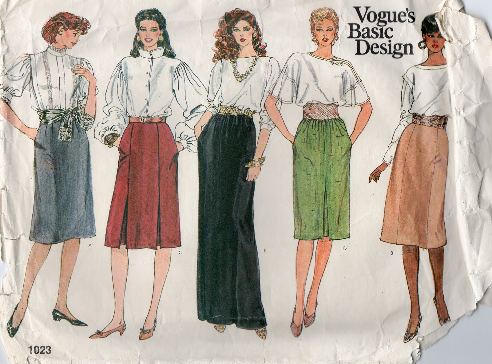
Skirt; Vogue 1023 view C, turquoise polycotton
Camisole; Country Road
Cardigan; Metalicus
Scarf; made by me
Bag; pink satin Olga Berg, birthday gift from a friend
Shoes; Perrini, had these for so many years I’ve forgotten where they came from
Nail varnish; Fools Paradise, BYS

Photo below from Josh Goot, Spring/Summer 10

pinterestmail

Wardrobe Refashion, project 6

This refashion was actually excessively easy and barely worth a tutorial of “during” pictures, but here it is…
I started out with these drawstring waist, three quarter pants.  They are shapeless and unattractive and only suitable for pyjamas… but the fabric is lovely fine linen in a gorgeous shade of pistachio that I fall in love with straight away… but am I ever going to wear these pants as is?  No way.  Drawstring and elasticised waists are just a no-go in my wardrobe.  I feel they bunch unattractively around my waist/hips, adding bulk to a problem area, and as a recent commenter kindly reminded me, I am not model thin.  Yeeeah…..  If I will take the risk of putting myself out there then people will feel free to inform me of my figure flaws, but hey I can take it.
So here are the before pants:
No way am I modelling these for the blog, they do look ridiculous and I have some pride.

I removed the drawstring and the elastic from the waist casing and cut the leg pieces off just below crotch level:

Now I took each of the legs; in these pants the back leg pieces are wider than the front pieces, so when ironed flat you get a pressing line with the leg seamline just inside of this running down the length of the legs … I marked with pins on the leg backs the line of this seamline that is on the leg fronts, and cut the fabric of the leg backs approximately 1cm in from this pinned line and overlocked the raw edges… Then on the leg fronts (which looks superficially the same as it did before) I stitch in the ditch down the original seamline… this is being pointed to by my unpicker in this photo… and thus a hem is created on each side of the two long leg pieces utilising the original pressing line.  (phew! that probably made no sense whatsoever! the picture can do the talking…)

I fitted these two pieces over my shoulders and pinned them inside the original waistband and stitched them on the top stitching line as well as the bottom stitching line of the waistband casing.  The short crotch seams front and back are re-sewn to be straight seams.  The original back of the pants with its pockets still intact I placed at the front.. and cut new holes for the drawstring at the new front…

There was a little slit at the bottom of the legs (now the bodice), I kept this and sewed it down with a button for an extra detail and to bring it in under the arm and help avoid bra flashing…

Hemmed the bottom, et voila….

I think it looks a little like a scrubs top, but then I do like this look.  The team that brought us Scrubs the TV show introduced to non-hospital workers a whole new wardrobe concept in the sexy loose-fitting comfort of scrubs, (and who didn’t just love “Scrubs”?)  This will be a good light floaty top which will be lovely and cool for hot days.  And comfortable!  Man, I might just still use it for pyjamas as well as day-wear…

Details:
Top; pistachio linen, refashioned from old pants
Skirt; Diesel
Shoes; Timberland

pinterestmail
Switch to mobile version
↓