Beachy polka dots dress


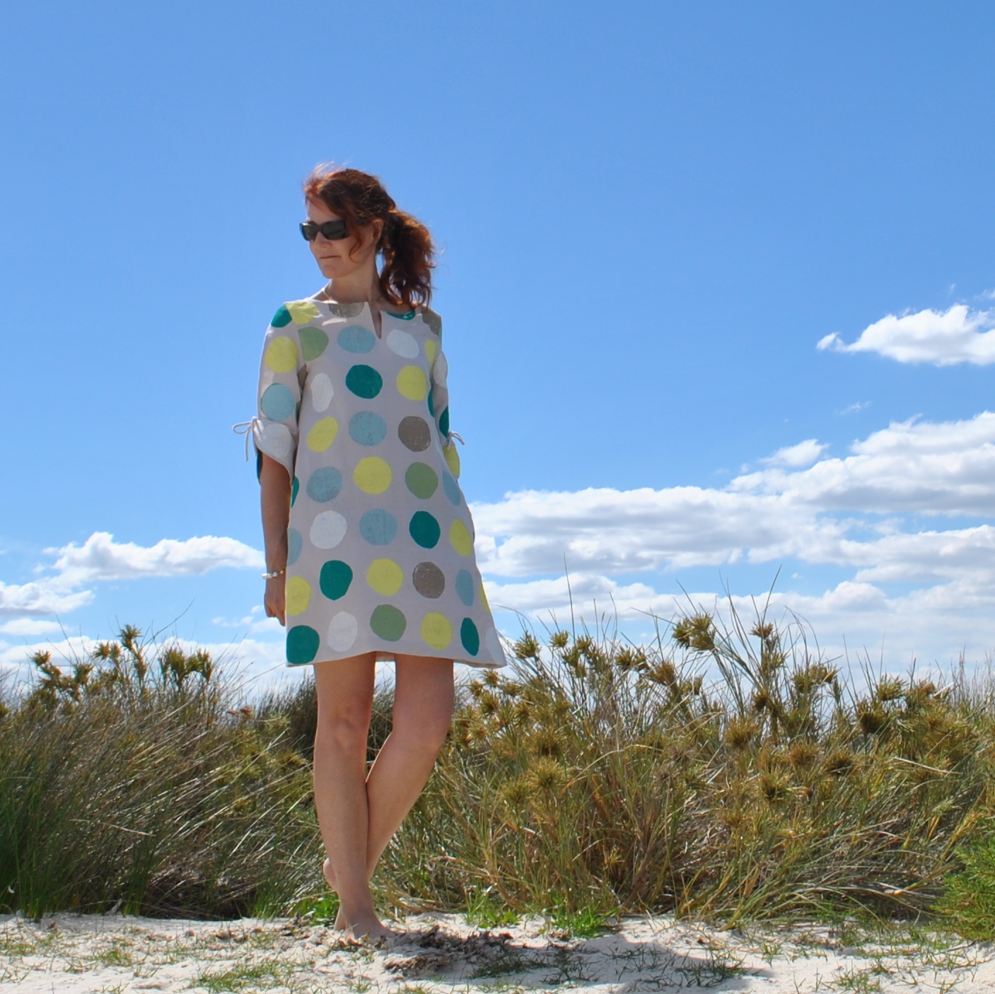
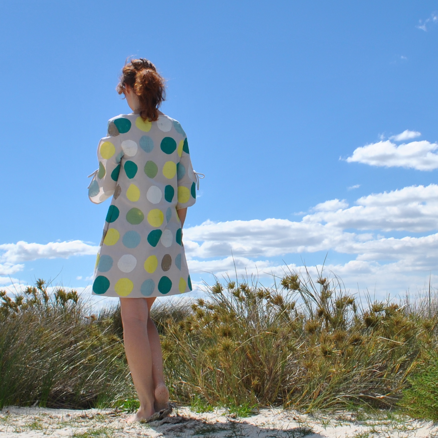
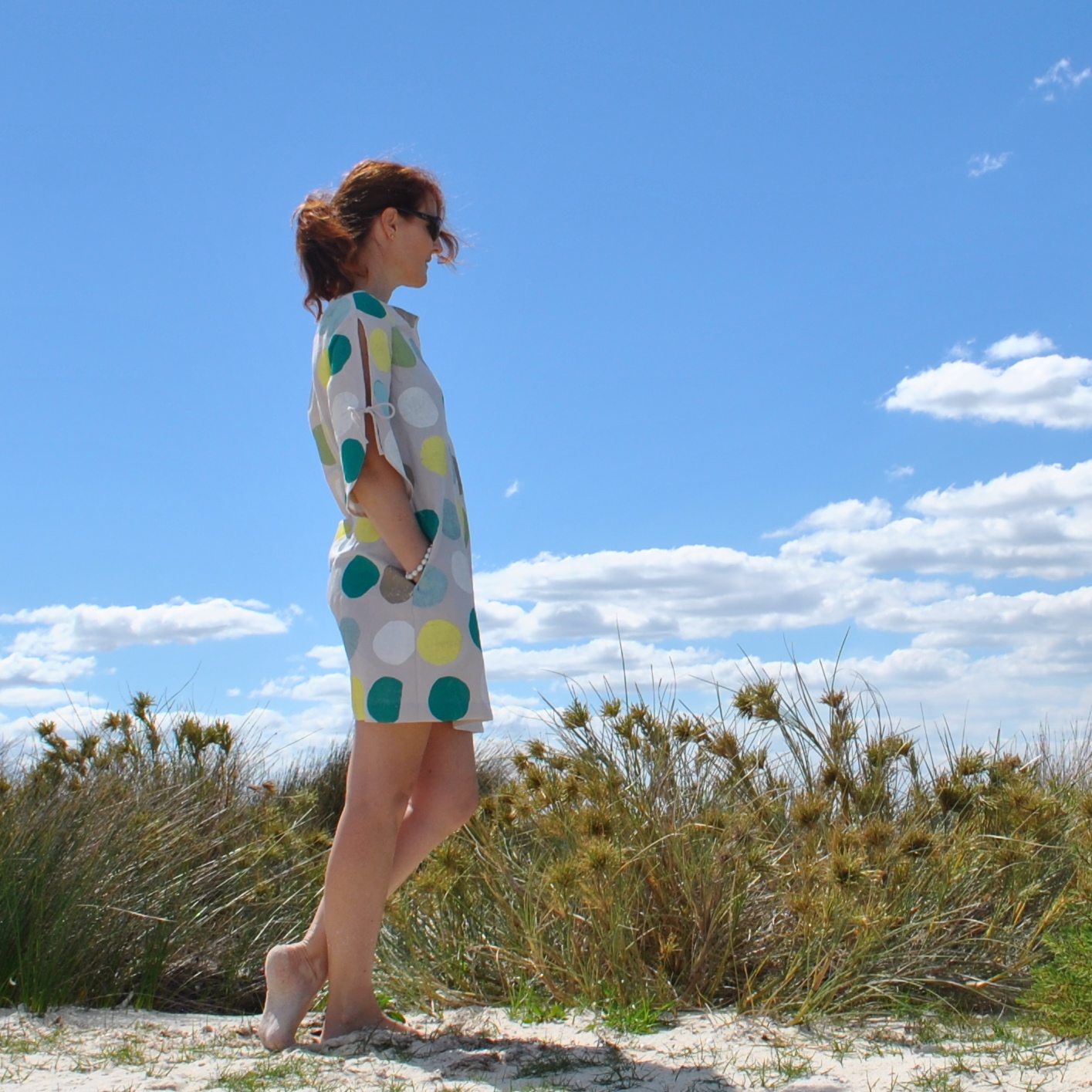
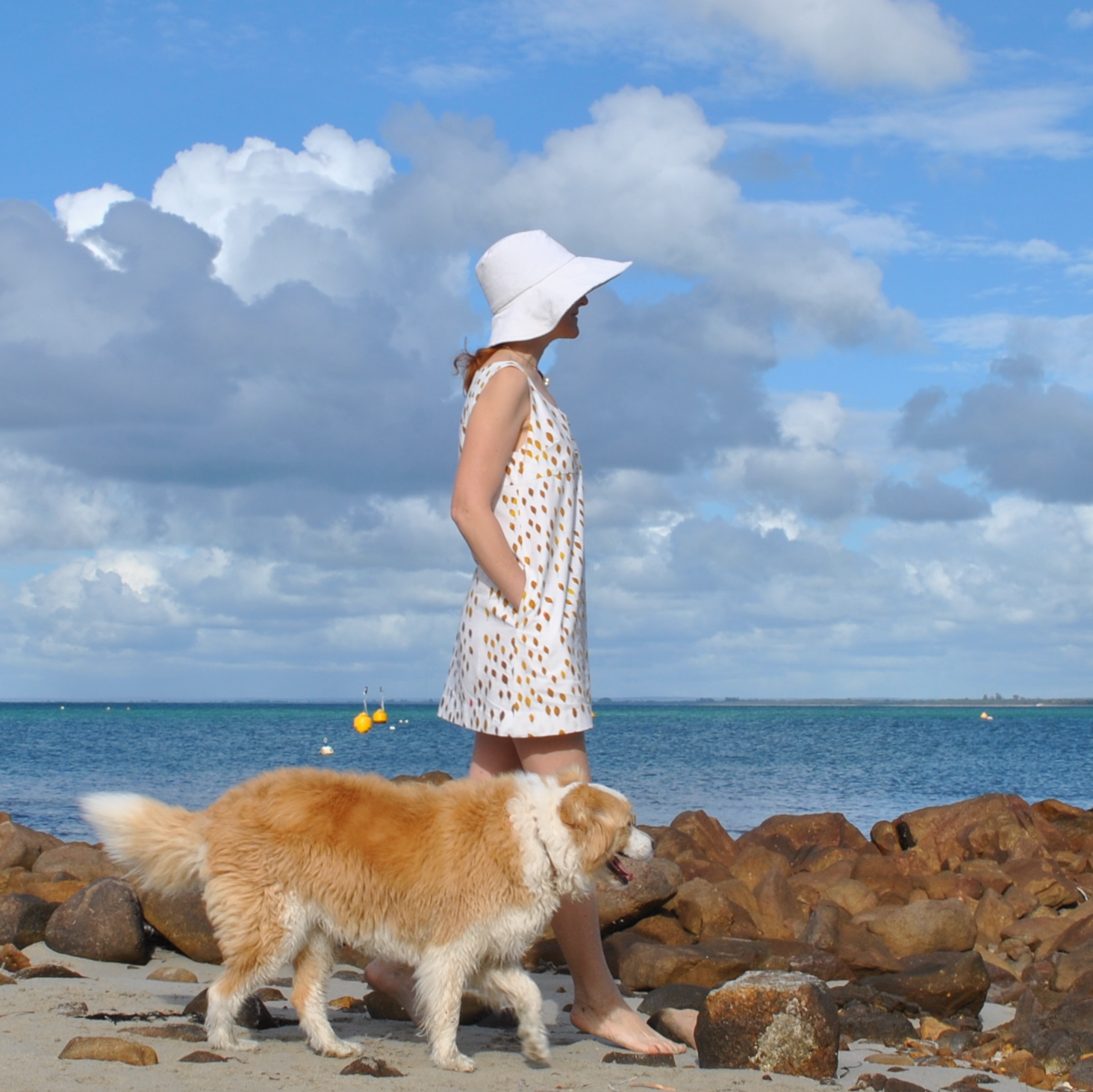
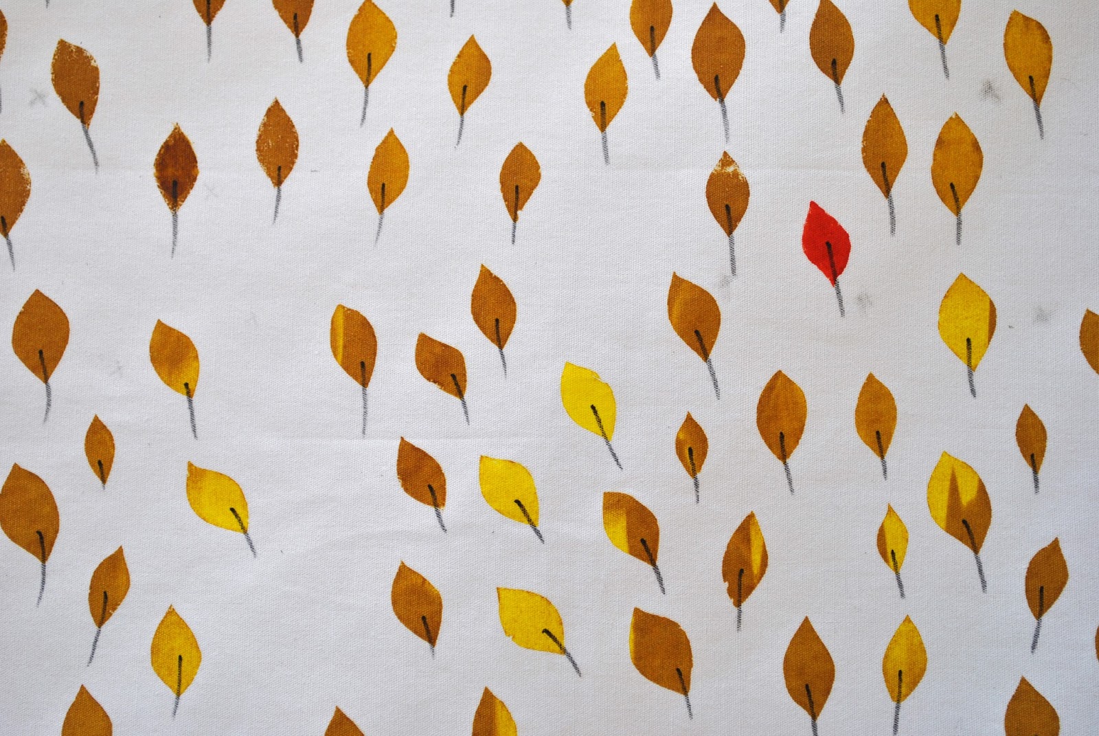
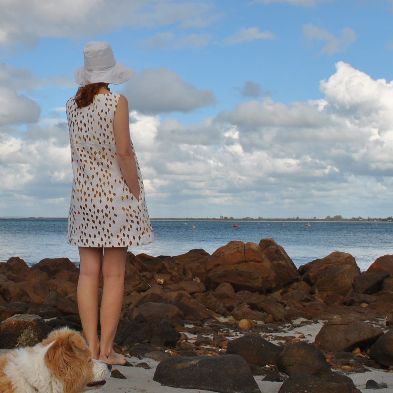
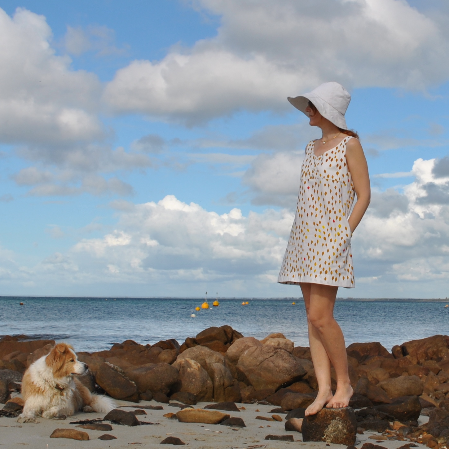
So, we had some purr-fectly dee-lightful weather last Monday, allowing me to wear, and take some piccies of, my dress. The product of my giant beachy polka dots fabric, screen-printed by moi.  Um, I’m completely satisfied with how it turned out.  And I can think of nothing further to add.  Not like me, I know  ðŸ˜‰

OK, just a few things.  
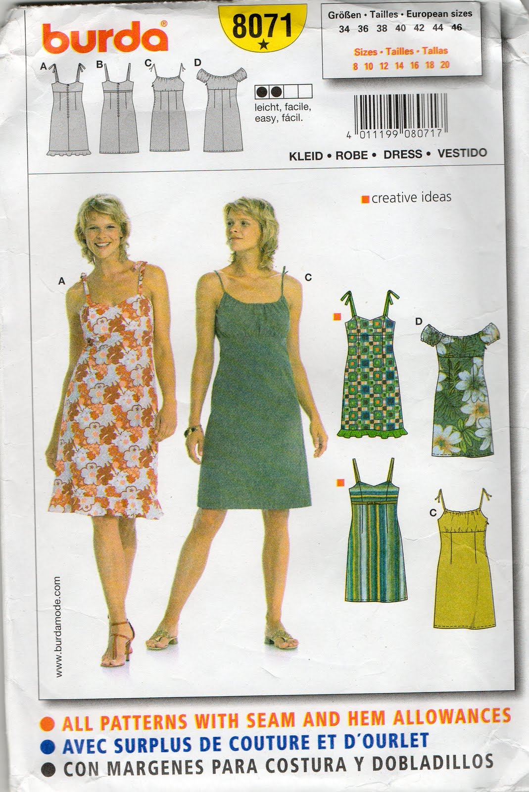
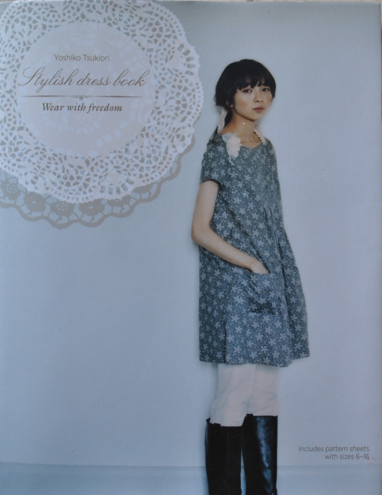
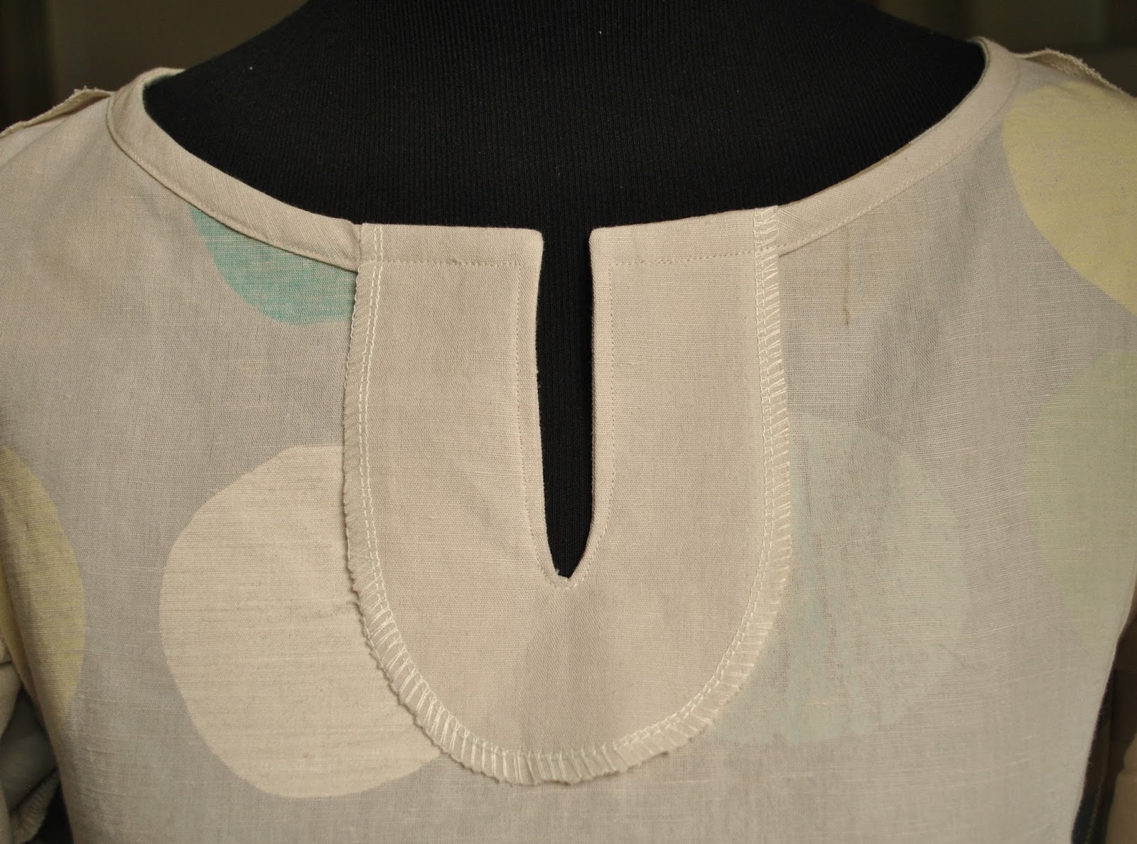
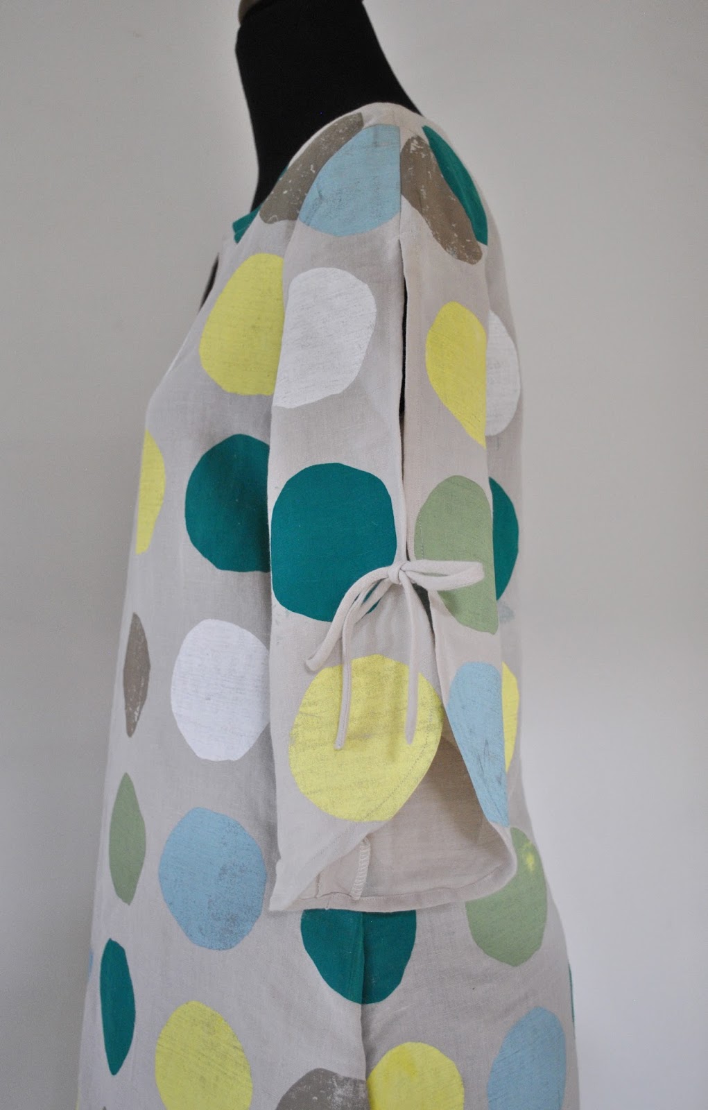
I used the pattern for dress F from the Stylish Dress Book by Yushiko Tsukiori, chosen because I wanted an almost featureless tunic dress, with no darts and minimal shaping to interfere with my print, but still had a certain je ne sais quoi.  This design, with a short neckline split and two piece open sleeves with a discreet but pretty little ribbon to tie them closed, was exactly what I wanted.  I cut out all the pieces before printing and sized my print to fit the pieces.

A stylistically simple design, like my stylistically simple print.  I added the obligatory-to-me pockets, ahem; deep inseam ones.  These are cut from the same sand-coloured cotton/linen fabric as the dress, but unprinted obviously.  The same goes for the bias-cut sleeve ties, and bias neckline finish and the neck facing.  There are advantages to printing your own; you can leave it off all the “invisible” bits of your dress, and that is a vast improvement… nothing to show through!

It’s been a thoroughly satisfying project in that the result truly matches my vision.  I’m going to really enjoy wearing it.  
The creativity demon inside has been sated… for now  ðŸ™‚
pinterestmail

Army jacket; 6 different ways

My khaki army-style jacket has been my go-to coat/jacket this winter.  I made it two years ago, completely inspired by all the fabulously cool examples I had seen out and about in Tokyo.  I got home and pretty much immediately set about gathering all the bits and pieces to make one for myself, adapting a jacket pattern from Burdastyle magazine so the features matched the ones I had seen in Tokyo.
Australia often marches to the beat of its own drum, fashion-wise; and looks that are IN! overseas may or may not take off over here.  You can never tell…. but anyhow, this winter army jackets were IN! here and I remembered that I had made one (o serendipitous moment!) pulled it out and have been wearing it pretty solidly since.  It is sooo warm!
Now, you might think it could only been worn as a casual thing, but being such an on-trend item I’ve found it incredibly useful and the deep olive colour goes with everything I have in the wardrobe.  I also made an attachable fur-lined hood to go with it but obviously such a thing is pretty irrelevent to our climate and so I’ve never attached it.  Maybe one day I will visit a snowy climate soon and can happily button on the hood without looking ridiculous?  A girl can but dream…. but in the meantime these are some of my favourite combos with it from this winter.

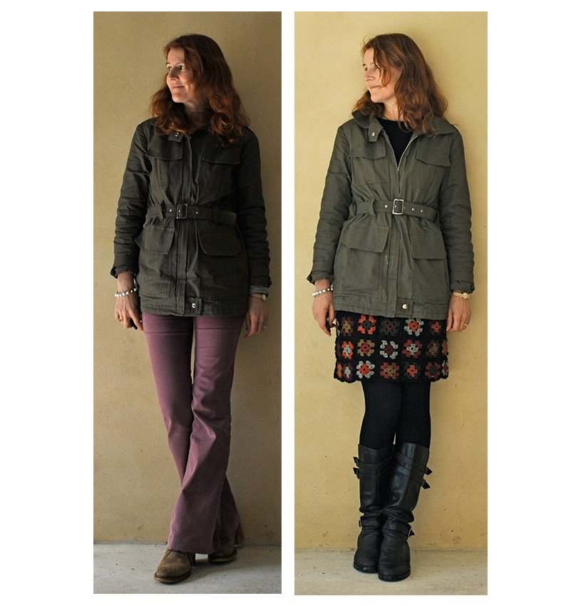
Below: at left; casual to the max, worn with my purple flared jeans.  Funny thing, I’ve kind of gone off jeans completely lately and don’t want to wear them at all.  I’ve semi-tossed these ones out now… they’re on probation….  At right; the jacket kept me toastily, snug-as-a-bug warm on our coldest day (15C) along with my crocheted Granny squares skirt, a black Tshirt, black woollen tights and biker boots.  I had my knitted gloves on for part of that day too, but not for the picture… brrrr!

army1a

At left; I’ve seen sequins combined with utilitarian khaki in a gazillion gorgeous street-style photos, and loved the craziness of the look, so I wore the jacket over my own silver sequinned skirt, a drapey white top, and with black suede pumps to a dinner with friends, and felt like an ultra trend-ite, for once!  At right; sporting a symphony of satisfyingly subtle sludgy goodness, worn with my khaki linen shirt, my sludgy little skirt (incidentally, the same fabric as my purple jeans in the photo above, dyed brown), my olive leggings, and olive knitted socks (not really showing here)   A bit drab maybe? but then again drab is my middle name.  Seriously, you should see the looks I get when I fill in forms.
(10pts to anyone who can pinpoint that quote….)

army2a
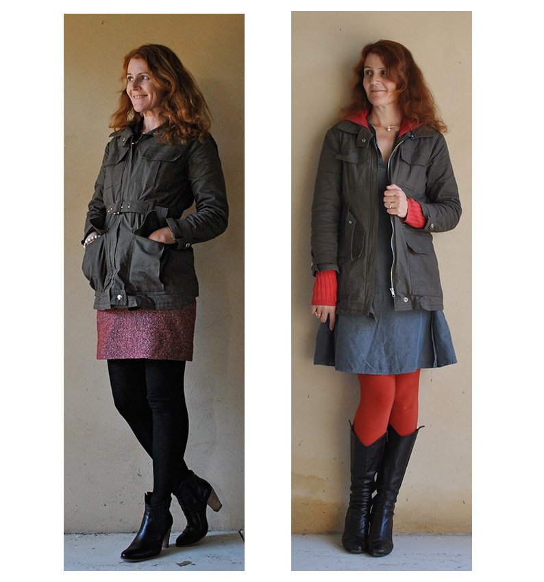
At left; worn into the city, with my rusty-red wool/silk skirt, black woollen tights and high-heeled booties, and at right, worn with my gunmetal blue silk dress, red hoodie and paprika tights.  Incidentally, this is today’s outfit, and I had a lovely lunch out with Dad.  He was wearing this shirt, actually nearly every time I see him he seems to be wearing it!  Which is super nice of him  🙂
army3a

So, the weather is warming up gradually, in fits and starts, and soon I’ll stop reaching for this jacket but I’ve sure appreciated and enjoyed its cosy comforting warmth and its easy-going style.  Hopefully the trend will stick around for a few more winters to come!

pinterestmail

Screen-printing: golden curls

 We had our last screen-printing class (sad face)   I’m going to miss heading out to class!  Anyhow, since I feel up to doing regular screen-printing on my own at home I had decided to try out a couple of the less usual techniques; so, foiling…

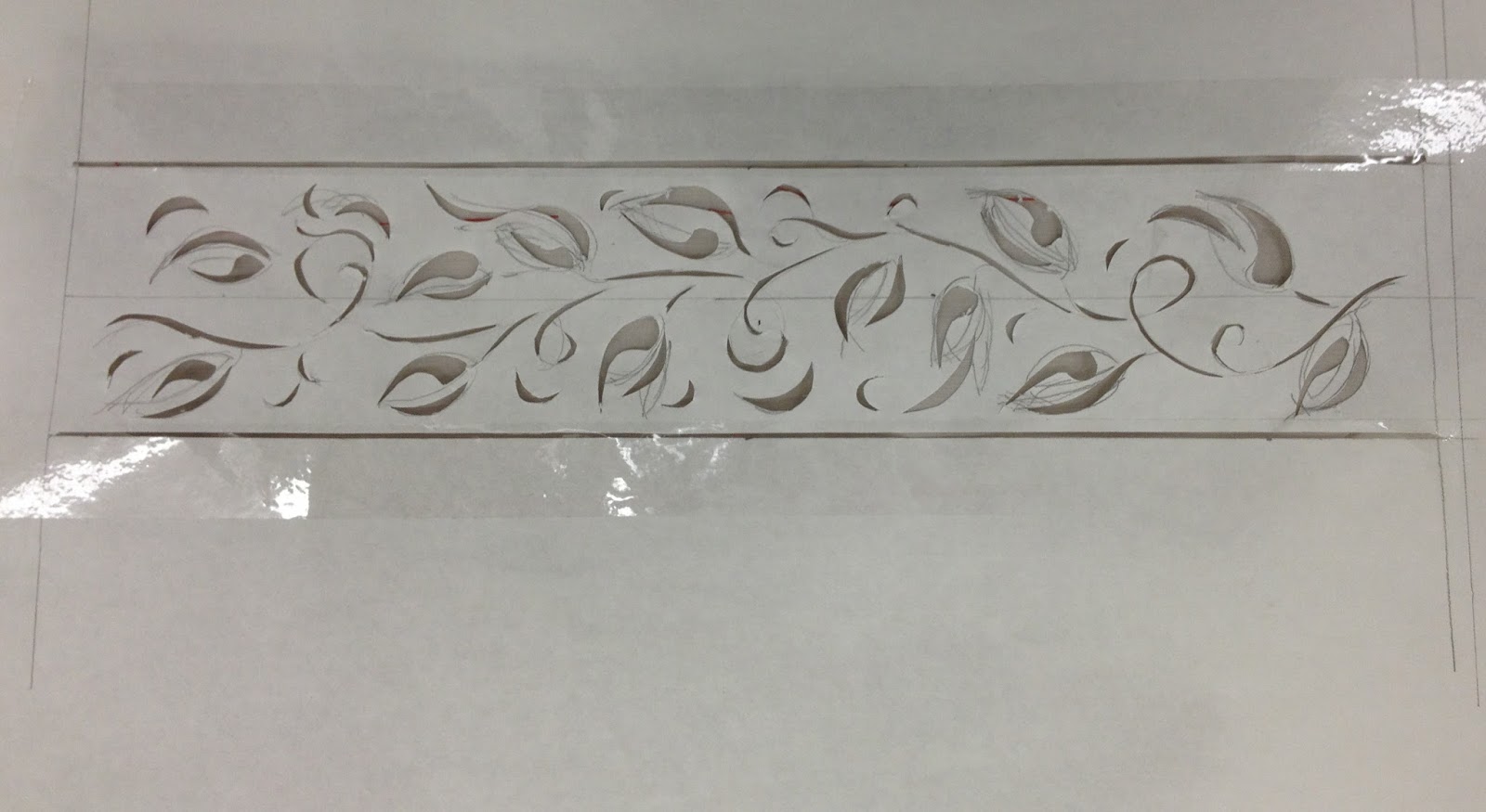
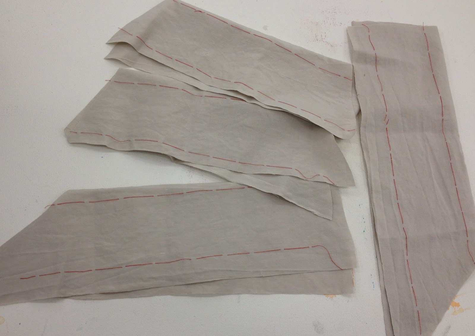
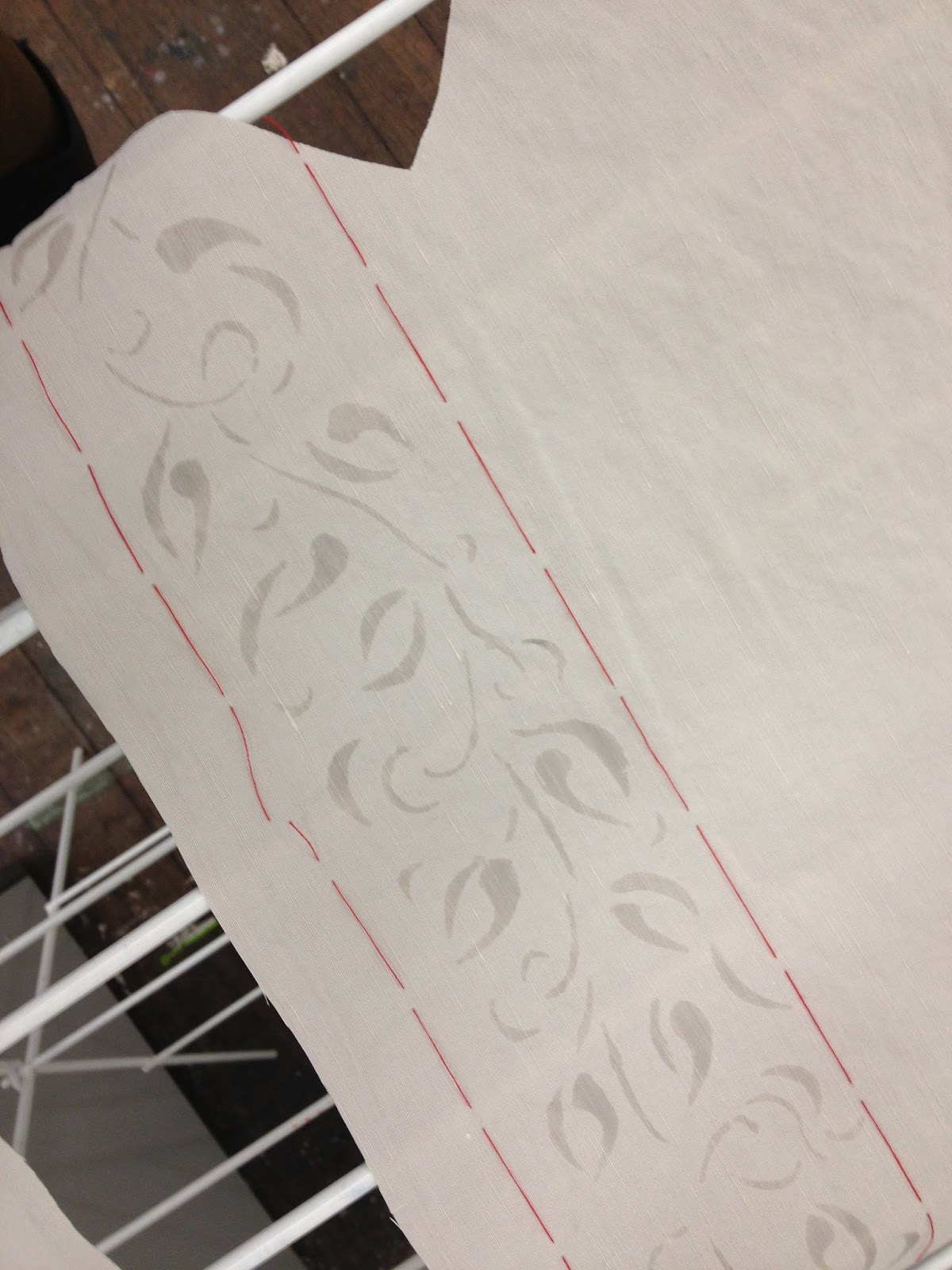
I put a lot of thought into marking the placement of my design … and came up with the following idea; those straight cut-out lines on either side of my stencil were masked with clear, see-through sticky tape, and are intended to be a sort of “window” through which I was hoping to see the lines of red tacking stitches, in order to put the screen down as accurately as possible.  Of course, you could just put the screen down on a large piece, print with a wide margin all around, and then cut out your pieces afterwards, but I had only exactly just enough of this pale grey silk/linen for my pieces and needed to be as fabric economical as possible.  This approach worked beautifully! and I would definitely do this again if I wanted to print a border design like this.

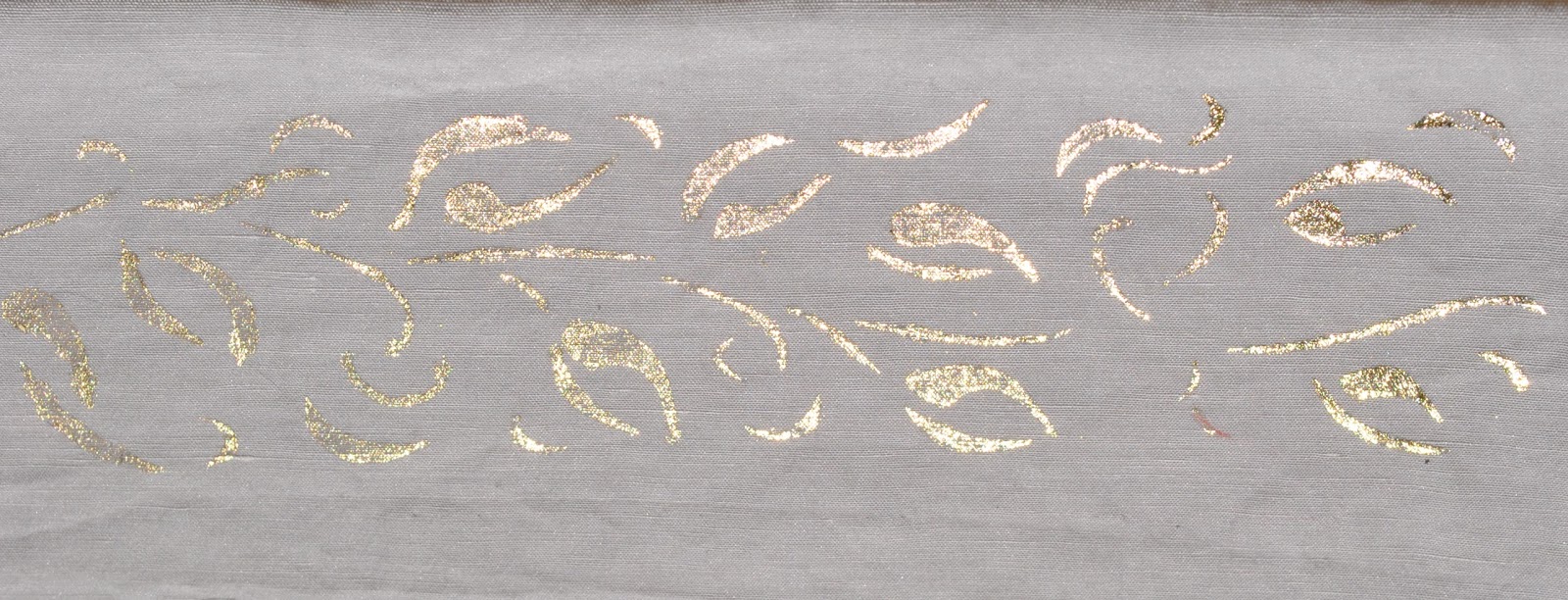
 Ta da!  the foiling glue actually looked pretty cool all by itself on the fabric, subtle and rustic in a tone-on-tone way like ancient stone carvings or something, and I was tempted to leave it like this!  But nothing ventured, nothing gained, or let’s hope so anyway…

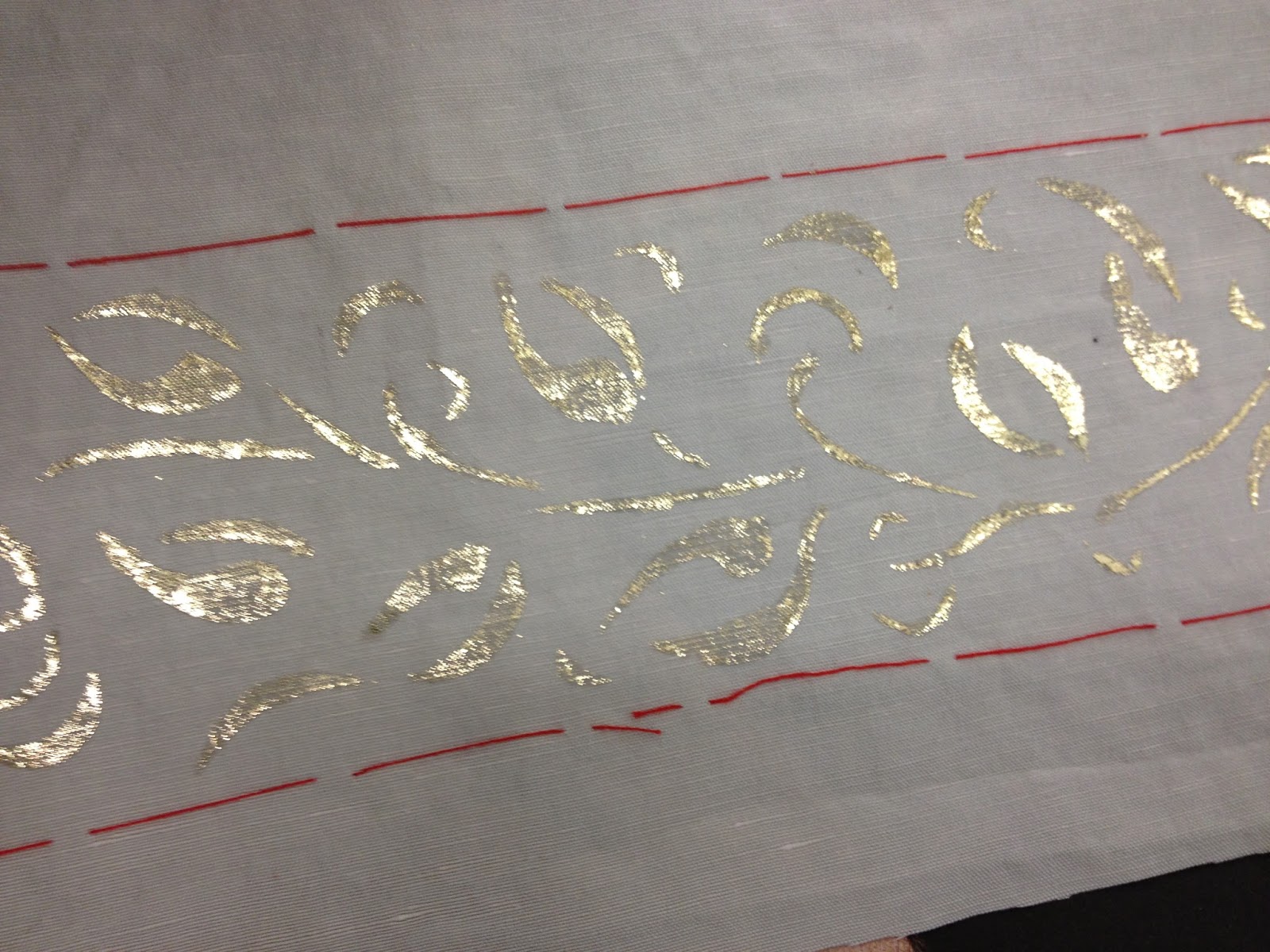
…and Eureka!

I tried in places to achieve a very subtle mix of shades, but mostly went for gold.  I only wear gold.  She says, all la-di-da like.

I quite liked my design, and how it turned out, but the foiling glue is trickier and even messier than regular fabric paint, if you can imagine! so I’m not sure if I would do this technique again.  The glue is like a close relative of epoxy, and if you make the mistake of getting any on your fingers it rapidly turns into a tenacious tacky stain and nothing short of Gumption will get it off.  No kidding!
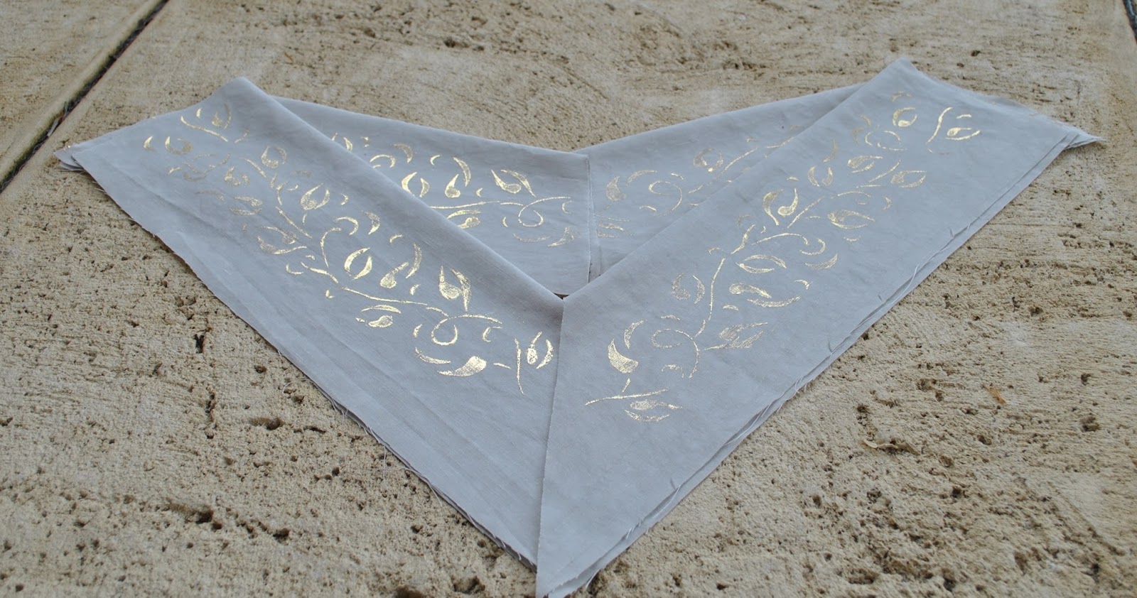
Below should give an idea of how I’m going to use these pieces, when I get around to it.  Sometime, soon.
I’m really going to have to get cracking on the sewing machine  ðŸ™‚ 
pinterestmail

Autumn leaves sundress

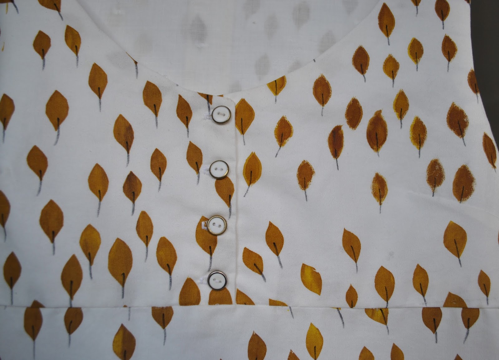
I made a sundress using my autumn leaves fabric, screen-printed by me here.  Those who like wonky weird imperfect prints are going to like this, if you don’t, then avert your eyes!
The pattern is an adaption of dress T, from the Stylish Dress Book, the design Reana chose for me to make my sew bossy dress here, which now looks like this.  That one is such a great dress to wear; so comfy and easy to throw on it has quickly become one of my favourites  ðŸ™‚
For this new dress I didn’t have enough fabric to make up the pattern as is.  I left off the sleeves, and removed about 15cm in width from the centre fold of both the skirt front and back, so there is no gathering into the bodice … that’s a whole foot taken out of the skirt’s circumference overall!  and there was still plenty of room in the skirt for me to have inseam pockets.  I cut these from a much nicer, lightweight white swiss dot cotton.
The front neckline of the bodice has been scooped out a bit deeper than the pattern, and I split the front bodice and made a little placket, with buttons and buttonholes.  Just because, I dunno (shrug), something to focus on other than those weird and wonky leaves.  The front and back bodice each have a full facing, cut from a lightweight plain white cotton.

 Hehe… would you believe I’ve only just noticed, when I uploaded this picture? that one of the leaves on the front of the bodice is missing its stem??  Only just noticed!  LOL!  And while drawing them in I checked and checked…  I’ve fixed this up now, but didn’t bother to take another picture.

I’m a bit meh about this dress, partly because my print is … funny; and partly because the fabric itself is a pretty poor quality.  It is a bit stiff and almost calico-like in texture.  Now I’m kinda kicking myself I didn’t take the risk and buy a finer quality cotton in the first place, problem was, I had no confidence in myself and started out with the assumption I was going to stuff it up.   I will wear the dress, because it’s airy and cool and will be great to have in the wardrobe in the hottest days of summer when I just want to grab something casual, and I’m hoping it will soften up over time with wear and washing.  The thing is, I usually judge my self-mades by posing the question; would I buy this if I saw it in a store?  And realistically I would probably pass this over, laughing at its hideousness.  Oh well.  

A thought…  I can always use it as an apron, for future screen-printing sessions?!  Ha!

I did learn something pretty important in printing and making this dress…  Cut out the pattern pieces before printing! 
This approach is hugely superior to printing a length of fabric and then deciding what to make with it, like I did here.  Several reasons…

There is less wastage of fabric ink and your own effort, since you are not printing fabric that you won’t use. 

You can make sure that the print is properly covering the pattern piece as you are going along. 

You can if desired place the print just exactly how you want it to appear on the piece.  

It’s guaranteed that you will have enough fabric printed to make what you want, there’ll be no laying down the pattern pieces and being disappointed that you underestimated just how much you would need.
Another consideration… there will be no angst when cutting into your precious print since it is already cut out and ready to go!

And, learning from my own mistakes… yes, I have already sewn together my giant polka dot pieces too, and I’m pretty happy with that one…..  Stay tuned!  ðŸ™‚

Details:
Dress; based upon dress T from the Stylish Dress book by Yoshiko Tsukiori, screen-printed ivory cotton
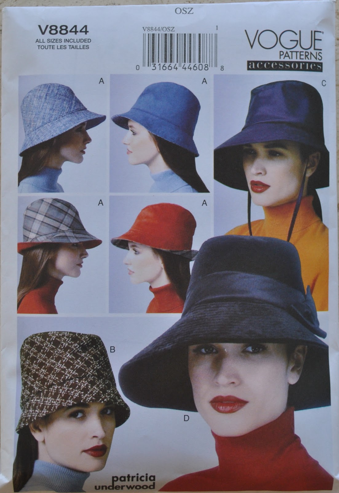
Hat; Vogue 8844, ivory corduroy, details and my review of this pattern here
pinterestmail

Screen-printing: giant beachy polka dots

My latest screen-printing project  ðŸ™‚
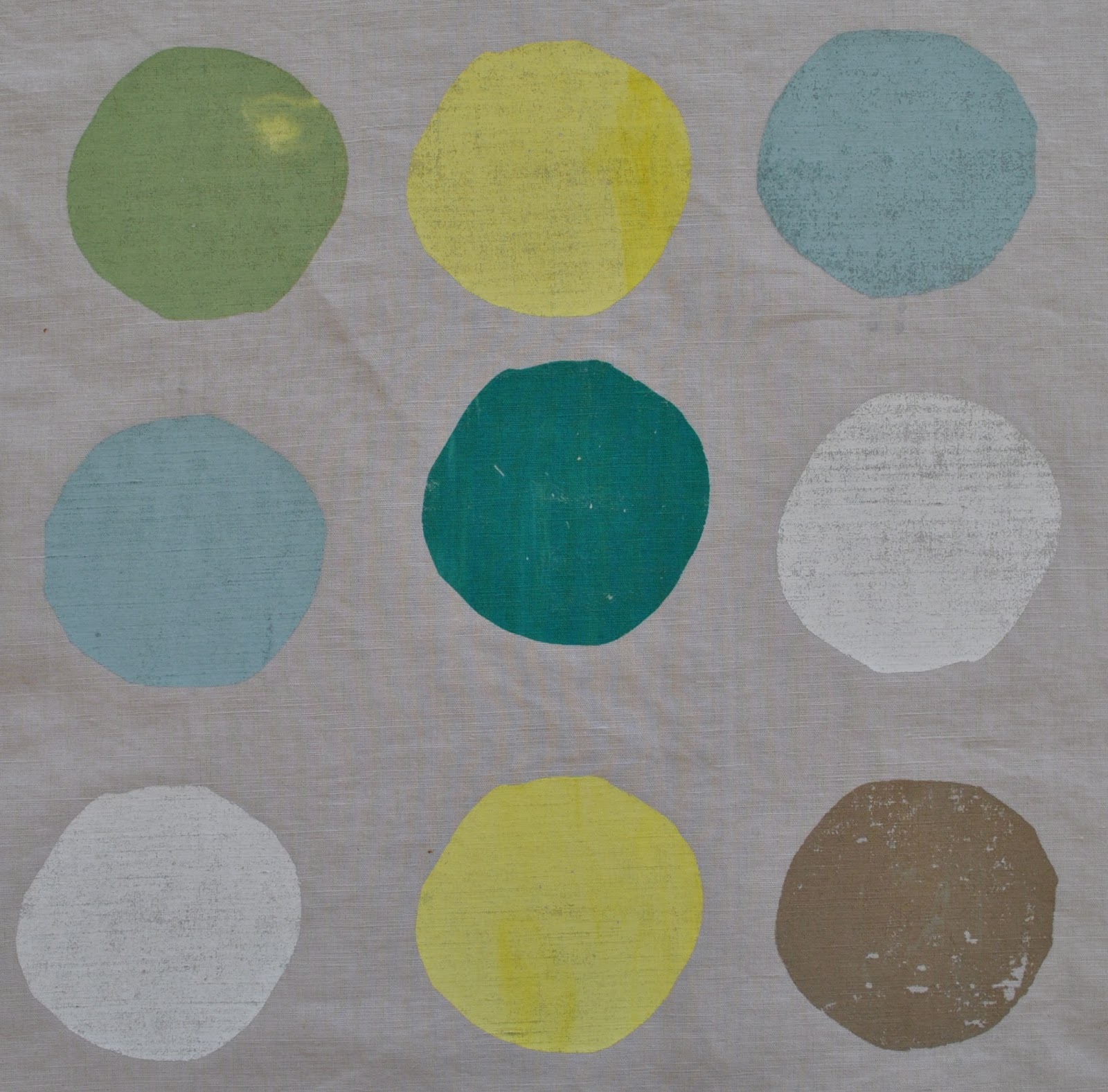
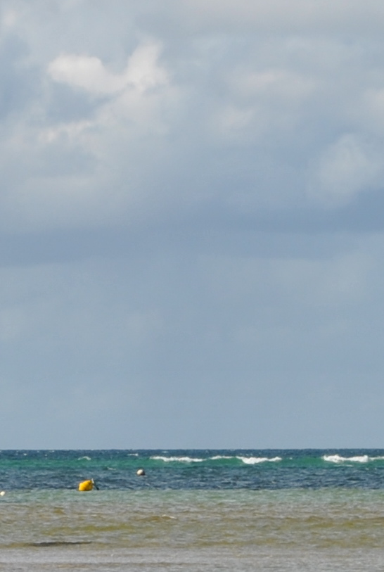
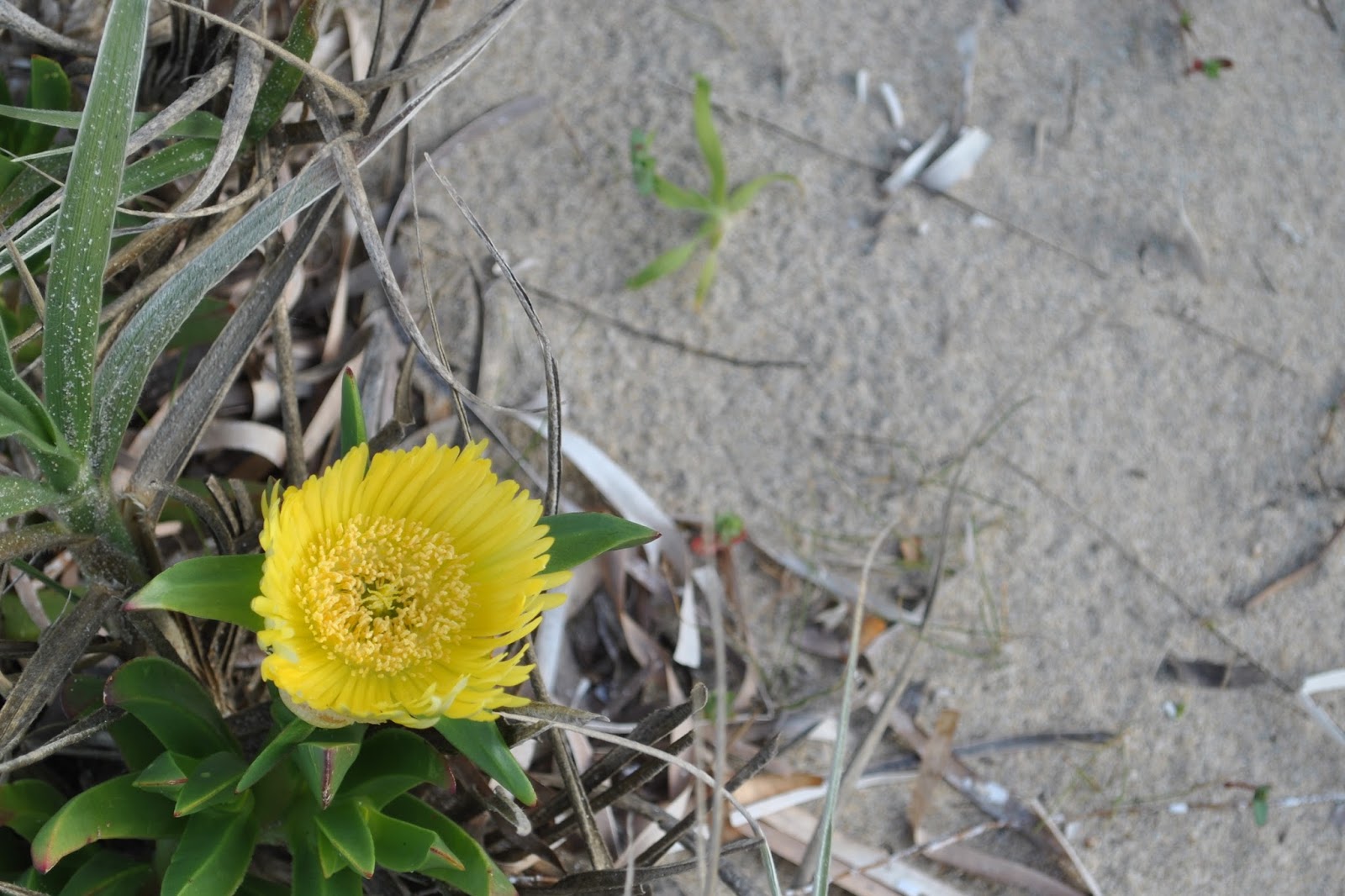
Searching for design inspiration, I randomly set myself a theme.  The beach!  I sketched out several ideas and variations, some abstract some more literal, and spent ages agonising over which one I should do… aaargh, so indecisive!!  Eventually settled on this very simple and abstract one, obviously! since we are really pushed for time and space in our class and it’s best not to to turn up with very ambitious ideas.  I had to finish this one at home since I only managed to get halfway through in class.  But I am seriously considering setting up at home to print at least one of my other beach-related ideas too.
I used a lovely lightweight cotton/linen from Spotlight, in a soft sandy shade.  This is probably the nicest, classiest fabric I have printed so far.  It was scary, but I felt ready to take a risk.
The colour palette (6 colours) :

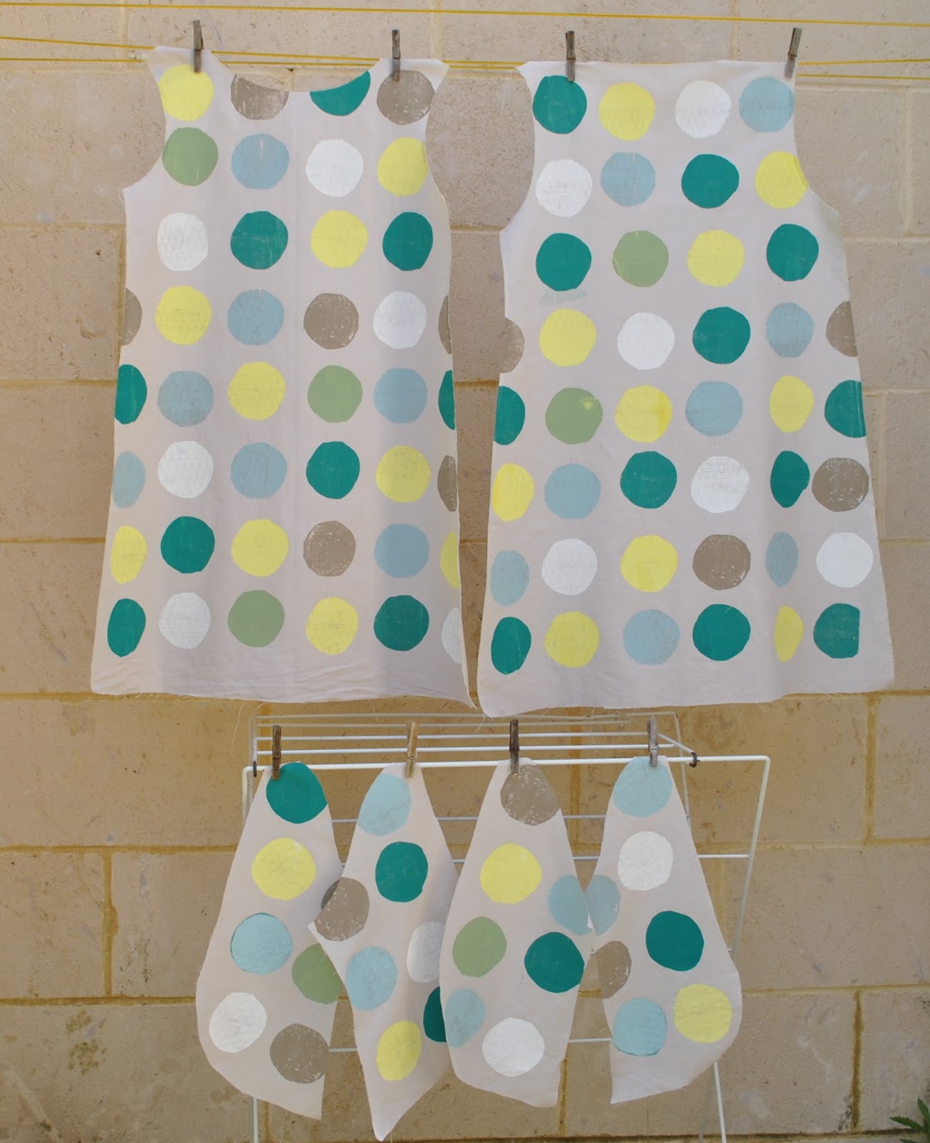
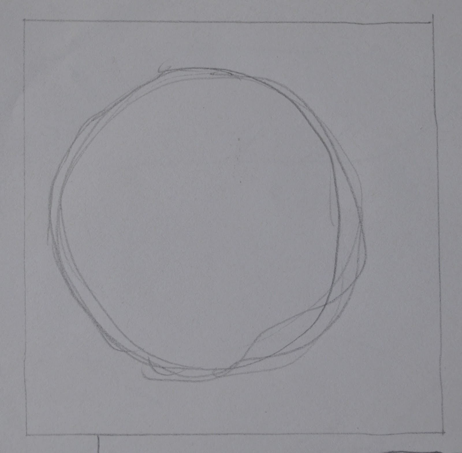
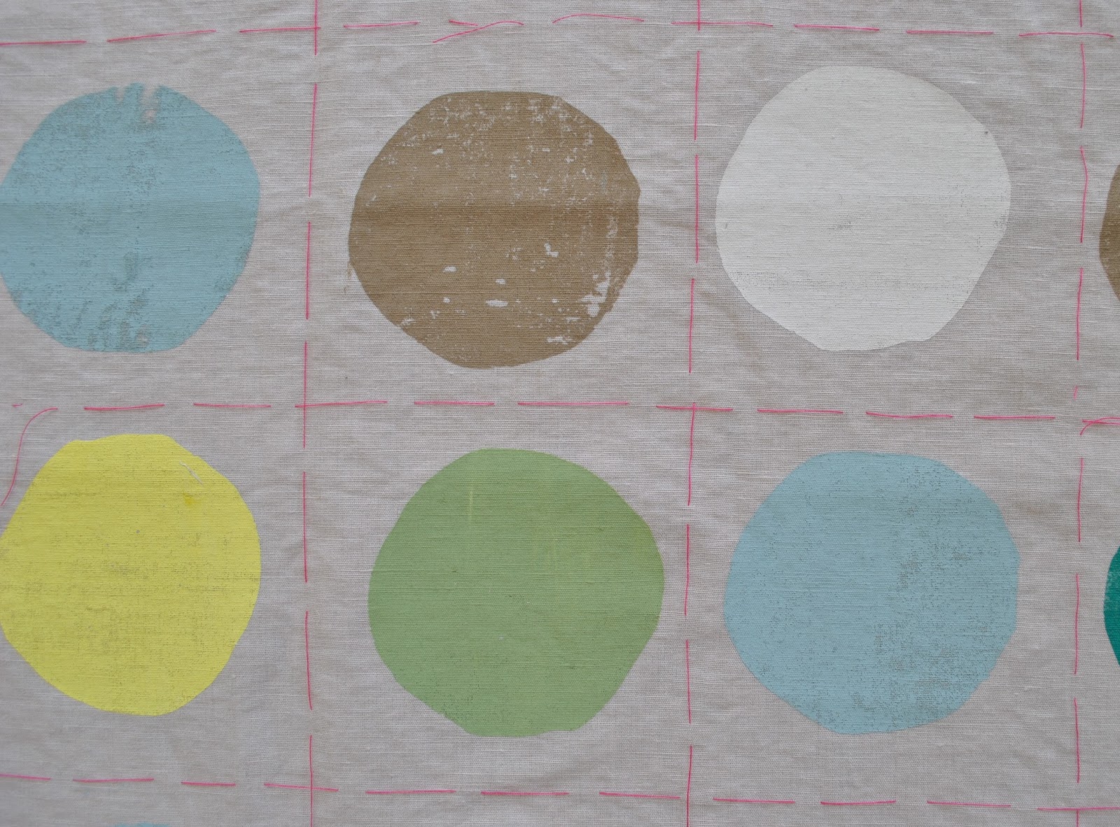
The dots are all printed using the same imperfect circle template, but oriented different ways so they don’t look identical to each other.
Funny moment; my friend J, with whom I am doing the class, on seeing my stencil “um, it’s a hole?”
When printing I tried to vary the visual texture of the dots; at times I did a scanty pull, to get scratchy dots, at other times I put together blobs of slightly different shades of the colours without mixing properly, to get streaked or blotchy dots.

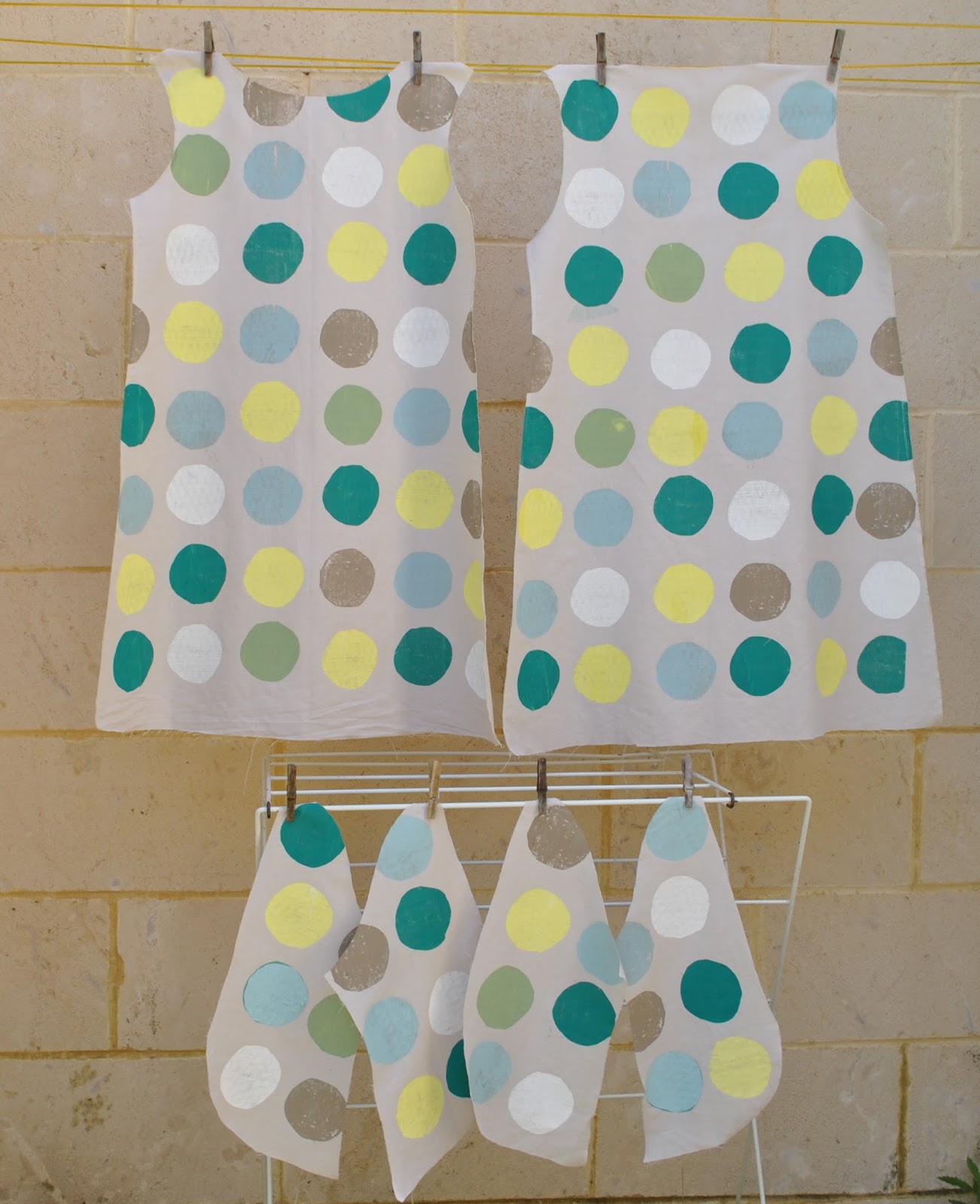
Before class, I cut out all my pattern pieces and tacked an accurate 11cmx11cm grid all over each piece.  When printing the dots I placed the screen just slightly off every now and again, because I like how a little imperfection makes the design look more casual and fun.  Plus, wonky designs are the beginner screen-printer’s best friend!!

The whole shebang…

Thoughts: I am super happy with how the print turned out! and am pretty excited to see how the final garment will look.  I’m motivated to sew it up quickly, because my teacher specifically asked me to show it at our next class.. which will be our last!  Yes, I’m a little sad that my weekly class is going to end, but this isn’t going to be the end of my screen-printing adventures, that’s for sure!

pinterestmail

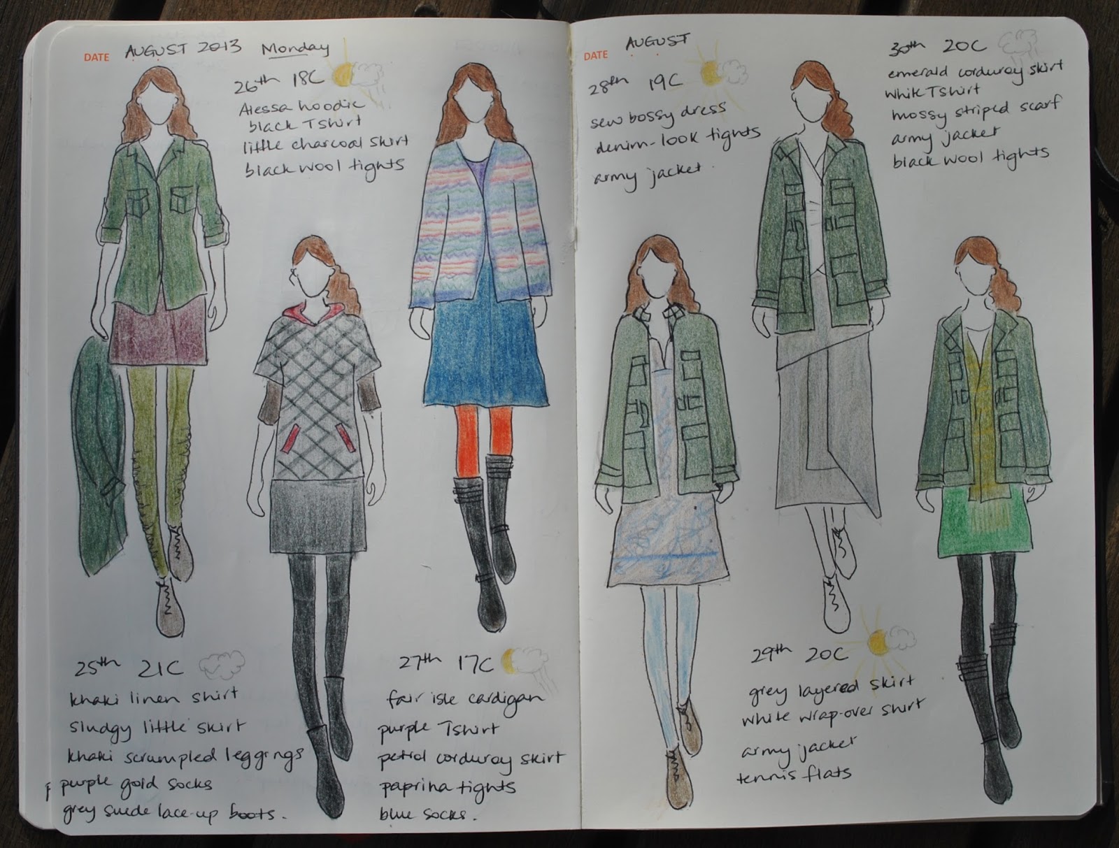
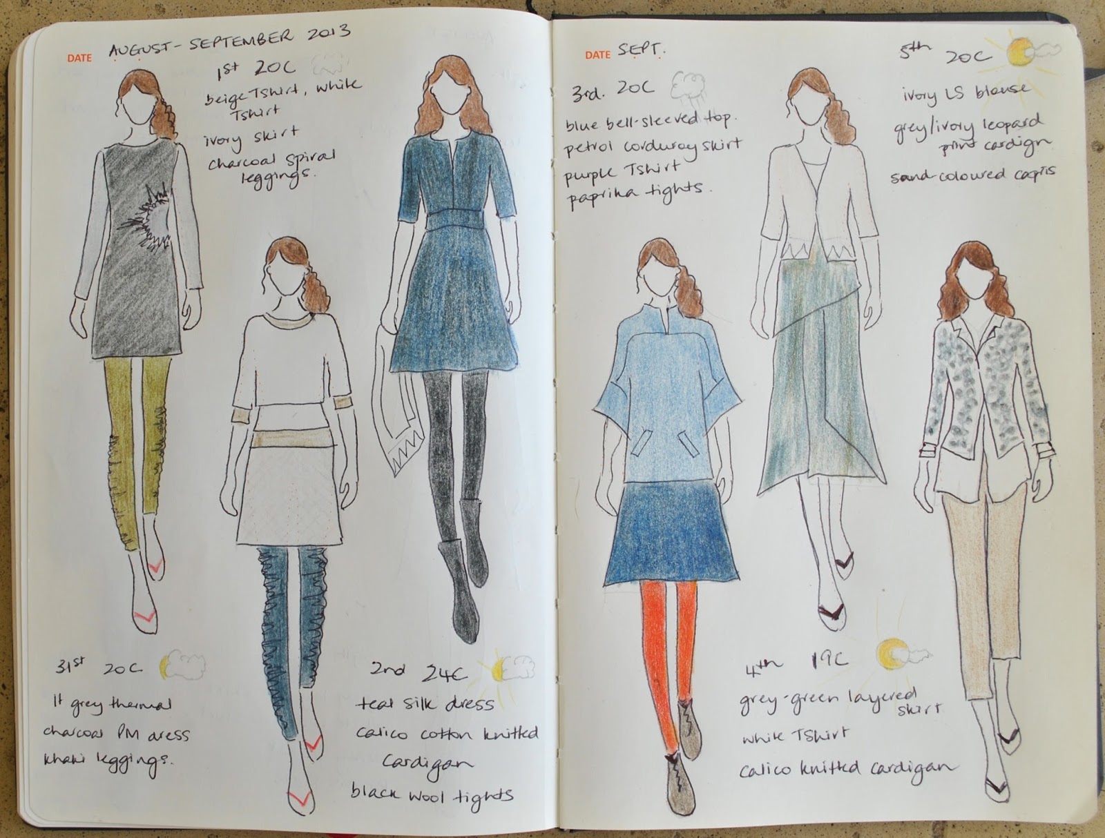
the paper doll project

(I’ve pledged to wear only clothes handmade by me this year and to sketch my daily outfits in my Fashionary.  I’m calling this the paper doll project)

25th-30th August
from left:
khaki linen shirt, sludgy little skirt, khaki leggings, purple-gold socks, army jacket
alessa hoodie, black Tshirt, little charcoal skirt, black wool tights
Fair isle hand-knit cardigan, purple Tshirt, petrol corduroy skirt, paprika tights, blue socks
sew bossy dress, denim-look tights, army jacket
grey-green layered skirt, white wrap shirt, army jacket
emerald corduroy skirt, white Tshirt, mossy knitted scarf, black wool tights, army jacket

31st August-5th September
from left:
lt grey thermal, charcoal pattern magic dress, khaki leggings
beige Tshirt (unblogged), white Tshirt, ivory curtaining skirt, charcoal grey spiral leggings
silk/linen dress, black wool tights, calico knitted cardigan
blue bell-sleeved top, petrol corduroy skirt, purple Tshirt, paprika leggings
grey-green layered skirt, white Tshirt, calico knitted cardigan
ivory blouse, leopard print cardigan, sand-coloured capris

pinterestmail

New (not) khaki leggings

Hello  ðŸ™‚
I’m still renovating my wardrobe… and can I just say, beige leggings, hmmm.  (shudder) I’d taken a hearty dislike to mine over recent weeks.  But they still had some wear in them.  Wasteth not, wanteth not.  It was really just the colour that had become offensive to my eyes.   Corrective action was called for.  
To the dye pot!!! 
(spoken in the same tone as one says “to the bat cave!” of course!)
Before…
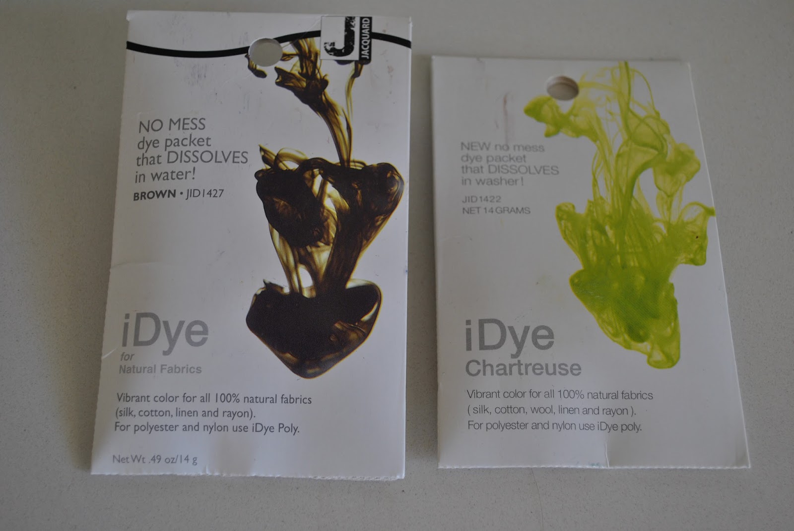
the transformative materials…
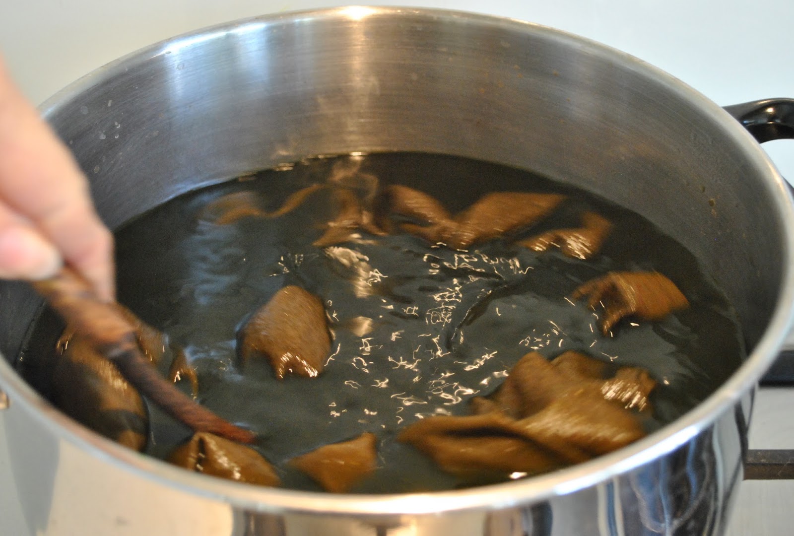
I used only a shake (that’s an official unit of measurement there) each of iDye in Brown and Chartreuse.  Probably a pinch at the most, plus heaps of salt.  Pinch, heaps;  some other highly technical terms.  Trust me, I’m an analytical chemist!

And now they are no longer hideous to my eyes, they have a new lease on life  ðŸ™‚
my tutorial on dyeing

Details:
Leggings; self-drafted of beige cotton knit, dyed khaki, originally posted here
Tshirt; self-drafted, grey knit stuff, details here
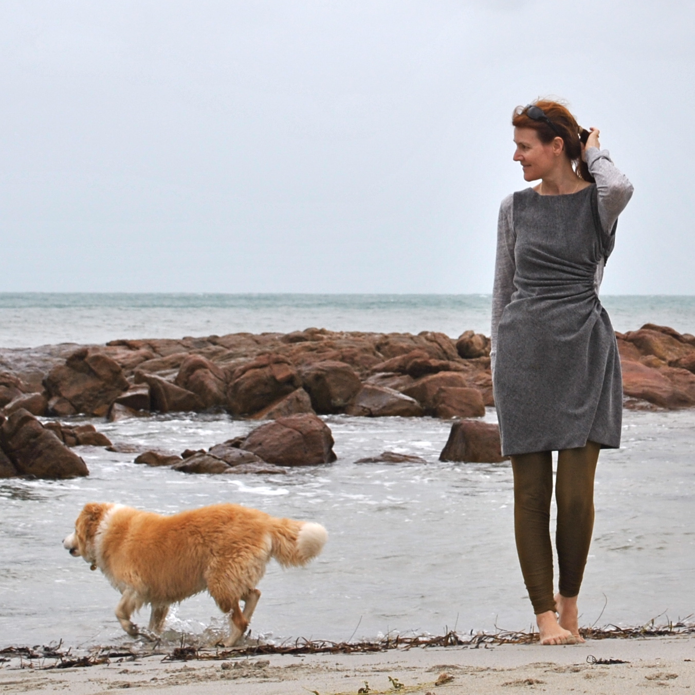
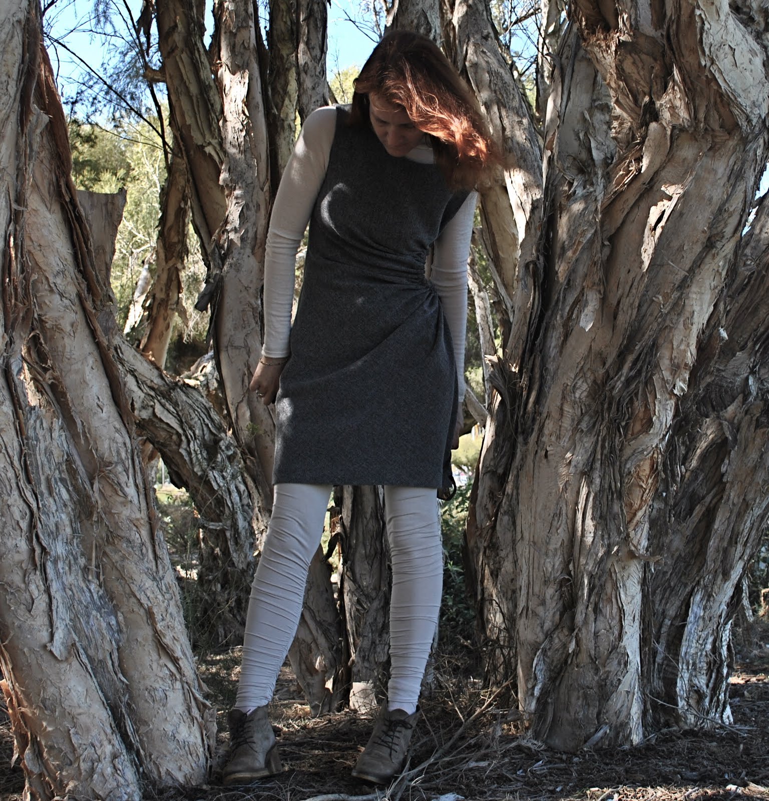
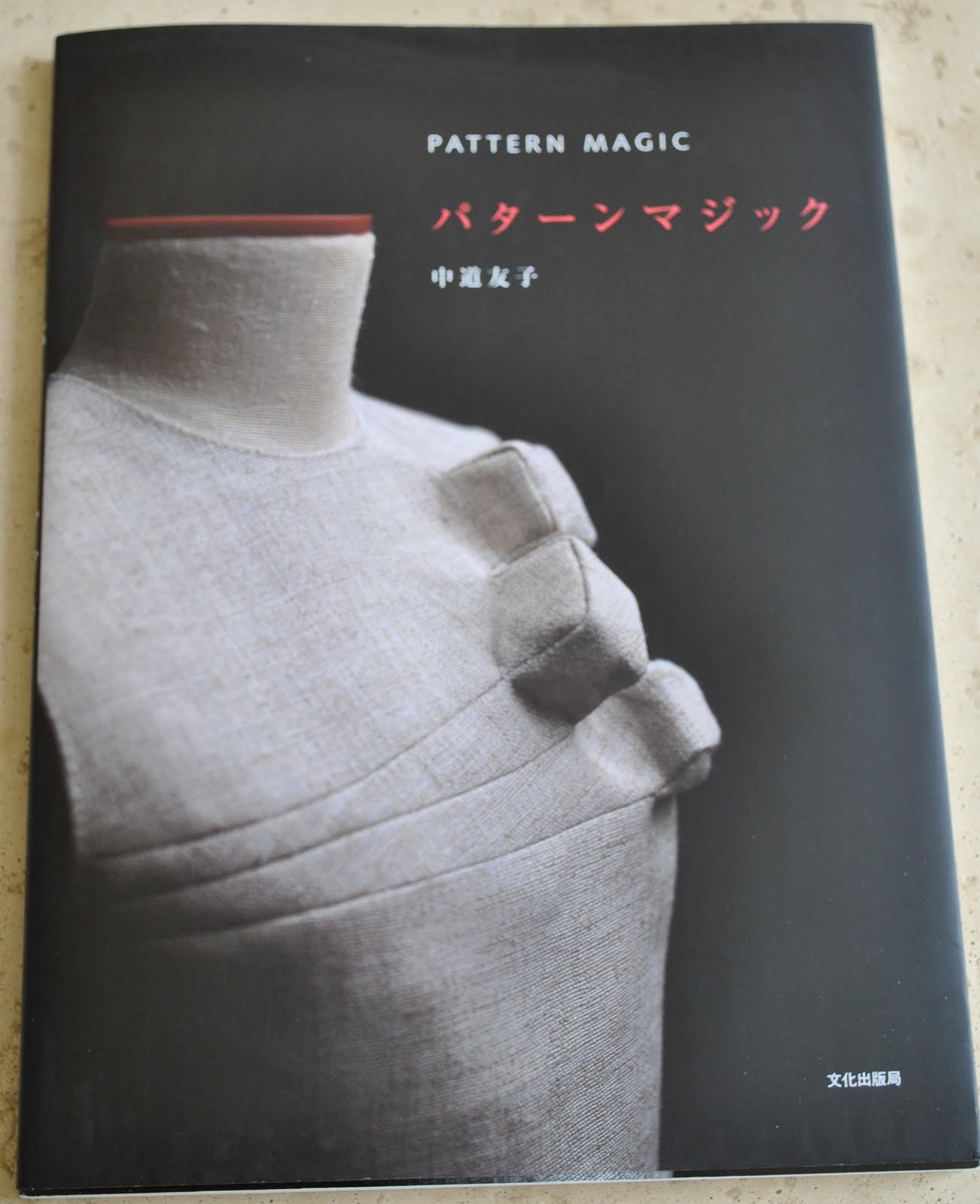
Dress; the gathered hole dress from Pattern Magic by Tomoko Nakamichi, charcoal suiting, details here
pinterestmail

stabilising the zip in a delicate fabric

When stitching an invisible zip into a delicate fabric, it’s a good idea to stabilise the fabric at the stitching line somehow, give it some oomph to help guard against ripping.  Generally, patterns recommend using commercially purchased bias binding or tape, which is sewn to the seam allowance to double the thickness of fabric at that point.  Me being kinda stinge-y  I mean thrifty, ahem!  I usually snip a strip of the selvedge off to use.  
Why? several reasons…
The selvedge of any fabric, even delicates, is usually surprisingly strong and quite stable compared to the body of the same fabric.  
Particularly with sheer fabrics; the selvedge, being exactly the same colour of course, will blend in perfectly and won’t show through to the right side of a sheer fabric at all.  This is a big plus if your fabric is an unusual colour.
Also, you are making good use of the scraps that you would probably toss out anyway, which is more economical than not, yes??
Just stitch it down to the wrong side of the garment, as close to or just within the seam allowance.  If your fabric is super delicate you could fold it over, or use a couple of strips layered together, giving you triple thickness fabric at this point…

Sew in the zip as normal…

Don’t worry about those fluffy messy looking edges, because once the lining has been stitched to the zip tape you can’t even see those scrappy edge bits anyway.

pinterestmail
Switch to mobile version
↓