Tag Archives: Own Design

A horse, and other news

The lovely Yoshimi the Flying Squirrel will be literally flying! and over here!  She has revealed her travel plans, so now I may say something too…  I am thrilled to say that she is coming to visit me on her way to the bloggers meet-up in Melbourne.  I will be so happy to see her again, and am super excited to show her around Perth!  I’m planning for, and hoping that she will have a really wonderful time here, and I know she will have an absolutely brilliant and fun weekend at the Melbourne meetup with TJ and Maria and all the other Melbourne gals too.  Exciting stuff!  😀

In current doings, I’ve been mucking about with fabric paint again today…

I bought this lightweight mustardy-chartreuse silk in ?Tessuti’s? I think? during my girly trip to Melbourne with Mum and Cassie last year and it’s been burning a hole in my conscience.  I’ve reeeeally wanted to make something interesting with it but couldn’t think what and it was fast becoming too precious to cut up.  Finally I’ve thought of something… hopefully this will turn out cool in the end.
My initial grand plan was of a more realistically shaded horse, with sharply defined edges outlining rippling equine muscles and tendrils of mane billowing gorgeously in the slipstream…  those pie-in-the-sky ideas had to be abandoned when experiments revealed that the paint bled like the blazes on this silk.  Oh well.  Embrace the limitations, and all that!  And a serendipitous one; since the splodgily abstract nature of my print brings to my mind the markings of an Appaloosa horse.  Ok, I’m happy!
The technical blahdy-blah…
I drew my design, gave it a grid so I could enlarge it to a good size to fit my piece, and then traced it onto the fabric using water soluble pen, although tracing probably wasn’t necessary in the end.  I mixed a hefty blob of black fabric paint into about 2 cups of water, in a plastic spray bottle… just one of those cheapies you see in the gardening section of the supermarket for your seedlings.    Some experimenting was necessary to determine a good ratio, giving a solution that was thin enough to spray without clogging up the nozzle, and yet had enough paint to leave a mark on the fabric.  
Cut out my stencil and sprayed away.  I also sprayed the other pieces; and as lightly and as thinly as I could, painted in some mane and body contouring streaks with a paintbrush, separately.
 This will be appearing in wearable form, tout de suite… 

In other sewing news, I have decided that I might quietly do a stitchers guild SWAP this year.  I’ve bought a few Australian Stitches magazines over the years and, like lots of people, Lynn Cook’s wardrobe planning was always my favourite bit.  I discovered that following her example was an established sewing blog thing-to-do last year, with rules and a time frame and a competition as well!  man, I’m so behind the times  🙂   
Anyway, I’ve really admired everyone’s SWAP wardrobes, and thought that maybe my own rather random sewing efforts could do with a bit more planning…  so sensible! a new concept for me  🙂  I might not actually enter my SWAP into the official competition… I mean, you are only allowed to make one thing before 26th December, whaaa???  don’t know if I can wait that long!  But I do like the whole idea of following the rules and making a co-ordinating mini-wardrobe.  So I’ll see how I go.  The stash has been raided for some likely looking candidates and I’ve sketched out a plan of attack…
The horse-y fabric may or may not become the first “thing”  🙂

pinterestmail

Scorpio

… the sign of the scorpion.
Scorpio was always going to be the difficult one.  I literally had zero idea what to do, right up until about last week.  Googling scorpion images I did see some rather cool designs for scorpion tattoos that I quite liked.  Which led to doodling stylised scorpions and thinking that I could do some printing, and then the practical wardrobe consideration that some of my older lingerie sets are starting to get to the end of their life, underwires starting to work loose, picot edging on some pieces starting to unravel…  Boom, decision made.
I forgot to take many pictures of my design process … but these are two of my preliminary sketches for my scorpions.  My final design had seven writhing scorpions, which I applied to the fabric first one way and then the other, to lose any obvious repeatability in the print.  Ahem, probably a completely unnecessary thing to do considering the tiny pattern pieces in lingerie!
The fabric is a sandy coloured cotton jersey, bought as a huge roll at the Morrison remnant sale last year.  The set used but a teensy portion of this!  I wanted the scorpions’ colour to be sort of variegated, not flat; so I used two colours, an apricot-y pink and a yellow-y mustard, put down on the screen in unmixed blobs.  The marbling turned out to be real subtle.  You can just see it if you squint a bit  😉

To economise my print, I first laid out my pattern pieces in the most fabric economical layout I could, and roughly marked each piece out by dotting about a centimetre outside the cutting lines of each, using a purple water soluble pen.  This was to ensure that I covered each pattern piece with my print fully, as well during the printing process I cut out some pieces and printed them separately to achieve better placement of the print.
Patterns: the bra is KwikSew 3300, modified to have a foam cup insert as described here.  I left the straps plain and unprinted because I’ve got a couple of bra-strap-revealing summery tops, so a nice unobtrusive beige strap is just the ticket.  I left off the sliders because the only ones I could get were brilliantly snowy white. which would have looked awful.  So I just went with a plain strap, with a length of the lingerie elastic sewn between the back and the strap providing the wearing ease.  Both pairs of matching undies are the bikini portion of McCalls 2772, a pattern I’ve used a lot for undies.  I used unprinted self fabric for the panty liners but it blends in so perfectly you can’t even see them in the picture above!

I usually use 1cm lingerie elastic on my lingerie.. and when I went to get some more of the pale yellow, Spotlight only had the 1.5cm width; aaagh!… so I had to use this wider stuff on the upper sections of the bra.  Oh well (shrug) you can only see that it’s wider on the inside!
You can probably also see the hand pick-stitching around the perimeter, my version of under-stitching that secures the bra lining to the foam cup.  I don’t know if this stitching is necessary or not?but I just don’t like the idea of the foam cup not attached to anything, possibly floating about in the wash.  I stitch it all together, just in case.
I did make some teeny mini-bows using orange-y mustard coloured ribbon, and trialled sewing them on the set as decoration, but took them off.  That scorpion print is plenty busy enough already!

pinterestmail

White trees and buttons

I’ve sewn up my white trees fabric… into a top! I drafted it myself but it is a pretty simple silhouette; basically a big oversized T-shape, with something interesting in the form of the completely open top edge.  The top edges of front and back have a full length button and buttonhole placket respectively, stretching from sleeve hem to sleeve hem along the whole neckline, and it’s partially buttoned up to close the top of the sleeves.  Technically, you could button the top edge up all the way, except that the neckline is curved as an anti-strangulation measure.  It’s funny though, when you’re wearing it you can’t really tell the neckline is curved, it reads as an almost straight edge.

It is based on several different sources of inspiration: years ago I had a Metalicus Tshirt that had an open top with snaps, that could open like this from sleeve right the way along the neckline; and also a few months ago Kirsty posted plans for her gorgeous top from the Japanese pattern book She has a Mannish Style, a top with a wide buttoned neckline although with separate closed sleeves.  I sorta combined those concepts in the design of my own top.

Most time consuming bit: I fiddled for aaaages with the spacing of the buttons/buttonhole, so it would both look “right” and also that I could have a button placed just at the point on my shoulders where I wanted it to go.

the back view is unexciting, but I know those of us who sew like to see this bit too….  

Since the front neckline has a lower dip than the back, the buttons are spaced a little more wide apart along the front curve than the corresponding buttonholes at the back.  I sewed up the rest of the top completely, before doing the button/buttonhole plackets along the top edge, this was the last step.  The top edges were interfaced with similarly shaped strips of iron-on interfacing and then I sewed the plackets on.
What else.  Oh, and it’s got pockets, too  (blush)
I fear I have some sort of weird pocket obsession…  is pocket-aholic a “thing”?   Guess I should sign myself up  ;D

Details:
Top; my own design, coffee cotton broadcloth, screen-printed by me with little white trees here
Skirt; Vogue 1247, blue damask, details here and my review of this pattern here
Sandals; c/o Misano

LATER EDIT:
this tee has received a bit of a makeover! Basically I hadn’t worn it in over a year, so I gave it a rejuvenating dunk in a pink dye bath… voila!!!  I love it all over again and it’s back in rotation…. yay!!!
wearing it with:
pinterestmail

Gunmetal linen trousers to jacket-y thing

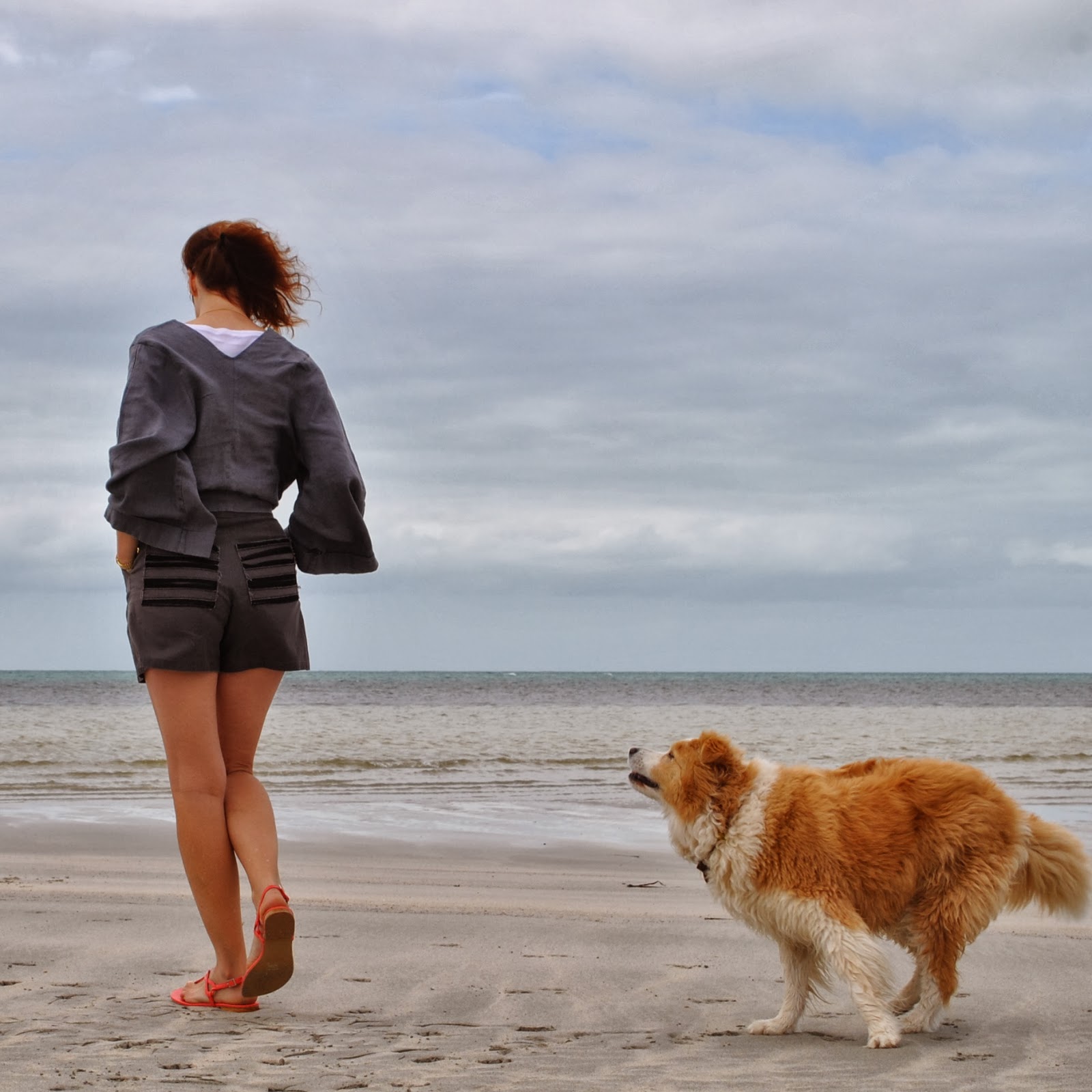
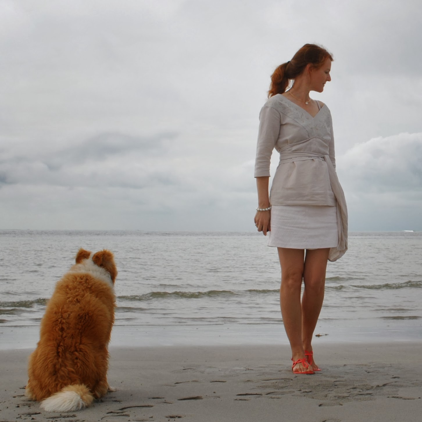
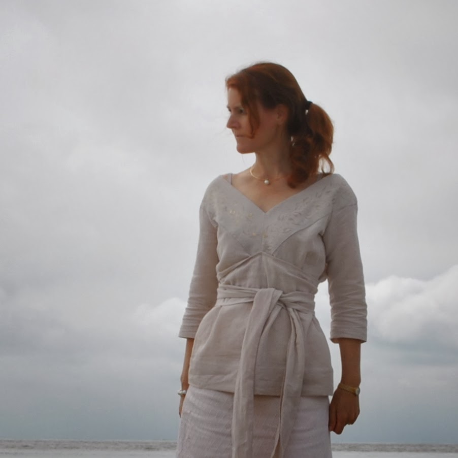
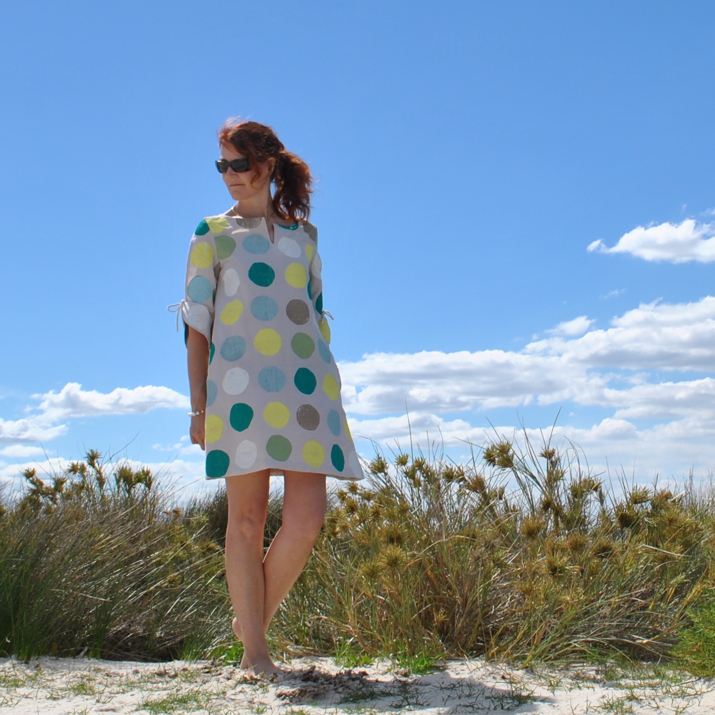
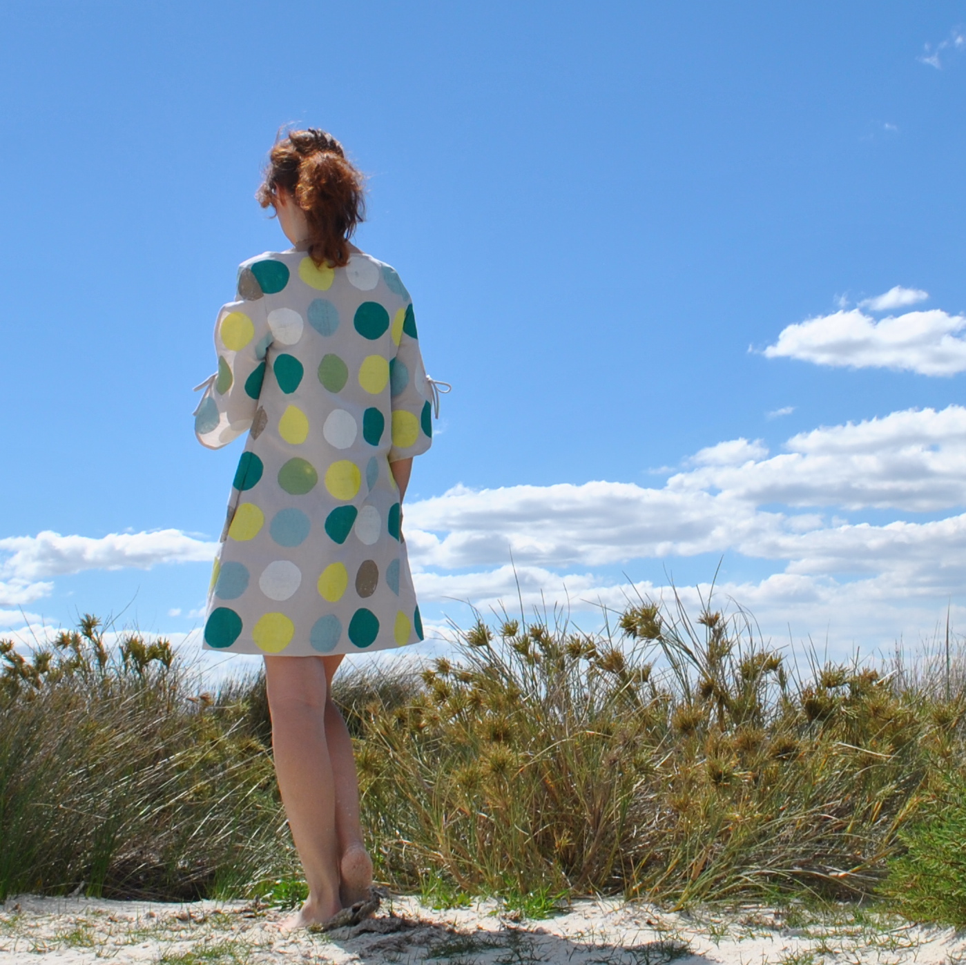
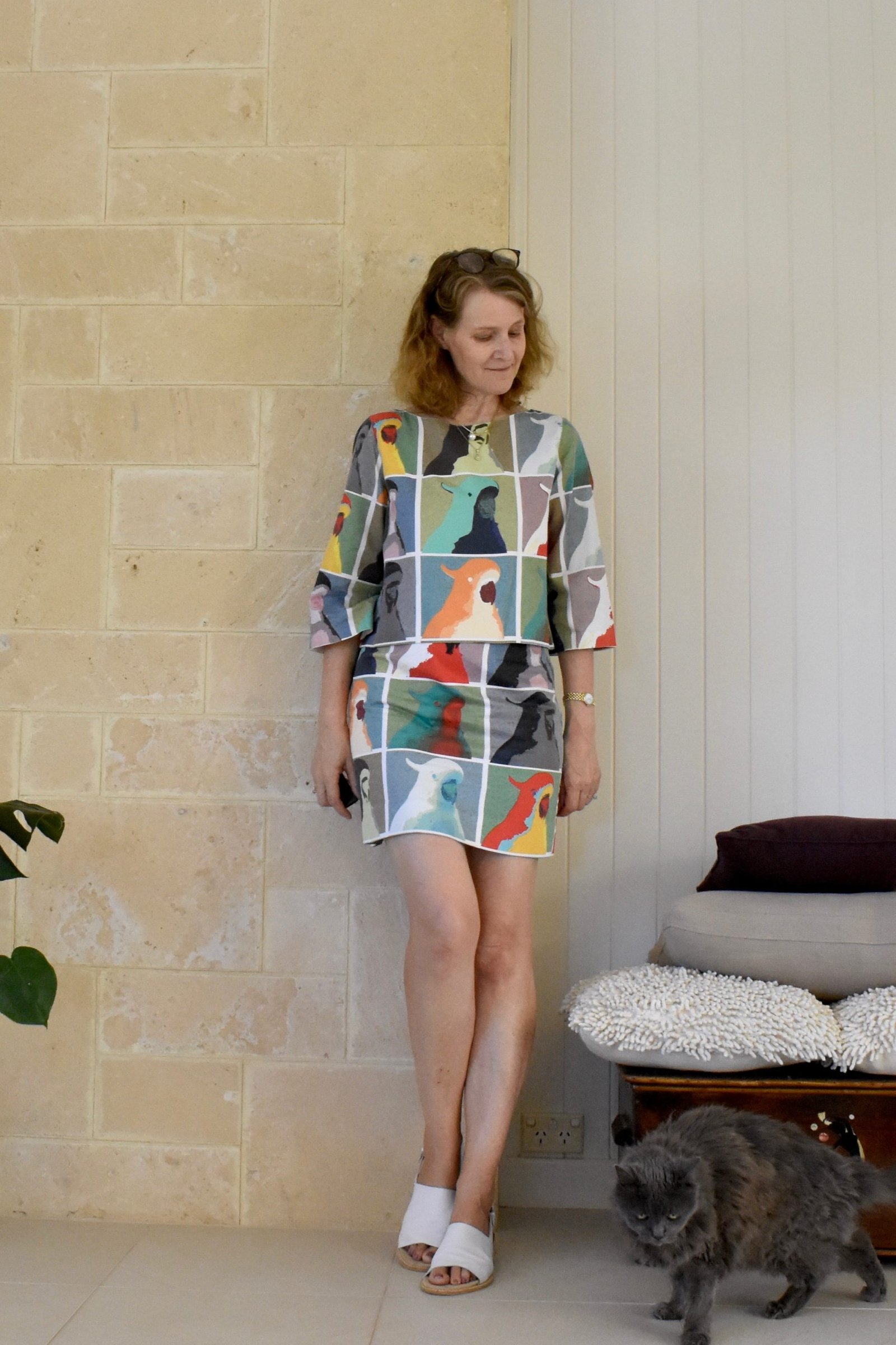
So new top…  well, new? not really, this funky little jacket was until recently a pair of menswear-inspired, wide-legged, linen trousers, that have been sitting in my re-fashioning bag for a coupla years now.  True!  I took them out to wear as fancy dress last year, but they went straight back into the bag afterwards!
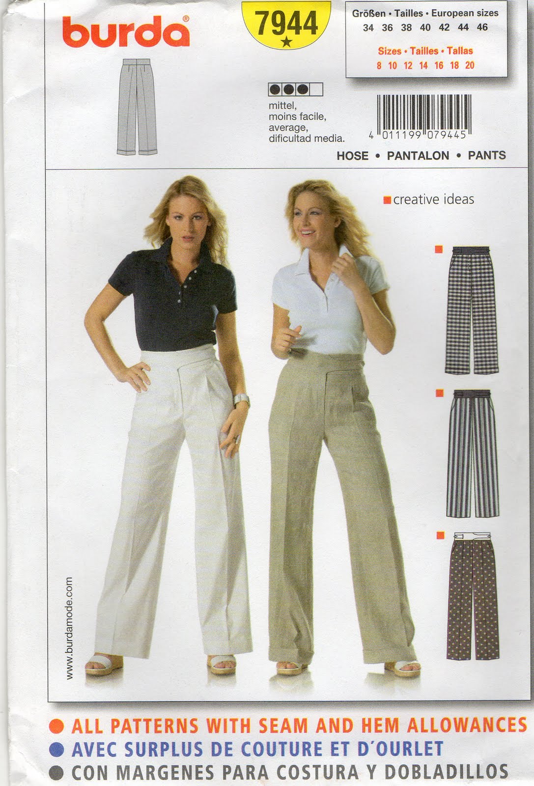
I originally made these trousers back in 2009 using Burda 7944, and they have been good trousers.  I wore them a lot and even featured them in a 6 different ways post forever ago. 

 But eventually they got to the stage where they looked like a dishrag practically as soon as they went on and got “knees” in them instantly.  That’s linen for ya; I love it to bits but if it’s not a quality weave it does tend to lose its integrity quickly.  This linen was not particularly fine-grade in the first place.  Some linen trousers can get away with the dish-raggy look but not a tailored design like this one. 
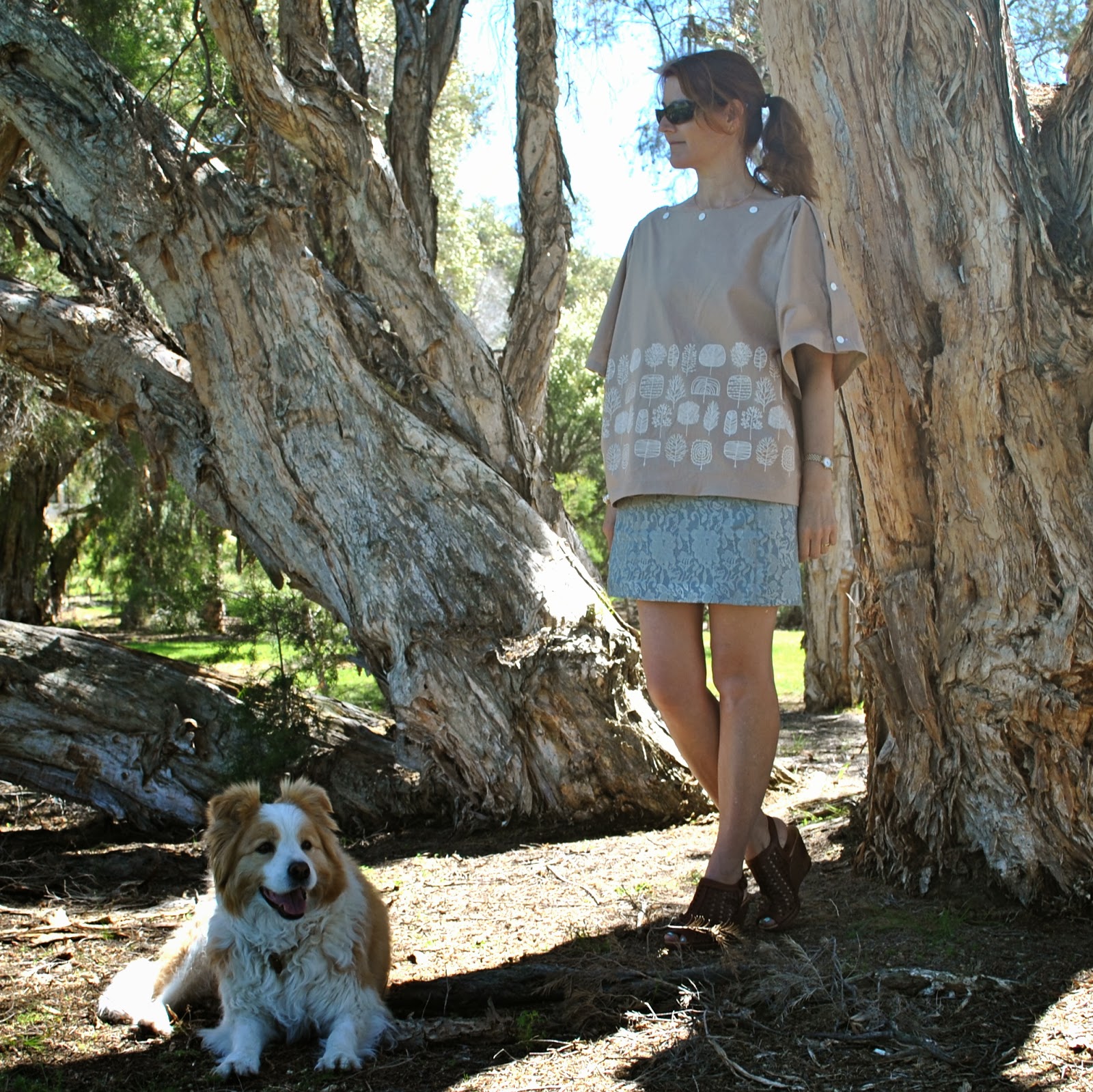
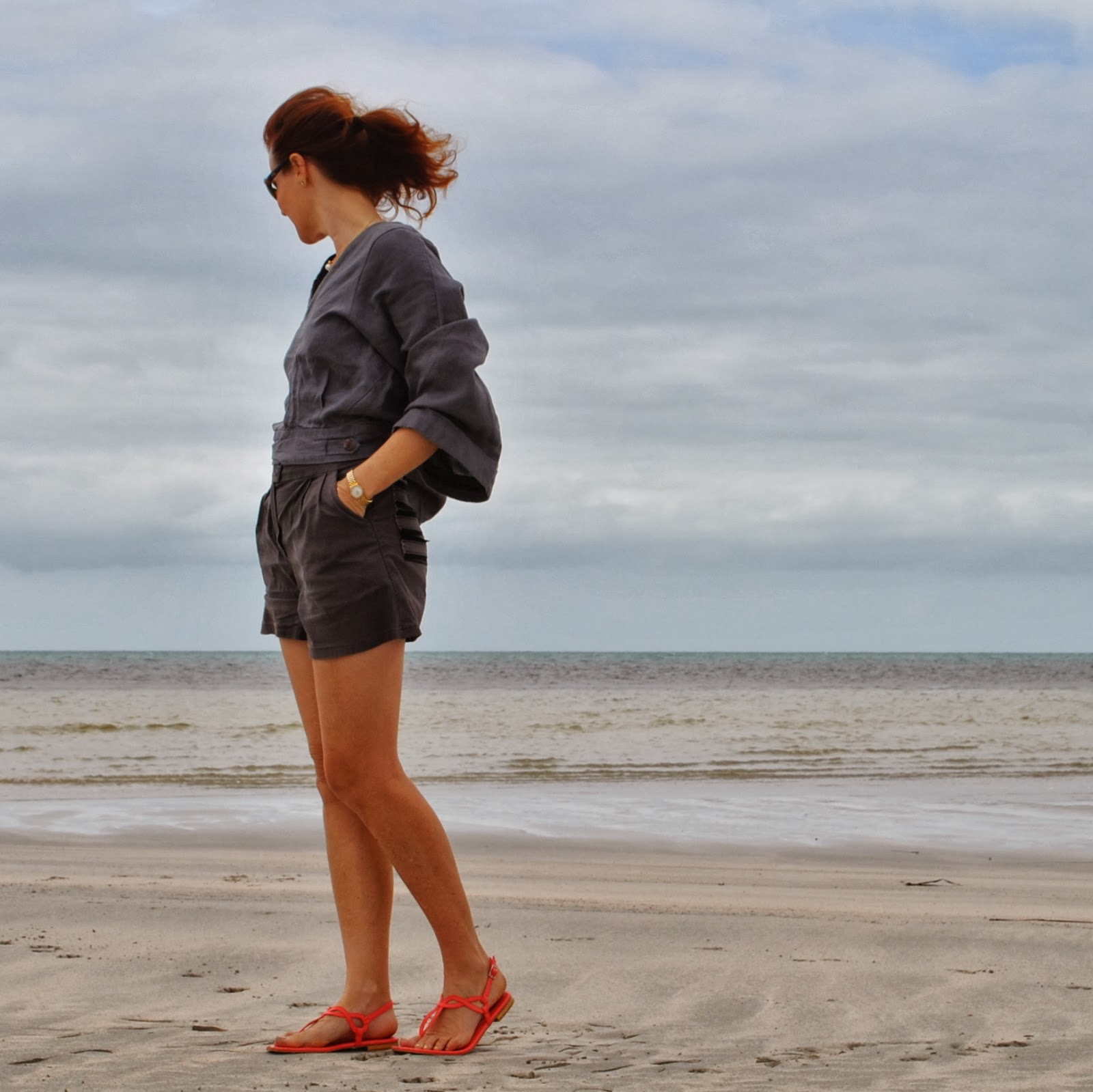
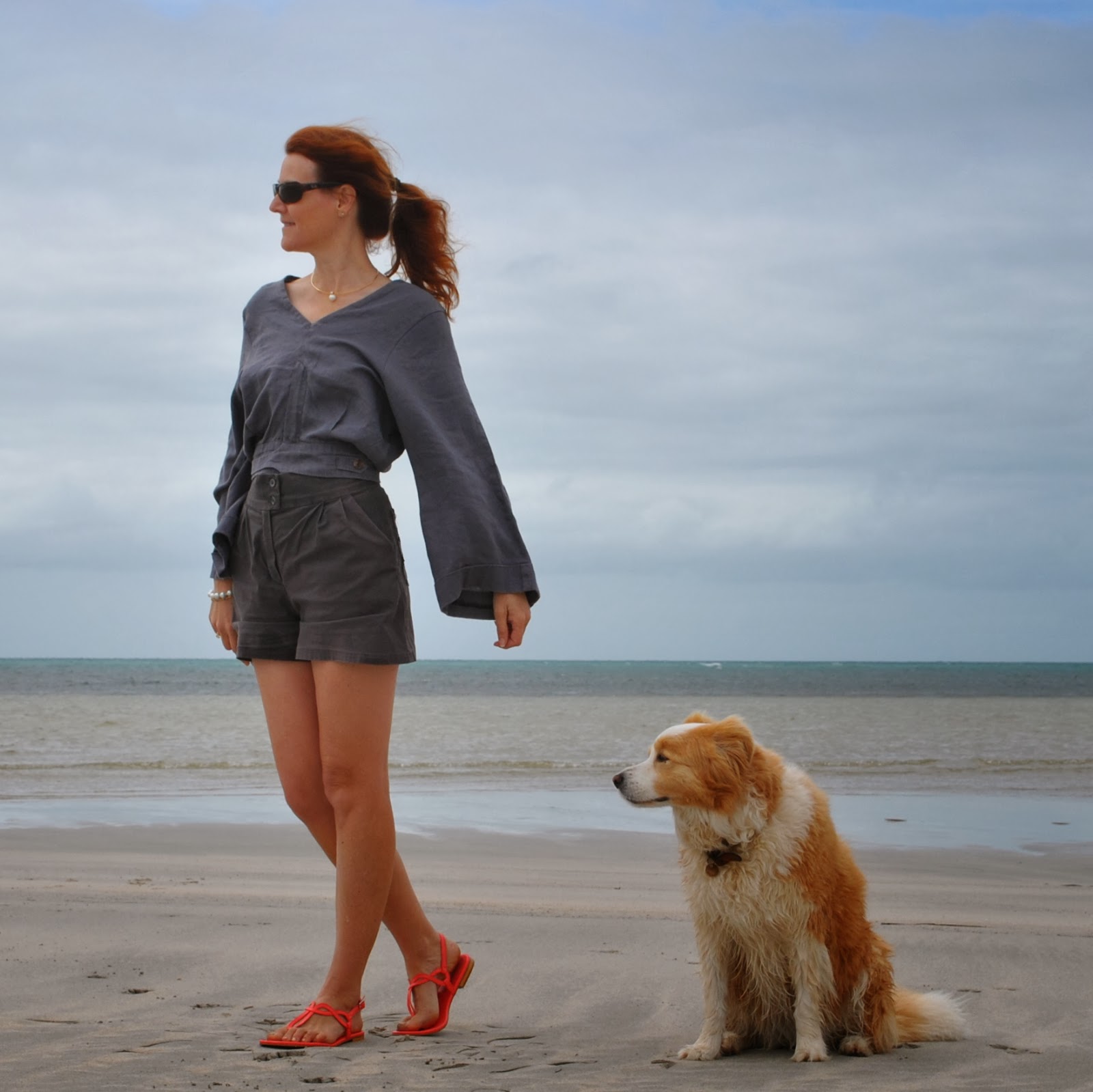
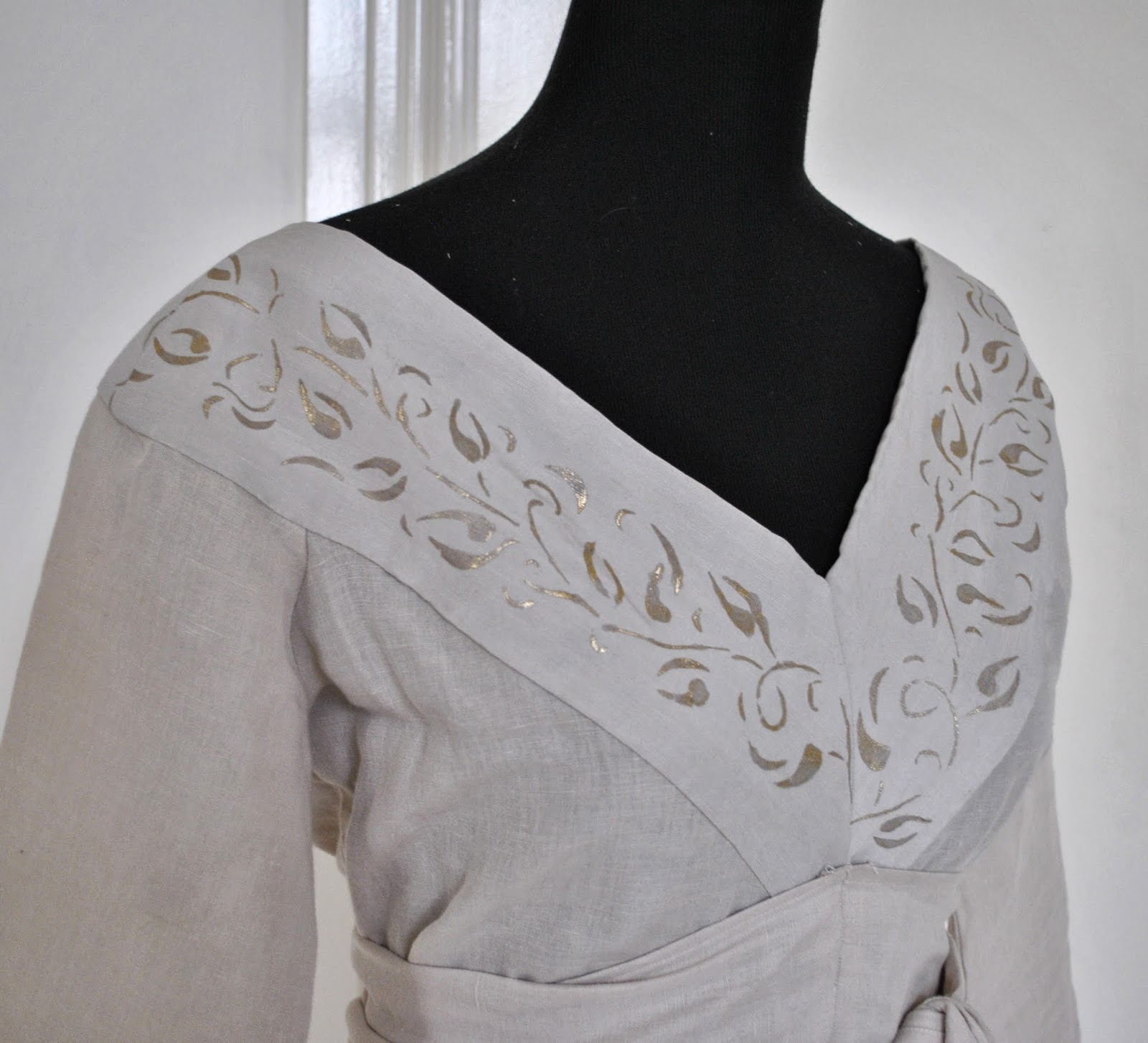
I’ve re-made them into a loose-sleeved jacket thingy.  I’ve done this very same re-fashion once before, making a boxy little jacket out of a pair of Mum’s old cast-off three-quarter pants, but these trousers started out with quite a different shape to those pants so have ended up as quite a different shaped jacket.  The waistband is close-fitted, not loose, and those long wide legs with a satisfyingly deep cuff have resulted in long wide sleeves, still with that satisfyingly deep cuff on the ends.  You put it on with unzipped fly, and then zip it up down! and do up the buttons, just like when it was trousers but upside down.  Cool huh?  I really like it in it’s new identity.  Making something like this is deeply satisfying to me.  Taking something old, unwanted and un-chic and making it into something different; and I use the term different as in the kind of thing you rarely see a pattern for.  It’s hardly mainstream, is it?  This is why I sew; to make things for myself that are individual and unusual.

A quick run-down on the procedure…
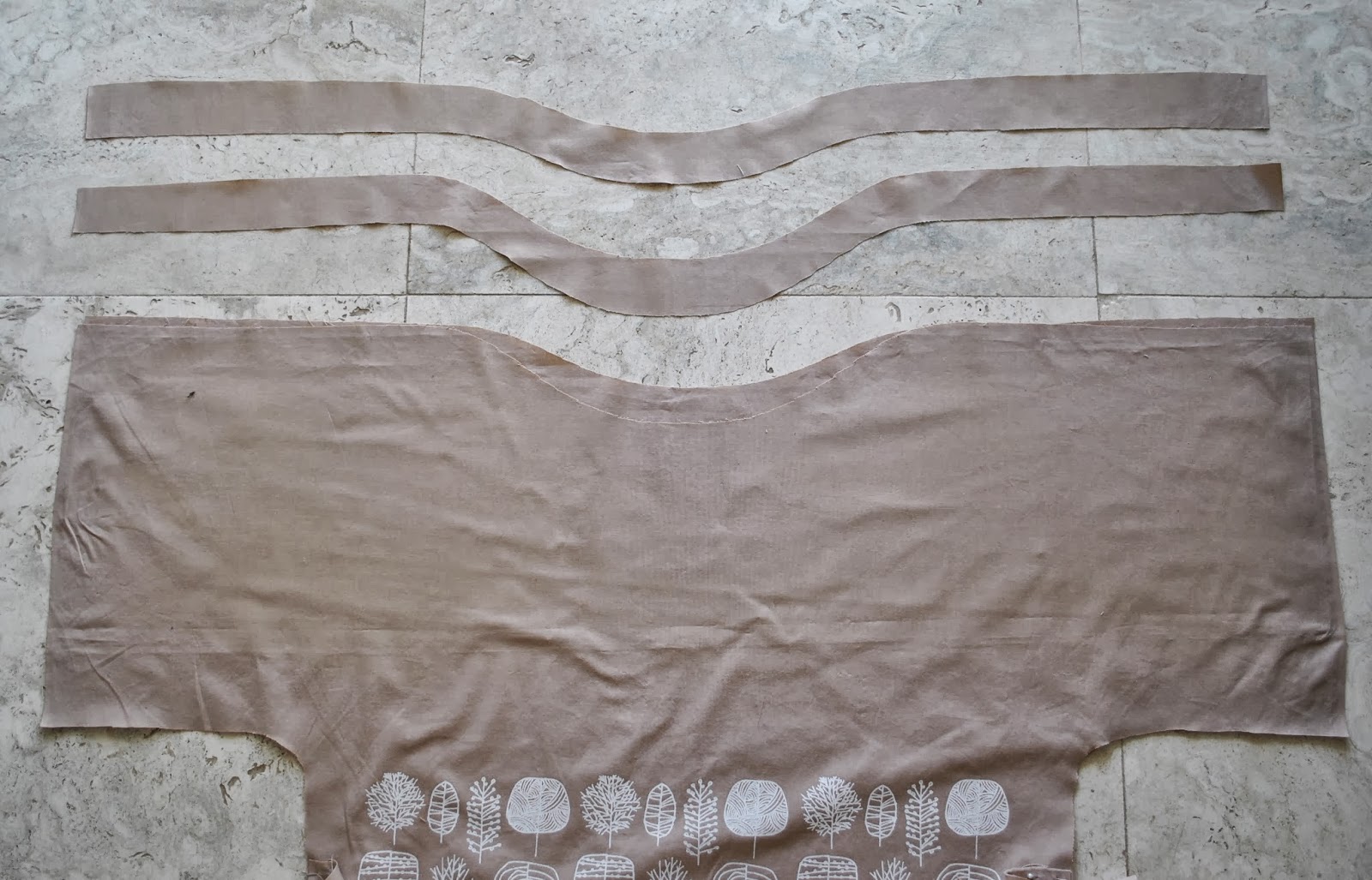
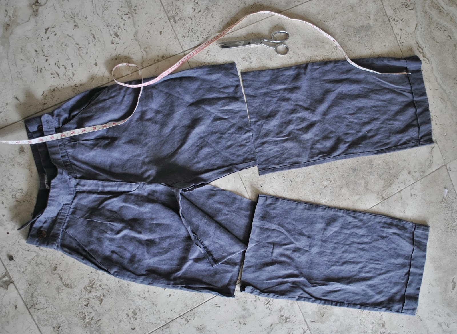
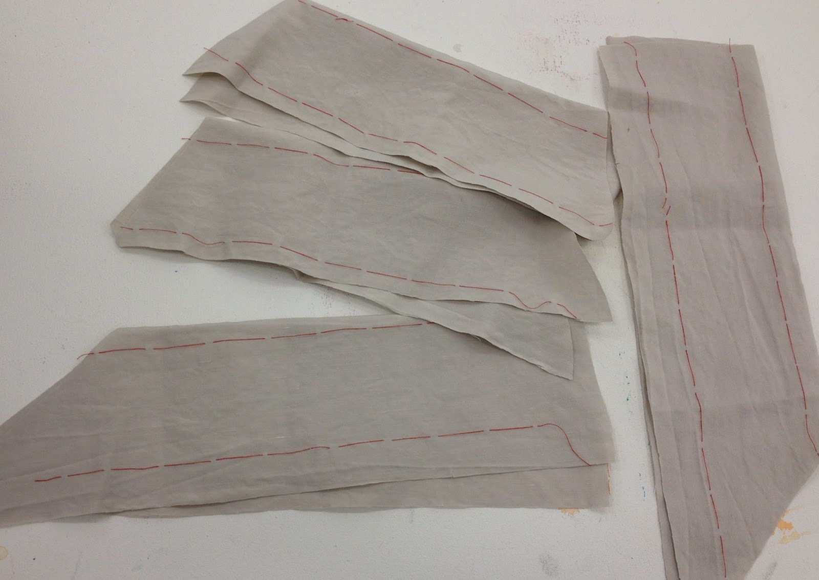
Firstly, you cut off the legs to give a “body” section, and cut open the inner leg seam from one inner leg to the other.

as my son says; ironing is for the weak!!!

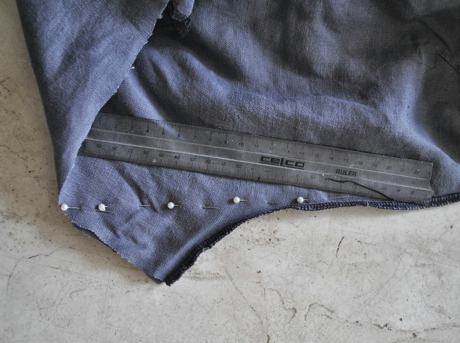
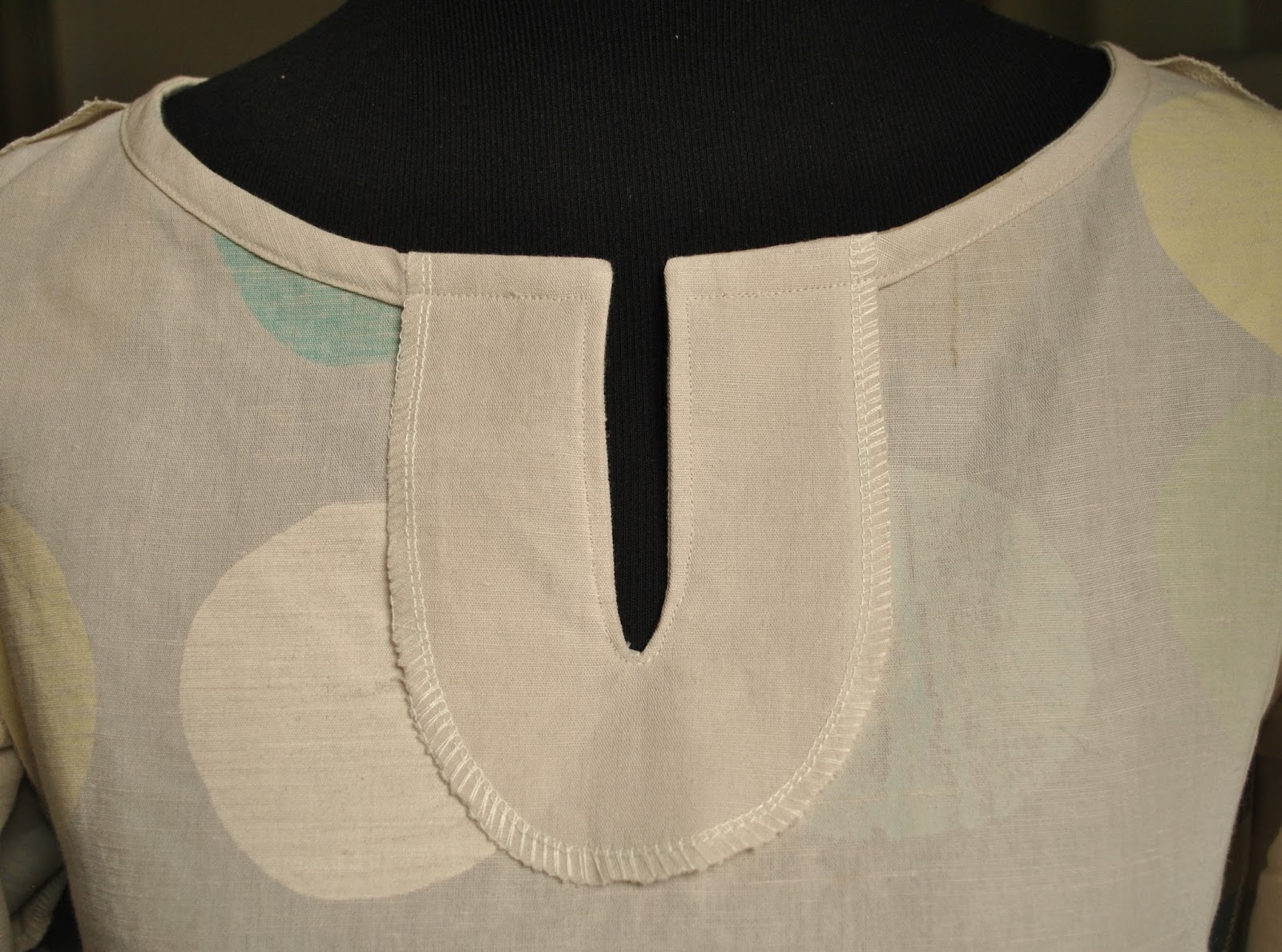
Re-stitch both the front and back crotch seams to be straight lines from the waistband(back)/bottom of zip(front) to the old-crotch/new-neckline opening,  Cut off excess fabric (the old-crotch curves).

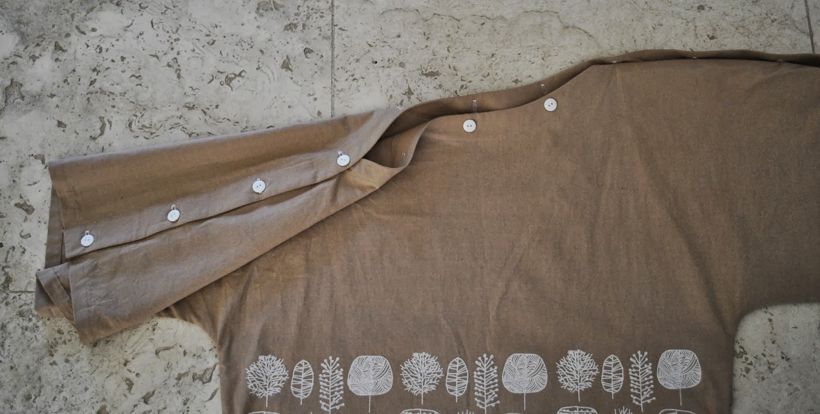
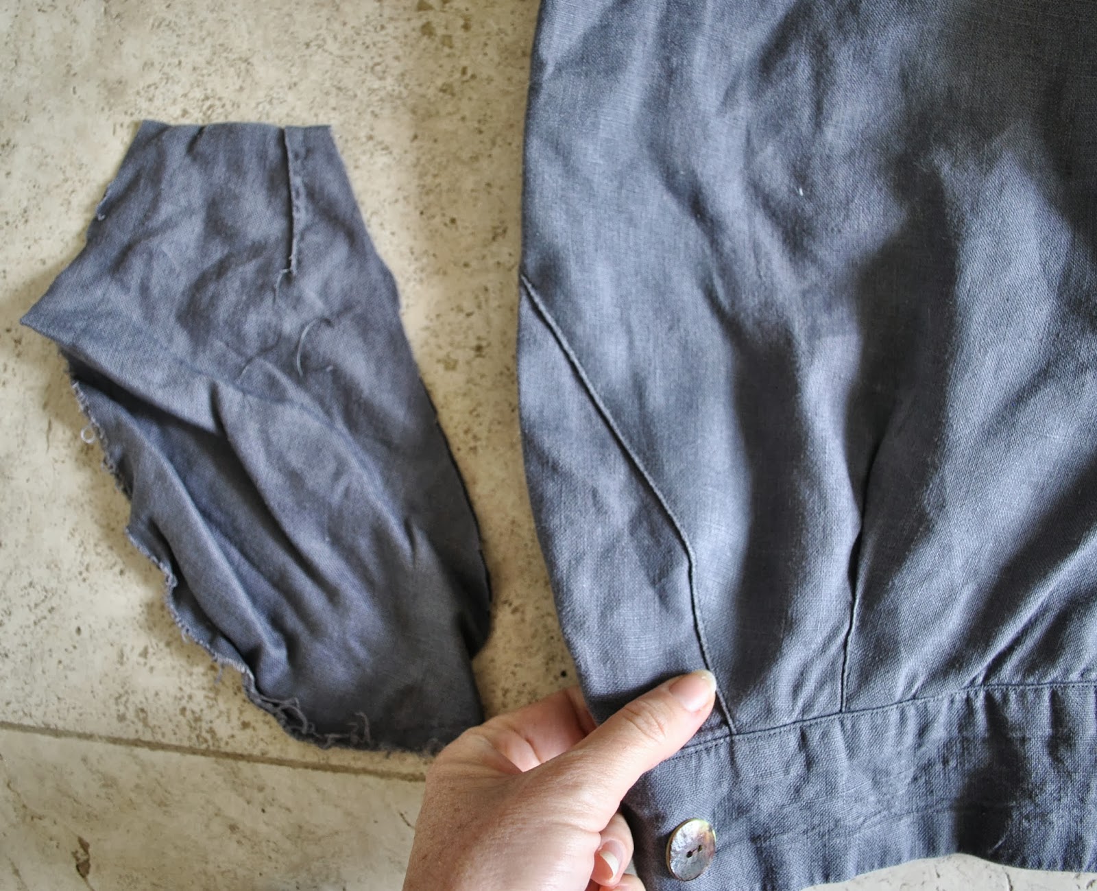
My trousers had pockets; stitch the opening closed and trim off the pocket bags inside.  I know I know, it’s slightly painful to remove pockets, even useless ones, but they just do not work in this design.  I also switched the old plastic, colour-matched buttons I had used previously for nacre buttons sewn on upside down with the mottley-brown underneath showing, just because.

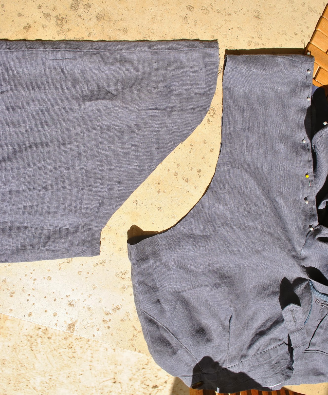
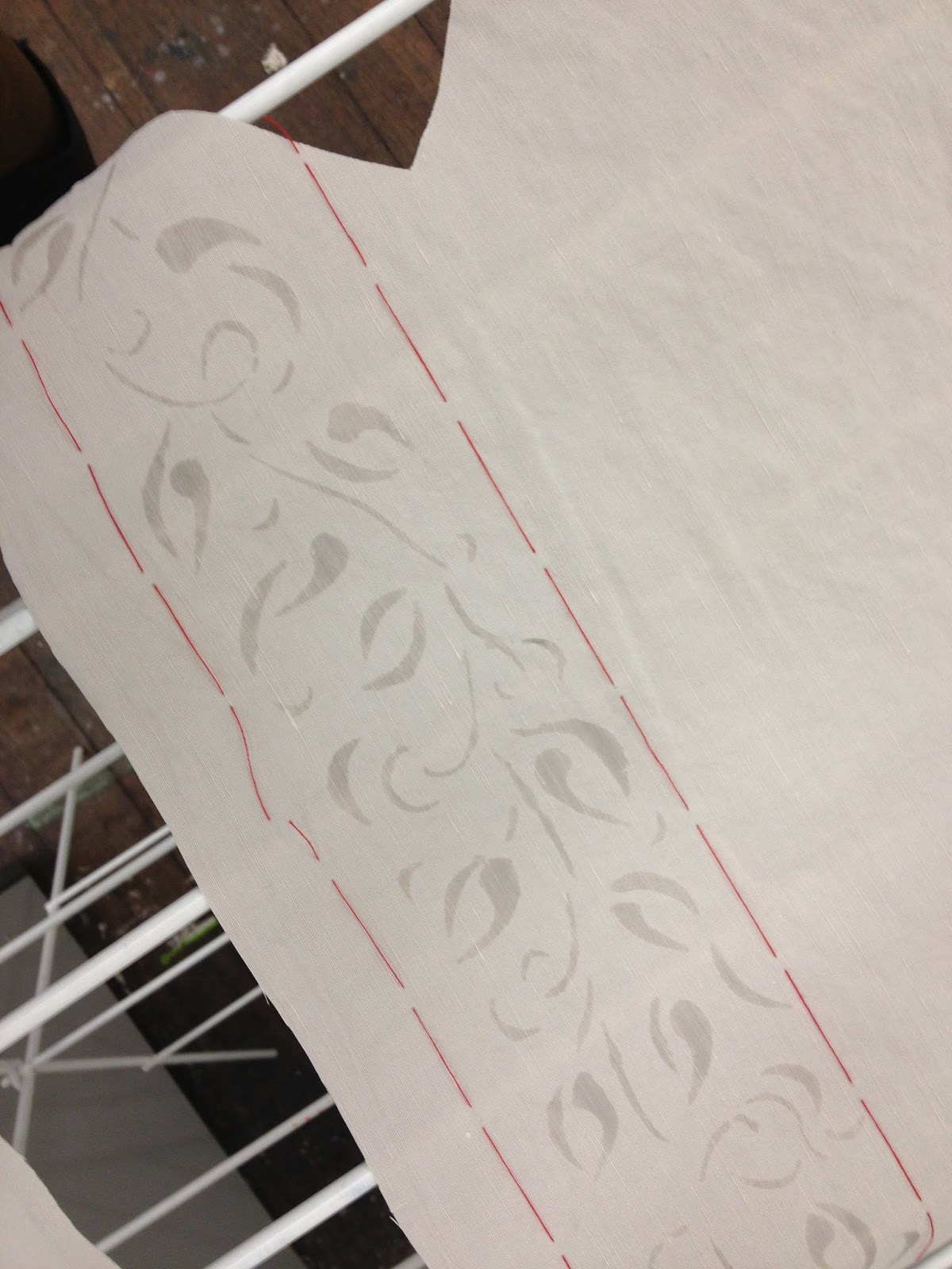
Stitch up the shoulder seams and cut armhole curve on the body section, and a sleevecap curve at the top of the cut-off legs, now sleeves.  If you have a great fitting shirt pattern then use this as a guide.  I just tried it on a few times, pinned it and winged it, being sure to keep both sides symmetrical.
Set the sleeves into the body section.

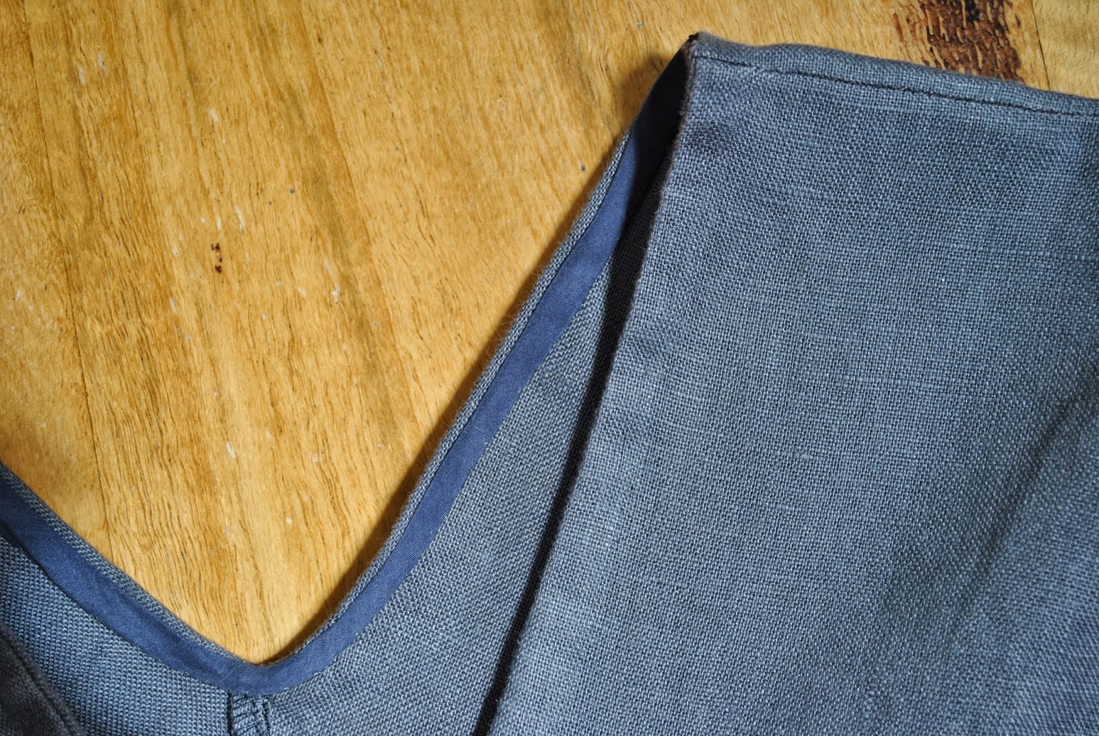
Fold in a hem around the neckline and stitch it down however you choose, I used a short bias cut strip of silk, leftovers from this top, invisibly fell-stitched.

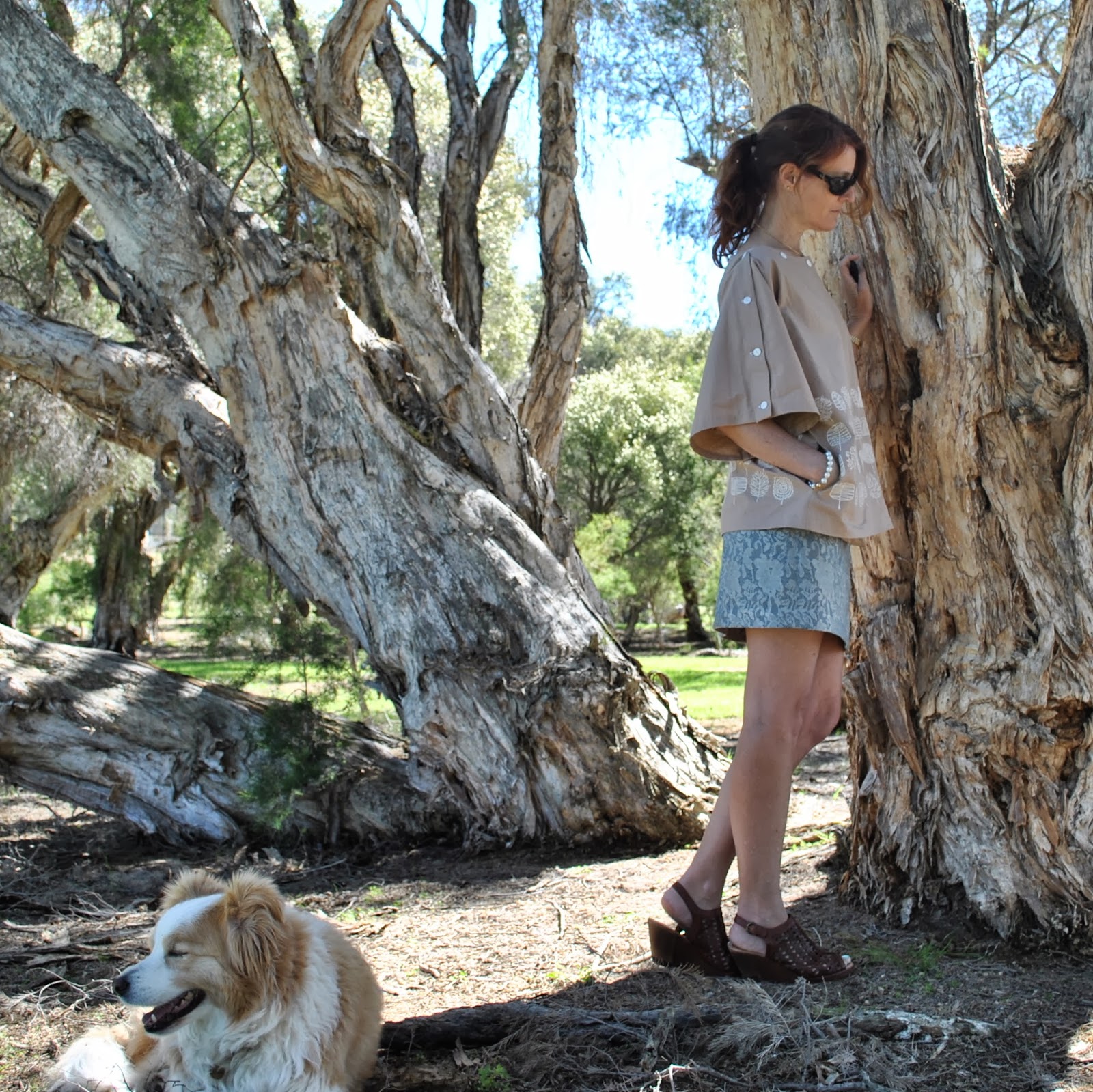
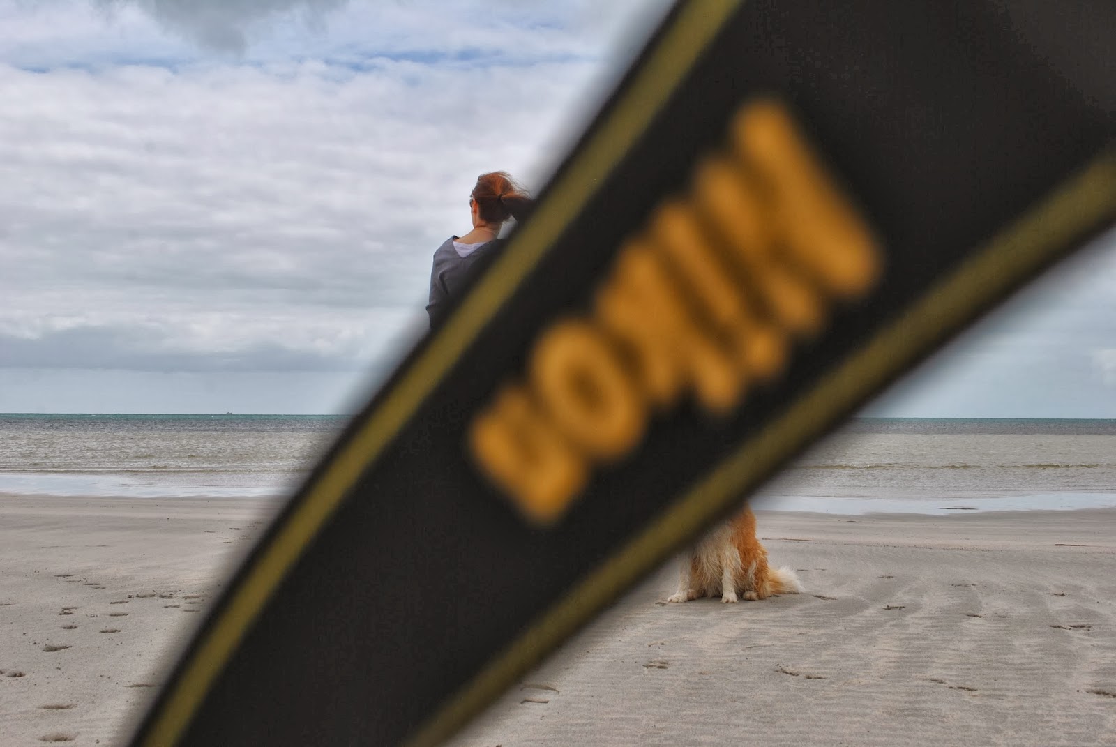
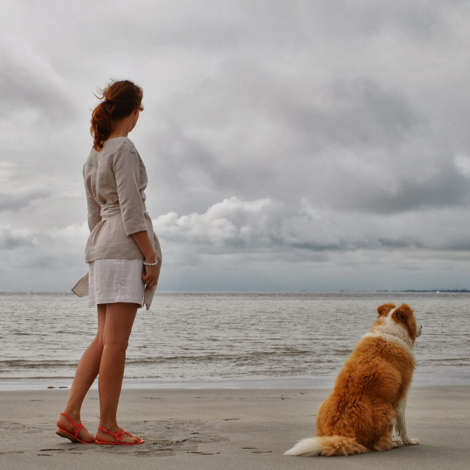
Don’t know if it’s obvious or not, but it was crazy windy while I was taking these photos.  My tripod actually blew over once!  Goodness knows why I pick the absolute blasting-est days to get out and photograph my makes.  I must be some kind of freaking masochist.  Hair; styled by gale-force winds.  Lovely, not.  But, seize the moment, and all that.  After all, this is what I actually look like here.  Keeping it real.  Man, I’m a loon.
This one gave me a laugh when I saw it!

Details:
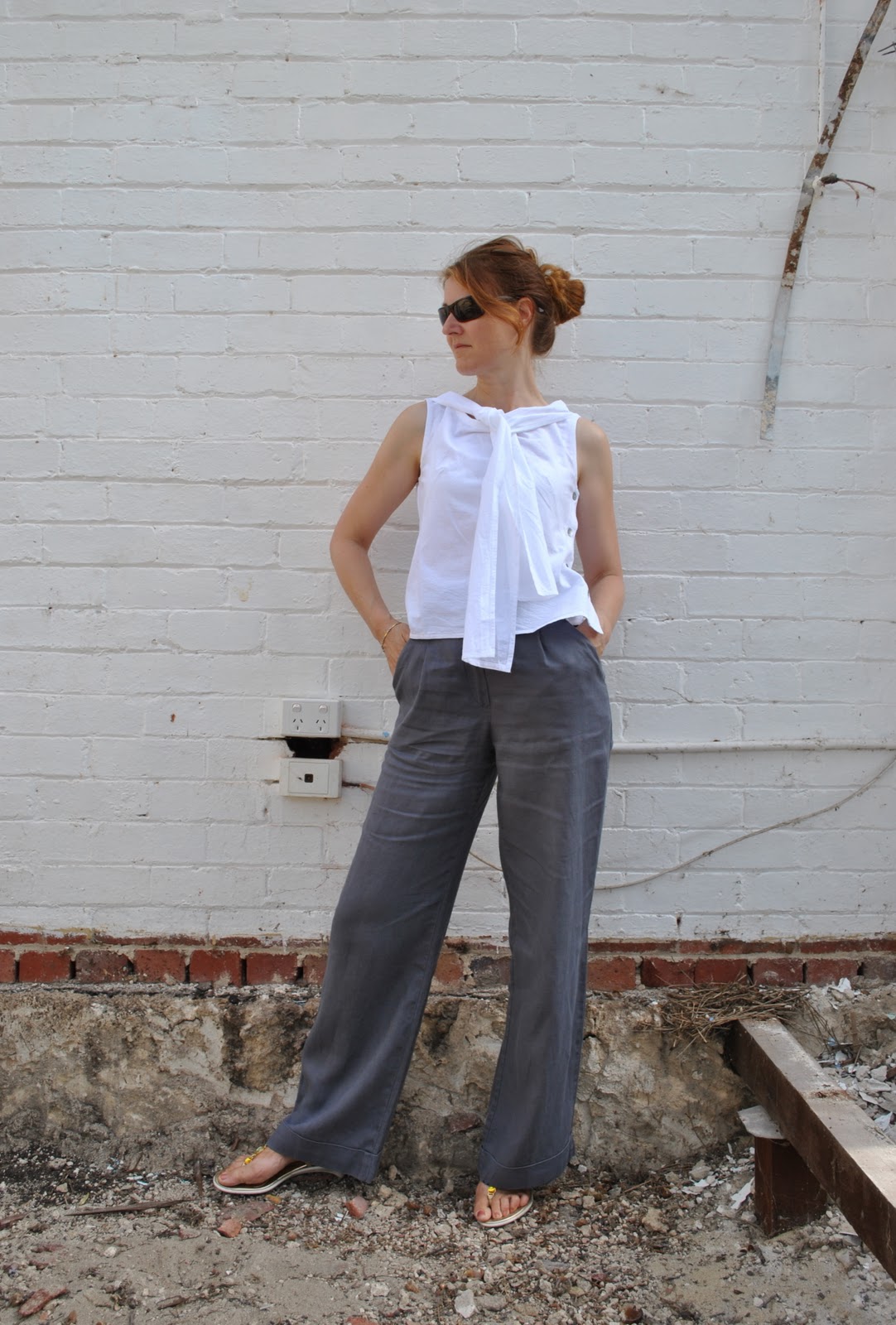
Jacket; refashioned from a pair of Burda 7944 trousers, gunmetal linen
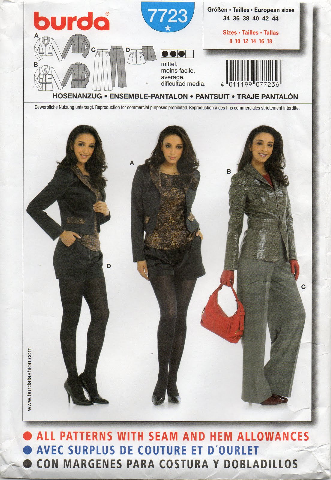
Shorts; Burda 7723, themselves refashioned from an old skirt, details here, and see my review of this shorts pattern here
Tshirt (underneath); self-drafted, white cotton jersey, details here
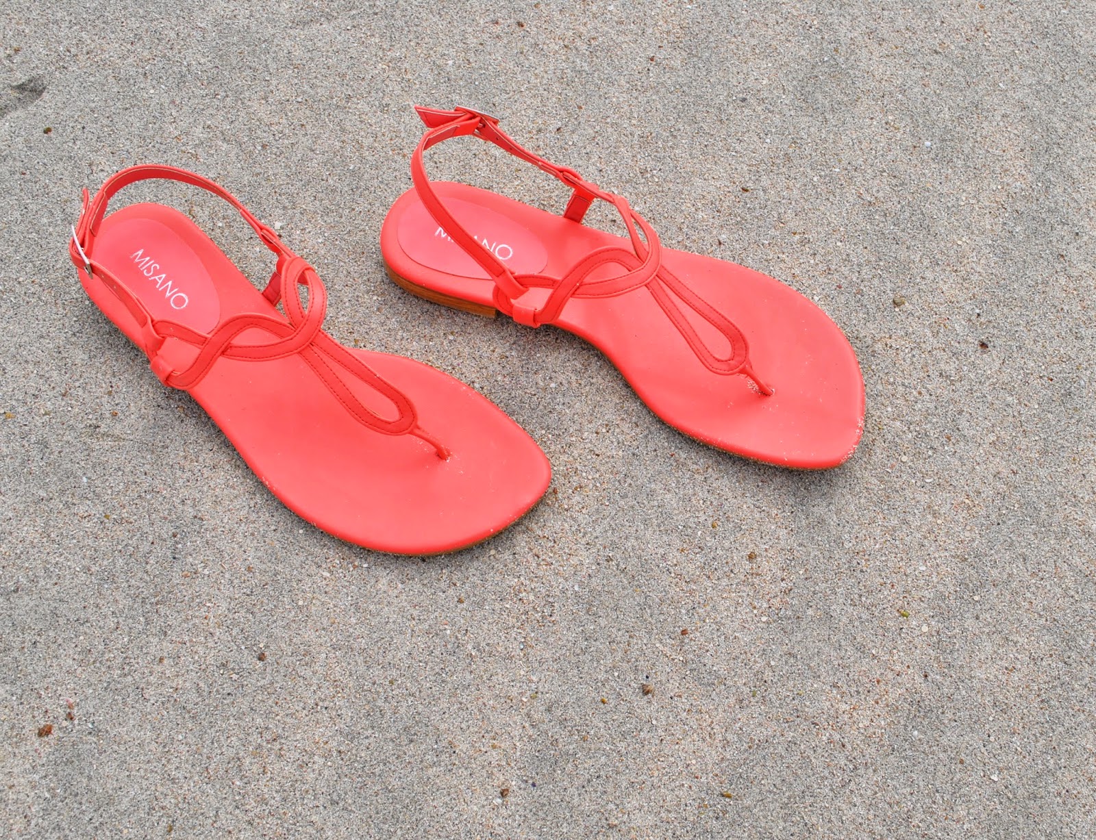
Sandals; c/o Misano

pinterestmail

Sandy top with gold bits

OK, so I’ve made a top.  Simple, fairly plain, unexciting even? but I’m totally happy with it anyway.  Hard to see in the photo above, but the front and back neckbands have little golden swirls, twirling and tumbling sinuously around it.  Screen-printed by me!
The neckbands are of pale grey silk/linen from Fabulous Fabrics, and the remainder of the top is made using a pale sand-coloured cotton-linen from Spotlight,  the leftovers from after I cut out the pieces for my giant polka-dot dress.
I used the pattern for top 136B from Burdastyle magazine 07/12.  Sam gave this mag to me for Christmas last year, but this is the very first thing I’ve made from it  (oops!)  No matter, I reckon Burdastyle patterns never really go outta style  🙂  When planning my top I knew exactly what I wanted; a pull-over loose top with a big wide neckband for screen-printing, and either a wrap-front or something to define the waist.  I searched through, only like every single one of my patterns, the lines of this one leapt out as pretty close to the vision I had in my head.

Technical blah-dy blah: I have to confess that while stylistically the design was perfect, technically it was far from a perfect fabric/pattern match: the pattern was designed to be tight for stretch knits and came graded for Plus sizes 44-52 only; and I wanted “loose” in a woven and I generally go with a 38.  But I reckoned it could work; those factors have the opposite effect to each other so it’s like they cancel each other out right?  It was worth a try, anyway.  I’ve never let fabric inappropriateness get in the way of my creative vision! and was pretty sure it would be OK.  
I traced a size 44 and just cut my pieces with quite big seams allowances, plus a touch extra at three areas just in case: the underarm points on the front and back, around the widest part of the sleeves, and with extra width at the hips; essentially, the places where you might expect extra ease would be required.  Basted the pieces together and tried it on, ensuring the raglan seams matched the notches on the neckband pieces as a set-in-stone point of reference and just made a few little adjustments in and out and here and there to some seams.  I reckon it turned out OK!
The waist ties are meant to be attached inside the centre neckband seam, from the top to the bottom of the seam, which means that not only would it have covered up part of my print, but when you wrap it around your waist it would have dragged the V-neck right down, thus rendering it a very cleavage-tastic top indeed.  How it is, is quite cleavage-y enough for me already, thanks!  Burdastyle’s coy description is “Impossible to ignore!”   Ahem, so I sewed mine on further down, only just covering the very lowest tip of the neckband.

The neckline is a flatteringly wide portrait neckline, which means that my bra straps are showing.  But I’m cool with that, since I just happen to have a bra with straps that just about perfectly colour-match this top.  Now is that good wardrobe planning, or what?!  I reckon they just look like little camisole straps.

And; I have a pair of new flat sandals for summer!  these gorgeous cheerful bright coral sandals are going to pep up my wardrobe so nicely!  They are practically neon!

Details:
Top; Burdastyle magazine 07/2012, 136B modified, with neckband screen-printed by me here
Skirt; Vogue 1247 modified, ivory curtaining fabric, details here and my review of this pattern here
Sandals; c/o Misano

pinterestmail

Beachy polka dots dress


So, we had some purr-fectly dee-lightful weather last Monday, allowing me to wear, and take some piccies of, my dress. The product of my giant beachy polka dots fabric, screen-printed by moi.  Um, I’m completely satisfied with how it turned out.  And I can think of nothing further to add.  Not like me, I know  😉

OK, just a few things.  
I used the pattern for dress F from the Stylish Dress Book by Yushiko Tsukiori, chosen because I wanted an almost featureless tunic dress, with no darts and minimal shaping to interfere with my print, but still had a certain je ne sais quoi.  This design, with a short neckline split and two piece open sleeves with a discreet but pretty little ribbon to tie them closed, was exactly what I wanted.  I cut out all the pieces before printing and sized my print to fit the pieces.

A stylistically simple design, like my stylistically simple print.  I added the obligatory-to-me pockets, ahem; deep inseam ones.  These are cut from the same sand-coloured cotton/linen fabric as the dress, but unprinted obviously.  The same goes for the bias-cut sleeve ties, and bias neckline finish and the neck facing.  There are advantages to printing your own; you can leave it off all the “invisible” bits of your dress, and that is a vast improvement… nothing to show through!

It’s been a thoroughly satisfying project in that the result truly matches my vision.  I’m going to really enjoy wearing it.  
The creativity demon inside has been sated… for now  🙂
pinterestmail

Army jacket; 6 different ways

My khaki army-style jacket has been my go-to coat/jacket this winter.  I made it two years ago, completely inspired by all the fabulously cool examples I had seen out and about in Tokyo.  I got home and pretty much immediately set about gathering all the bits and pieces to make one for myself, adapting a jacket pattern from Burdastyle magazine so the features matched the ones I had seen in Tokyo.
Australia often marches to the beat of its own drum, fashion-wise; and looks that are IN! overseas may or may not take off over here.  You can never tell…. but anyhow, this winter army jackets were IN! here and I remembered that I had made one (o serendipitous moment!) pulled it out and have been wearing it pretty solidly since.  It is sooo warm!
Now, you might think it could only been worn as a casual thing, but being such an on-trend item I’ve found it incredibly useful and the deep olive colour goes with everything I have in the wardrobe.  I also made an attachable fur-lined hood to go with it but obviously such a thing is pretty irrelevent to our climate and so I’ve never attached it.  Maybe one day I will visit a snowy climate soon and can happily button on the hood without looking ridiculous?  A girl can but dream…. but in the meantime these are some of my favourite combos with it from this winter.

Below: at left; casual to the max, worn with my purple flared jeans.  Funny thing, I’ve kind of gone off jeans completely lately and don’t want to wear them at all.  I’ve semi-tossed these ones out now… they’re on probation….  At right; the jacket kept me toastily, snug-as-a-bug warm on our coldest day (15C) along with my crocheted Granny squares skirt, a black Tshirt, black woollen tights and biker boots.  I had my knitted gloves on for part of that day too, but not for the picture… brrrr!

army1a

At left; I’ve seen sequins combined with utilitarian khaki in a gazillion gorgeous street-style photos, and loved the craziness of the look, so I wore the jacket over my own silver sequinned skirt, a drapey white top, and with black suede pumps to a dinner with friends, and felt like an ultra trend-ite, for once!  At right; sporting a symphony of satisfyingly subtle sludgy goodness, worn with my khaki linen shirt, my sludgy little skirt (incidentally, the same fabric as my purple jeans in the photo above, dyed brown), my olive leggings, and olive knitted socks (not really showing here)   A bit drab maybe? but then again drab is my middle name.  Seriously, you should see the looks I get when I fill in forms.
(10pts to anyone who can pinpoint that quote….)

army2a
At left; worn into the city, with my rusty-red wool/silk skirt, black woollen tights and high-heeled booties, and at right, worn with my gunmetal blue silk dress, red hoodie and paprika tights.  Incidentally, this is today’s outfit, and I had a lovely lunch out with Dad.  He was wearing this shirt, actually nearly every time I see him he seems to be wearing it!  Which is super nice of him  🙂
army3a

So, the weather is warming up gradually, in fits and starts, and soon I’ll stop reaching for this jacket but I’ve sure appreciated and enjoyed its cosy comforting warmth and its easy-going style.  Hopefully the trend will stick around for a few more winters to come!

pinterestmail

Screen-printing: golden curls

 We had our last screen-printing class (sad face)   I’m going to miss heading out to class!  Anyhow, since I feel up to doing regular screen-printing on my own at home I had decided to try out a couple of the less usual techniques; so, foiling…

I put a lot of thought into marking the placement of my design … and came up with the following idea; those straight cut-out lines on either side of my stencil were masked with clear, see-through sticky tape, and are intended to be a sort of “window” through which I was hoping to see the lines of red tacking stitches, in order to put the screen down as accurately as possible.  Of course, you could just put the screen down on a large piece, print with a wide margin all around, and then cut out your pieces afterwards, but I had only exactly just enough of this pale grey silk/linen for my pieces and needed to be as fabric economical as possible.  This approach worked beautifully! and I would definitely do this again if I wanted to print a border design like this.

 Ta da!  the foiling glue actually looked pretty cool all by itself on the fabric, subtle and rustic in a tone-on-tone way like ancient stone carvings or something, and I was tempted to leave it like this!  But nothing ventured, nothing gained, or let’s hope so anyway…

…and Eureka!

I tried in places to achieve a very subtle mix of shades, but mostly went for gold.  I only wear gold.  She says, all la-di-da like.

I quite liked my design, and how it turned out, but the foiling glue is trickier and even messier than regular fabric paint, if you can imagine! so I’m not sure if I would do this technique again.  The glue is like a close relative of epoxy, and if you make the mistake of getting any on your fingers it rapidly turns into a tenacious tacky stain and nothing short of Gumption will get it off.  No kidding!
Below should give an idea of how I’m going to use these pieces, when I get around to it.  Sometime, soon.
I’m really going to have to get cracking on the sewing machine  🙂 
pinterestmail
Switch to mobile version
↓