Tag Archives: Printing

“cool bunny” T-shirts

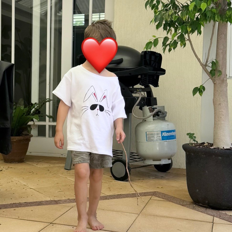
Hello!  For the Easter just gone by I wanted to give something to my three little grandsons… chocolate has been ruled out by the parents and so I had to think of something else.  I decided upon this!  As a teen, my eldest Tim used to have a pink T-shirt with a “cool bunny” printed on it which he absolutely loved.  It was actually a very different print from this one, but with this in mind I googled “cool bunny” and something like this was one of the millions that came up.  I thought it was really cute!

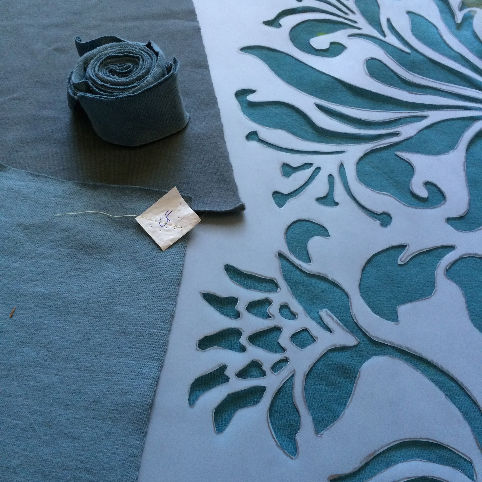
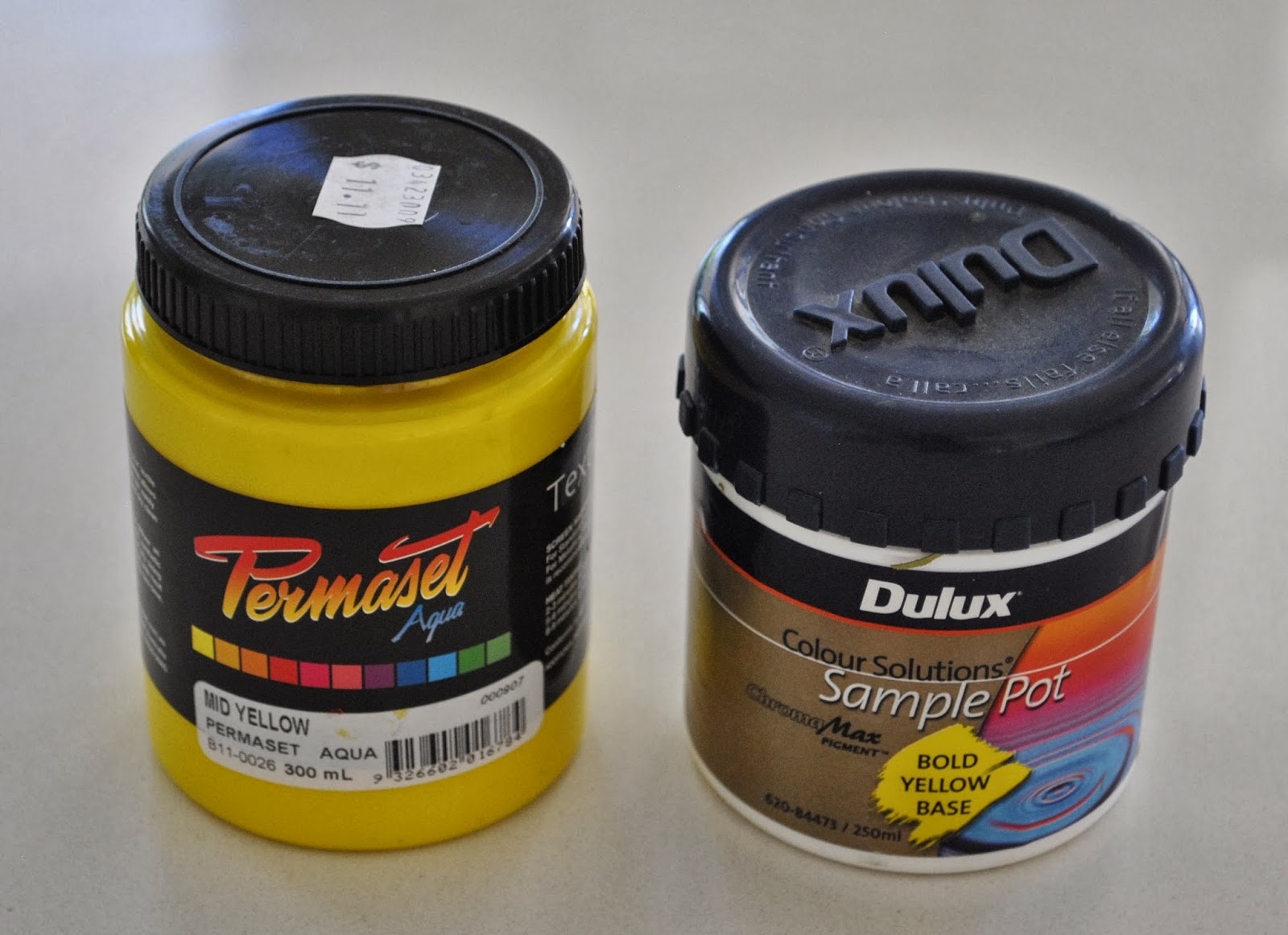
The following is my process… I’d done a screen printing course years ago and so already had all the materials on hand.  Most of my old paints had dried up but fortunately the red and black were ok.  Phew!

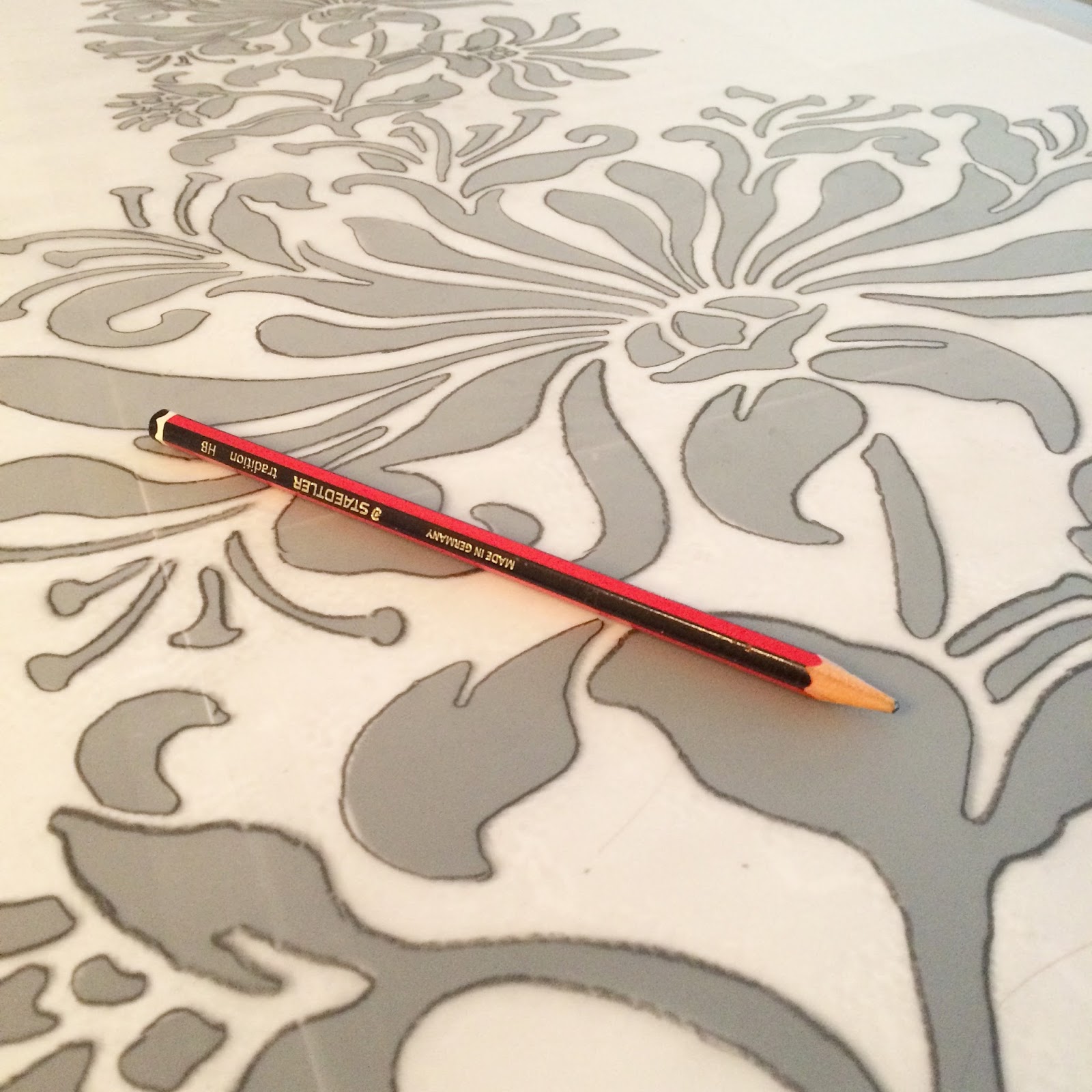
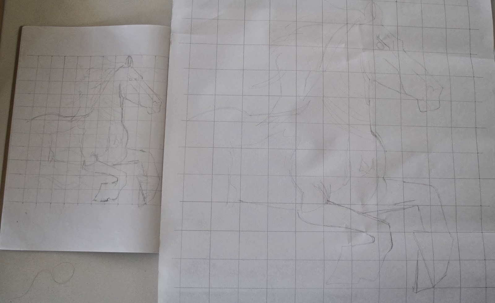
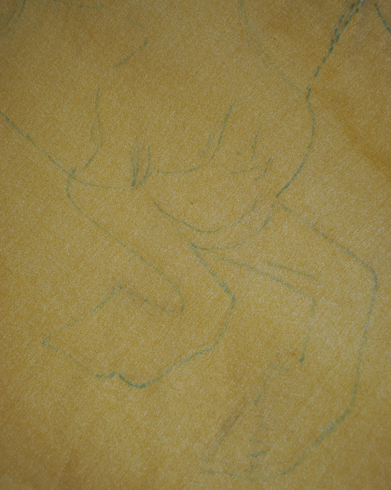
I hand-drew the design on tracing paper in lead pencil, then transferred the designs to equally sized pieces of wrapping paper.

Why wrapping paper?  Well, because it’s a little stiff and “waxy” in texture I thought it would last a little longer in the printing process, and hopefully not disintegrate after a few prints.  Yes I could have gone out to buy proper printing paper but I’m still on a “use what I’ve got in the house already” kick.  I’d pre-cut the paper pieces to be the exact same size, in the hopes of being able to overlay the two colours as perfectly as possible.

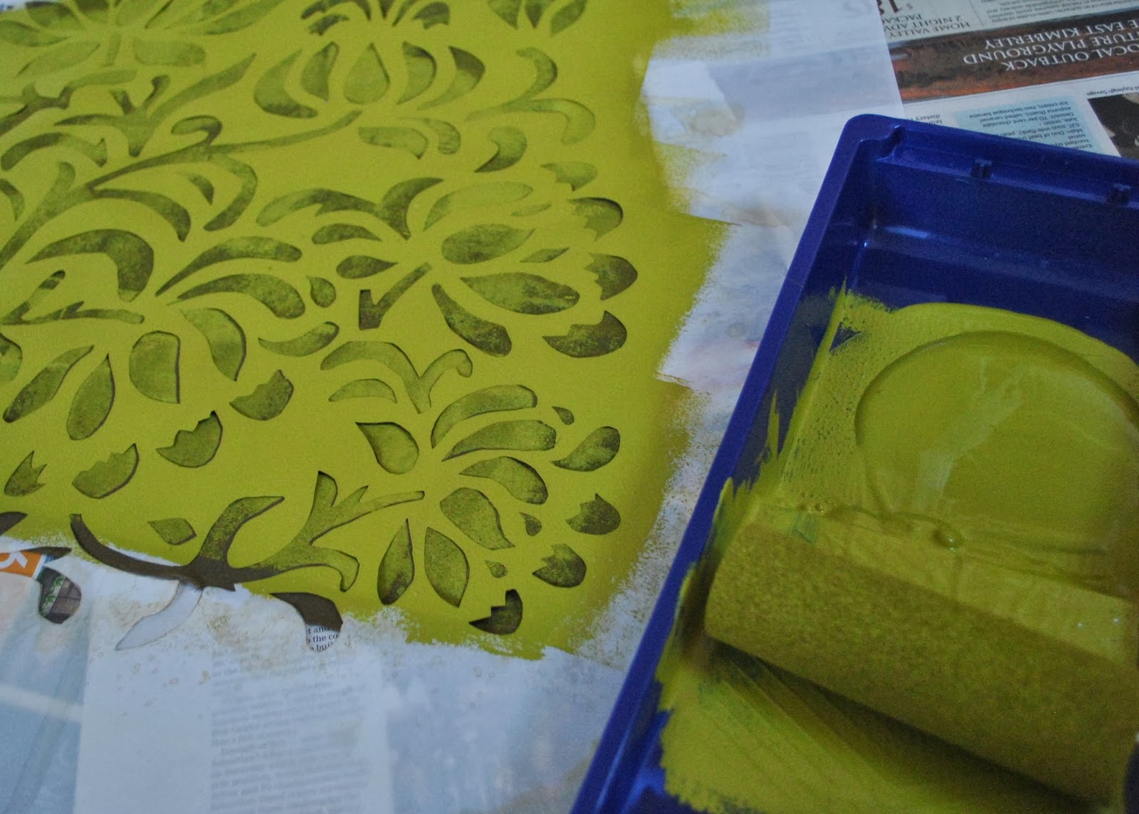
Using a scalpel, from my shoemaking kit, I cut out the two designs.  I’d also cut out four pieces of white cotton jersey (from stash) big enough for a T-shirt front.  Four pieces? but I only have three grandsons?  well I was accounting for one possibly not working out well since I wasn’t going to easily be able to do all this a second time!  Screenprinting is quite involved!

To help line up the prints, I’d drawn the corners on the white cotton jersey in disappearing ink.  As it turned out, this didn’t work out well at all because the edges of the paper are stuck down to the screen with masking tape which then obviously also masks the corners drawn on the cotton jersey underneath.  So of course you can’t see them.  I mean, duh!  It was actually pretty difficult to line up the screen for the red print afterwards.  I’m going to have to put my thinking cap on for future multi-colour prints.
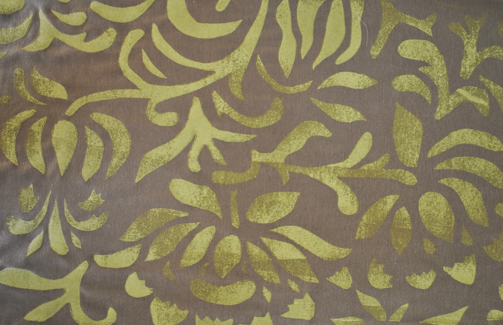
First print done!

I’d cut the black with little “bridges” to keep the design actually together, so after printing I went over with a paintbrush and carefully filled in the bridges.

Second print!

These are the three that worked pretty well…

and this one did not.  If you can’t see it straight away, just look at the red, inside-the-ears bit, and you can see how skewiff it is compared the the others.  I’ve still got this fabric, and may use it for something else in the future.

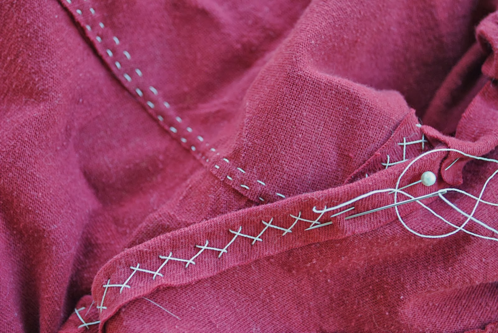
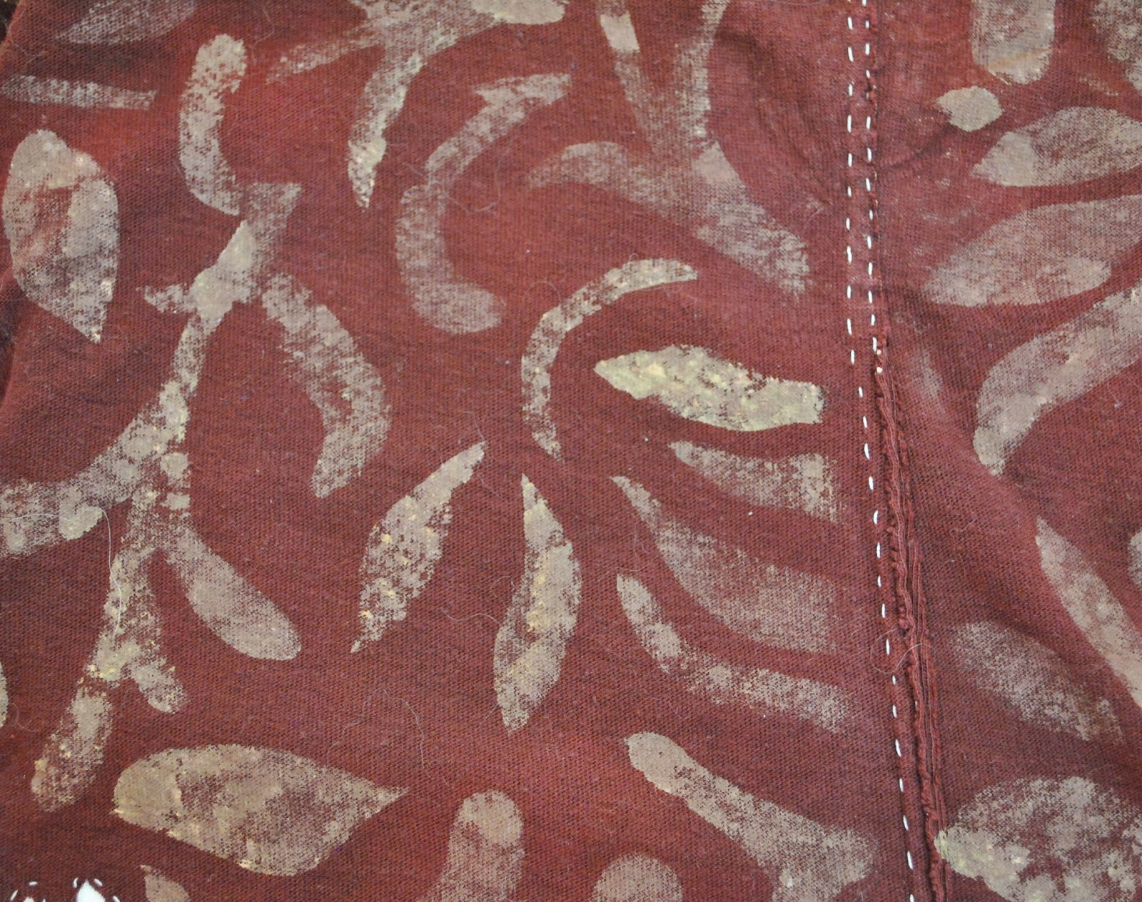
Heat set the prints, and then I sewed up the T-shirts.

I used Butterick 5510 for G’s T-shirt above, that I’d used for him previously…

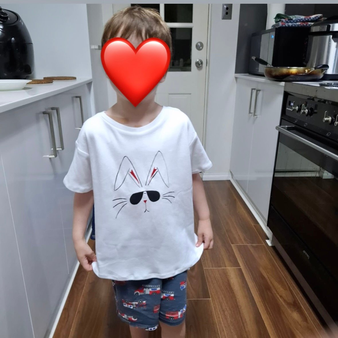
and for A’s and T’s I’d traced around a child’s T-shirt and adapted it to their sizes as well as I could.  I deliberately made them all oversized so they could grow into them, but they did all turn out pretty big.  Fortunately all the boys seem to like them and have worn them, so I’m happy!

pinterestmail

an Alabama Chanin project; “Magdalena Dusk”

The very lovely Lisa, of Lisa’s Carolina Handmade very kindly sent to me some really beautiful and special fabric; some 100% organic cotton jersey from the Alabama Chanin store in the United States.  How sweet is that?!!!  I’m so grateful to Lisa… and so excited about what I could do with this very precious stuff.  Obviously only an Alabama Chanin project would do.  SO I’ve been busy planning, plotting and generally scheming as to what could do the fabric justice.  
The colour is Dusk, which is a kind of blue-y/greeny/grey with a mostly blue-ish bent to it, if that makes any sense.  I had enough for a skirt and also to fully bind and appliqué a tank top.  I liked the idea of another allover, fully embellished Alabama Chanin project since I reeeeeeeeally love my first ensemble; so I bought some plain white cotton jersey from Spotlight, broke out the dyes and got cracking.  My aim was to make some colours to blend in nicely with the Dusk.  Since the dusk is a mostly blue with green/grey tinge, I was going for some mostly green with blue/grey tinge, and also some mostly grey with a blue/green tinge; meaning they will hopefully blend in really nicely with each other.  Several days of dyeing and some more dyeing and then some over-dyeing to fine-tune some of the colours; and I have a nice range of blue/green/grey shades to go nicely with my Dusk..

Dusk is the middle one in the lower row

I used iDye for natural fabrics in a mix of colours; mostly Royal Blue, Golden Yellow and Brown.  I really liked the shades of grey I was getting with the iDye Brown to “dirty” the various teals, but the “grey” wasn’t quite grey enough, so over dyed those pieces further with just a touch of iDye in Black.  This turned out just close enough to perfect!  The colours are a little blotchy and swirly and I am very happy with that, since the Alabama Chanin jersey has a veeeery subtly motley tone to it too.  I really like the contrasts and variations in tones of the fabrics.

The next thing was to choose a stencil design.  I toyed with the idea of going with Anna’s Garden again, like with my first Alabama Chanin project and also the project I stencilled for Mum.  I really LOVE that design!  But of course I eventually decided I should go with something new.  I finally chose Magdalena from the Alabama Chanin website, available here.  I resized it slightly, traced it onto drafting film from Jacksons art supplies, cut out the stencil.  I’d nearly finished tracing before it dawned on me that the upper part of the design is actually identical to the lower part, just on a smaller scale! *light bulb*

At that point I had started to realise that smaller part of the design might be too small a scale for what I wanted to do, so I’ve pretty much decided to just use the lower, larger scale part for my project.  I haven’t ruled out using the entire design on a future project but for this one I’m just going for the one size motif, repeated all over.  🙂
I bought some spray paint from Bunnings; White Knight “Squirts”, colour Flat Black, to stencil the design to the back of the upper fabric.  A few experimental “sprays” onto newspaper made me realise this was intense stuff!  So I cut a piece of silk organza, the type used for making silk screens and laid it over the stencil. 
 This lightened the spray considerably, the resultant coverage is satisfactorily sheer and shadowy, and not so much of an intense thick solid coat of paint on my fabric like it would have been otherwise.
At this point I decided that I quite liked the look of it printed just like this actually! and gave serious thought to dyeing more fabric, printing it like this and making it up as the finished thing; boom done.   Hmmm, do I really need two of the same print in my wardrobe?
Maybe not…  damn.
I’ve started cutting out my motifs and just lightly sticking them in place to the base fabric.  For this I use acrylic glue from Bunnings and just applied the lightest of thin coats of glue to the motifs. I did this using the cut-off finger of an old rubber glove, dipped it with glue, which I then dabbed sparingly onto the back of each motif.  It’s not a very secure attachment but it’s not meant to be permanent, just enough to hold them in place, rolled up, until I can get everything stitched on securely.
And then it’s on to the process of stitching and appliquéing!  This could take some time, but with a bit of luck dedication and application and doing just a little bit at a time, frequently; my outfit could even be ready for next autumn.
In fact; yes, I think I can do it.  I’m better with a deadline and having a definite concrete goal to work towards keeps me on track… soooo I’m making the pledge now!
I AM going to finish this by the end of March, next year.
Now I just have to keep my promise to myself…. fingers crossed!
pinterestmail

a blocky sundress

I screen-printed this random murky-coloured block fabric last year, and have finally got around to making it into something.  At last!  The 5-colour print is my own  design; and in fact the dress is my own design too  🙂   

Originally I had cut the ivory cotton into vaguely sheath-dress-shaped pieces to help me size and place the print.  

Inevitable then, that I would go off the idea of a sheath dress … and eventually I dreamed up, well; this!  It’s a blocky sort of a print, and a blocky sort of a dress in design too, with all straight lines and edges throughout and not a single curve to be found!  The style lines have been marinating in my head for a few months now and so I’m happy it now has corporeal form.
Maybe I should make a pattern for this.  Be a designer.

Bwahaha, kidding! 
The side panels are two piece, with the lower one overlapping the upper one so as to create a simple pocket that extends into the side seams.  The design is fairly unstructured and unfitted, boxy enough that I can just pull it over my head without the need for closure.  Then to give it some shape I made two little arrowhead tabs that can button at the sides to pull in the boxiness and create a bit of shape at the waist.   The domed textured buttons were inherited from my grandmother’s stash.

I think it will make quite a good casual knockabout dress.  The fabric is not soft, but quite stiff and thick and crisp and densely woven, so I think it suits this loose but structured boxy style quite well.  In retrospect I think I was quite ambitious with my print.  But y’know? I’m glad I did have a good go at something a bit tricky, and I like it despite the problems and imperfections.  Now I’m thinking I really should get out my screen printing stuff again.  Give it another go!

o hai there, watcha doing?

Details:
Dress; my own design, screen-printed by me as described here, on ivory cotton, stiff, thick, crisp

pinterestmail

Further Alabama Chanin-ing

Hello!  I am getting started on my next Alabama Chanin project.
Yes, an authentically executed Alabama Chanin creation is a big time commitment but I really enjoyed making my 3-piece set and it is nice to have a hand-held project to work on slowly, something easily transportable that doesn’t require much space or special equipment or a lot of thought but that you can just pick it up and get on with, a little bit at a time.
I’m using some hot pink jersey knit from my stash, bought in the Fabric Store in Melbourne during one of my trips over there with Mum and Cassie, I’ve forgotten which one now.  Probably the previous one, hmmm…  Actually, I had pulled this fabric out in the early planning stages of my recent SWAP and marked it as a definite; that was before eyeballing the rest of the long term stash residents that I was keen to sew up and realised that colour-wise, it didn’t fit in at all.
And it still didn’t.  Really, hot pink? I don’t know what I was thinking.  My current way of thinking wrt my wardrobe is to have it mostly subtly and/or autumnally shaded, and while in theory I like hot pink, in reality I was just like; ah, No.
So, step one; wash, soak and dye the fabric.  I used a small shake each of iDye in Brown, Yellow and Chestnut in the dye-pot.  Sounds hideous? well I did do a small sample first and thought it a huge improvement.  So that was a go.  My fabric was a slightly variegated hot pink and became a slightly variegated rusty-purply raspberry.

Cutting and Printing:  This is where things got tricky… I received an email recently from Carolyn in Florida, asking about the curl factor of jersey and how did it affect the Alabama Chanin technique.  Well, in the case of this particular fabric as can be seen in the photo above, the curl factor was extreme and the edges of my fabric curled up so badly And they just would not lie flat by themselves.  From a screen printing point of view this is disastrous.  I wanted to have my screen print go right up to the very edges of the fabric, and so the edges just had to lie as flat as possible.  So for a quick and easy fix-it I just used regular household sticky tape to tape just the very edge of the fabric down to my backing newspaper, just inside the seam allowance and immediately prior to printing.  Not a pretty or elegant solution, but it worked pretty well!

Printing the fabric seems to have tamed the curl quite a lot too!  The seam allowance for Alabama Chanin designs is small, like 5mm or so, so you do need to print right up close to the edge.  I’ve found from my first project that I prefer to have my embroidery right up to but preferably not within the seam allowances, though.

I will say; if your fabric does curl very badly I can see the case for printing then cutting out.  I do have my reasons for preferring to print after cutting out; reduces waste of expensive printing ink since you’re only printing what you are using: heckuvva lot easier when manipulating the smaller pieces to get a very good placement of print.  That last point is my primary reason for doing it this way, and I’m still glad I did cut out first.  I guess this is something that the individual will have to decide for themselves when embarking on a project like this  🙂

The Stencil:  This time I chose the Abbie’s Flower stencil from the book Alabama Chanin Studio + Design, by Natalie Chanin.  I enlarged it by approximately three times using the good ol’-fashioned method of drawing a grid on the design, then drawing a bigger grid on your paper in which you painstakingly copy each little square on the bigger scale.  Like we used to use in primary school; from back in the dark ages, before photocopiers.  Ha!

I thought the overall motif was still a bit small and my least favourite part of printing is placement of the screen for repeat printings.  I mean; if your motif is larger in area then you decrease the number of times you have to re-place the screen on your piece of fabric; and the less placement the better, imo.  So I ad-libbed putting more motifs from the Abby’s Flower stencil around about and added in a few random leaves and curlicues of my own too, until my stencil covered the maximum area I could get on my screen.

The embroidery technique I have chosen for this project requires keeping the printed motifs intact in the final garment, so I needed to print the motifs in proper fabric paint instead of the discardable house-paint that I used for my first project.  I used Permaset water based Textile Printing Ink from Jacksons, and mixed a deep oxblood red/brown colour using orange, crimson and a bit of green.
My green had a few chunky bits in it that didn’t mix in properly, and I really like the few areas of streaky green that showed up in the screen print.  It’s almost a pity that they will be mostly covered up by my embroidery!

My print placement was not perfect: note; it never is! and after I’d finished I noticed a few largish gaps that stood out visually in a not-good way.  So the next day I mixed up a teeny bit more paint, cut a new, very small paper stencil of two leaves and carefully printed in a few of these in the gap areas. The design looks quite irregular so I think it worked out very well.  They stand out like a sore thumb right now because they are a deeper colour but I’m thinking they’ll probably blend in OK once I get embroidering  🙂

pinterestmail

Experiments in Alabama Chanin

There has been progress; I’ve been mucking about with Alabama Chanin stooff, partially making a little fitted tank top to test for size and to allow me to get a feel for the techniques.  It’s only half finished, and I’ve set it aside now to concentrate on my second and “real” Alabama Chanin project  🙂
I have outlined some of my thoughts in the hope that they may be useful to others starting out with Alabama Chanin too.  Particularly for Australians: the thing is;
the AC book is not written with us in mind; which is fair enough of
course but we can’t always get hold of the listed materials here.  I am trying to use only materials that are readily available
here in Australia.

Fabric: a couple of the boys’ old Tshirts from the toss-out bag.  I harvested the fabric for the neck and armhole bands from the sleeves.

yes, the same fabric as above, and no the colour is not off.   it got dyed after this photo was taken

Thread:
button craft thread is specified. 
This is more correctly known as button and craft thread, and Natalie
Chanin describes it as “one of the strongest threads (the Alabama Chanin team
has) found”.  Unfortunately I
couldn’t find anything of this name in Perth so I’m using Gutermann’s upholstery
thread from Spotlight.  It is the strongest in the Gutermann range and is typically available in about a dozen shades.

all-purpose thread at top, the upholstery thread below

I
traced the full front and back pieces of the Short/Long fitted dress, fitted top and fitted tunic pattern as
one piece each and will just folded back the excess portions when tracing each thing.  I’m generally a bit of a slacker when it comes to checking for fit but since there is a
heckuva lot of hand-stitching in these garments, I think a careful check for fit
is pretty important! And I am sooo glad I did since I found it necessary to
make a substantial sway-back adjustment. 

Stitching:
So, to machine stitch or hand-stitch? 
I totally cheated and stay-stitched and basted by machine!  I’m undecided about
whether or not I will hand-stitch all the seams in my final garment… part of me
thinks it would be better to save that effort for the decorative stitching
on the motifs.  In some cases I
allowed the knots to fall on the outside or right side, a
sometimes feature of AC work.  I
decided this is not a finish that appeals to me, so I will probably be concealing them
on the inside from now on.
The
stencil
; I bought the plastic sheet for the stencil from Jacksons Drawing Supplies and enlarged the Anna’s Garden stencil from my copy of the AC book.  The whole process is very time-consuming, so the design should be one you’re absolutely sure that you will like.  I totally wanted to design
my own stencil but decided to play it safe with one that I know from looking at the beautiful projects in the book looks really
amazing.  Using a proven design is good practice for getting a feel for how proportions and size of the motifs
work for the embroidery and appliqué techniques.  I think once I have a few projects under my belt then I might branch out and try my own ideas.
Printing: y’know, I’ve got a feeling this is going to be the most difficult part to get right out of the whole exercise…!  I haven’t found any sprayable textile paints as recommended, so I experimented with a watered
down solution of the Permaset textile paint from Jacksons Drawing Supplies, that I use for screen-printing, mixed in a regular spray
bottle.  Results: disastrous!
It bled underneath the stencil and the edges were
unclear and blurry.  NO pictures because it looked so awful  🙁
Attempt
number two;  tried stippling
undiluted textile paint with a stiff and bristly paintbrush.  This is effective, but took forever!  This may be worth it for small areas of
stenciling, and when I want to use just a small amount of the textile paint.

Permaset textile paint, stippled on with a dry brush
Permaset textile paint (Jackson’s Drawing Supplies), sample pot of Dulux household acrylic paint (Bunnings)

Attempt number 3; since textile paints are actually quite expensive, and since for some
techniques the painted sections are just cut away and discarded anyway, I
tried using a cheaper paint.  I
bought a sample pot of Dulux acrylic household paint and a small foam roller from Bunnings.  This worked beautifully!  Because the motifs are ultimately to be cut away I applied it lightly
and roughly here, without giving too much attention to getting perfect coverage but it would be pretty easy to get completely even coverage using the roller, if you were aiming to
keep the painted sections partially intact in the final design.

Obviously, household paint is only a good choice if the motifs in the final design are going to be completely cut away because it is stiff and inflexible and not comfortable to wear.  In the case that motifs are to be left partially or completely intact then proper textile paints would be necessary.

the Dulux acrylic paint, rollered onto my “real” project  🙂

Something I noticed when comparing my sample with the ones in the book: my stitches are teeny tiny compared to theirs!  Hmmm, might have something to do with why this has taken me sooooo long!  but very small stitches have always been my thing.  In my “real” project I am making an effort to do larger stitches… the project will go along a lot faster and will look more “Alabama Chanin-y” although that’s not so important to me as authenticity to my own personal style.  

…the size of those stitches!!!!

I didn’t get very far along with this little sample top, but I do quite like it and may actually finish it…  one of these days… once I’ve finished my swap items, that is 🙂

pinterestmail

Sagittarius

 … the sign of the centaur/archer.  
My new dress doesn’t have a centaur, but it does have the next best thing… a horse!  Plus; the requisite bow.  And two arrow(head tab)s. 

Ha!  (mutters sotto voce) nailed it…  😀
This is made using pattern number 35, from Patrones 7, a magazine given to me by Merche in a little exchange we did last year; thanks Merche!  Cassie got to the magazine first and made this little top, and now I have something from it too  🙂

Um, so the dress turned out very… retro, I think.  This was not the effect I was going for, btw.  I was going for modern and summery.  I think I got WW2 era and autumnal.  Slip on a handknit woolly cardigan, put flesh-coloured nylons on my pegs, sensible brogues or wellies on my feet and victory curls in my hair; and this is exactly the kind of ensemble my grandmother would have worn as a young Englishwoman in the 40’s.  I didn’t think the pattern “looked” retro when I picked it for my dress, in fact I thought it rather modern and timeless.  Funny thing.  Seriously I have no idea what happened, twixt design and execution, but something sartorially timewarp-y happened.

The fabric is a mustard silk crepe, originally from Tessuti’s in Melbourne? I think?  I spray-printed a negative-space horse on the front skirt, and random spots all over the remainder of the dress pieces.  The dress is fully lined with silvery grey silk habotai from Fabulous Fabrics.  The greyness of the lining filled me with anxiety at first.  I could have got a perfect colour match if I’d chosen polyacetate lining but I had my heart set on silk habotai and grey was the least offensive choice.  I just went for it… and y’know? I’ve worn it a couple of times, and am so glad I did go with allover silk, because it is seriously sooo beautiful to wear!  We had 34C yesterday, and no kidding I felt like I was wearing nothing, the silk habotai is sheer heaven; divinely light-as-air and fluttery and slinkily gorgeous against the skin. 

Also; the colour.  (Sings) love it!  This project was an obvious contender for my swap, but I’m not going to count it since something else is going to be my one allowed thing before Christmas.  But of course the excellent thing is that both the colour and the style of the dress will fit in beautifully with my autumn wardrobe too.  And I can just enjoy wearing it on its own for now.  Yay!

The bodice is cut on grain, but the skirt pieces are cut on the bias.
Bias cut silk; for both dress and lining.  So yeah, ok; bias cut dresses look great and hang gorgeously, but they hog the fabric like nobody’s business and make for a dang masochistic sewing project!  Now I remember why I only make these very occasionally  😉
I sewed all seams as French seams, using strips of tissue paper to prevent those bias side edges from stretching out.  The closure is by invisible zip in the left side seam, and I stabilised the bias edge first by stitching a strip of the silk habotai selvedge to the seam allowance, like so.  Before hemming I left it hanging up for five days, and it was interesting that the bias didn’t drop out very much.  But it did just a bit; just enough to reiterate the old rule of thumb; yes, always hang a bias cut garment for several days before hemming!

I hand-sewed the sleeves and lower hem in a narrow rolled hem, but I got lazy with the lining and just whizzed it up on the machine.  Not a total masochist, then!

pinterestmail

A horse, and other news

The lovely Yoshimi the Flying Squirrel will be literally flying! and over here!  She has revealed her travel plans, so now I may say something too…  I am thrilled to say that she is coming to visit me on her way to the bloggers meet-up in Melbourne.  I will be so happy to see her again, and am super excited to show her around Perth!  I’m planning for, and hoping that she will have a really wonderful time here, and I know she will have an absolutely brilliant and fun weekend at the Melbourne meetup with TJ and Maria and all the other Melbourne gals too.  Exciting stuff!  😀

In current doings, I’ve been mucking about with fabric paint again today…

I bought this lightweight mustardy-chartreuse silk in ?Tessuti’s? I think? during my girly trip to Melbourne with Mum and Cassie last year and it’s been burning a hole in my conscience.  I’ve reeeeally wanted to make something interesting with it but couldn’t think what and it was fast becoming too precious to cut up.  Finally I’ve thought of something… hopefully this will turn out cool in the end.
My initial grand plan was of a more realistically shaded horse, with sharply defined edges outlining rippling equine muscles and tendrils of mane billowing gorgeously in the slipstream…  those pie-in-the-sky ideas had to be abandoned when experiments revealed that the paint bled like the blazes on this silk.  Oh well.  Embrace the limitations, and all that!  And a serendipitous one; since the splodgily abstract nature of my print brings to my mind the markings of an Appaloosa horse.  Ok, I’m happy!
The technical blahdy-blah…
I drew my design, gave it a grid so I could enlarge it to a good size to fit my piece, and then traced it onto the fabric using water soluble pen, although tracing probably wasn’t necessary in the end.  I mixed a hefty blob of black fabric paint into about 2 cups of water, in a plastic spray bottle… just one of those cheapies you see in the gardening section of the supermarket for your seedlings.    Some experimenting was necessary to determine a good ratio, giving a solution that was thin enough to spray without clogging up the nozzle, and yet had enough paint to leave a mark on the fabric.  
Cut out my stencil and sprayed away.  I also sprayed the other pieces; and as lightly and as thinly as I could, painted in some mane and body contouring streaks with a paintbrush, separately.
 This will be appearing in wearable form, tout de suite… 

In other sewing news, I have decided that I might quietly do a stitchers guild SWAP this year.  I’ve bought a few Australian Stitches magazines over the years and, like lots of people, Lynn Cook’s wardrobe planning was always my favourite bit.  I discovered that following her example was an established sewing blog thing-to-do last year, with rules and a time frame and a competition as well!  man, I’m so behind the times  🙂   
Anyway, I’ve really admired everyone’s SWAP wardrobes, and thought that maybe my own rather random sewing efforts could do with a bit more planning…  so sensible! a new concept for me  🙂  I might not actually enter my SWAP into the official competition… I mean, you are only allowed to make one thing before 26th December, whaaa???  don’t know if I can wait that long!  But I do like the whole idea of following the rules and making a co-ordinating mini-wardrobe.  So I’ll see how I go.  The stash has been raided for some likely looking candidates and I’ve sketched out a plan of attack…
The horse-y fabric may or may not become the first “thing”  🙂

pinterestmail

Scorpio

… the sign of the scorpion.
Scorpio was always going to be the difficult one.  I literally had zero idea what to do, right up until about last week.  Googling scorpion images I did see some rather cool designs for scorpion tattoos that I quite liked.  Which led to doodling stylised scorpions and thinking that I could do some printing, and then the practical wardrobe consideration that some of my older lingerie sets are starting to get to the end of their life, underwires starting to work loose, picot edging on some pieces starting to unravel…  Boom, decision made.
I forgot to take many pictures of my design process … but these are two of my preliminary sketches for my scorpions.  My final design had seven writhing scorpions, which I applied to the fabric first one way and then the other, to lose any obvious repeatability in the print.  Ahem, probably a completely unnecessary thing to do considering the tiny pattern pieces in lingerie!
The fabric is a sandy coloured cotton jersey, bought as a huge roll at the Morrison remnant sale last year.  The set used but a teensy portion of this!  I wanted the scorpions’ colour to be sort of variegated, not flat; so I used two colours, an apricot-y pink and a yellow-y mustard, put down on the screen in unmixed blobs.  The marbling turned out to be real subtle.  You can just see it if you squint a bit  😉

To economise my print, I first laid out my pattern pieces in the most fabric economical layout I could, and roughly marked each piece out by dotting about a centimetre outside the cutting lines of each, using a purple water soluble pen.  This was to ensure that I covered each pattern piece with my print fully, as well during the printing process I cut out some pieces and printed them separately to achieve better placement of the print.
Patterns: the bra is KwikSew 3300, modified to have a foam cup insert as described here.  I left the straps plain and unprinted because I’ve got a couple of bra-strap-revealing summery tops, so a nice unobtrusive beige strap is just the ticket.  I left off the sliders because the only ones I could get were brilliantly snowy white. which would have looked awful.  So I just went with a plain strap, with a length of the lingerie elastic sewn between the back and the strap providing the wearing ease.  Both pairs of matching undies are the bikini portion of McCalls 2772, a pattern I’ve used a lot for undies.  I used unprinted self fabric for the panty liners but it blends in so perfectly you can’t even see them in the picture above!

I usually use 1cm lingerie elastic on my lingerie.. and when I went to get some more of the pale yellow, Spotlight only had the 1.5cm width; aaagh!… so I had to use this wider stuff on the upper sections of the bra.  Oh well (shrug) you can only see that it’s wider on the inside!
You can probably also see the hand pick-stitching around the perimeter, my version of under-stitching that secures the bra lining to the foam cup.  I don’t know if this stitching is necessary or not?but I just don’t like the idea of the foam cup not attached to anything, possibly floating about in the wash.  I stitch it all together, just in case.
I did make some teeny mini-bows using orange-y mustard coloured ribbon, and trialled sewing them on the set as decoration, but took them off.  That scorpion print is plenty busy enough already!

pinterestmail
Switch to mobile version
↓