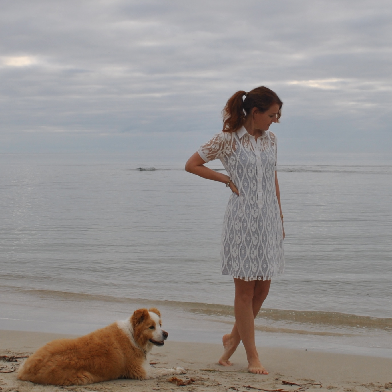
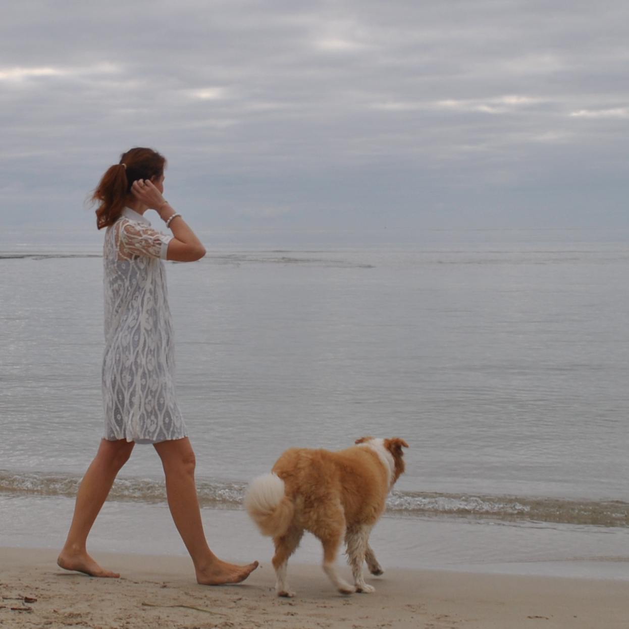
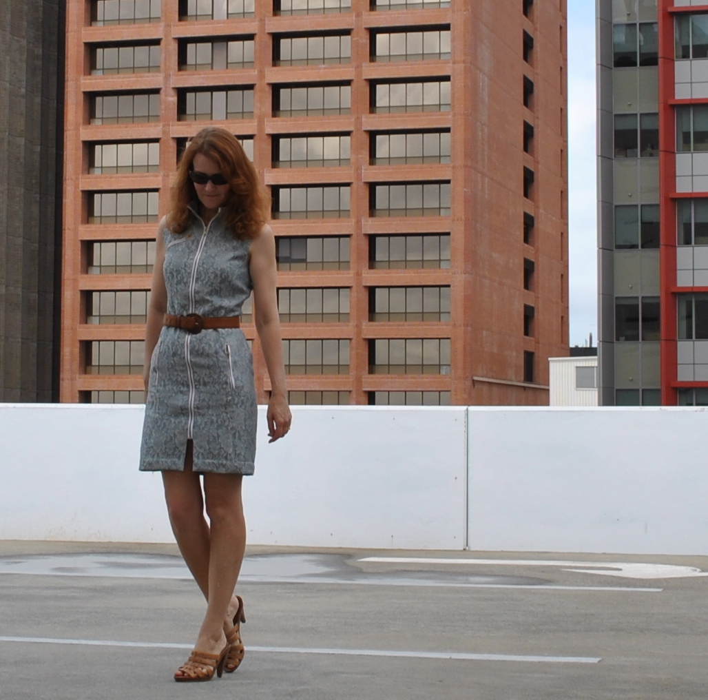
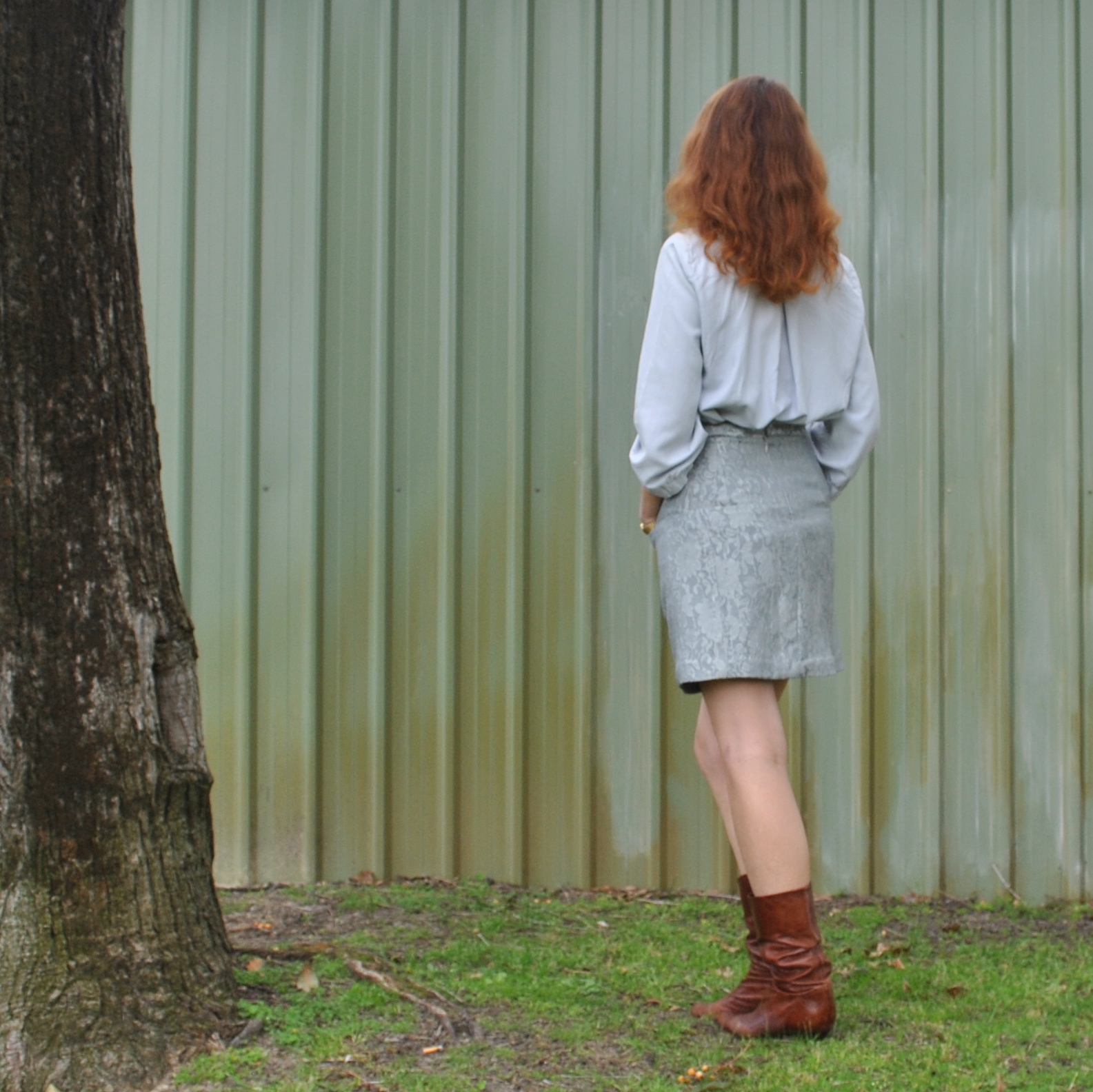
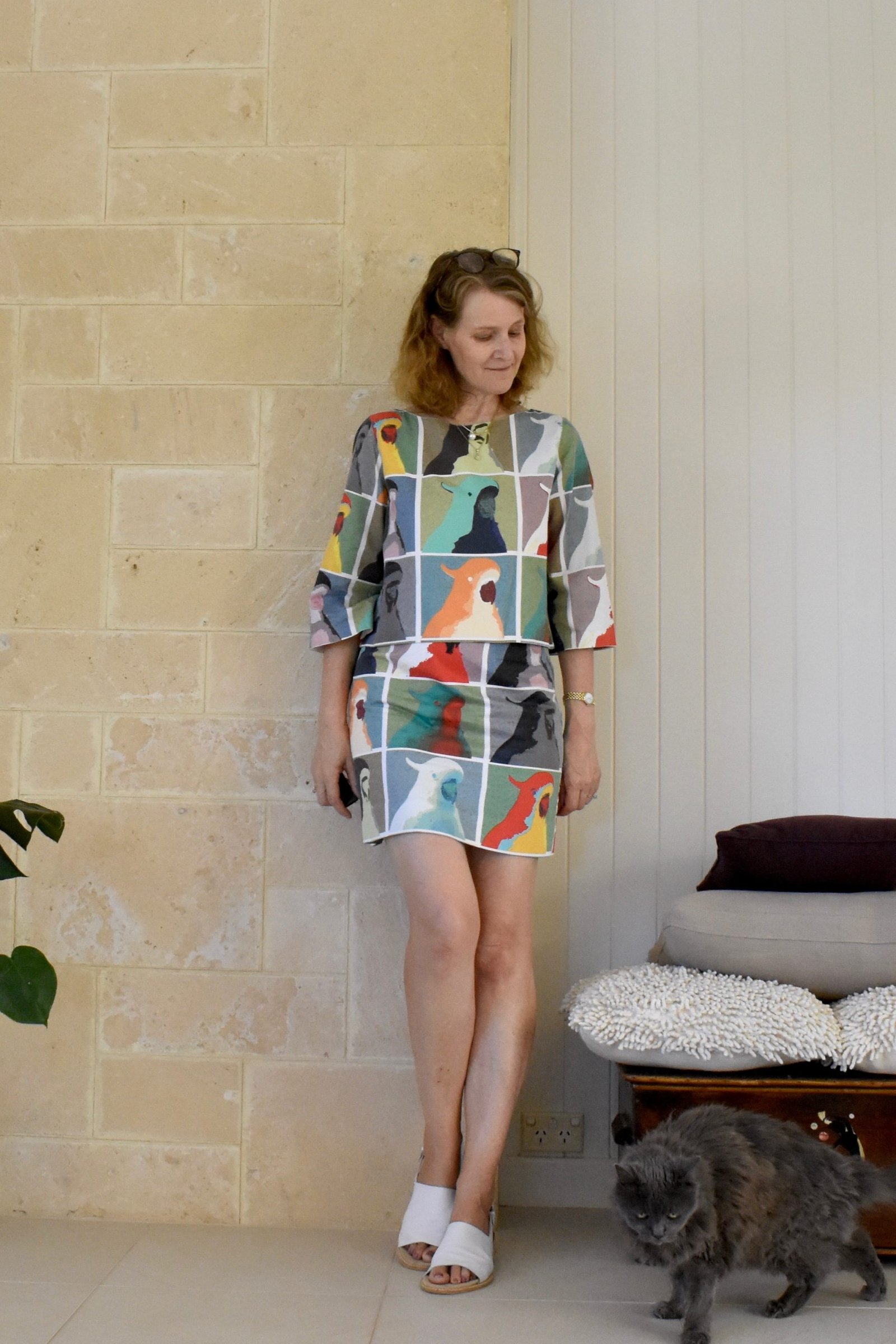
New skirt, yeah 🙂
I
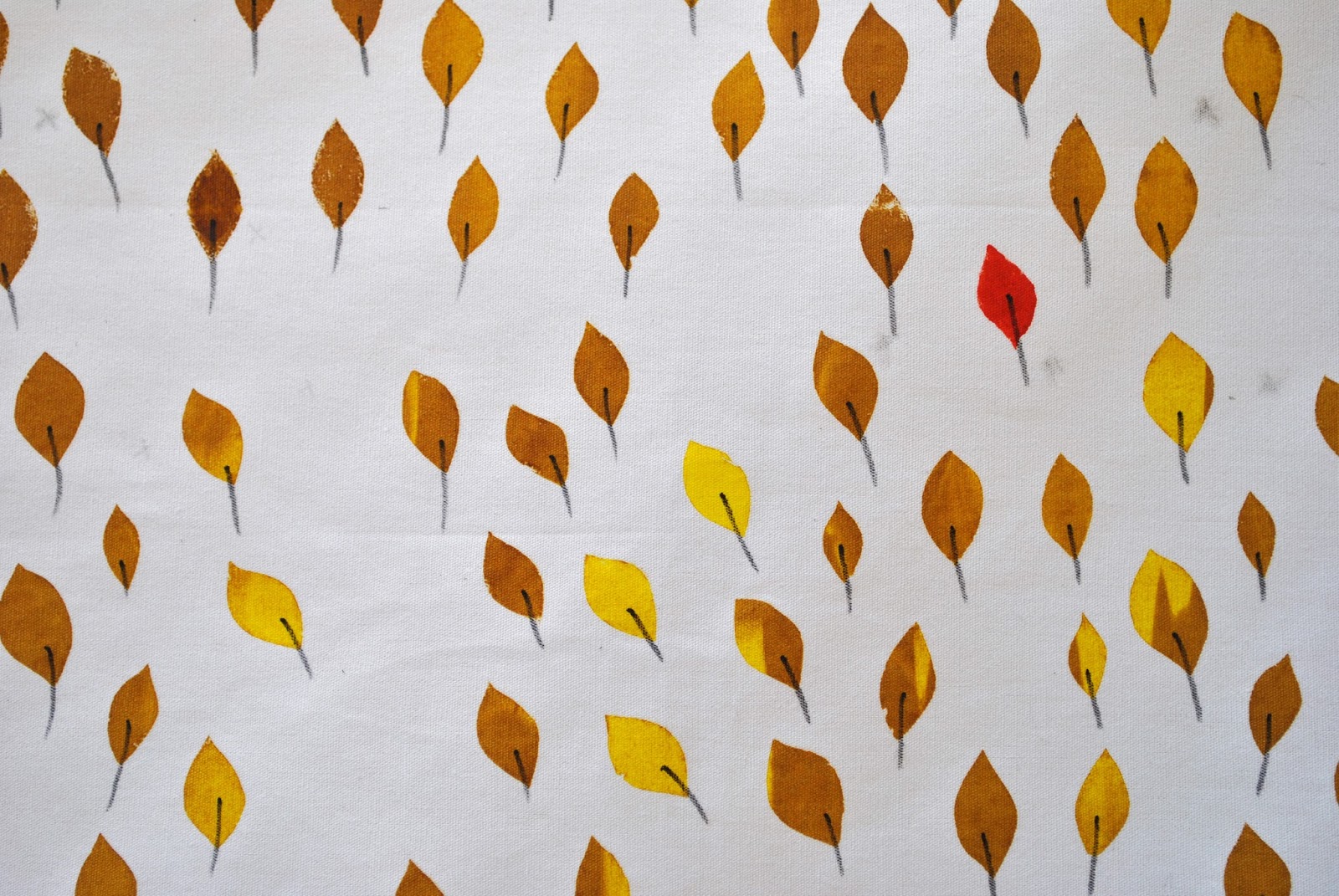
bought this lightweight blotchy grey-green cotton from Tessuti’s in Melbourne,
during
my girly trip away with my Mum and Cassie last year… and always intended
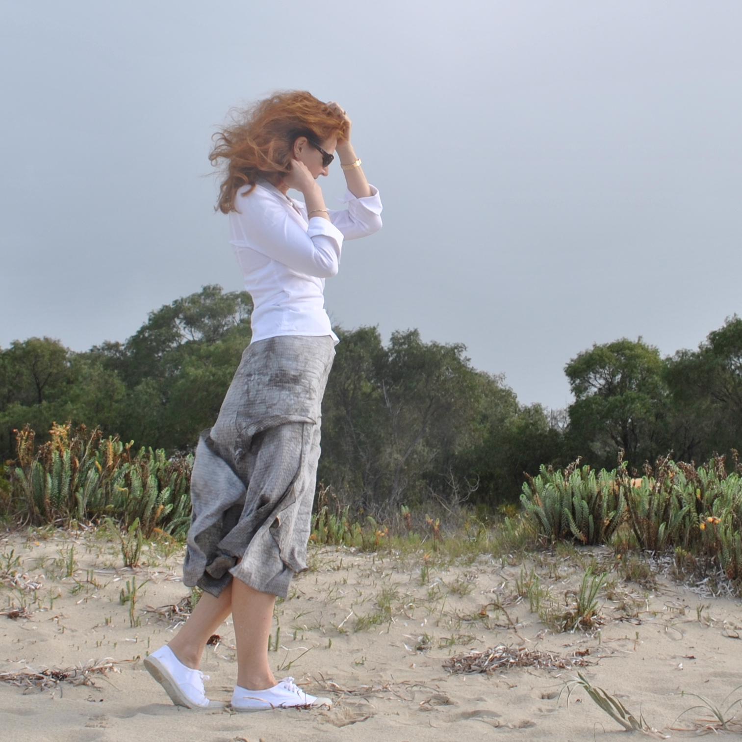
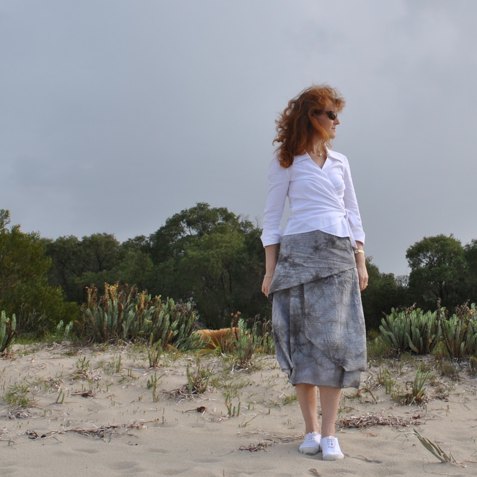
to make just exactly this skirt. The pattern is an old favourite Vogue 7880, a flatteringly longline skirt with beautifully staggered asymmetrical layers, and the option for a feminine handkerchief hemline. It’s an interesting as well as lovely design because it looks different from every angle. There was a stiff breeze on the beach when I
took these pictures, which is normally a pain for the sort of weirdo who tries to photograph their sewing creations out in the great outdoors… I mean
who does that anyway?! but actually turned out to be a good thing I think, because the wind
has assisted in showing off the different layers fluttering against each other, how
they actually appear when in motion, so to speak. Thanks, wind, for blasting me to bits! Very much appreciated!

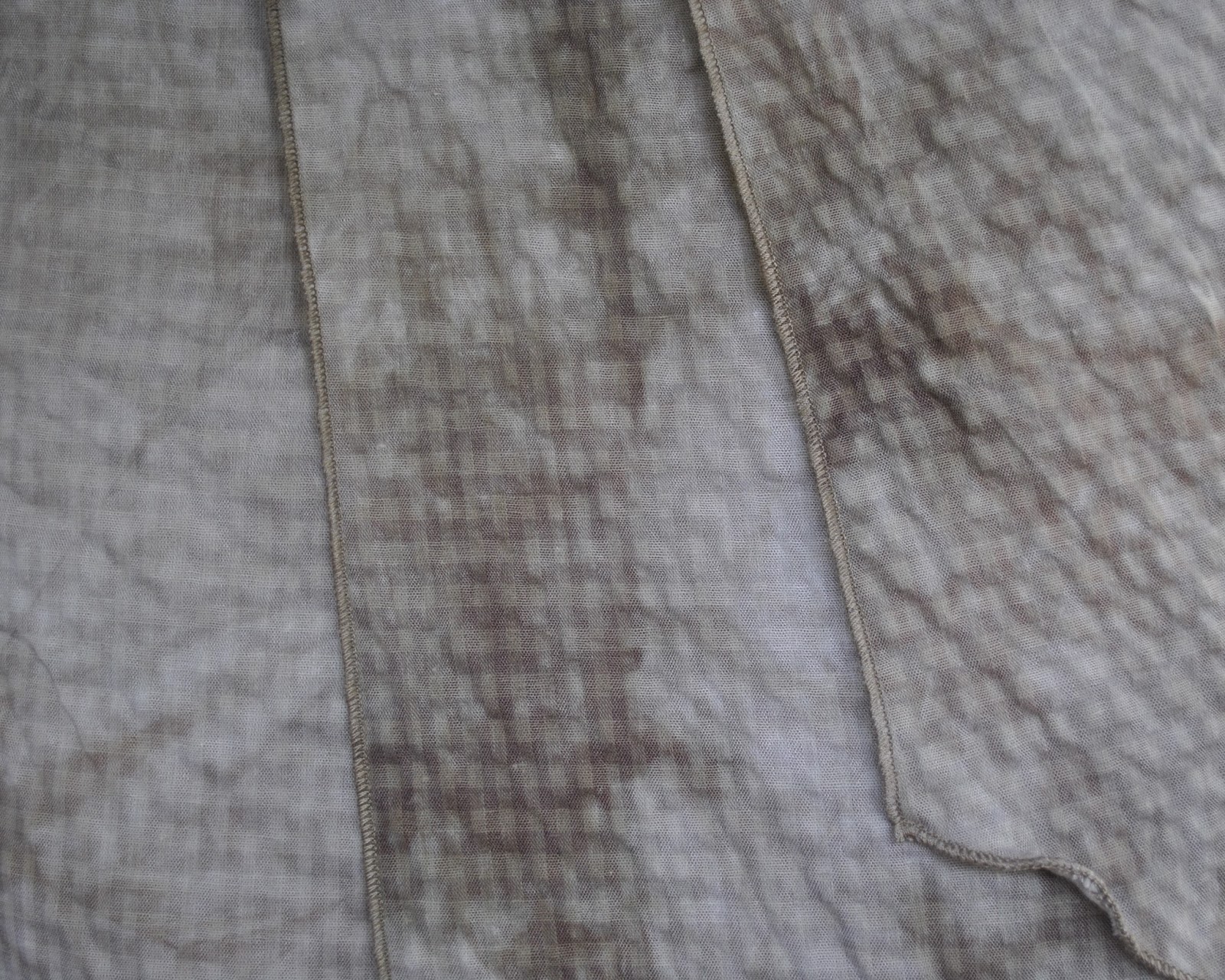
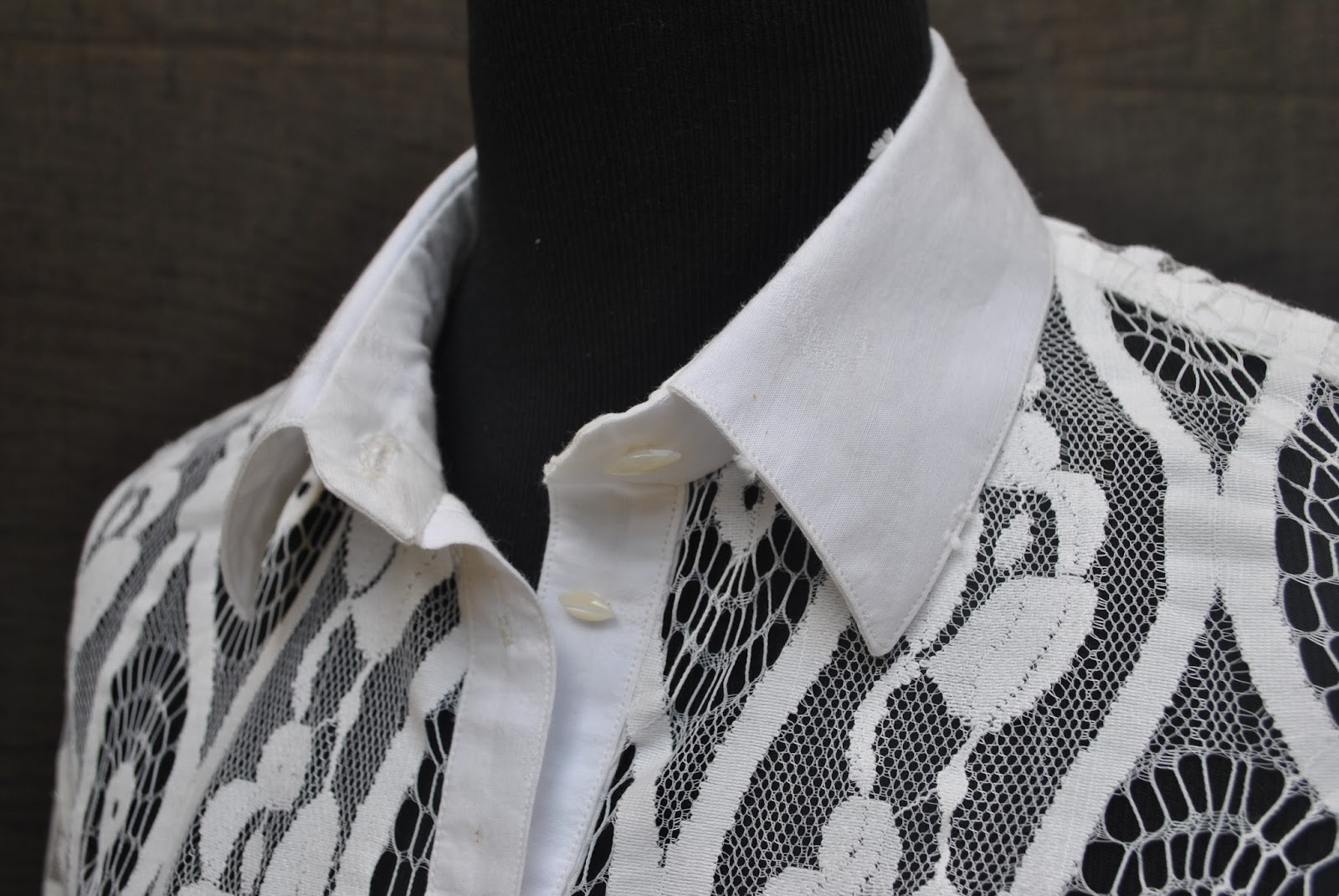
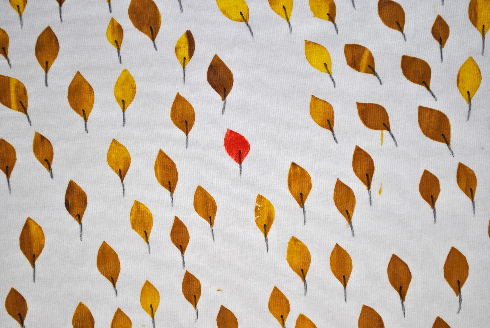
The
fabric is a very lightweight cotton, a little crinkly, even slightly seersucker-y. It has the shadows of the classic seersucker check
appearing in its background, overlaid with cloudy, watercolour like swirls of
grey, khaki, sage, olive… all my favourite sludgey colours in other words. The bolt was clutched to my chest pretty early in the shopping expedition, if I recall correctly. Mwahahaha.

This skirt pattern has three views and I’ve made lots of them over the years. This newest version is sorta halfway
between views B and C, which have always been my two favourite
views. I’m so glad I’ve hung on to
the pattern because it is interesting and lovely, and imo there’s just
nothing ticking either of those boxes in currently available skirt patterns at the moment. Is it just me or are skirt patterns
pretty boring and unimaginative right now? Obviously I have absolutely nothing against basic skirt
patterns, since after all I’ve made my own fair share of very plain little
skirts!… but we need some of the more pretty and/or out-there ones too, don’t
we? And sadly there are just very
few interesting, exciting, gorgeous and/or challenging designs around. If there are, then please tell me, where
are they?!
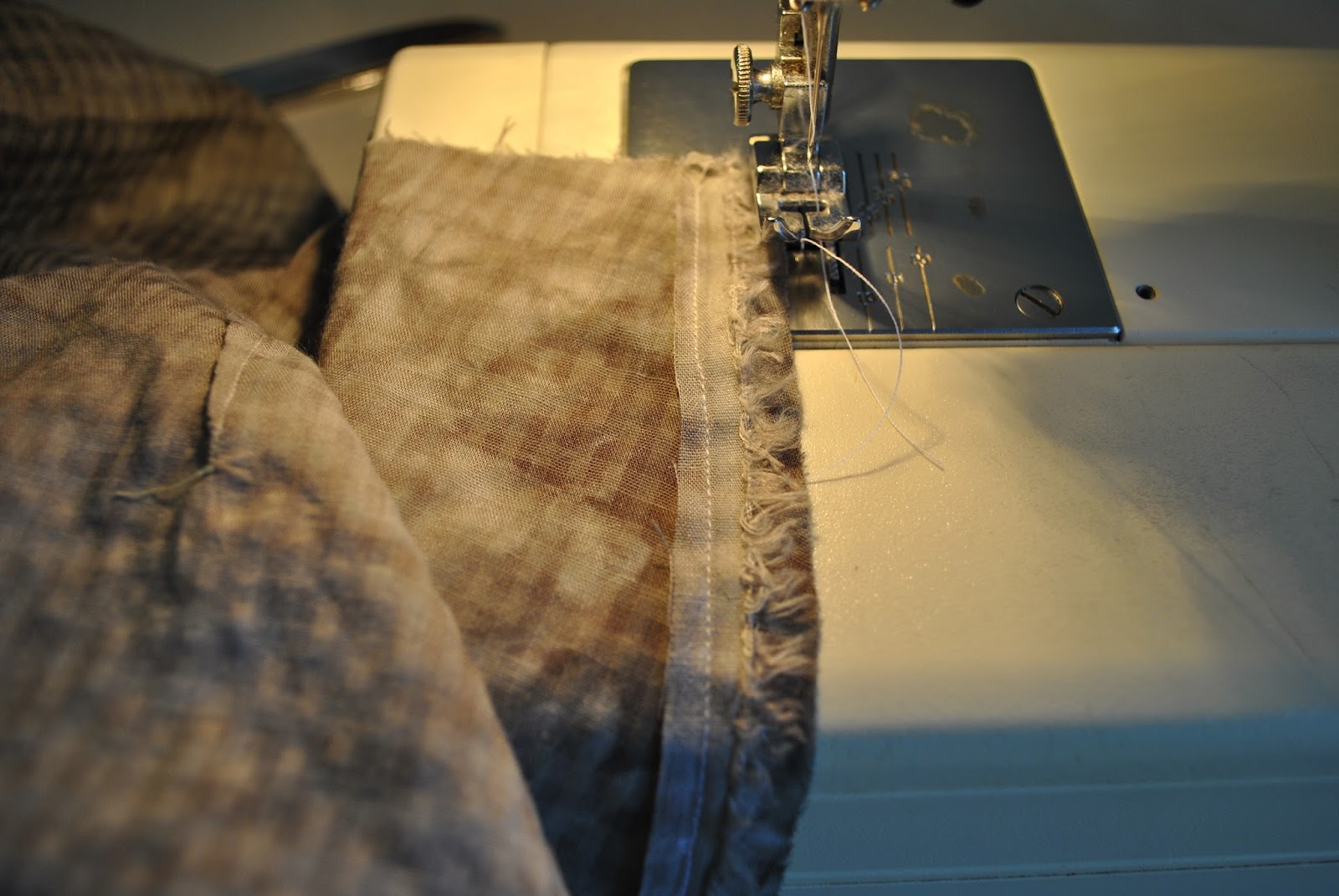
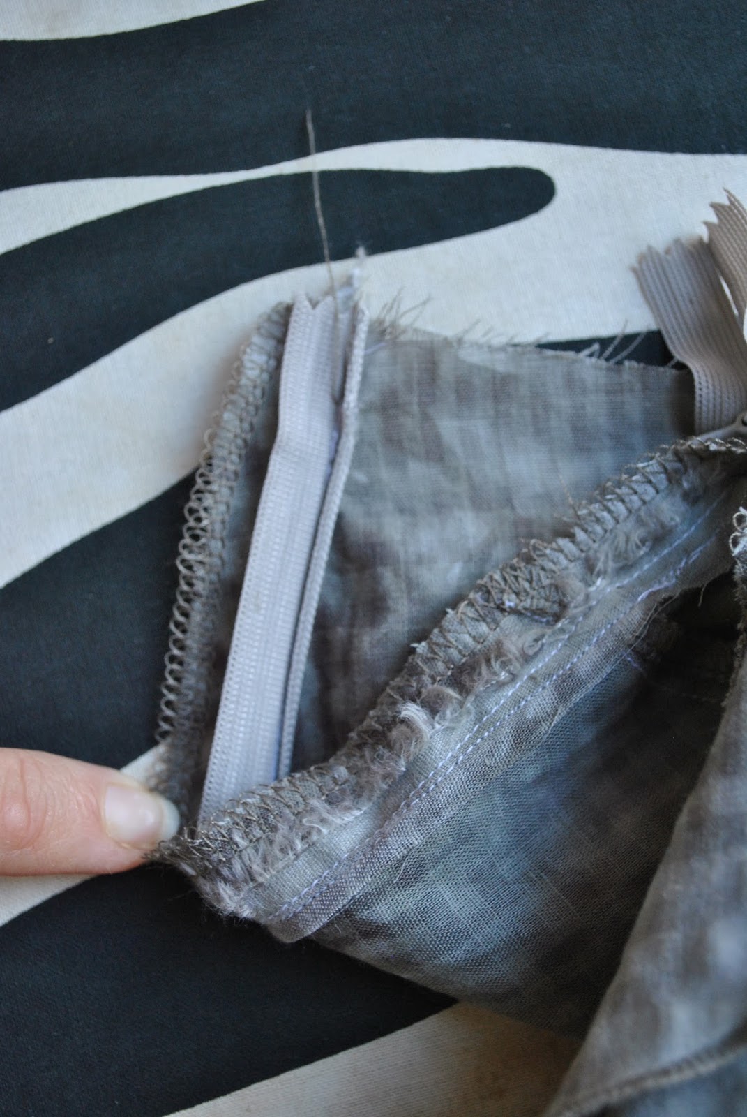
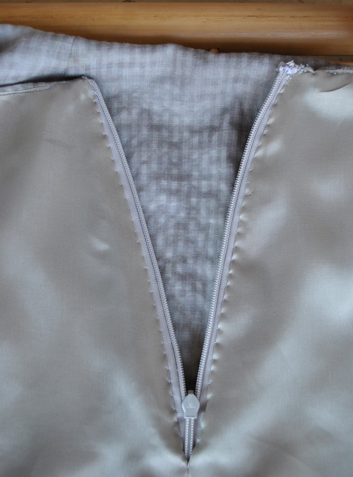
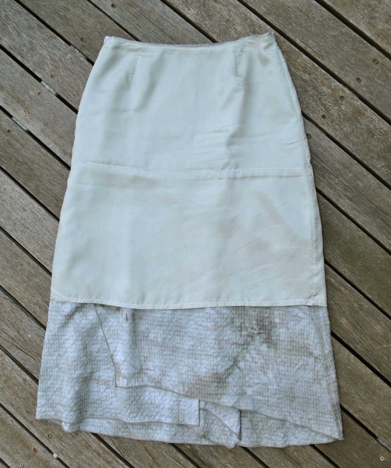
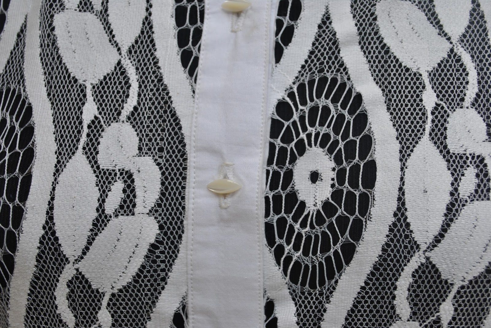
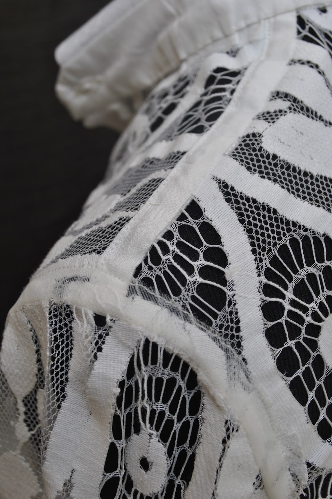
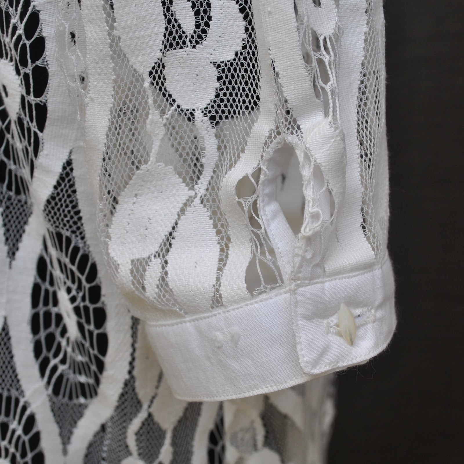
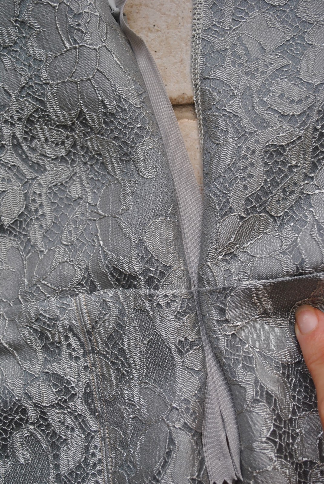
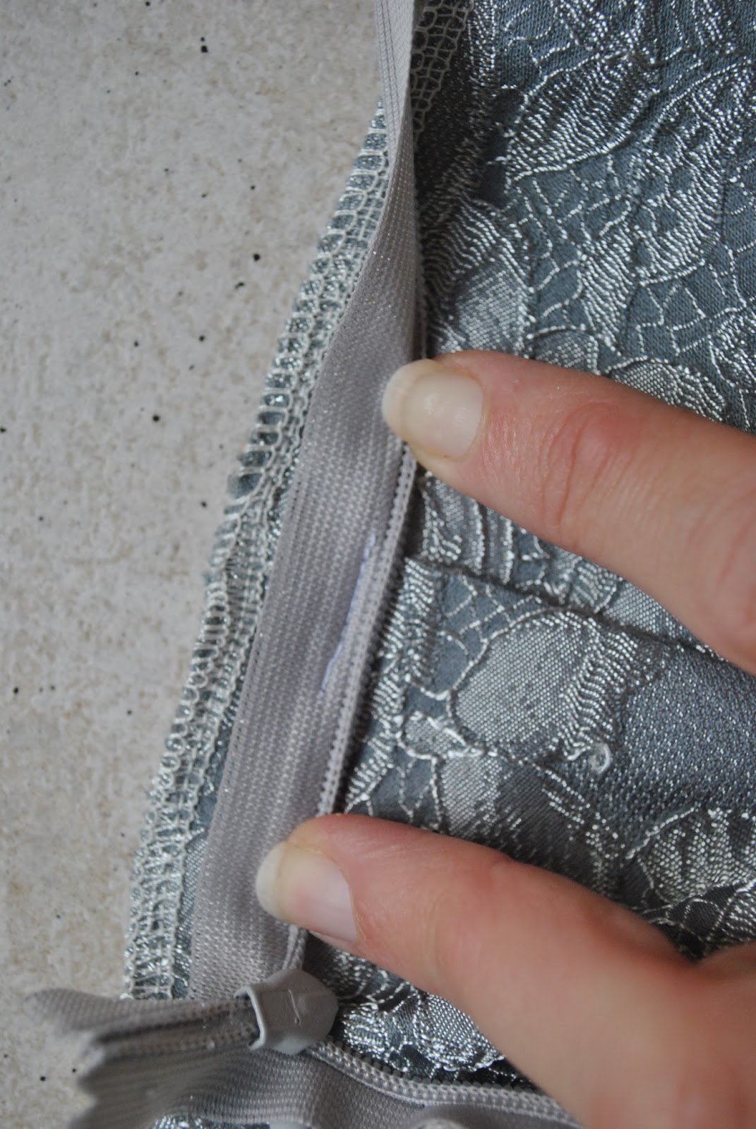
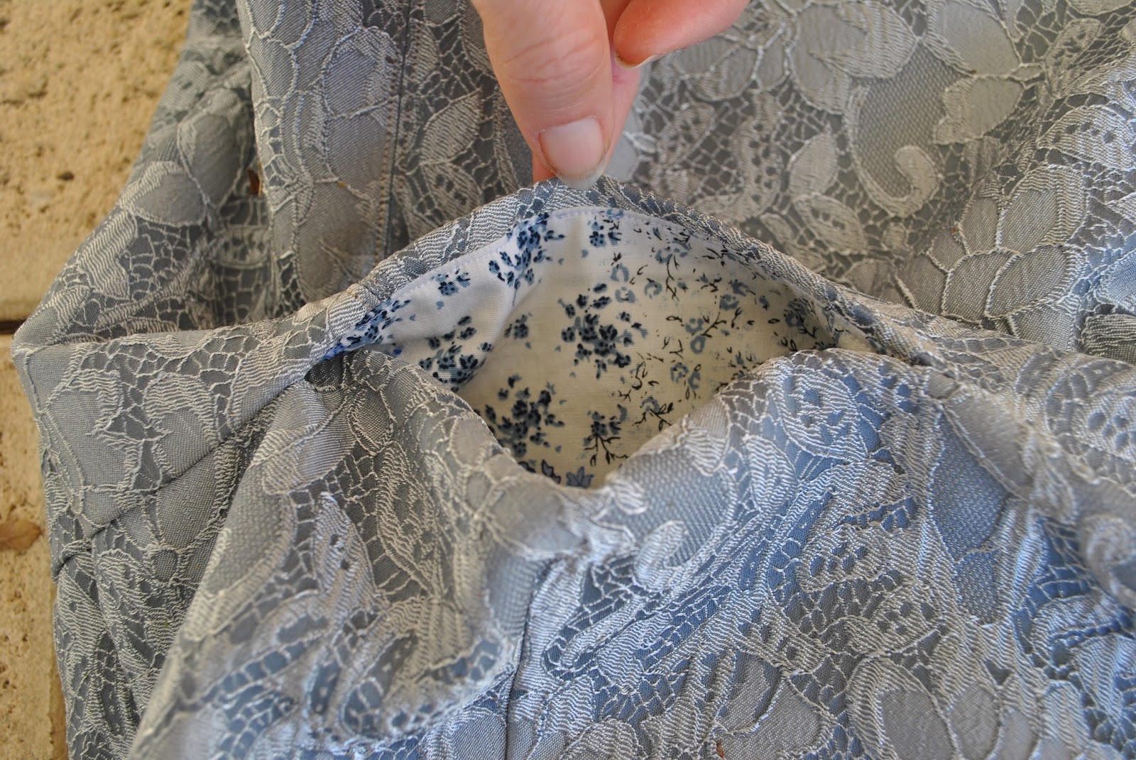
This
pattern has inner stay pieces, to which you attach the lower skirt pieces. For several of my versions of this
skirt I’ve chosen sheer fabrics, because the floaty layers are really crying out to be
made in very light fabrics like chiffon; and so I generally lengthen the
stay to hit just above knee length, to make it more like a real proper
lining. It’s pretty easy to mark
the old stitching line on the stay, to which you add the lower skirt pieces as
normal, and then you just hem the stay just like you would a lining. The longer length hangs inside the
skirt, providing modesty when you have chosen sheer fabrics, or in case you do happen to be wearing
the skirt on a very windy day, ahem.
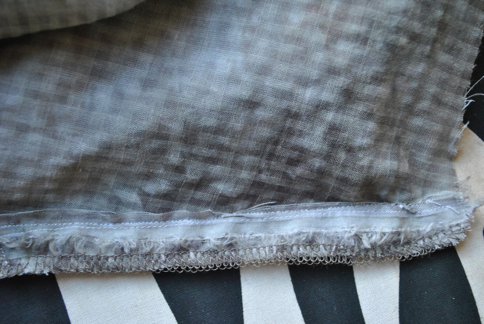
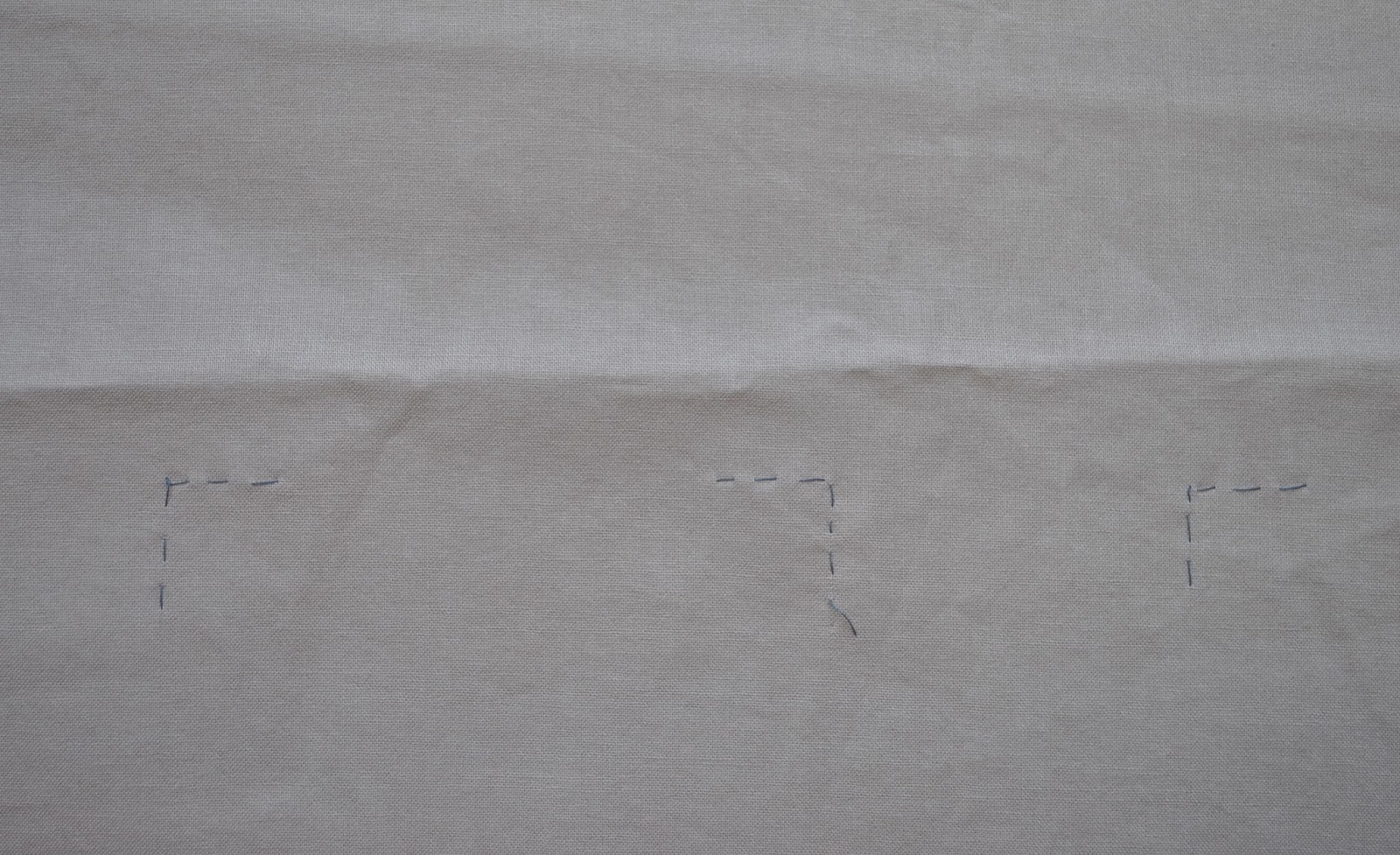
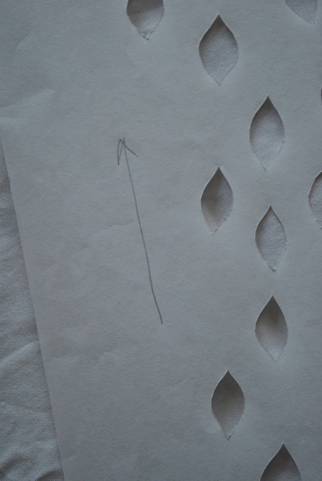
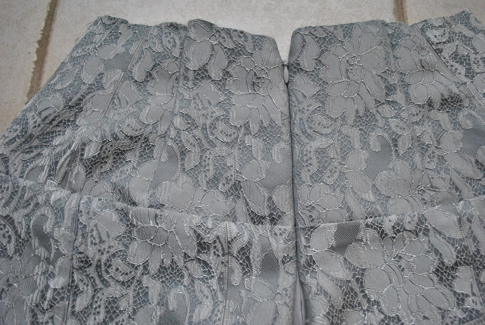
you can just barely make out the line of stitching halfway up the inner stay/lining, where the lower skirt pieces are attached…
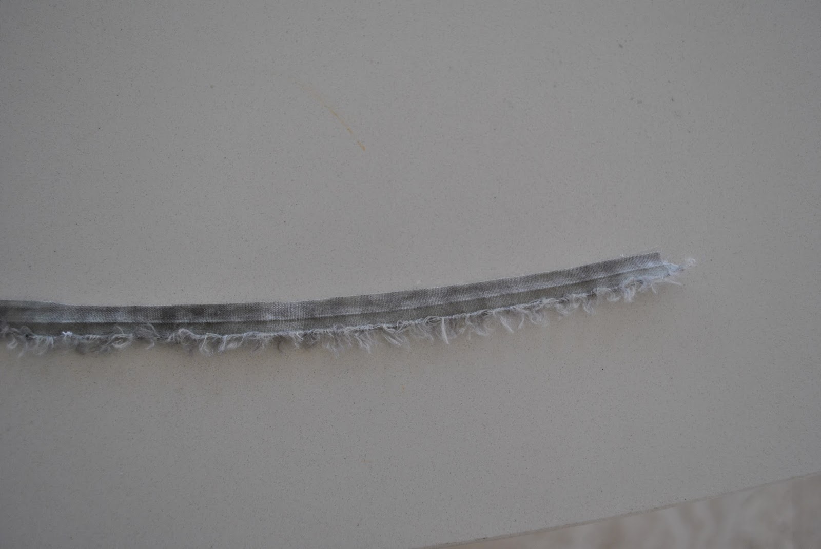
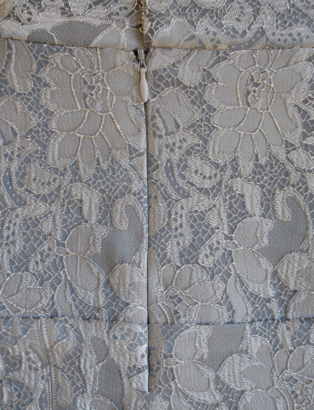
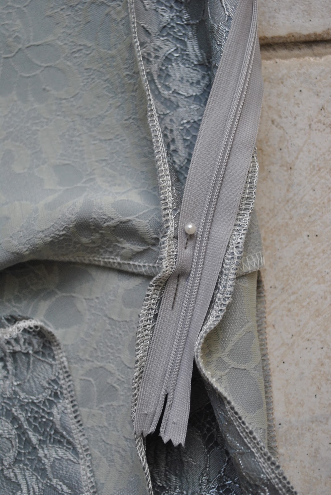
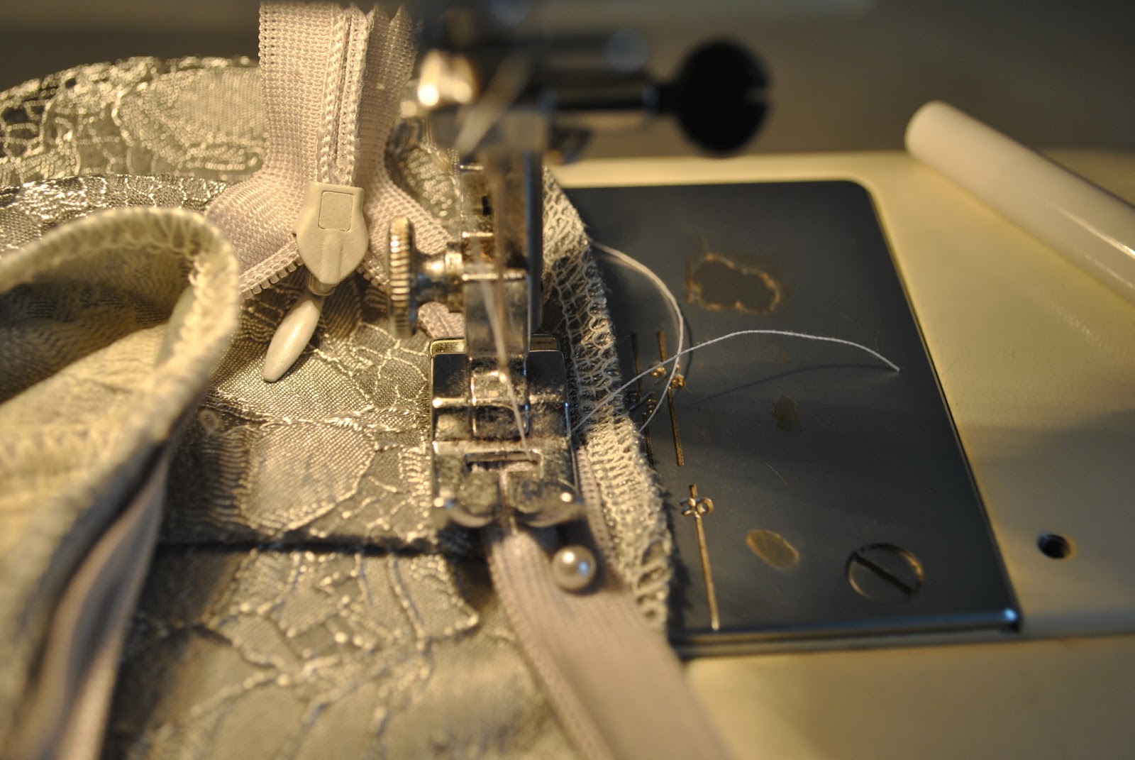
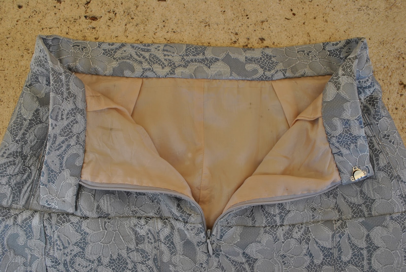
It
has an invisible zip closure, and I finished the raw edges using the rolled hem
stitch on my overlocker.
Details:
Skirt; Vogue 7880, lightweight cotton with polyacetate stay/lining
Shoes, bensimon, from seed
btw, if you like playing “spot the dog”she just squeaked into two of the pictures here 😉