Category Archives: Uncategorized

Autumn leaves sundress

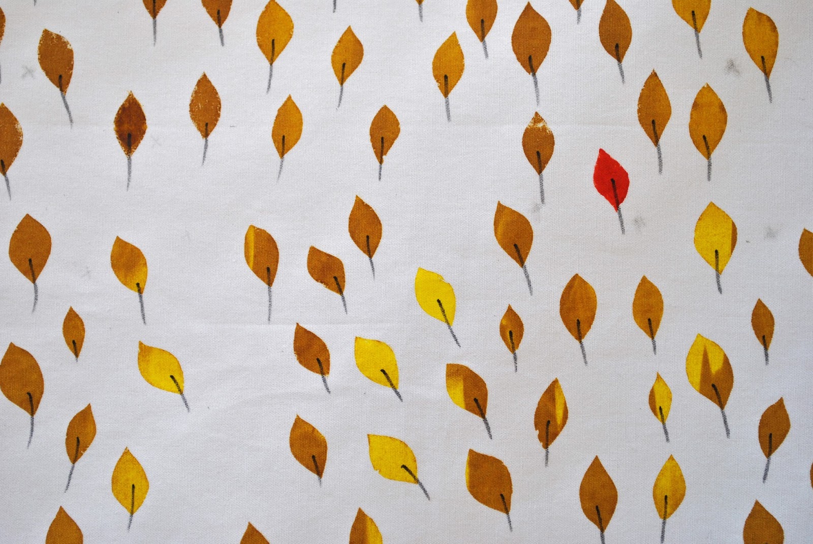
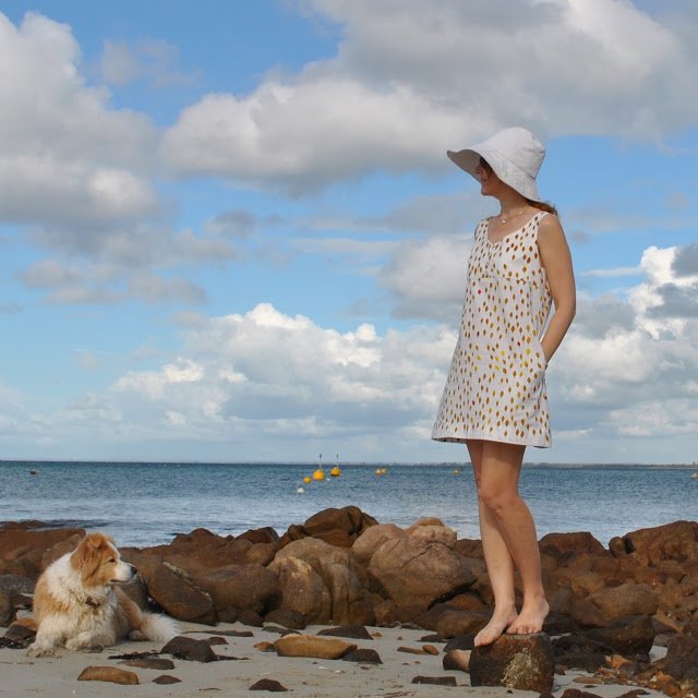
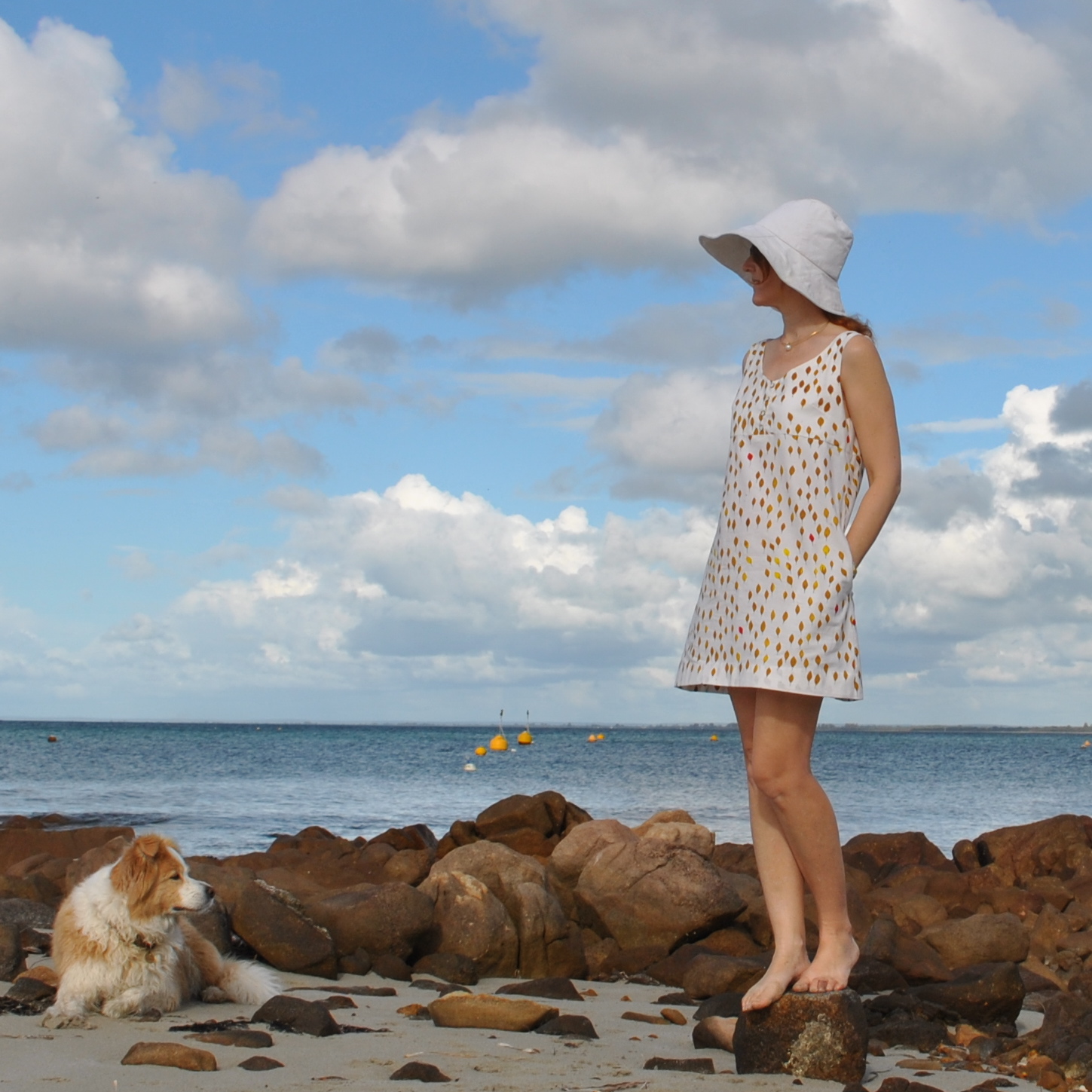
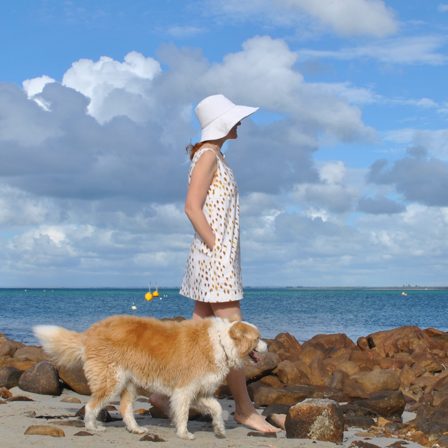
I made a sundress using my autumn leaves fabric, screen-printed by me here.  Those who like wonky weird imperfect prints are going to like this, if you don’t, then avert your eyes!
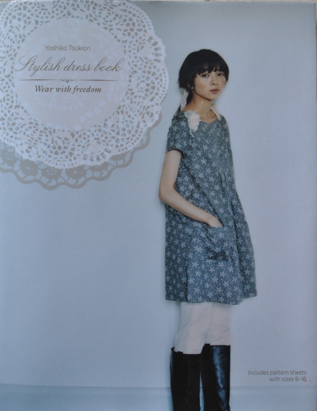
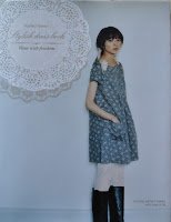
The pattern is an adaption of dress T, from the Stylish Dress Book, the design Reana chose for me to make my sew bossy dress here, which now looks like this.  That one is such a great dress to wear; so comfy and easy to throw on it has quickly become one of my favourites  ðŸ™‚
For this new dress I didn’t have enough fabric to make up the pattern as is.  I left off the sleeves, and removed about 15cm in width from the centre fold of both the skirt front and back, so there is no gathering into the bodice … that’s a whole foot taken out of the skirt’s circumference overall!  and there was still plenty of room in the skirt for me to have inseam pockets.  I cut these from a much nicer, lightweight white swiss dot cotton.
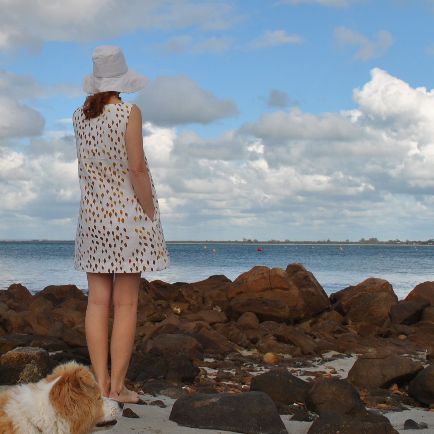
The front neckline of the bodice has been scooped out a bit deeper than the pattern, and I split the front bodice and made a little placket, with buttons and buttonholes.  Just because, I dunno (shrug), something to focus on other than those weird and wonky leaves.  The front and back bodice each have a full facing, cut from a lightweight plain white cotton.
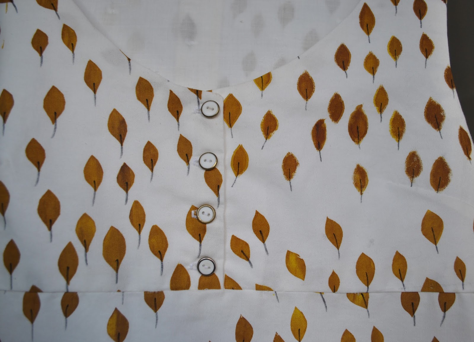
 Hehe… would you believe I’ve only just noticed, when I uploaded this picture? that one of the leaves on the front of the bodice is missing its stem??  Only just noticed!  LOL!  And while drawing them in I checked and checked…  I’ve fixed this up now, but didn’t bother to take another picture.

I’m a bit meh about this dress, partly because my print is … funny; and partly because the fabric itself is a pretty poor quality.  It is a bit stiff and almost calico-like in texture.  Now I’m kinda kicking myself I didn’t take the risk and buy a finer quality cotton in the first place, problem was, I had no confidence in myself and started out with the assumption I was going to stuff it up.   I will wear the dress, because it’s airy and cool and will be great to have in the wardrobe in the hottest days of summer when I just want to grab something casual, and I’m hoping it will soften up over time with wear and washing.  The thing is, I usually judge my self-mades by posing the question; would I buy this if I saw it in a store?  And realistically I would probably pass this over, laughing at its hideousness.  Oh well.  

A thought…  I can always use it as an apron, for future screen-printing sessions?!  Ha!

I did learn something pretty important in printing and making this dress…  Cut out the pattern pieces before printing! 
This approach is hugely superior to printing a length of fabric and then deciding what to make with it, like I did here.  Several reasons…

There is less wastage of fabric ink and your own effort, since you are not printing fabric that you won’t use. 

You can make sure that the print is properly covering the pattern piece as you are going along. 

You can if desired place the print just exactly how you want it to appear on the piece.  

It’s guaranteed that you will have enough fabric printed to make what you want, there’ll be no laying down the pattern pieces and being disappointed that you underestimated just how much you would need.
Another consideration… there will be no angst when cutting into your precious print since it is already cut out and ready to go!
And, learning from my own mistakes… yes, I have already sewn together my giant polka dot pieces too, and I’m pretty happy with that one…..  Stay tuned!  ðŸ™‚

Details:
Dress; based upon dress T from the Stylish Dress book by Yoshiko Tsukiori, screen-printed ivory cotton
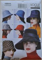
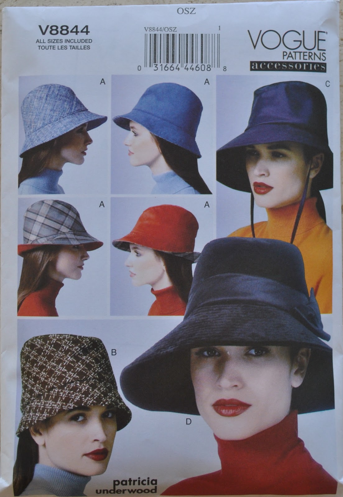
Hat; Vogue 8844, ivory corduroy, details and my review of this pattern here
pinterestmail

Screen-printing: giant beachy polka dots

My latest screen-printing project  ðŸ™‚
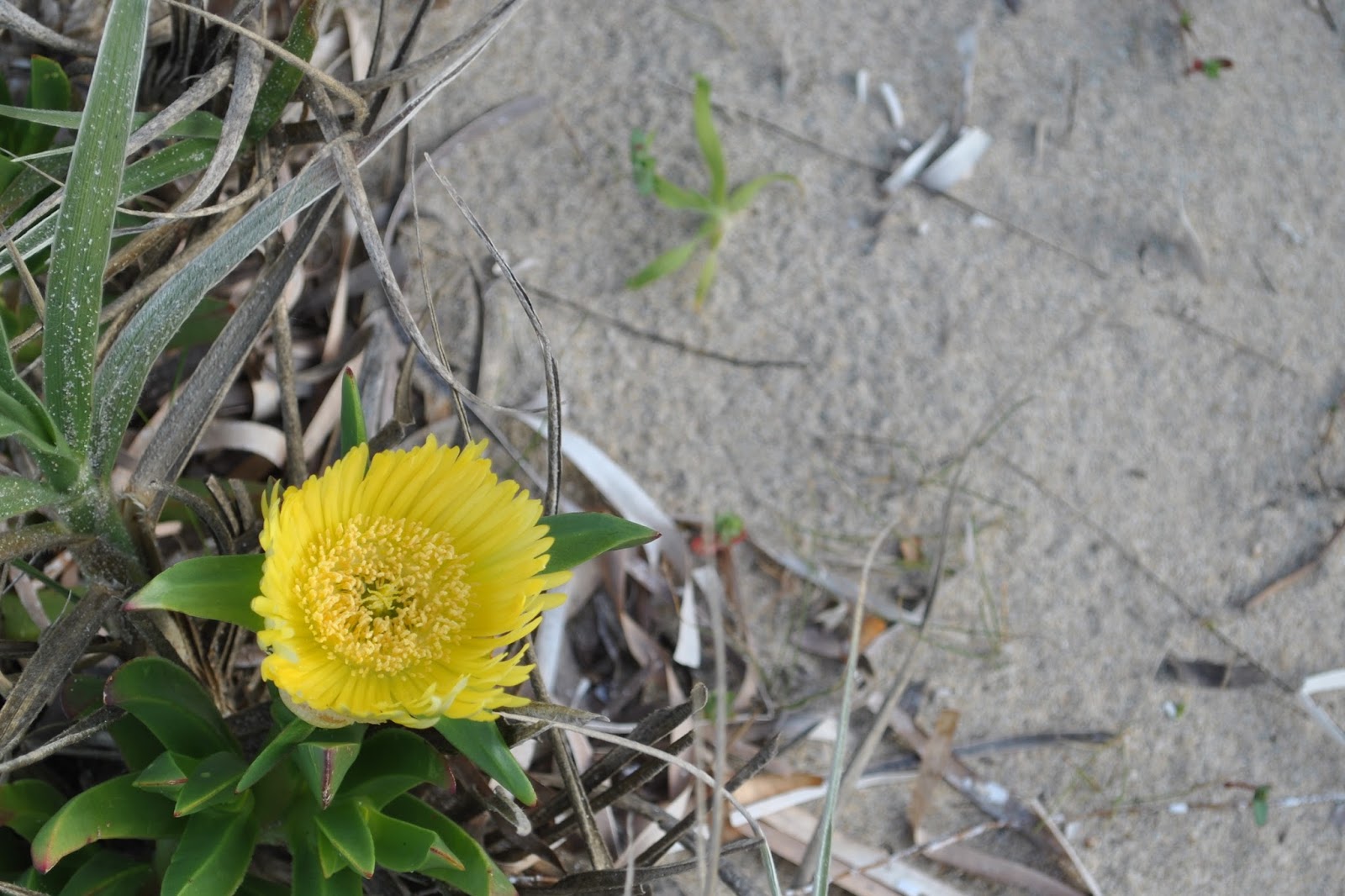
Searching for design inspiration, I randomly set myself a theme.  The beach!  I sketched out several ideas and variations, some abstract some more literal, and spent ages agonising over which one I should do… aaargh, so indecisive!!  Eventually settled on this very simple and abstract one, obviously! since we are really pushed for time and space in our class and it’s best not to to turn up with very ambitious ideas.  I had to finish this one at home since I only managed to get halfway through in class.  But I am seriously considering setting up at home to print at least one of my other beach-related ideas too.
I used a lovely lightweight cotton/linen from Spotlight, in a soft sandy shade.  This is probably the nicest, classiest fabric I have printed so far.  It was scary, but I felt ready to take a risk.
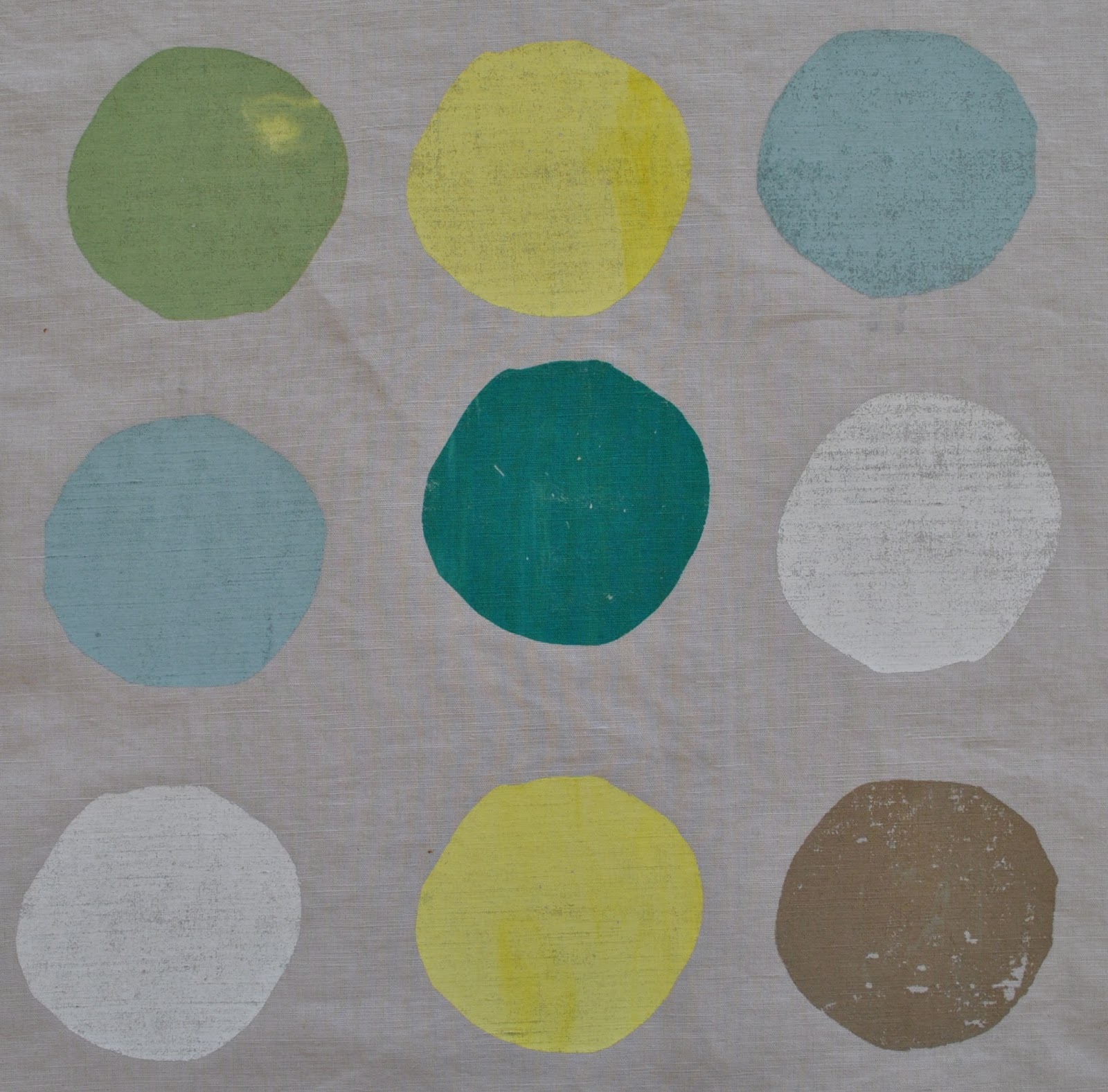
The colour palette (6 colours) :

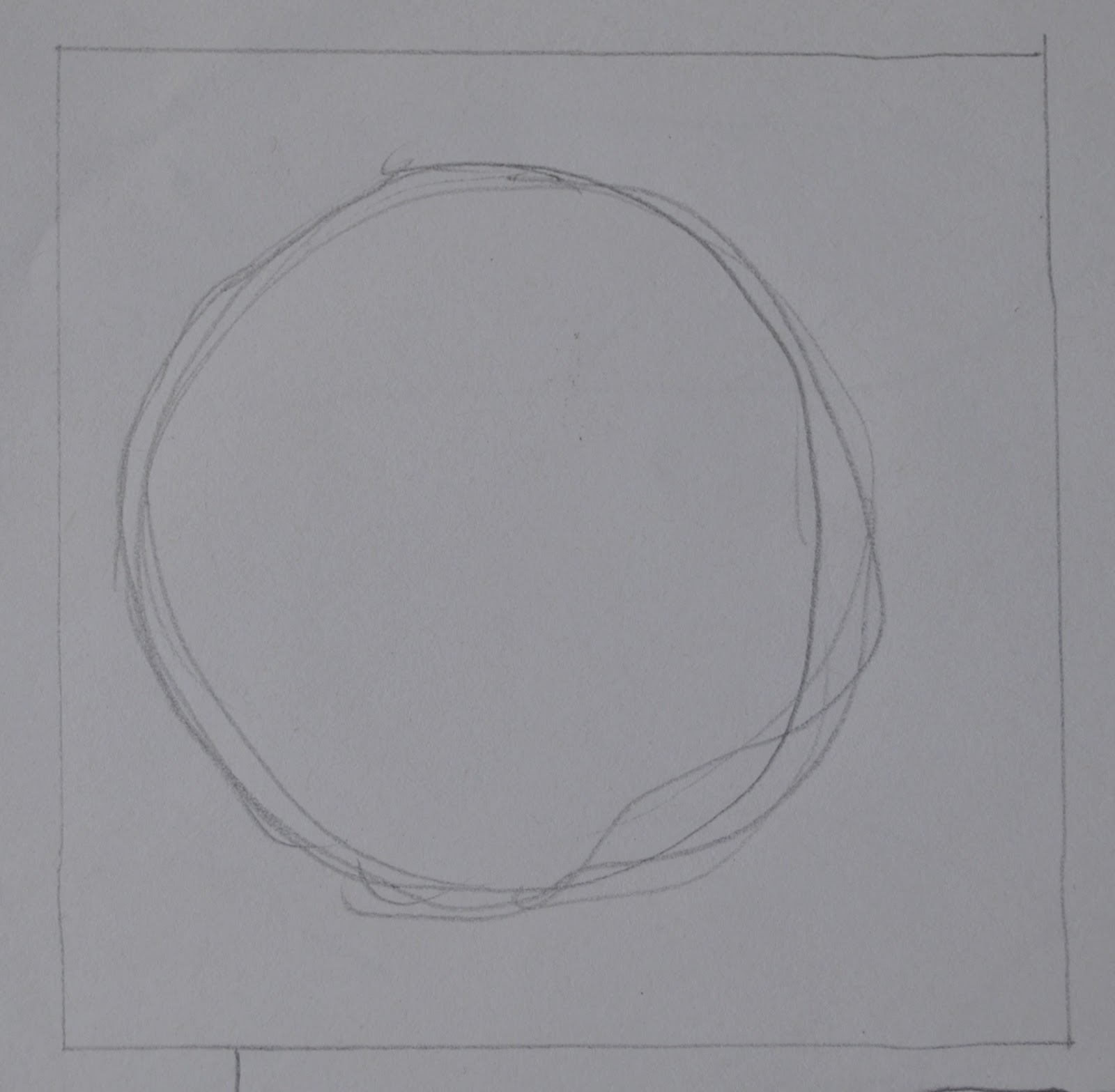
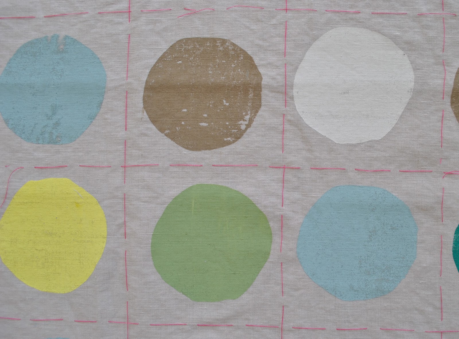
The dots are all printed using the same imperfect circle template, but oriented different ways so they don’t look identical to each other.
Funny moment; my friend J, with whom I am doing the class, on seeing my stencil “um, it’s a hole?”
When printing I tried to vary the visual texture of the dots; at times I did a scanty pull, to get scratchy dots, at other times I put together blobs of slightly different shades of the colours without mixing properly, to get streaked or blotchy dots.

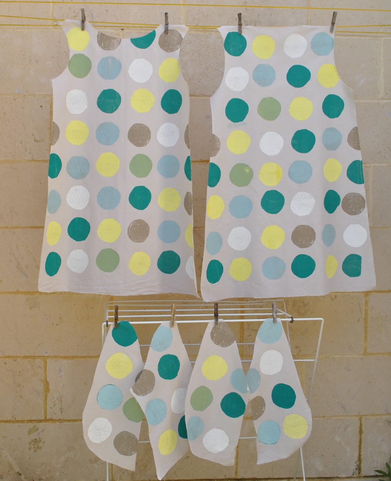
Before class, I cut out all my pattern pieces and tacked an accurate 11cmx11cm grid all over each piece.  When printing the dots I placed the screen just slightly off every now and again, because I like how a little imperfection makes the design look more casual and fun.  Plus, wonky designs are the beginner screen-printer’s best friend!!

The whole shebang…

Thoughts: I am super happy with how the print turned out! and am pretty excited to see how the final garment will look.  I’m motivated to sew it up quickly, because my teacher specifically asked me to show it at our next class.. which will be our last!  Yes, I’m a little sad that my weekly class is going to end, but this isn’t going to be the end of my screen-printing adventures, that’s for sure!

pinterestmail

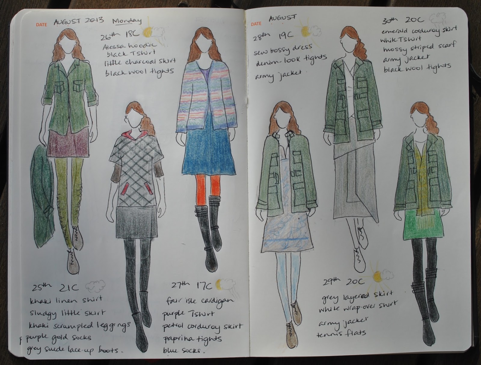
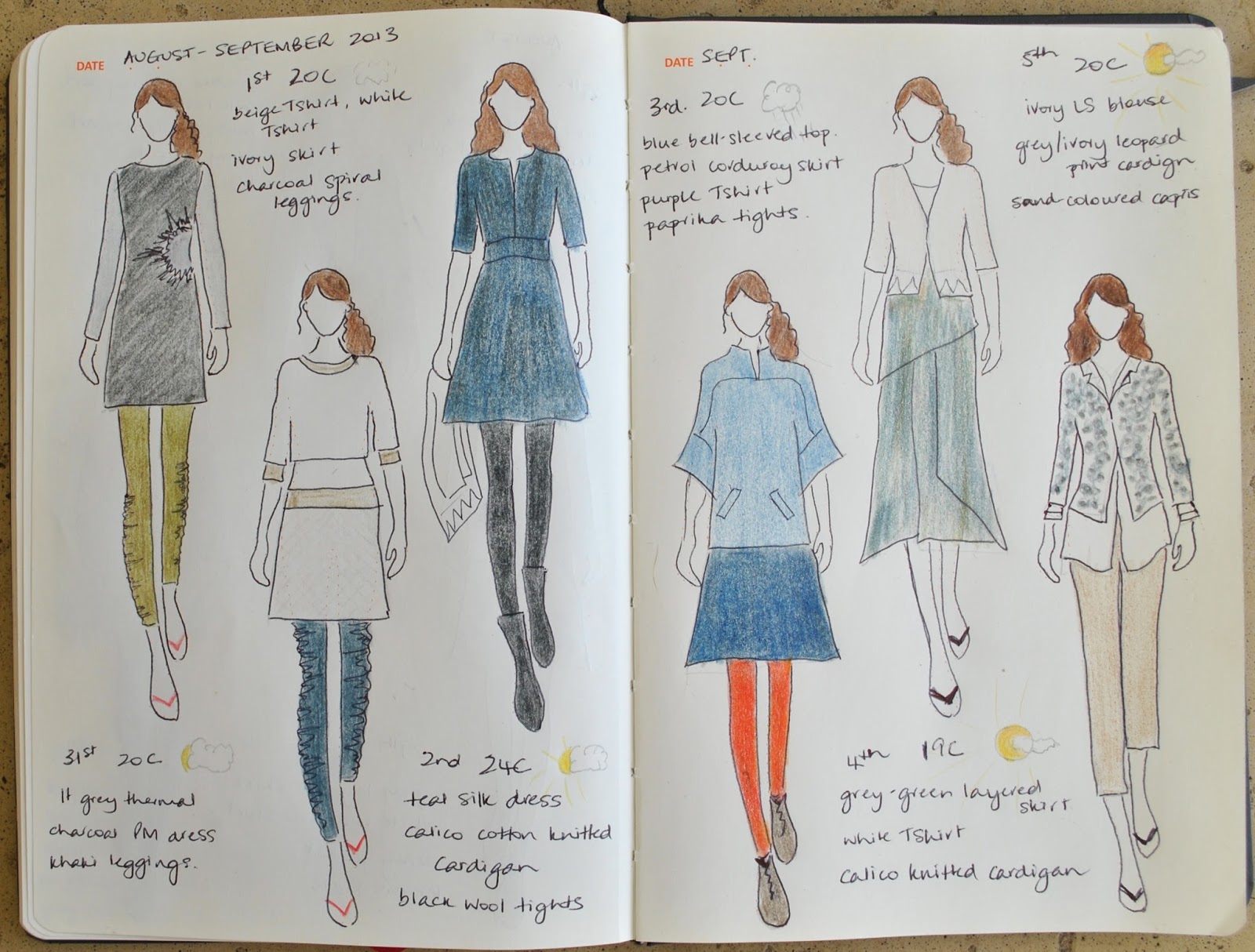
the paper doll project

(I’ve pledged to wear only clothes handmade by me this year and to sketch my daily outfits in my Fashionary.  I’m calling this the paper doll project)

25th-30th August
from left:
khaki linen shirt, sludgy little skirt, khaki leggings, purple-gold socks, army jacket
alessa hoodie, black Tshirt, little charcoal skirt, black wool tights
Fair isle hand-knit cardigan, purple Tshirt, petrol corduroy skirt, paprika tights, blue socks
sew bossy dress, denim-look tights, army jacket
grey-green layered skirt, white wrap shirt, army jacket
emerald corduroy skirt, white Tshirt, mossy knitted scarf, black wool tights, army jacket

31st August-5th September
from left:
lt grey thermal, charcoal pattern magic dress, khaki leggings
beige Tshirt (unblogged), white Tshirt, ivory curtaining skirt, charcoal grey spiral leggings
silk/linen dress, black wool tights, calico knitted cardigan
blue bell-sleeved top, petrol corduroy skirt, purple Tshirt, paprika leggings
grey-green layered skirt, white Tshirt, calico knitted cardigan
ivory blouse, leopard print cardigan, sand-coloured capris

pinterestmail

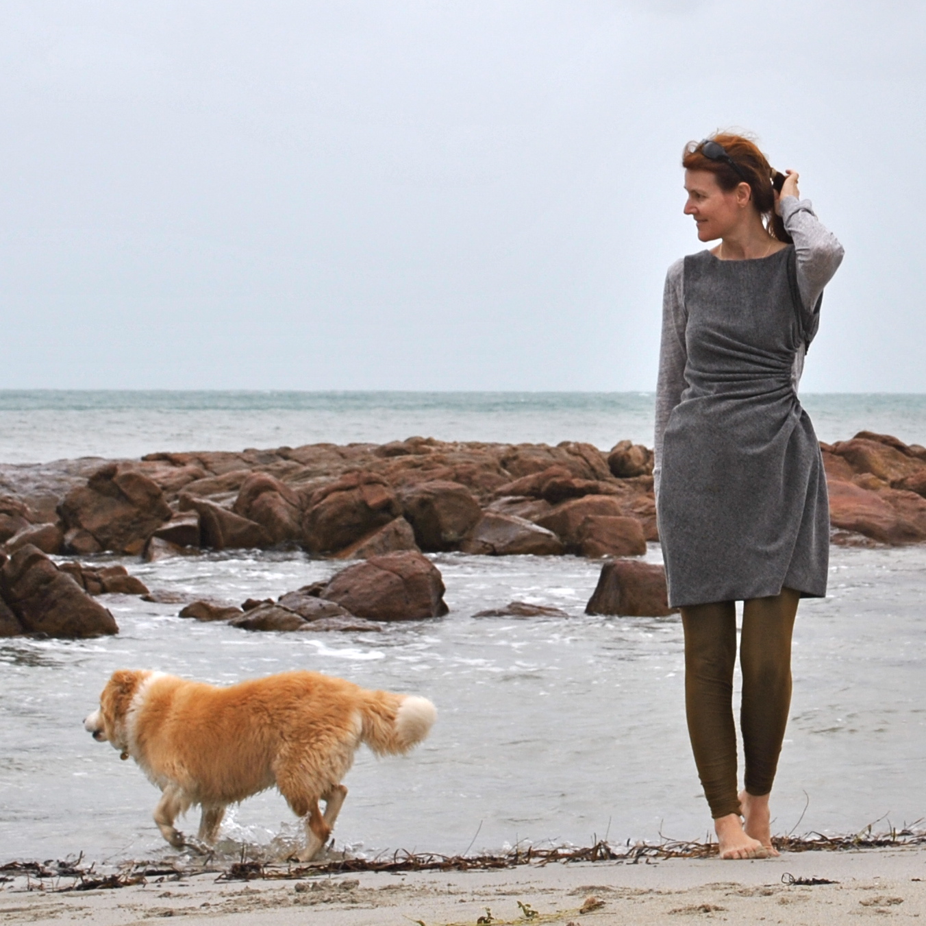
New (not) khaki leggings

Hello  ðŸ™‚
I’m still renovating my wardrobe… and can I just say, beige leggings, hmmm.  (shudder) I’d taken a hearty dislike to mine over recent weeks.  But they still had some wear in them.  Wasteth not, wanteth not.  It was really just the colour that had become offensive to my eyes.   Corrective action was called for.  
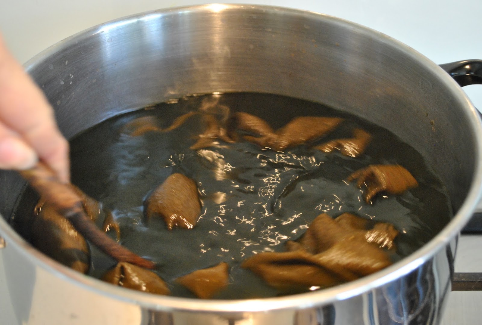
To the dye pot!!! 
(spoken in the same tone as one says “to the bat cave!” of course!)
Before…
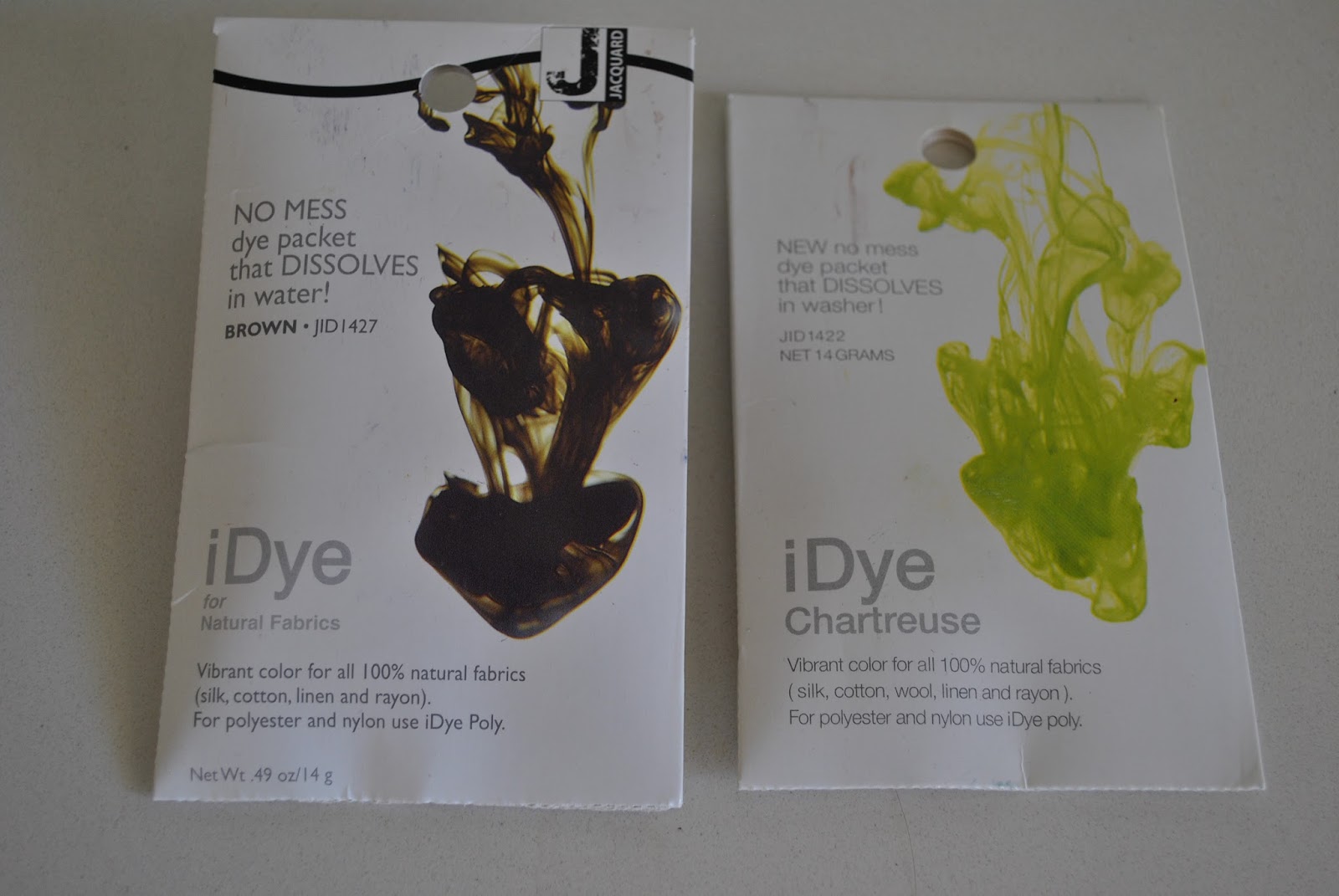
the transformative materials…
I used only a shake (that’s an official unit of measurement there) each of iDye in Brown and Chartreuse.  Probably a pinch at the most, plus heaps of salt.  Pinch, heaps;  some other highly technical terms.  Trust me, I’m an analytical chemist!

And now they are no longer hideous to my eyes, they have a new lease on life  ðŸ™‚
my tutorial on dyeing

Details:
Leggings; self-drafted of beige cotton knit, dyed khaki, originally posted here
Tshirt; self-drafted, grey knit stuff, details here
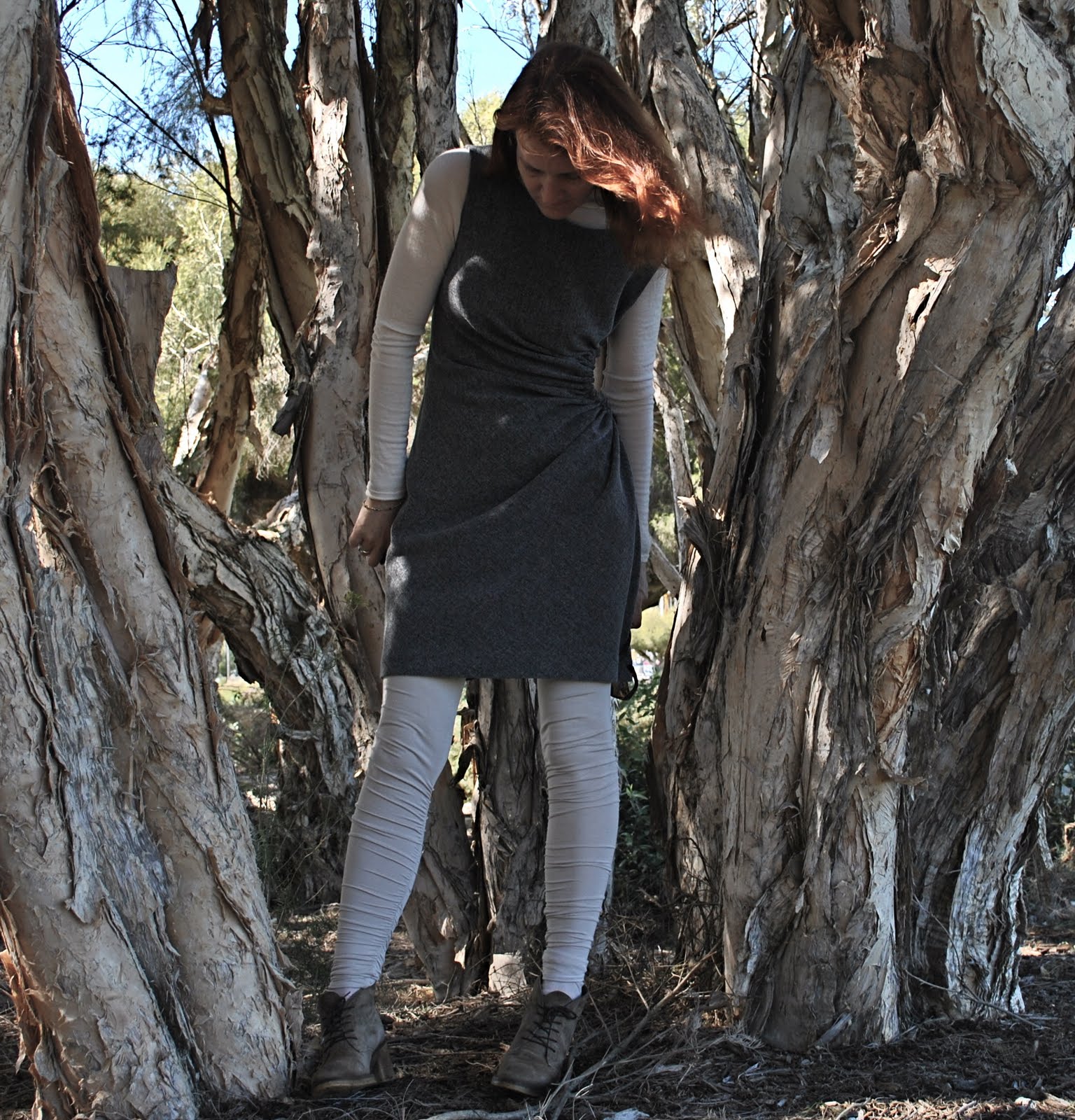
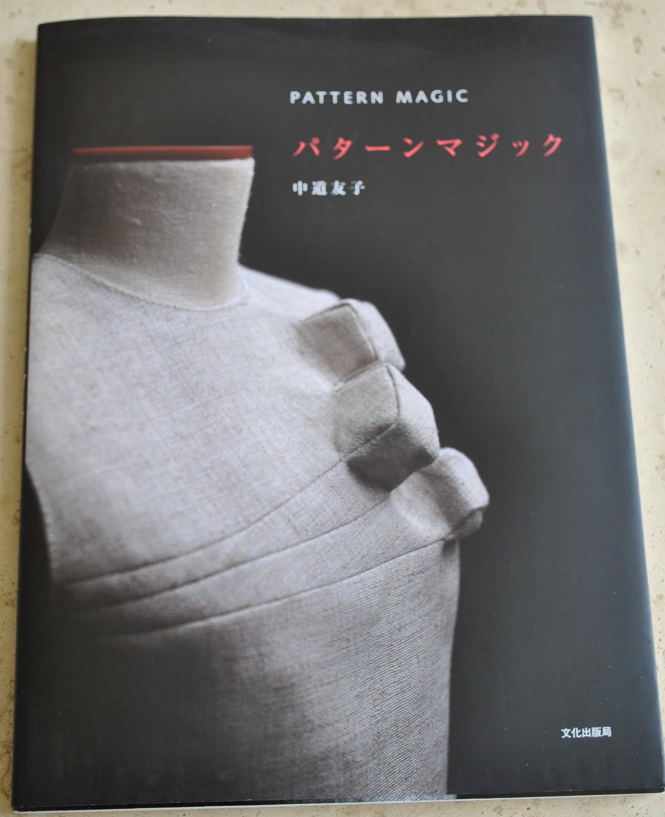
Dress; the gathered hole dress from Pattern Magic by Tomoko Nakamichi, charcoal suiting, details here

pinterestmail

stabilising the zip in a delicate fabric

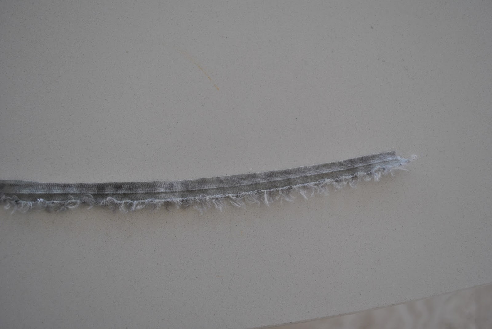
When stitching an invisible zip into a delicate fabric, it’s a good idea to stabilise the fabric at the stitching line somehow, give it some oomph to help guard against ripping.  Generally, patterns recommend using commercially purchased bias binding or tape, which is sewn to the seam allowance to double the thickness of fabric at that point.  Me being kinda stinge-y  I mean thrifty, ahem!  I usually snip a strip of the selvedge off to use.  
Why? several reasons…
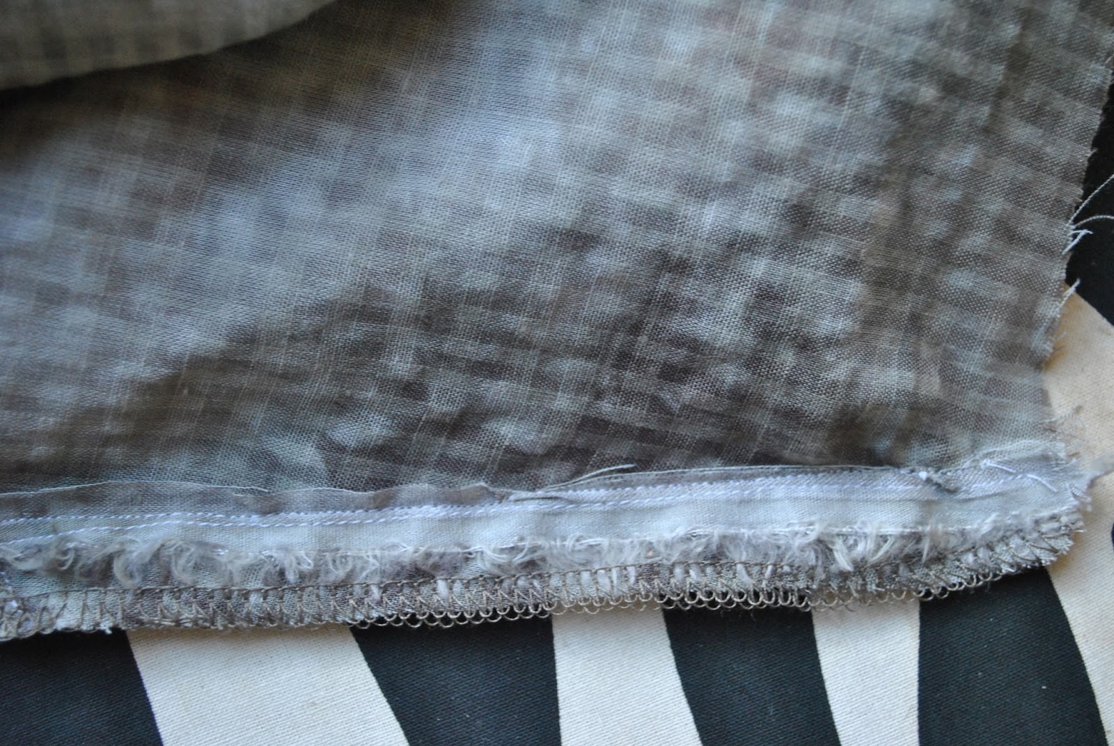
The selvedge of any fabric, even delicates, is usually surprisingly strong and quite stable compared to the body of the same fabric.  
Particularly with sheer fabrics; the selvedge, being exactly the same colour of course, will blend in perfectly and won’t show through to the right side of a sheer fabric at all.  This is a big plus if your fabric is an unusual colour.
Also, you are making good use of the scraps that you would probably toss out anyway, which is more economical than not, yes??
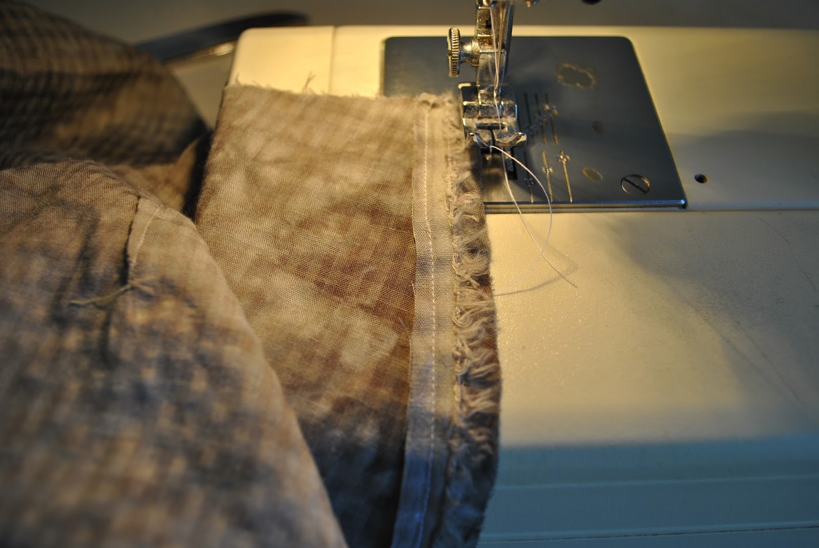
Just stitch it down to the wrong side of the garment, as close to or just within the seam allowance.  If your fabric is super delicate you could fold it over, or use a couple of strips layered together, giving you triple thickness fabric at this point…

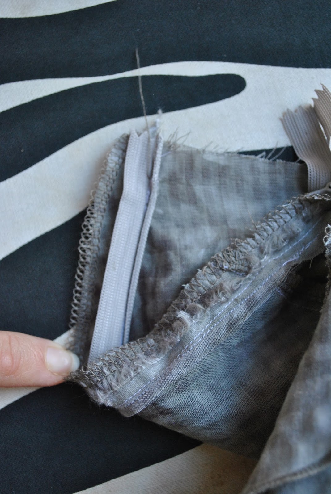
Sew in the zip as normal…

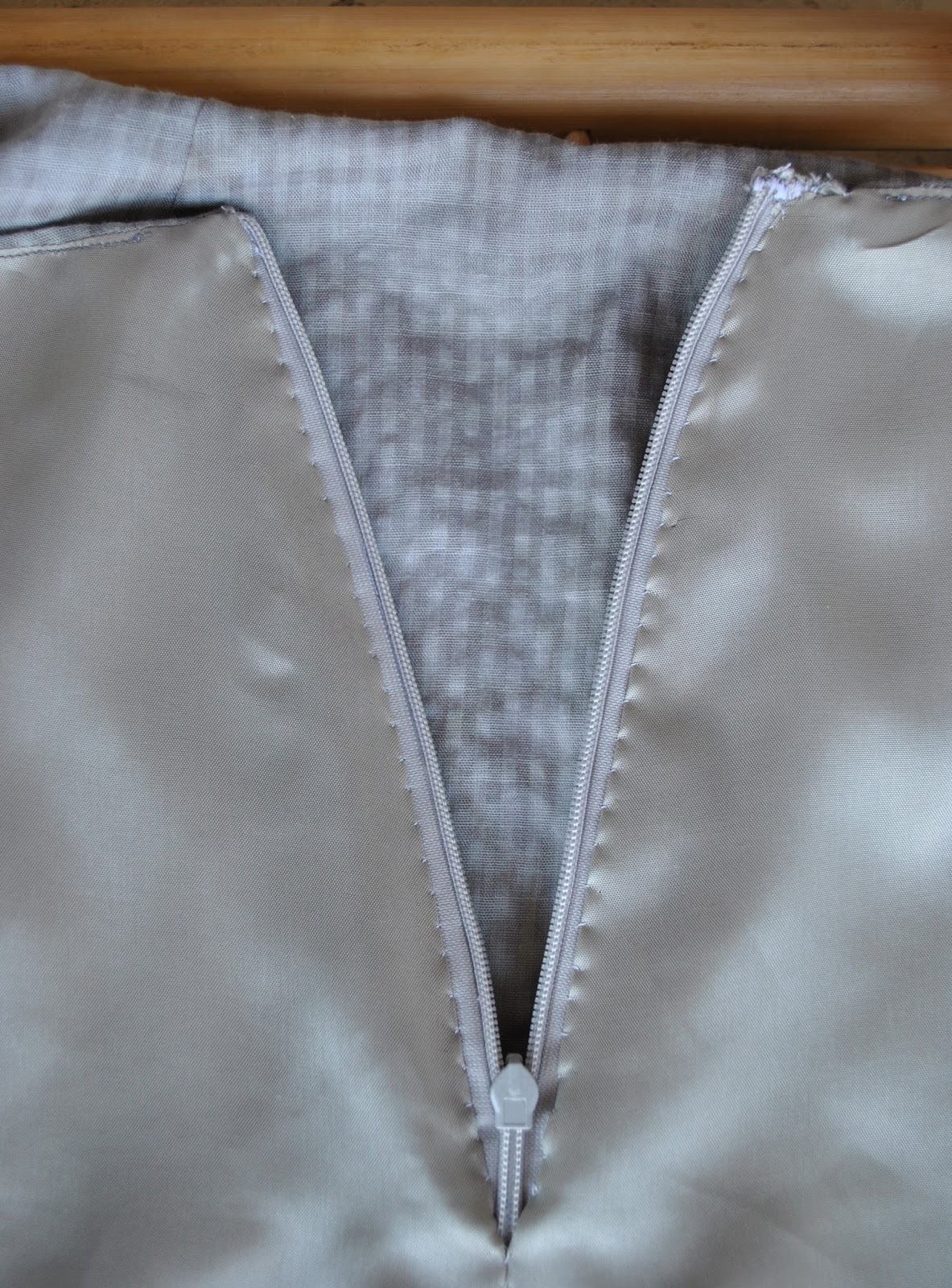
Don’t worry about those fluffy messy looking edges, because once the lining has been stitched to the zip tape you can’t even see those scrappy edge bits anyway.

pinterestmail

Fluttery grey-green skirt

New skirt, yeah  ðŸ™‚
I
bought this lightweight blotchy grey-green cotton from Tessuti’s in Melbourne,
during my girly trip away with my Mum and Cassie last year… and always intended
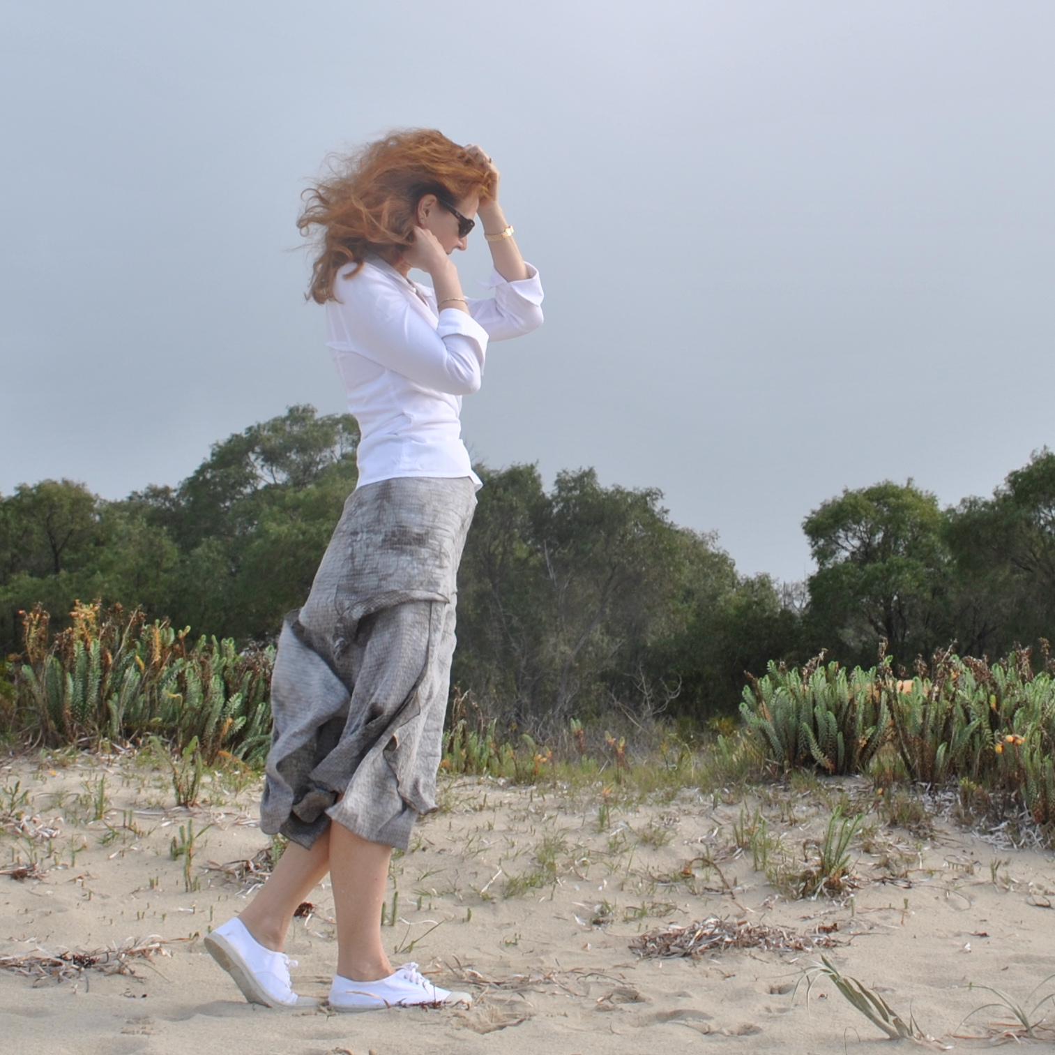
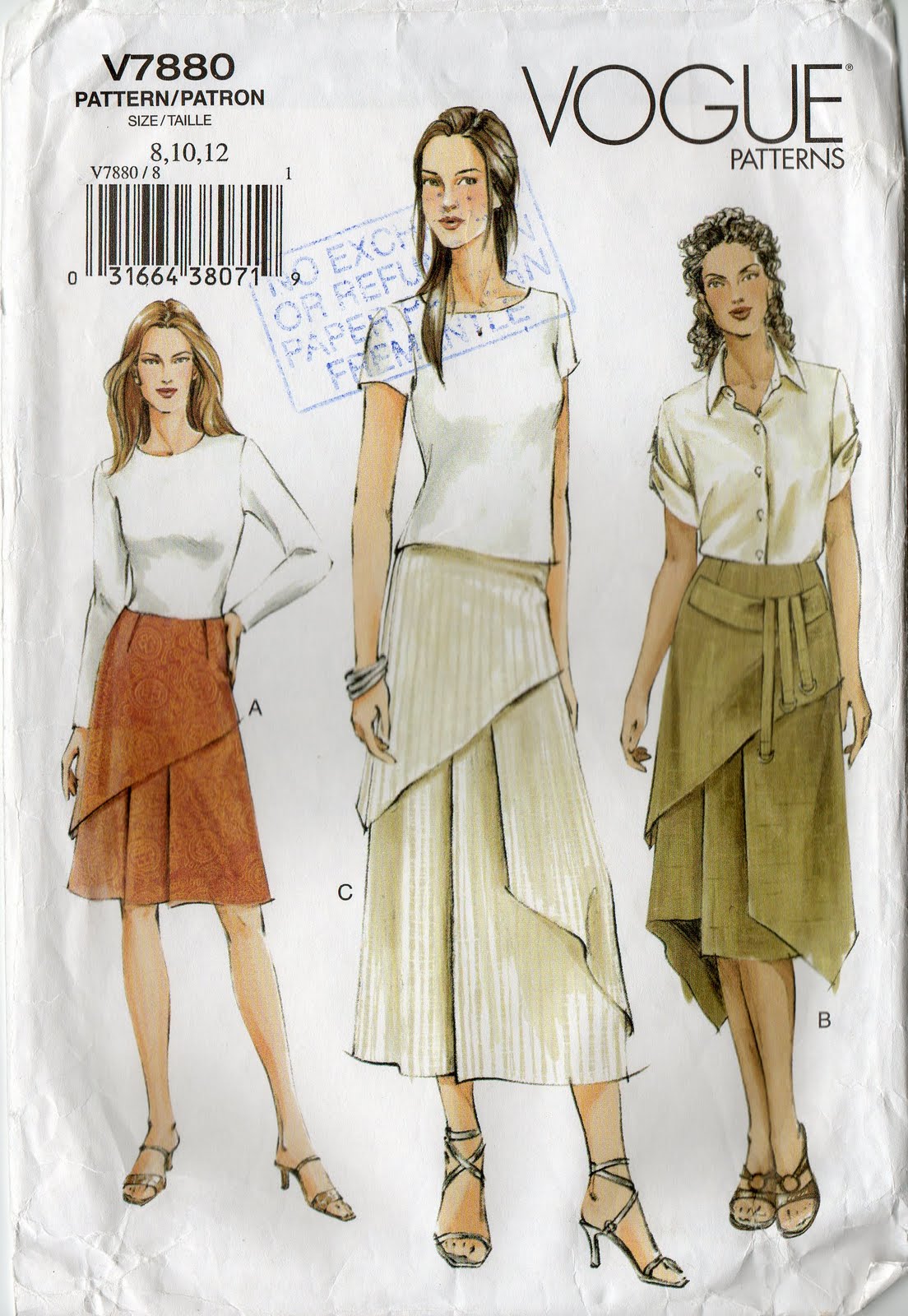
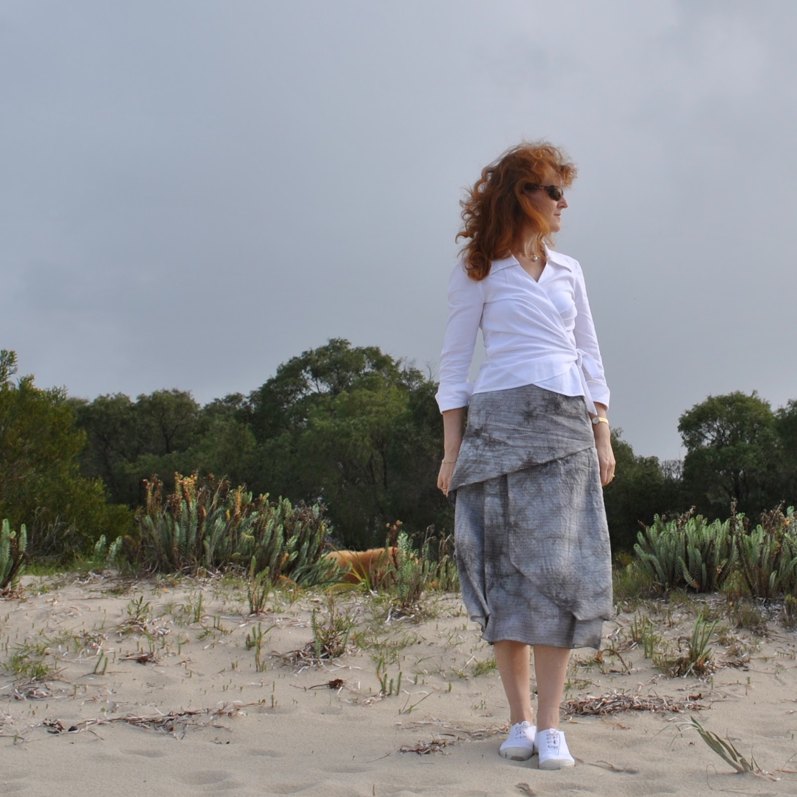
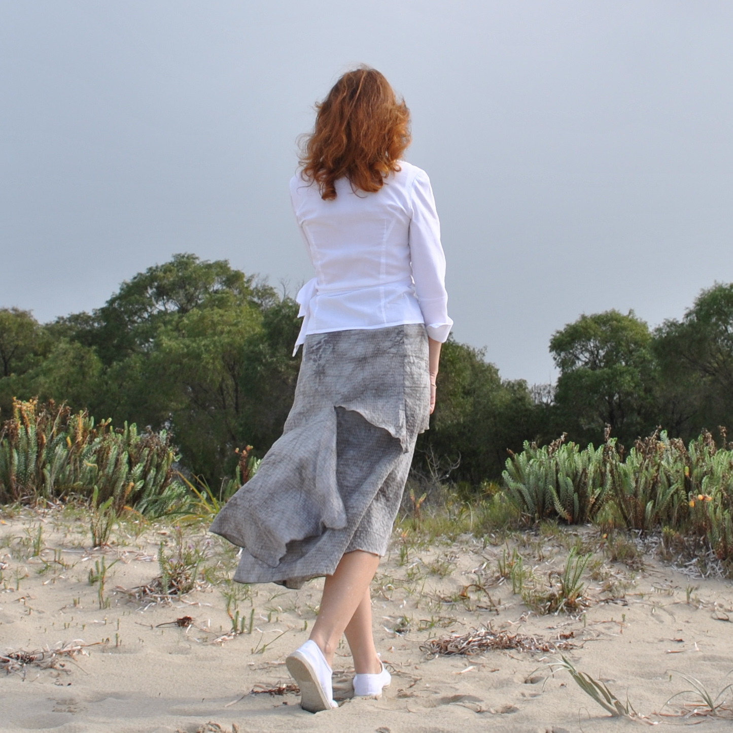
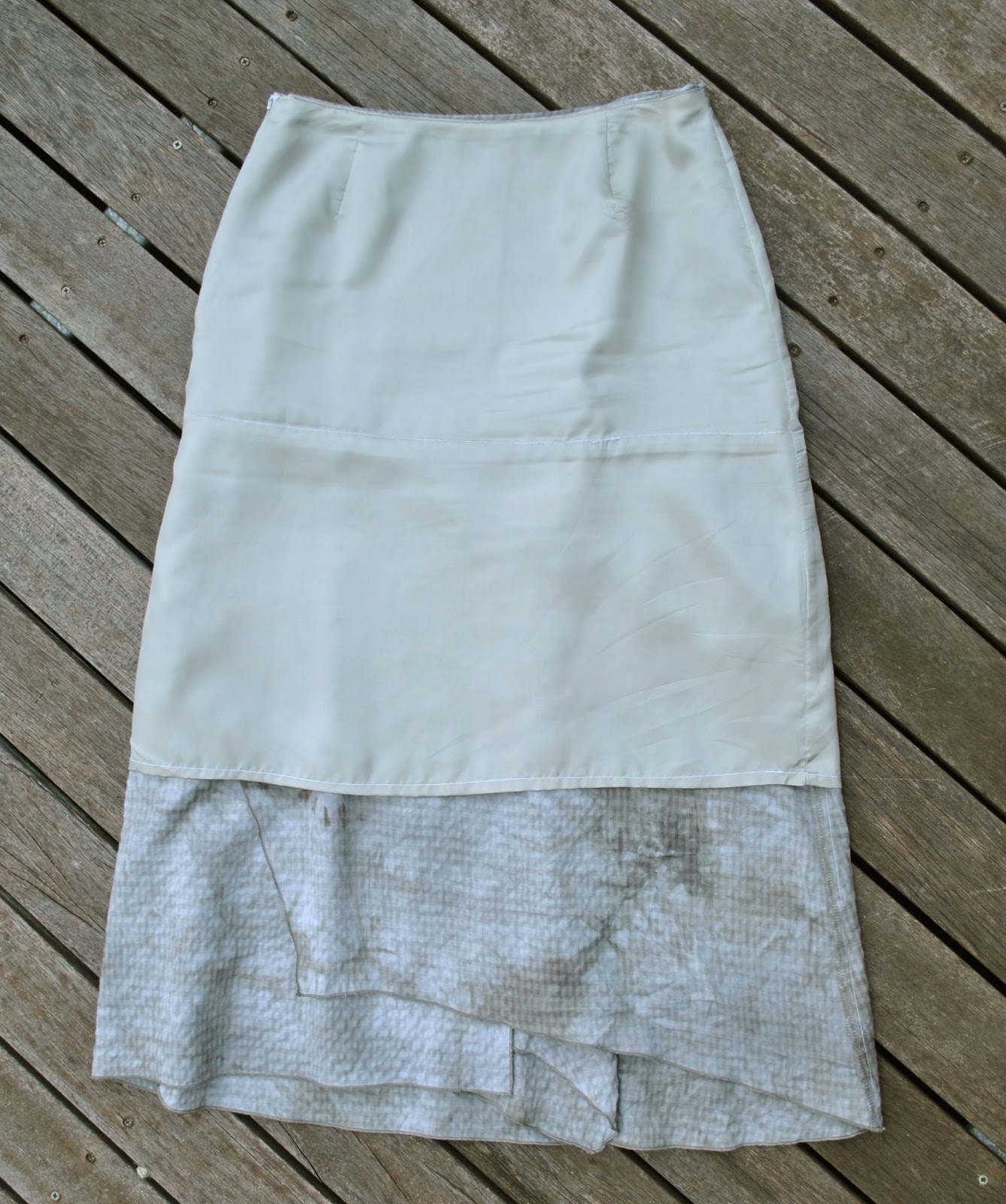
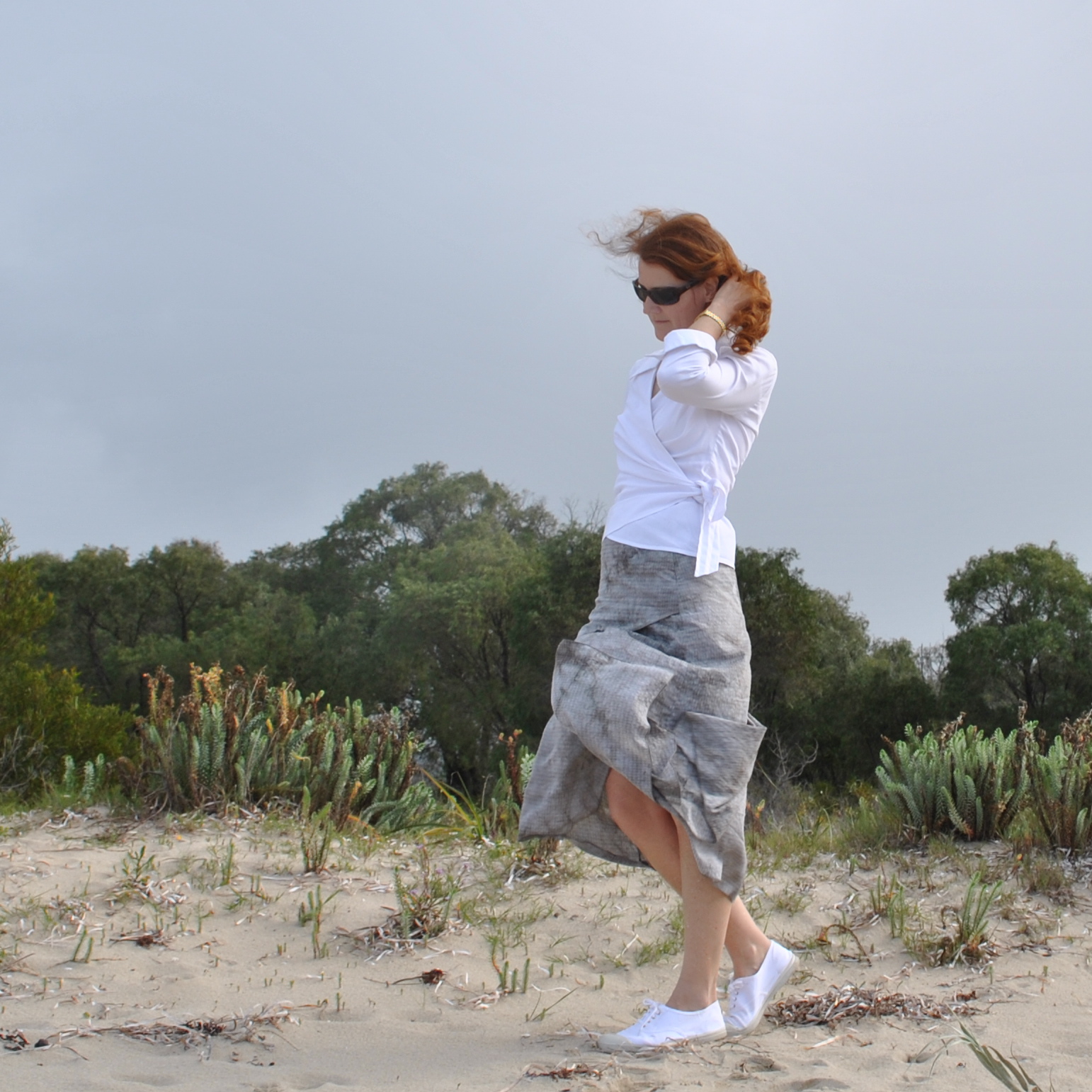
to make just exactly this skirt.  The pattern is an old favourite Vogue 7880, a flatteringly longline skirt with beautifully staggered asymmetrical layers, and the option for a feminine handkerchief hemline.  It’s an interesting as well as lovely design because it looks different from every angle.  There was a stiff breeze on the beach when I
took these pictures, which is normally a pain for the sort of weirdo who tries to photograph their sewing creations out in the great outdoors… I mean who does that anyway?!  but actually turned out to be a good thing I think, because the wind
has assisted in showing off the different layers fluttering against each other, how
they actually appear when in motion, so to speak.  Thanks, wind, for blasting me to bits!  Very much appreciated!
The
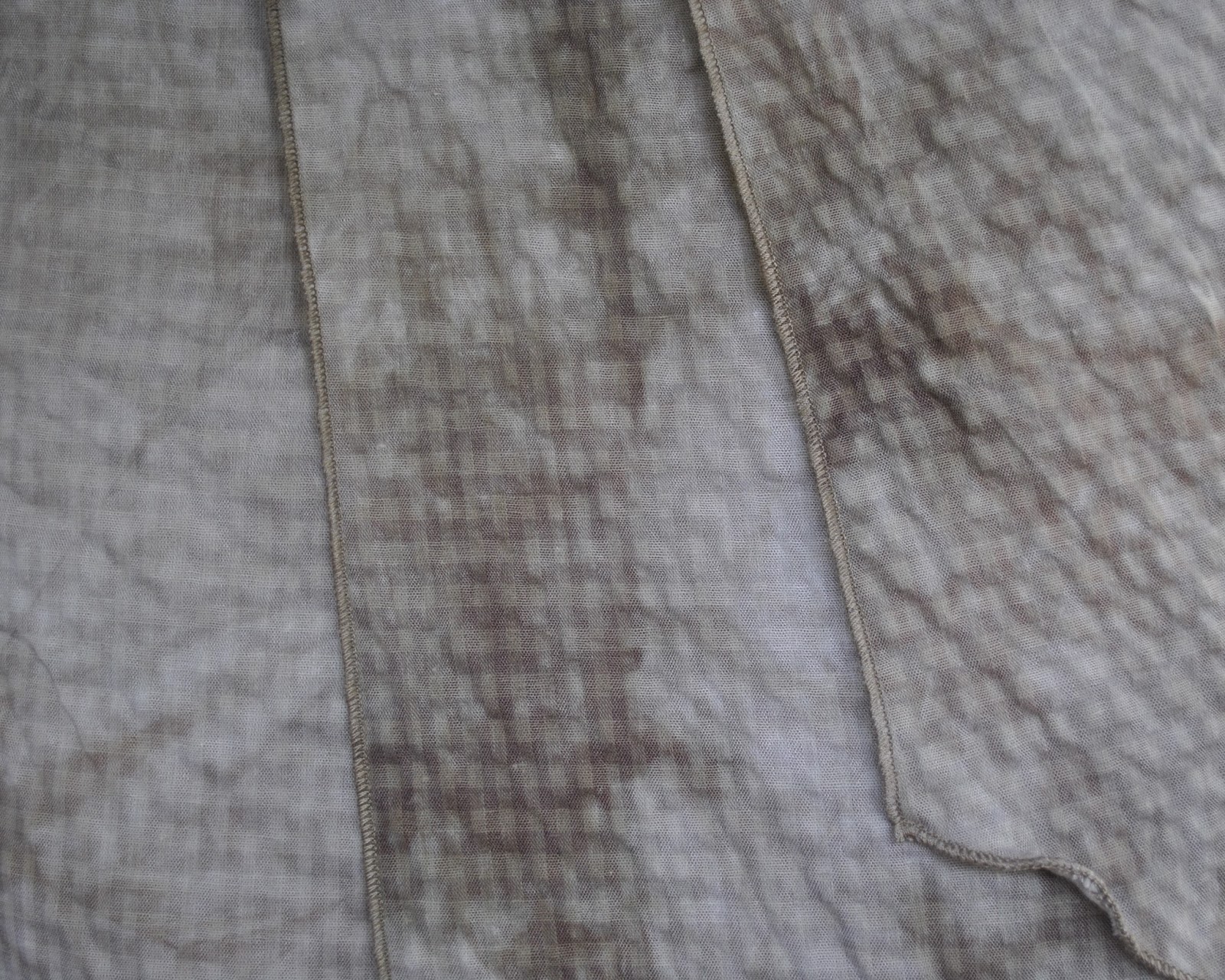
fabric is a very lightweight cotton, a little crinkly, even slightly seersucker-y.  It has the shadows of the classic seersucker check
appearing in its background, overlaid with cloudy, watercolour like swirls of
grey, khaki, sage, olive… all my favourite sludgey colours in other words.   The bolt was clutched to my chest pretty early in the shopping expedition, if I recall correctly.  Mwahahaha.
This skirt pattern has three views and I’ve made lots of them over the years.  This newest version is sorta halfway
between views B and C, which have always been my two favourite
views.  I’m so glad I’ve hung on to
the pattern because it is interesting and lovely, and imo there’s just
nothing ticking either of those boxes in currently available skirt patterns at the moment.  Is it just me or are skirt patterns
pretty boring and unimaginative right now?  Obviously I have absolutely nothing against basic skirt
patterns, since after all I’ve made my own fair share of very plain little
skirts!… but we need some of the more pretty and/or out-there ones too, don’t
we?  And sadly there are just very
few interesting, exciting, gorgeous and/or challenging designs around.  If there are, then please tell me, where
are they?!
This
pattern has inner stay pieces, to which you attach the lower skirt pieces.  For several of my versions of this
skirt I’ve chosen sheer fabrics, because the floaty layers are really crying out to be
made in very light fabrics like chiffon; and so I generally lengthen the
stay to hit just above knee length, to make it more like a real proper
lining.  It’s pretty easy to mark
the old stitching line on the stay, to which you add the lower skirt pieces as
normal, and then you just hem the stay just like you would a lining.  The longer length hangs inside the
skirt, providing modesty when you have chosen sheer fabrics, or in case you do happen to be wearing
the skirt on a very windy day, ahem.
you can just barely make out the line of stitching halfway up the inner stay/lining, where the lower skirt pieces are attached…
It
has an invisible zip closure, and I finished the raw edges using the rolled hem
stitch on my overlocker.
Details:
Skirt; Vogue 7880, lightweight cotton with polyacetate stay/lining
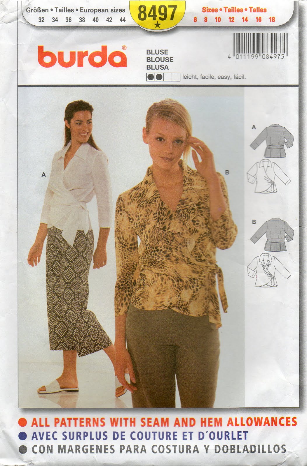
Shirt; Burda 8497, white cotton, details here
Shoes, bensimon, from seed
btw, if you like playing “spot the dog”she just squeaked into two of the pictures here  ðŸ˜‰
pinterestmail

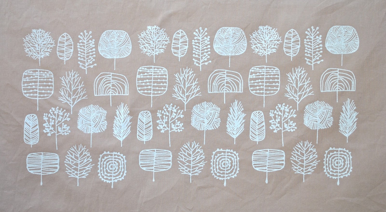
Screen-printing; white trees

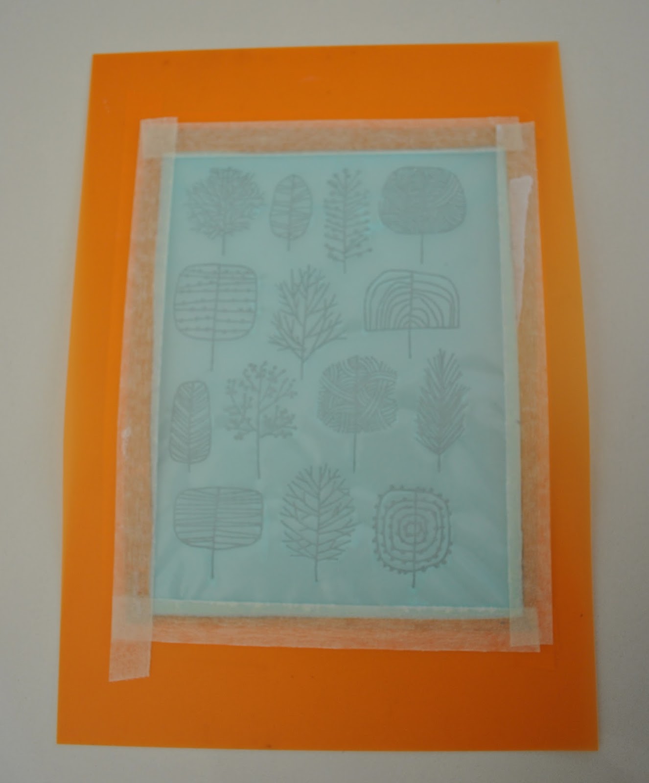
A very simple little print, but finally one with which I am satisfied… maybe because this design is not my own?! This is a design by Eloise Renouf, which I re-drew free-hand to improve the resolution for a screenprint.  I
LOVE her designs; and they strongly remind me of the Figgjo crockery that our family used every day while I was growing up.  Such stylised naive interpretations of nature really inform my own tastes to this day I think.  I’m plunged straight back into my childhood whenever I look at them  ðŸ™‚
As
well as the pretty design, my execution went sooo well this time too.  No boo-boos!  The print is very simple, which helped a lot!
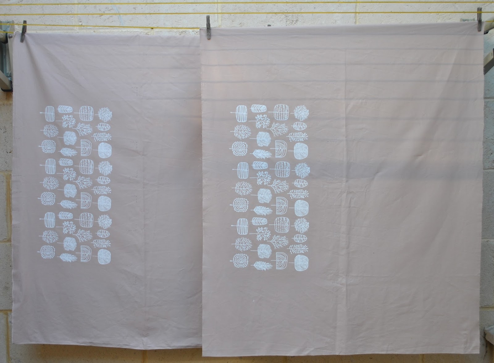
just one colour, with three repeats each on two pieces of fabric.
 The fabric is lightweight, cafe au lait cotton broadcloth from Spotlight.
I
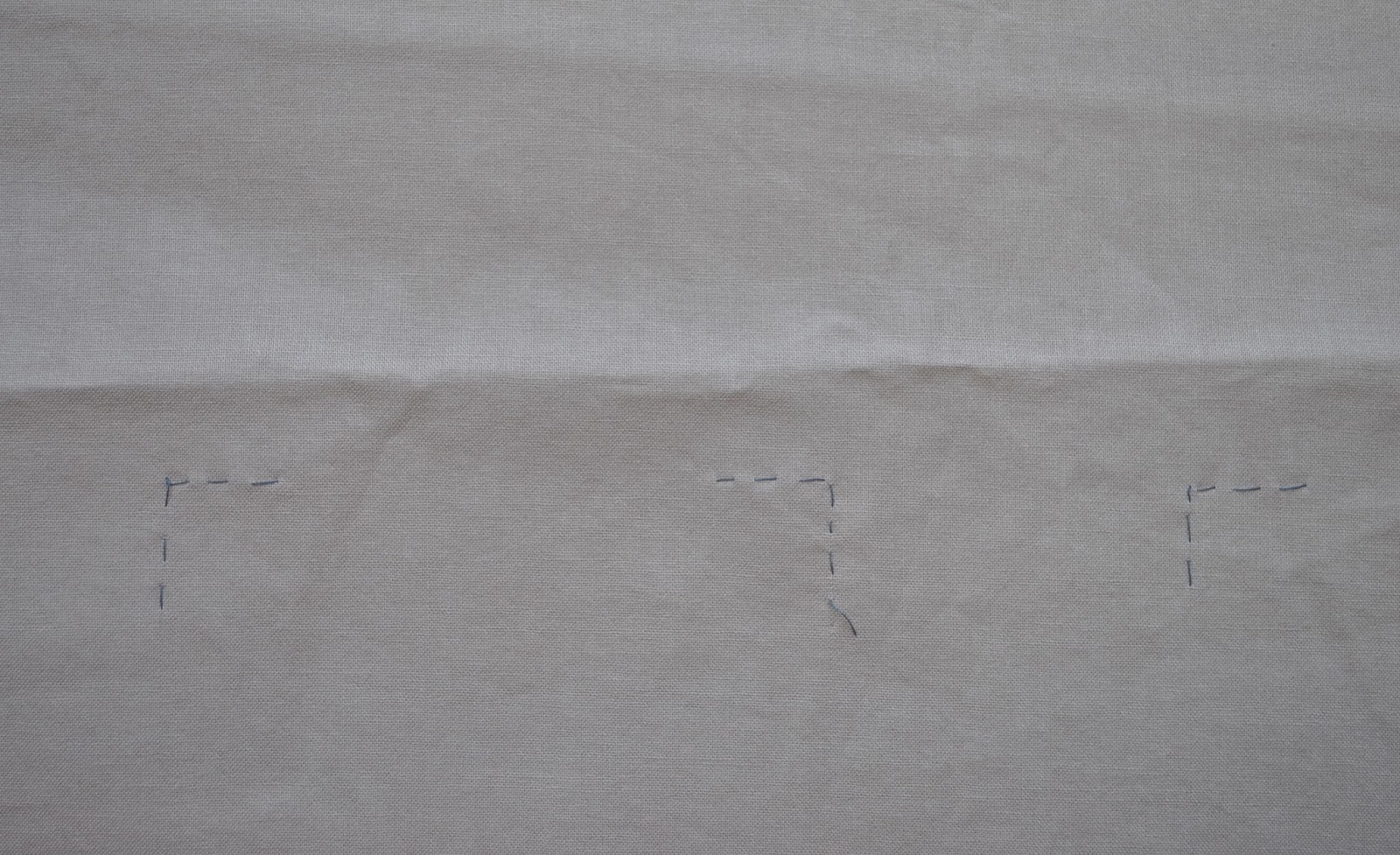
was super careful about marking for the repeats this time; I went down the same path as for the murky blocks design and tacked thread-lines at the corners of
each screen placement, and this paid off big-tiiime! with very easy and stress free placement.  It may take a bit of
extra time and planning, but doing this is well worth the effort and I will not
ever ever shirk doing this properly ever again.  With my previous design, the autumn leaves, I was really pushed
for time in the class and just quickly marked the corners with lightly pencilled-in crosses, but
this was a pretty lazy and slapdash method really. 
The sameness of them, and the proximity of different crosses for
different placements to each other was confusing and I was a bit disappointed
with how the registration turned out.  Note to
self: do NOT try to save time on marking the placement spots.  In fact, spend the MOST time on this bit.  Srsly!!!
Unlike
my previous stencils, which have all been paper stencils hand-cut by moi with a
craft knife, this time my drawing was scanned and transferred to a permanent
bonded stencil. The advantages of this are obvious; it can be used over and over and lasts almost indefinitely, depending how well you look after it, and design-wise you can dispense with the bridges needed to join all the negative spaces in your design so they don’t fall off.  Also the stencil and screen are all in
one, bonded together, so you don’t even need a separate screen.  
Downside; it costs more.
It’s
probably pretty easy to see that my print is a border.  A border for a mysterious… something, hehehe.  Something summery, of course!  I do have a plan…. which will appear here soon, when I can
get around to both making it, and then wearing it, and photographing it.  Lately, I’ve been zooming along supersonically with the first task on that list, and lagging behind with the
third… since I have a little queue of finished new spring projects just waiting to be worn and pictured.
pinterestmail

Virgo

… the
sign of the maiden.

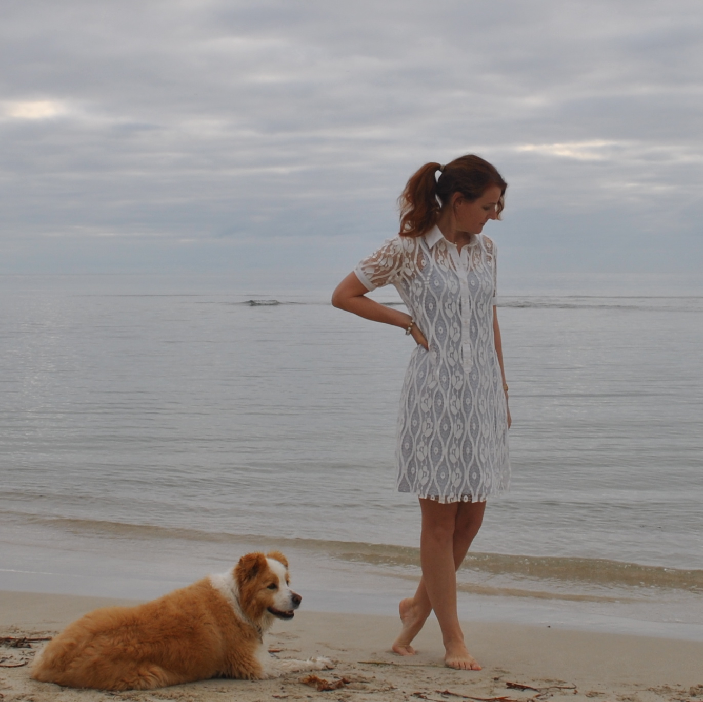
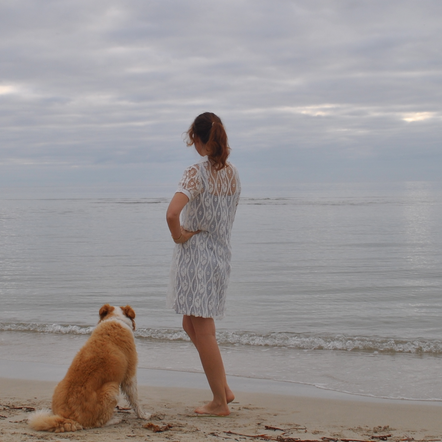
I have made a maidenly new dress  ðŸ™‚
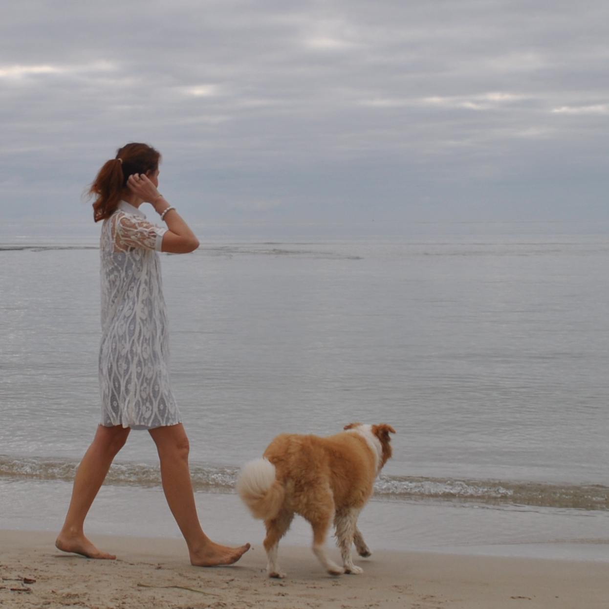
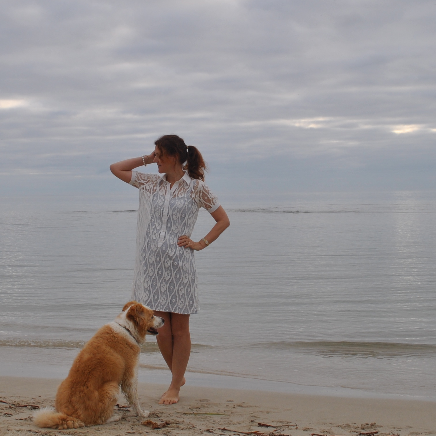
This delicate feathery ivory lace fabric was a very long term resident in my stash.  It’s a tricky customer; sooo cobwebby and so sparse that it has absolutely no structure or form whatsoever and it both stretches and collapses upon itself.  For years I’ve wondered what on earth I could do with it.  Finally I just decided a simple dress would do, and then tried to work out how its wayward flightiness could be tethered into some sort of “dress” arrangement.
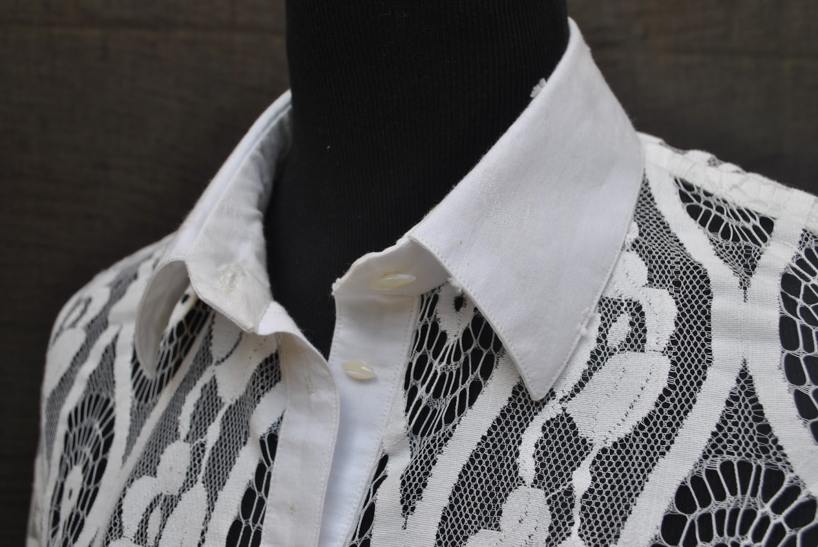
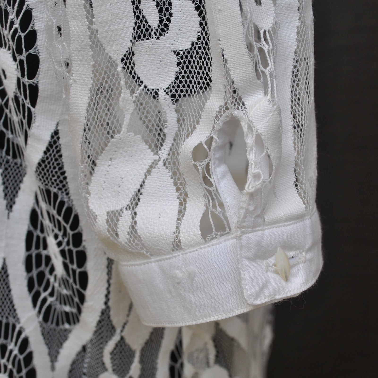
Essentially it’s a shirt-dress.   The backbone of the dress is the collar, the shoulder and armscye seams, and the front button and arm bands: these are the only stable elements in the dress; and the lace fabric just hangs loosely from those structural components.  

The white lace is from Fabulous Fabrics years ago, and for the bands and collar I used a perfectly colour-matched
ivory swiss dotted cotton voile with sparsely scattered fluffy dots, bought at Potters Textiles
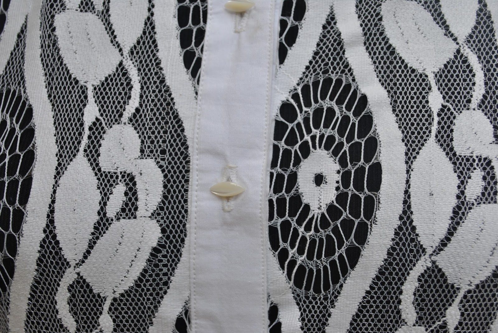
last year.  The buttons… ah, the
buttons!  They are lovely, antique
mother-of-pearl beauties that were given to me by ElleC… thank you so much
ElleC!  I used two of these buttons
previously in this blouse and now this new dress uses the remainder… and, yes! It
was really really hard to cut them
off their little card, but I decided that they are too lovely to sit in a
button tin forever and they deserve to be seen!  I think the marquise shape of the buttons is a purr-fect match for that same-shaped motif in the lace  ðŸ™‚

I had
finagled the number of buttonholes to use every single last one of the buttons
so I was pretty darn devastated when the shank of one broke as I was stitching
it on… noooooo! And a snowflake’s chance in hell of ever finding another one!
So it was oh-so carefully super-glued together before stitching on, however I was still worried about it so
I’ve super-glued it and its
buttonhole together and to the dress. 
Now the left sleeve can never
be unbuttoned and I expect I will be obsessively checking to see that that
button is still in place forever and ever after.  (sigh)

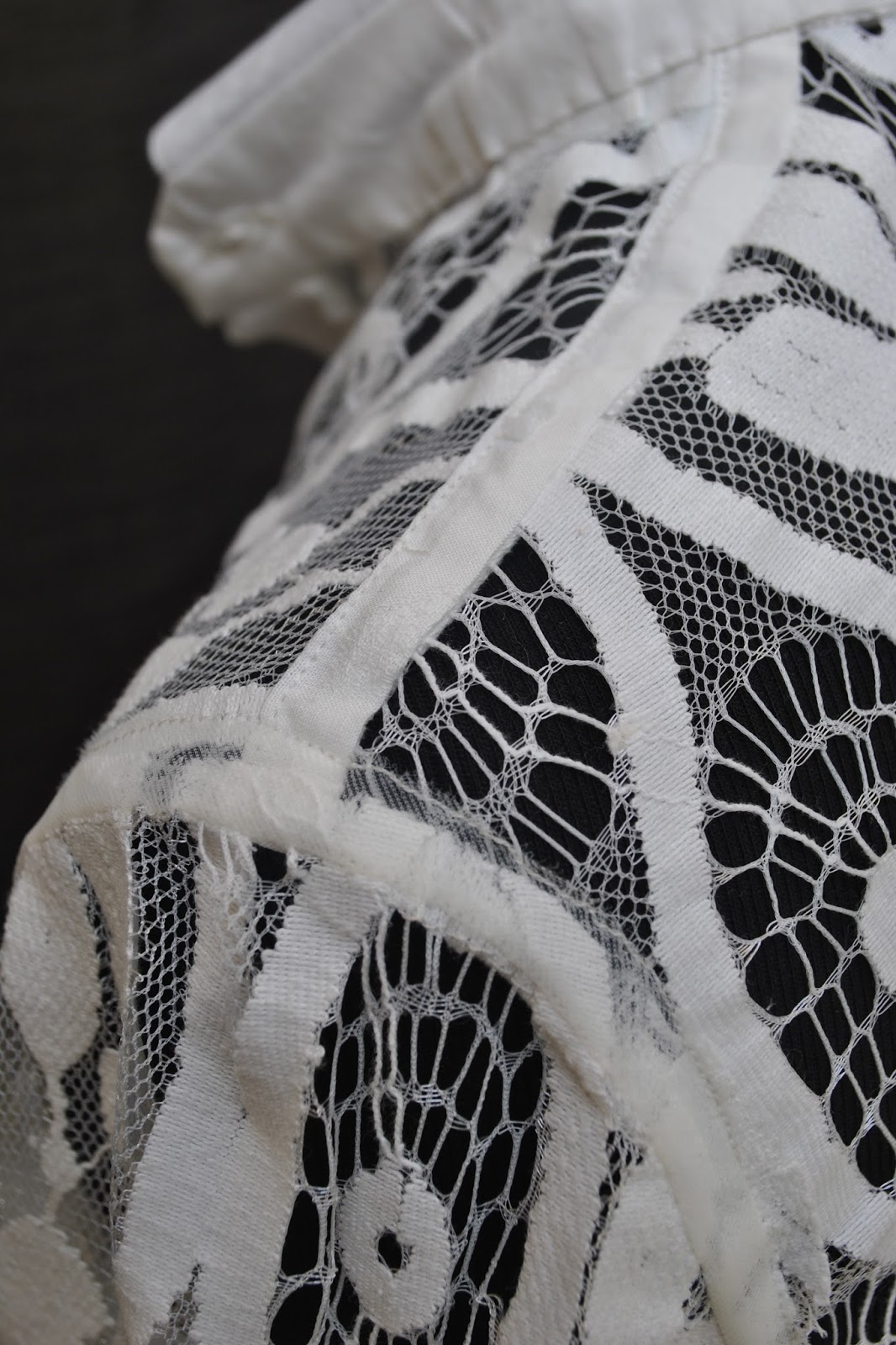
 I stabilized the shoulder seams with a
strip of the same ivory cotton, and the armscyes and side seams are encased with Seams Great, a gift from velosewer;  thanks Maria!  the Seams Great is a sheer and flimsy creamy-coloured tape and is virtually invisible from the right side of the garment.  

inside view

I experimented with a few different finishes for the lower edge of
the dress and all my results were just too hideous for words so the lower
hem is simply cut straight and left unfinished.  This does leave quite a nice ethereal lightness and floatiness to the
lower hem, and fortunately the fabric will not fray.

The pattern is Burdastyle magazine 05/2010 dress 111, which I have used once before to make a completely different style of dress!  Technically, this new version of this pattern has a few slight variations: the front bands are
narrowed to a finished width of 2.5cm; which is visually more in keeping with
the delicacy of the lace fabric. the sleeves are shortened and I sewed a very
narrow band as a one piece sleeve-band placket, pictured below. 
The front bodice was rotated to eliminate the bust dart because the fabric is so delicate sewing darts would have been difficult and they would have looked weird too.  I cut the
sides to be a straight and wide A-line from underarm to the lower hem.

Details:
Dress;
Burdastyle magazine 05/2010, 111 modified, ivory lace and ivory cotton, my review of this pattern here
Petticoat;
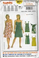
Burda 8071, powder blue silk, details here
pinterestmail
Switch to mobile version
↓